A Guide to Color and Conversion Rates

Color is one of the most powerful tools in the designer’s toolkit. It should be no surprise that different colors evoke different emotions and draw users attention. But if you ever tried to design a new project, you know how difficult is to decide on a color scheme that works well for it.
To get you started, I’ve compiled a quick reference guide that covers the basics colors theory and how they relate to UX design. This article is not meant to be a comprehensive guide of how to apply color to your design, but rather, it’s an overview for color theory within the context of UI and UX design project.
Color Theory
Color theory actually covers a number of things, but at the very basic level it’s the interaction of colors in a design through complementation, contrast and vibrancy:
- Complementation refers to the way we see colors in terms of their relationships with other colors. Choosing colors on opposite ends of the spectrum creates a visual harmony for the eyes. There are two common uses of complementation: the triadic and compound color scheme that we’ll discuss below.
- Contrast reduces eyestrain and focuses user attention by clearly dividing elements on a screen. A high contrast between elements makes text easily readable, and guides your reader’s attention. The most apparent example of contrast is an effective selection of background and text color, as you’ll see below.
- Vibrancy is an emotional implications of color. This topic was fully covered in article Create Emotion With Color In UX Design.
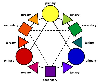
Color Wheel
A color wheel or color circle is an illustrative organization of color hues around a circle. Every shade of color has a set opposite and you can use the color wheel to find each specific color’s opposite.
Create an Effective Color Scheme
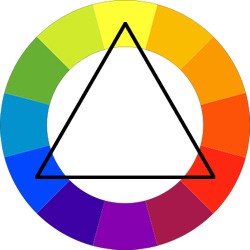
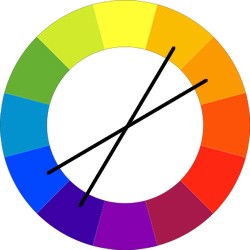
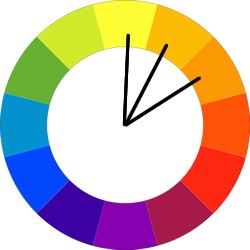
Here are 3 of the commonly accepted structures for a good color scheme: triadic, compound, and analogous:
Triadic. The triadic is the most basic and balanced of the three structures. It composed of 3 colors on separate ends of the color spectrum. There is a very easy way to create a triadic color scheme: take a color wheel, choose your base color and draw an equilateral triangle from this point. The three points of the triangle will form your tri-color scheme.
Compound. Colors that are opposite each other on the wheel are complementary. They contrast strongly, and they can be used to attract the viewer’s attention.
Analogous. Colors that are next to each other in the wheel are analogous. They can be used to create a sense of harmony and continuity in a design. While this scheme is relatively easy to pull off, the trick is in deciding which vibrancy of color to use, as it will be exaggerated. An analogous color scheme is based on a careful selection of colors in the same area of the color spectrum.
- Small text should have a contrast ratio of at least 4.5:1 against its background.
- Large text (at 14 pt bold/18 pt regular and up) should have a contrast ratio of at least 3:1 against its background.

The Impact of Color on Conversion Rates
Color theory in UI design is more than just a visual decoration, it can have game-changing effects on your business. For this section we’ll focus on CTA buttons.
A call-to-action button is a collection of 4 things: placement, shape, copy and color. If these 4 aspects are in line with each other, you’ll have a great call-to-action button. Button color is one of the longest standing debates in the world of conversion and optimization. There are plenty of A/B test results that show how a change in the color of a CTA button made a drastic impact on signups. For example, HubSpot shared a famous button color test:

Even though they originally predicted the green button would perform better, the red button resulted in 21% more clicks.
However, it’s impossible to generalize these results to all situations. There is simply no a magical color that consistently performs best for all sites or apps. Thus, you should always test colors on your page and with your audience to see what happens.
Contrast is a Key
If you want users to click something, make it stand out. If your site or app uses a lot of blue, users probably won’t notice a blue button right away, just like a light button won’t stand out against a light background. Users much more likely to click a CTA button that strongly contrasted with the background.

Conclusion
A basic understanding of color usage is a solid prerequisite for web and app design. What we’ve just discussed are just the fundamentals of how color theory can enhance your UI design, but there’s no limit to how in-depth you can go with colors in your app. No matter what colors you choose, they have a definite influence on the design as a whole — from communicating contrast or similarity, to evoking precise emotions.
Thank you!