Navigation through your app should be intuitive and predictable. Both new and returning users should be able to figure out how to move through your app with ease. But making navigation discoverable and accessible is a challenge on mobile due to the limitations of the small screen and to the need of prioritizing the content over the UI elements. Different navigation patterns attempt to solve this challenge in different ways, but they all suffer from a variety of usability problems.
In this article we’ll examine three basic navigation patterns for mobile apps — hamburger menu, tab bar and gesture-based navigation — and describe strengths and weaknesses of each of them.
Screen space is a precious commodity on mobile and the hamburger menu (or side drawer) is one of the most popular mobile navigation patterns that helps you save it. The drawer panel allows you to hide the navigation beyond the left edge of the screen and reveal it only after a user’s actions. This pattern can be particularly useful if you want your user to focus on the main content.
In its default state, the hamburger menu and all of its contents remain hidden
Example
As you can see, an actual menu is hidden behind the hamburger icon.
Previous version of Foursquare. Image credit: lmjabreu
##Pros
* *Large number of navigation options.* The main advantage of the navigation menu is that it can contain a fairly large number of navigation options in a tiny space.
* *Clean design.* Free up screen real estate by shifting the options off the screen into a side menu.
Cons
- Hidden navigation is less discoverable. What’s out of sight, is out of mind. When navigation is hidden, users are less likely to use navigation. While this type of navigation becomes standard and many mobile users are familiar with it, many people still simply don’t think to open it.
- Clash with platform navigation rules. The hamburger menu has became almost a standard on Android (pattern has a name Navigation drawer in Material Design), but in iOS it simply cannot be implemented without clashing with the basic navigation elements, and this can overload the navigation bar.
Attempt to use a hamburger menu in iOS app. Image credit: lmjabreu
- The hamburger icon hides context. Hamburger menu doesn’t communicate current location in glance, it’s harder to surface the information about current location as it’s only visible when the person clicks on a burger icon.
- Extra action required to move to the target destination. Reaching a particular page usually takes at least two clicks (one click on menu icon and the other — to the target page).
Tips
- Prioritize navigation options. If your navigation is complex, hiding it does not make it mobile friendly. A lot of practical examples clearly show that exposing menu options in a more visible way increases engagement and user satisfaction. Ask yourself: “What’s important enough to be visible on mobile?” Answering that question requires an understanding of what matters to your users.
Image credit: lukew
- Consider using tabs or tab bar if you have a limited number of highly prioritized navigation options.
YouTube makes main pieces of core functionality available with one tap, allows rapid switching between features. Credits: Luke Wroblewski
- Review your information architecture. Good apps are highly focused. So if you have one complex app you can split it’s functions between two (or more) simple apps. Facebook released their Messenger app in order to solve this problem of complexity. The reduced functionality results in a reduced set of menu options, and less need for a hamburger menu.
Tab Bar
Tab bar pattern is inherited from desktop design. It usually contains a relatively few destinations of similar importance and these destinations require direct access from anywhere in the app.
The tab bar doesn’t hide navigation, allow direct access and present feedback on the icon it’s related to.
##Example
Tab bar in Twitter lets the user navigate directly to the screen associated with the item.
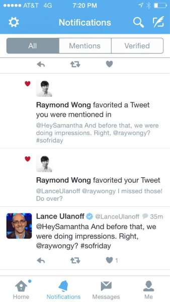
Twitter app for iOS. Image credit: Mashable
##Pros
* *Tab bar fairly easy communicates the current location.* Properly used visual cues (icons, labels and colors) makes self-evident so doesn’t require any explanation.

* *Tab bars are persistent.* They persist all the navigation options on screen at all times so your users have clear visibility of all the main app views and single-click access to them.
##Cons
* *Limited number of navigation options.* If your app has more than 5 options, it’s hard to fit them in a tab or navigation bar and still keep an optimum touch-target size.
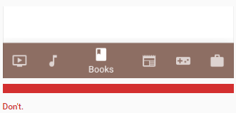
Don’t use more than 5 options in a tab bar
- Different location and logic behind the tab bar options for iOS and Android. Platforms have different rules and guidelines regarding UI and usability and you have to take this into consideration when designing tab bar for a particular platform. It can appear at the top (Android mostly) or at the bottom of the page (iOS mostly). Also on iOS, it’s common to use a bottom tab bar to switch between views in the app. Android’s platform convention is to display tabs for view control at the top of the screen instead. In addition, Android apps may use bottom bars to display actions.
Proper location and logic will help maintain a consistent experience with other apps on the platform and prevent confusion between actions and view-switching. Image credit: Google
##Tips
* *Make touch targets big enough.* Make targets big enough to be easily tapped or clicked. To calculate the width of each bottom navigation action, divide the width of the view by the number of actions. Alternatively, make all bottom navigation actions the width of the largest action.
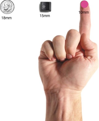
Most users can comfortably and reliably hit a 10mm by 10mm touch target. Image credit: uxmag
- Your icons should be usability tested. Use the 5-second rule: if it takes you more than 5 seconds to think of an appropriate icon for something, it is unlikely that an icon can effectively communicate that meaning.
- Always use icons together with labels. Due to the absence of a standard usage for most icons, text labels are necessary to communicate the meaning and reduce ambiguity. Users should be able to understand what exactly happens when they tap on a element.
Use text labels in order to provide short, meaningfully definitions to bottom navigation icons
#Gesture-Based Navigation
June 29, 2007, was a game-changer. From the moment Apple launched the first fully touchscreen smartphone on the market, mobile devices have been dominated by touchscreen interaction.
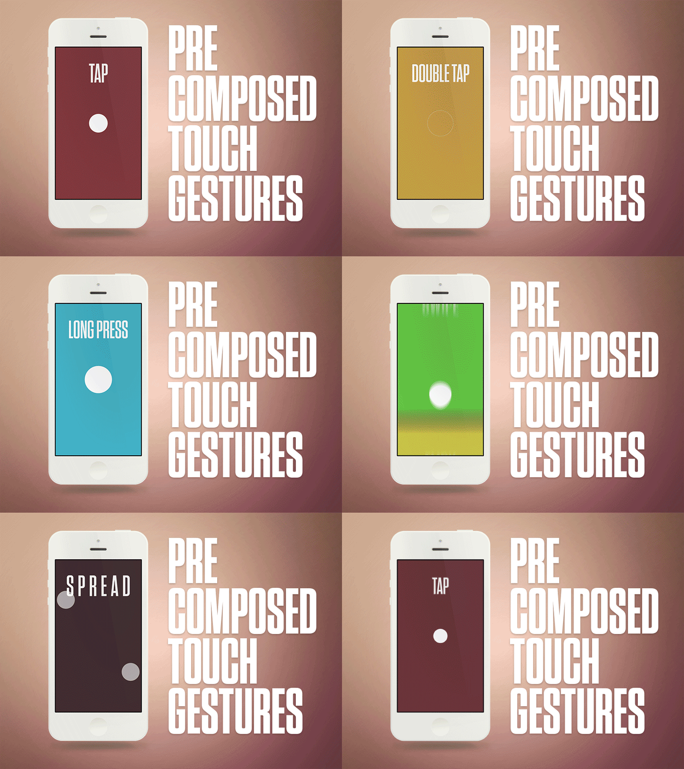
Image credit: Aaron Wade
Gestures immediately became popular among designers and there were many apps that were designed around experimenting with gesture controls.
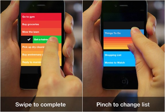
Gesture driven to-do app Clear
In today’s world, the success of a mobile app can dramatically depend on how well gestures are implemented into its user experience.
##Example
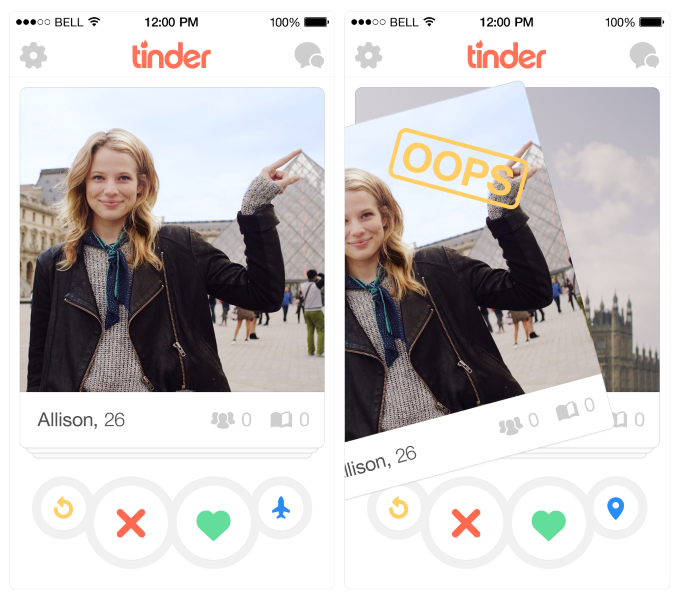
Tinder changed their industry with the swipe gestures, so it’s became almost product-defining gesture. People associate the app with the “swipe left” or “swipe right.”
##Pros
* *Removing UI clutter.* Building gestures into the heart of your design allows you to create more minimal interfaces and to save a screen space for a valuable content.
* *“Natural User Interface.”* Luke Wroblewski, in his [article](http://www.lukew.com/ff/entry.asp?1197), provides an information about the study in which 40 people in nine different countries were asked to create gestures for 28 different tasks like deleting, scrolling, zooming, etc. The important thing to note is that the gestures tended to be similar across culture and experience. For example, when prompted to “delete,” most people — regardless of nationality — tried dragging the object off screen.
##Cons
* *Invisible navigation.* The important design rule of a UI is visibility: through the menus, all possible actions can be made visible and, therefore, easily discoverable. An invisible user interface can be seductively beautiful but because it is invisible it is likely to have many usability issues: since gestures are always hidden, users need to find them first and just like in case of the hamburger menu: if you hide an option, less people will use it.
* *Increased user effort.* Most gestures are neither natural nor easy to learn or remember. When designing gesture-based navigation, be aware that every time you remove UI clutter, the application’s learning curve goes up and without proper *visual hints and cues*, users could get confused about how to interact with the app.
##Tips
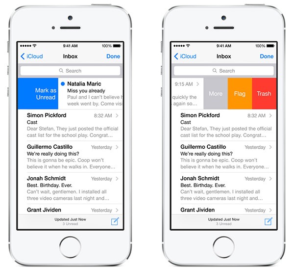
Make sure you’re not having to teach people a whole new way of interacting with an interface. Design the familiar experience. In order to design a good gesture-based navigation, you have to start by looking at the current state of gestures in the mobile world. For example, if you design an email app you can use a swiping over an email gesture because there’s a strong possibility that it’ll be familiar gestures for many users:
- Use progressive disclosure with slight visual cues to teach people how to interact with your interface. Keep in mind, that you need to show only the information that is relevant to the user’s current activity, almost the same way as games revealing game mechanics as you move further into a game.
Pudding Monsters uses an animated hand to present a new scenario for users.
#Conclusion
Helping users navigate should be a high priority for every app. Always think about your user persona, think about the goals they have when using your app, and use your navigation to help them meet those goals. The easier your product is for them to use, the more likely they’ll be to use it.
Thank you!