Color is one of the most powerful tools in the designer’s toolkit. At the same time, color is a tricky concept to master — with an infinite number of possible color combinations out there, it can be hard to decide what colors to use on your site or app. To make things easier, I’ve created a list of the best tools for choosing color palettes. I’m sure they will save you a lot of time. In this article you’ll find tools that will help you:
- Find inspiration
- Create your own color scheme
- Make color scheme accessible
1. Find Inspiration
Nature
There’s a lot of inspiration around you already. To get inspired you only need to look around. Print design, interior design, fashion… there are so many inspiring places to gather from. The best color combinations come from nature — simply take a picture of a beautiful moment and create your color scheme from this picture.
The best color combinations come from nature. You can create a color scheme from the shot.
##[Behance](https://www.behance.net)
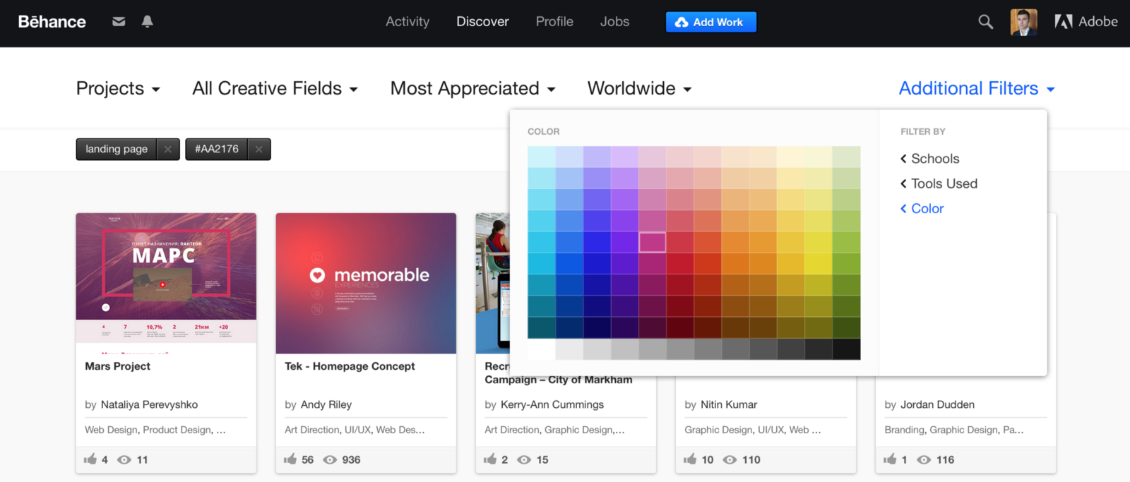
Behance showcase and discover the latest work from top online portfolios by creative professionals across industries. It’s also a great source for inspiration. To find fresh and interesting creative work simply filter by color.
##[Dribbble Colors](https://dribbble.com/colors/)
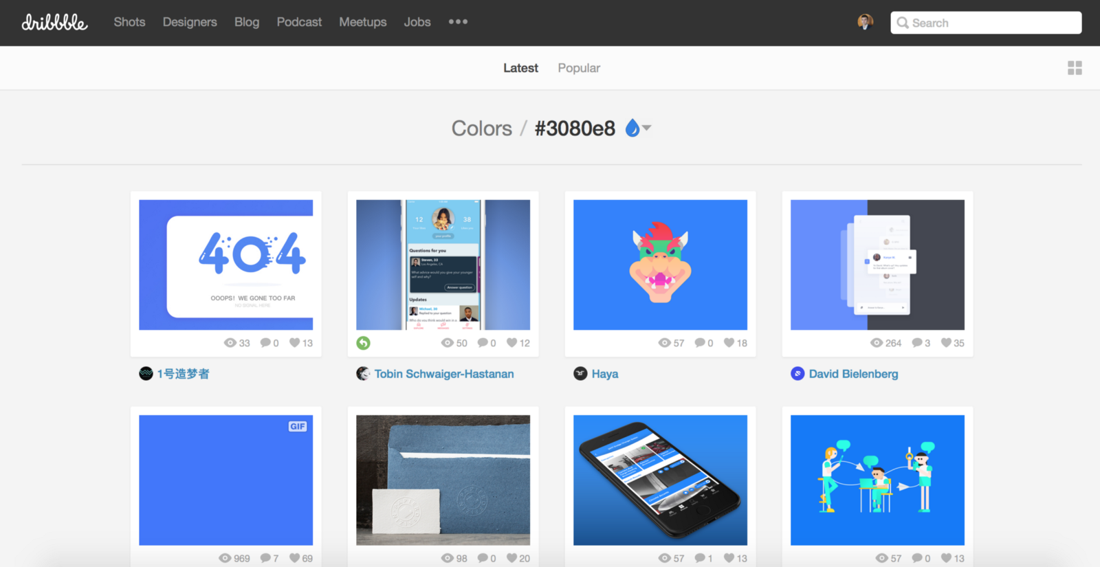
Dribbble is one of the best place for user interface inspiration. It has tool for searching by colors so when you want to do visual research on how particular color was used by other designers, go to dribbble.com/colors and select a desirable color.
You can also specify minimum percent of shot containing color (e.g. shot is 30% blue).
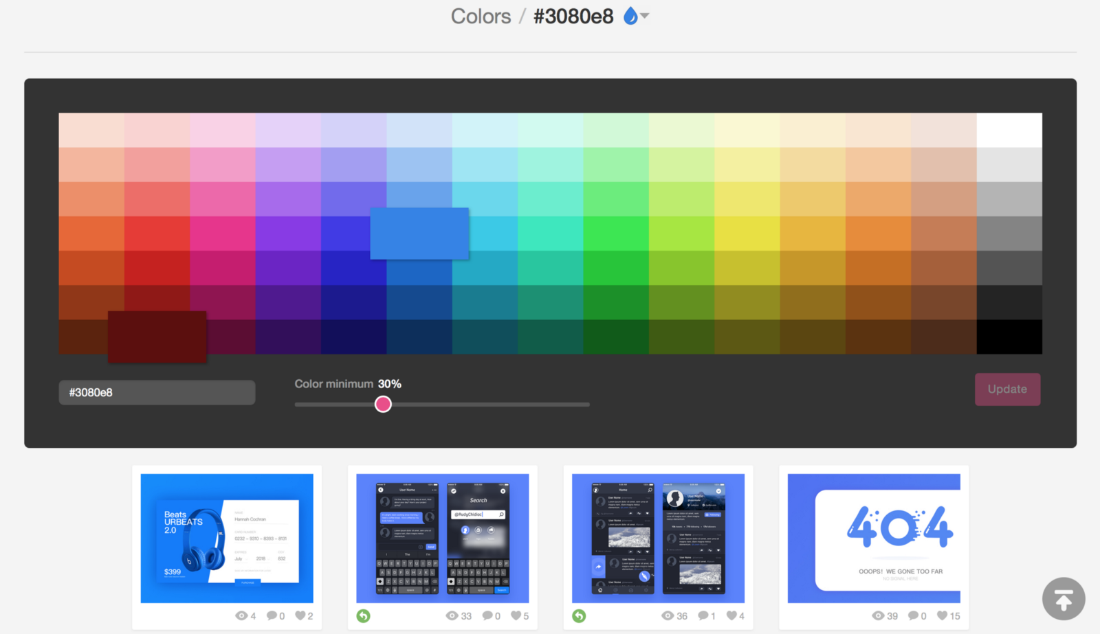
Specify minimum percent of shot containing color
##[Designspiration](http://Designspiration.net)
Designspiration is a great tool when you have an idea for your color palette but you want to see examples of this mix. You can pick up to 5 colors and search images that are matching your query.
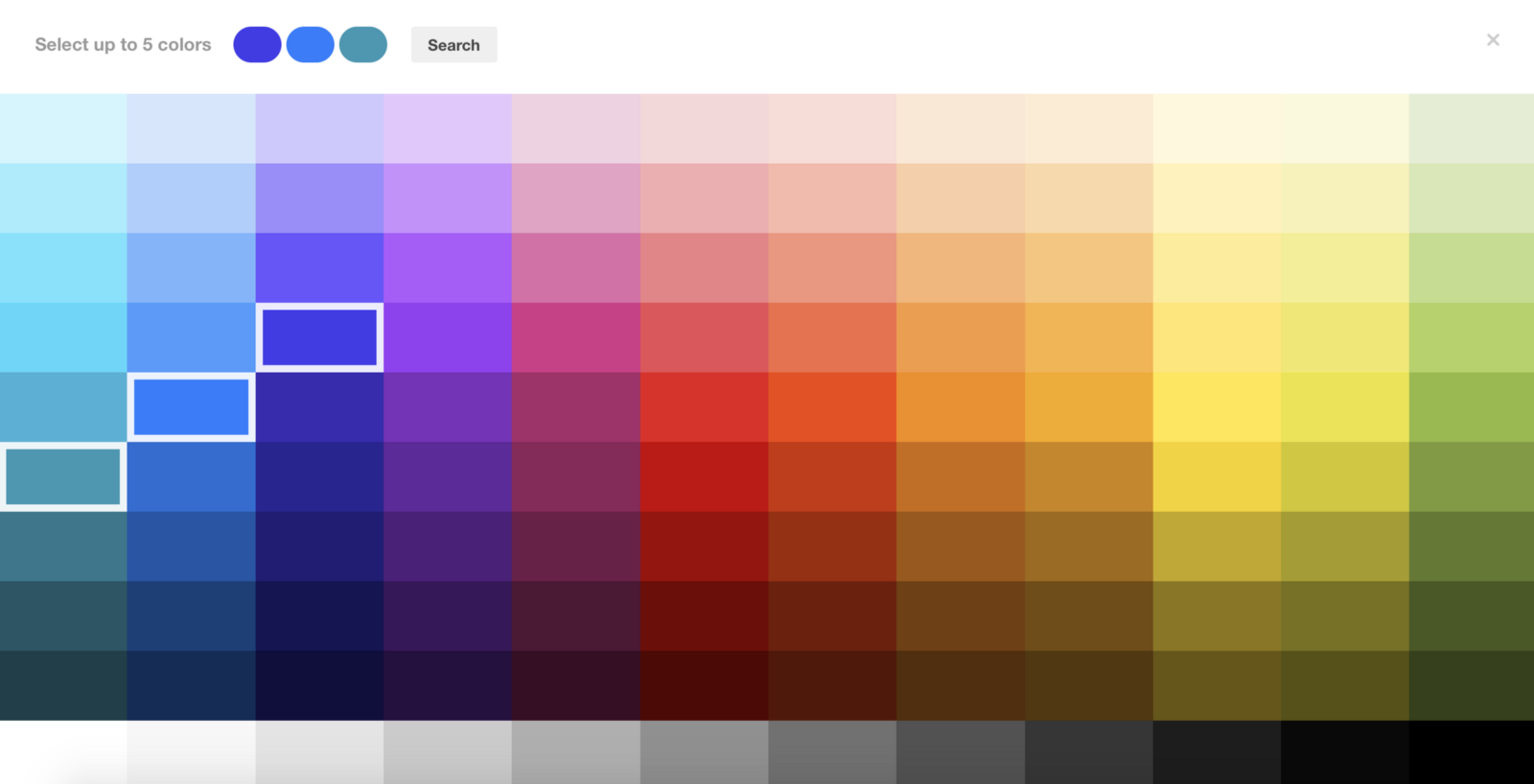
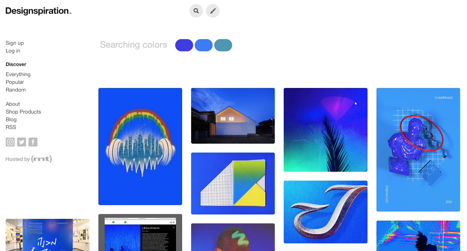
Designspiration will provide relevant examples
##[Tineye Multicolr](http://labs.tineye.com/multicolr/)
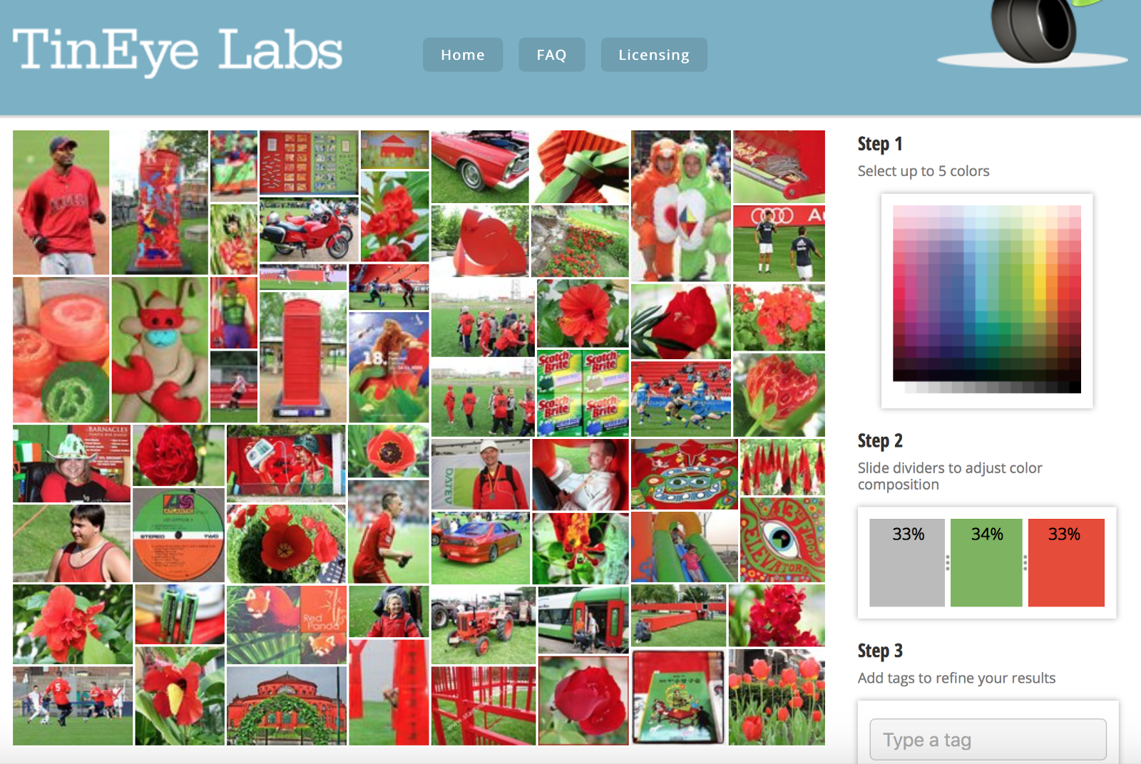
Tineye will help you to search for a mix of colors in the photo or even specify the amount of each one (color ratio). This website uses a database of 20 million Creative Commons images from Flickr. It’s probably the fastest way to get free images in the perfect colour combination.
##[Colorzilla](http://www.colorzilla.com/firefox/)
ColorZilla is an extension available for Google Chrome and Mozilla Firefox that includes a raft of colour-related tools including a colour picker, eye-dropper, css gradient generator and palette browser.

ColorZilla available for Chrome and Firefox
##[Canva](https://www.canva.com/colors/)
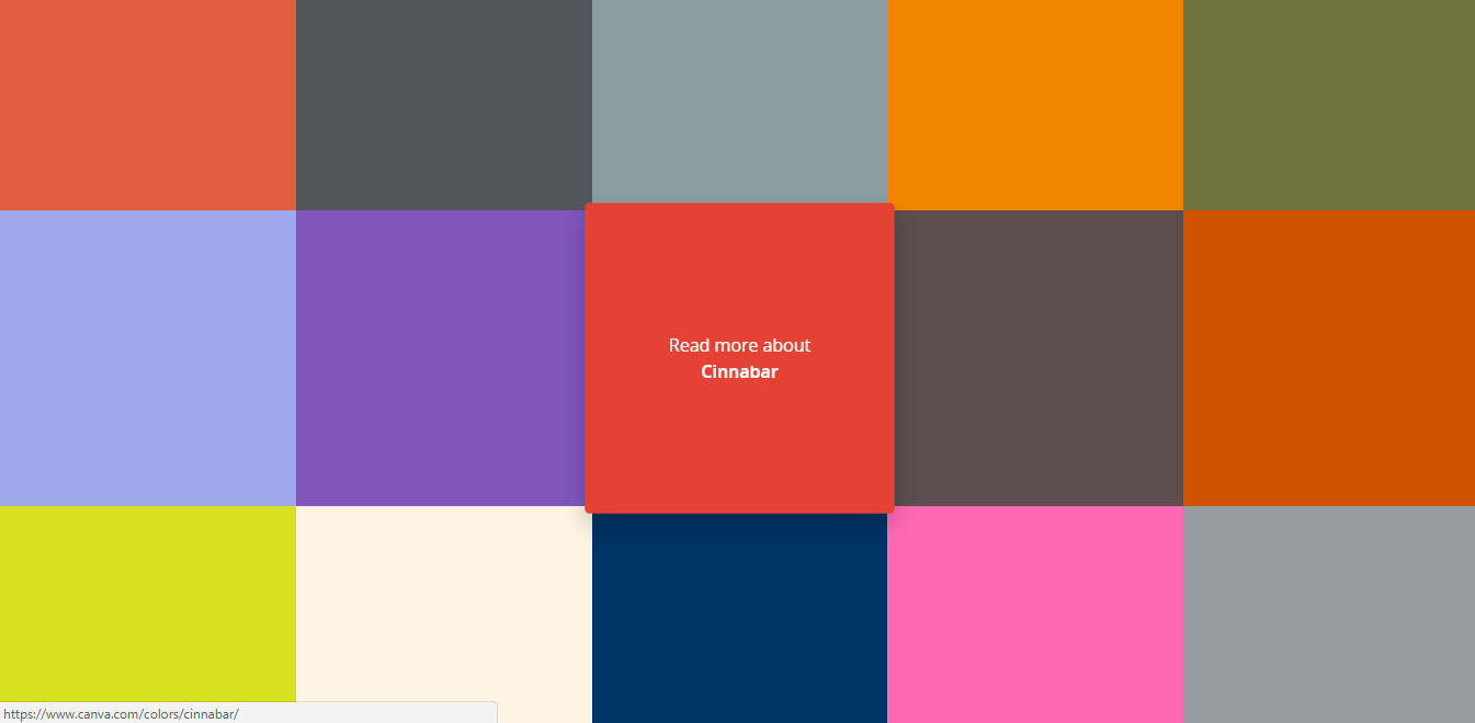
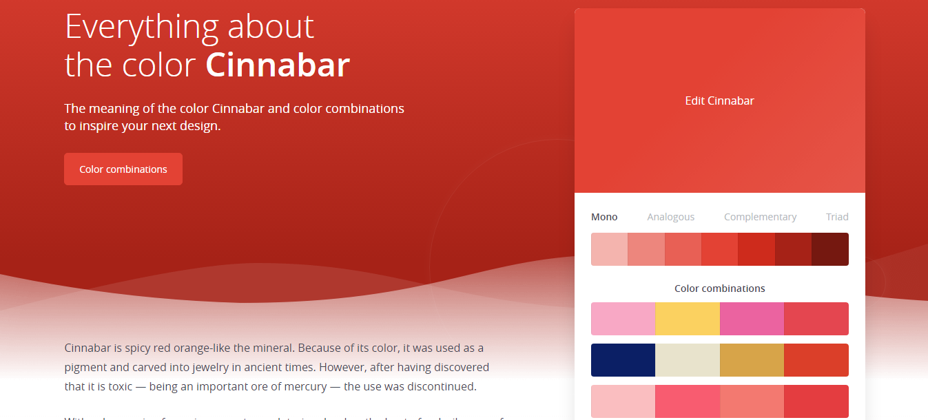
Canva design wiki on colors teaches you everything you need to know about colors, their meanings and the color combinations that will hopefully give inspiration to your next design!
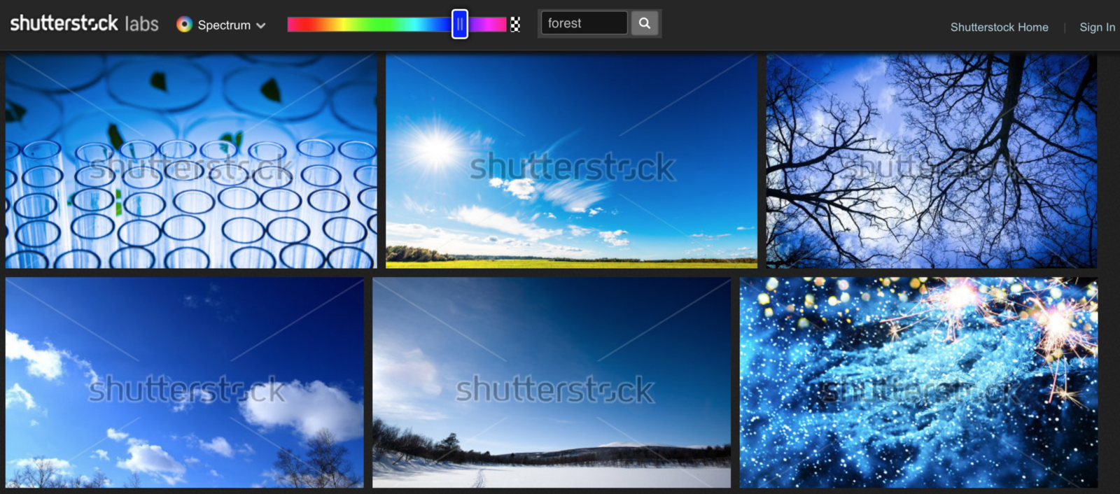
##[Shutterstock Spectrum](http://www.shutterstock.com/labs/spectrum/)
Sometimes the best way of seeing if a colour scheme will work is via a selection of stock images. All the main stock image services offer this kind of tool, but Shutterstock Spectrum has a particularly nice interface with large preview images. You don’t even need subscription because preview image with watermark will be enough to generate palette.
#2. Create Color Scheme
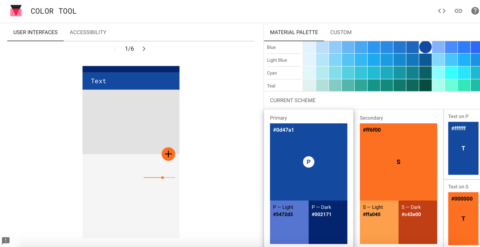
##[Material Design Color Tool](https://material.io/color/#!/?view.left=0&view.right=0)
Material Design Color Tool makes it possible to create, share, and apply color palettes to your UI, as well as measure the accessibility level of any color combination.
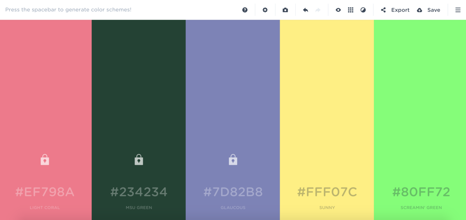
##[Coolors.co](https://coolors.co)
Coolors is a powerful tool to create multicolored schemes. You can simply lock selected color and press spacebar to generate new palette. The cool thing about this tool is that you aren’t limited to only one outcome — it’s possible to receive a few color schemes simply by modifying reference point.
Using this tool it’s also possible to upload an image and make a color palette from it.
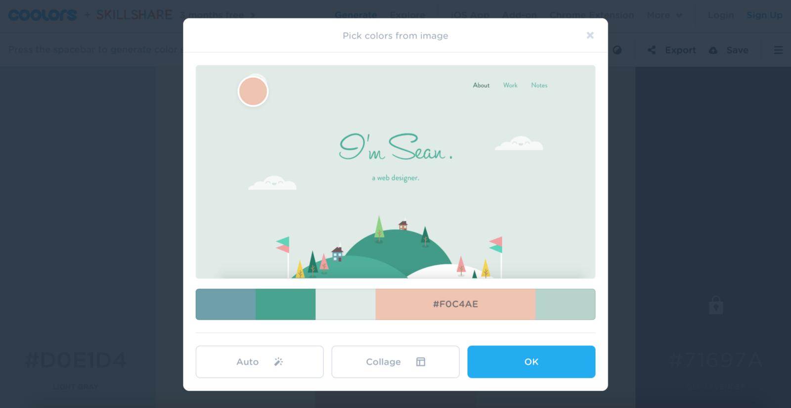
Coolors gives you the ability to upload an image and make a color palette from it.
##[Adobe Color CC](https://color.adobe.com/create/color-wheel/)
The tool previosly known as Kuler has been with us for a long time. It is available as a web and as a desktop versions. Using a web version of the tool it’s possible to create color schemes with the color wheel:
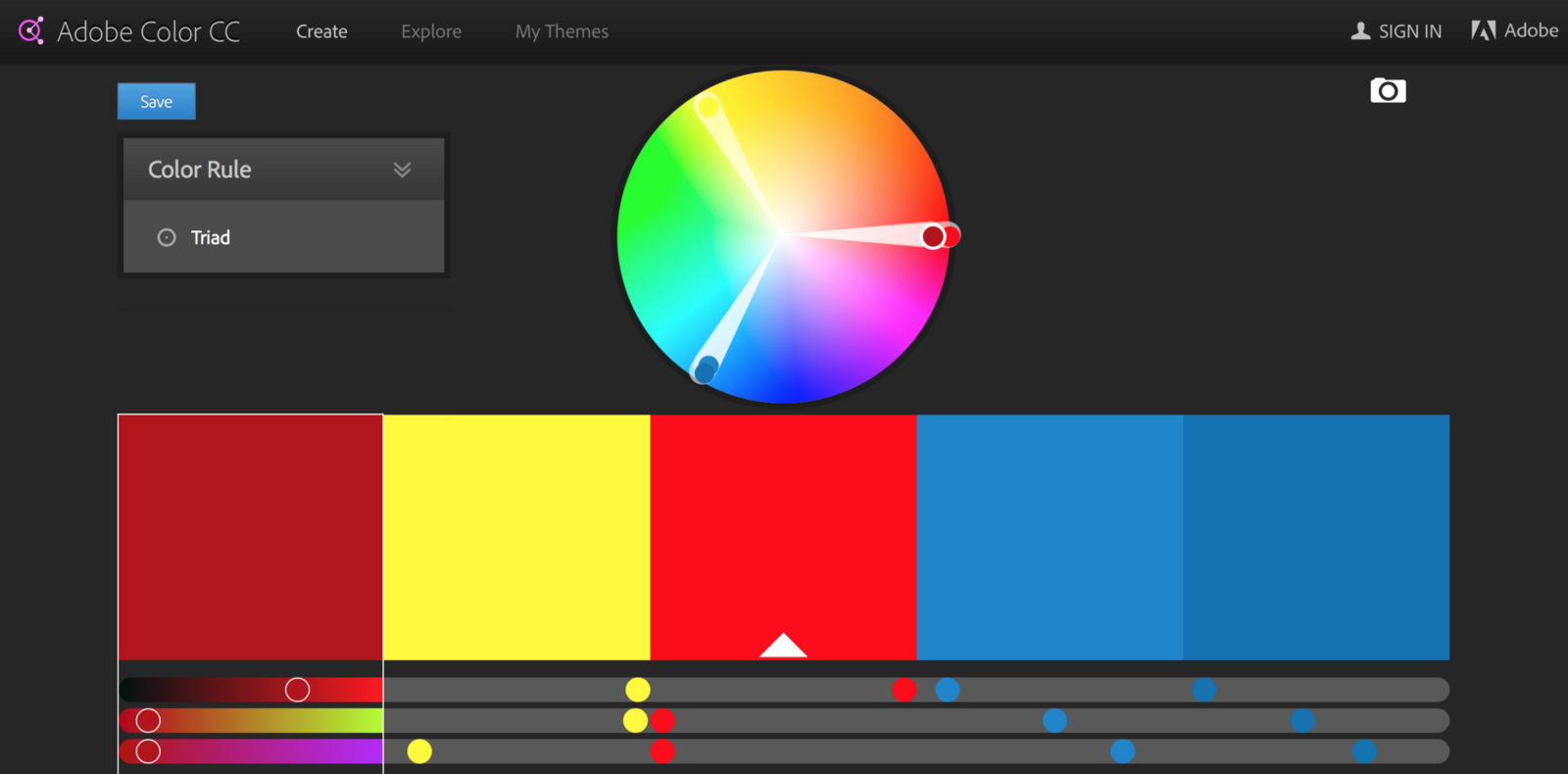
Colour CC lets you create and save various colour schemes, each of which consists of a set of five colours.
Create color schemes from existing images:
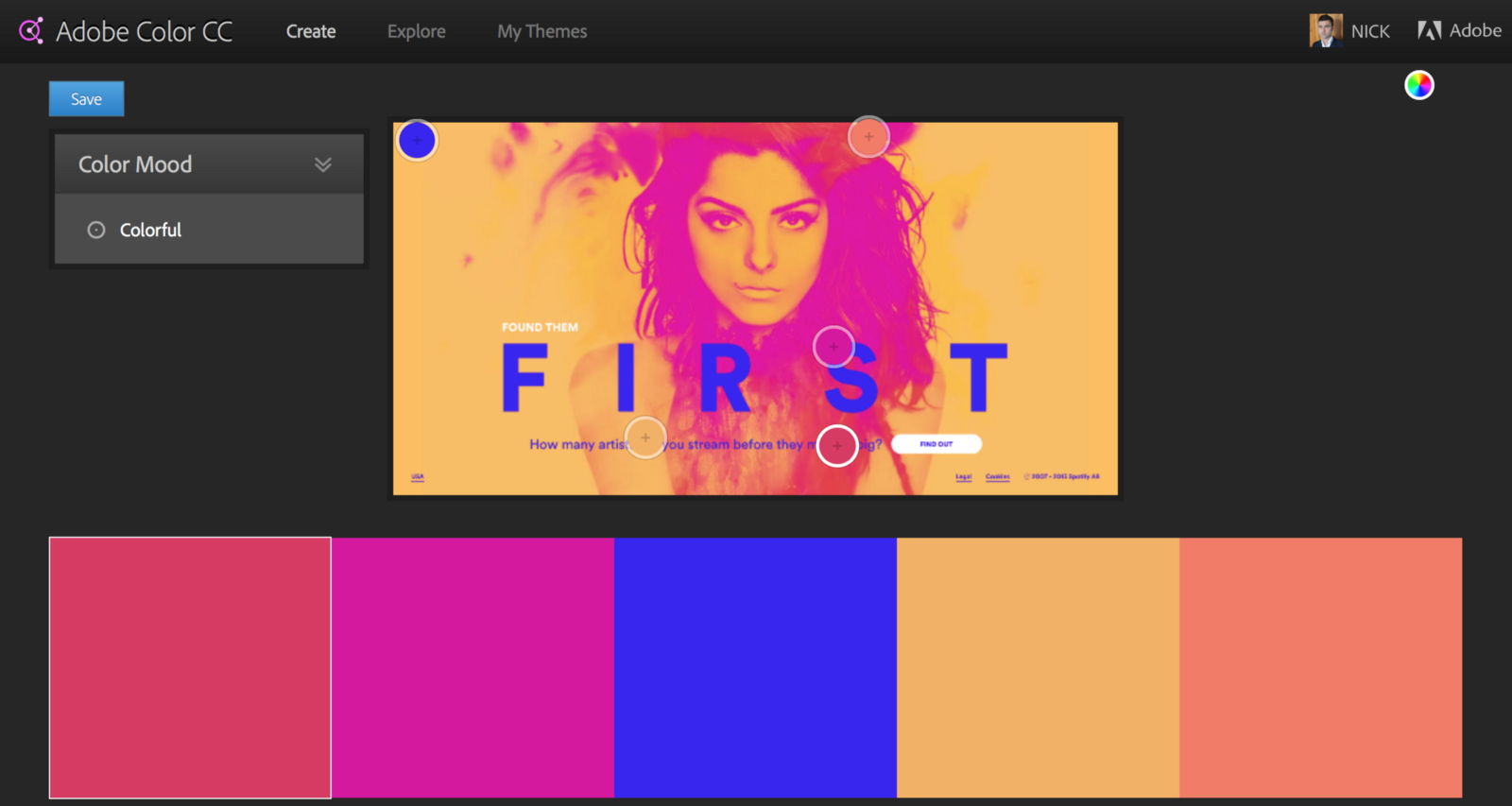
Creating color scheme from existing image.
Or browse thousands of color combinations from the Kuler community in ‘Explore’ section:
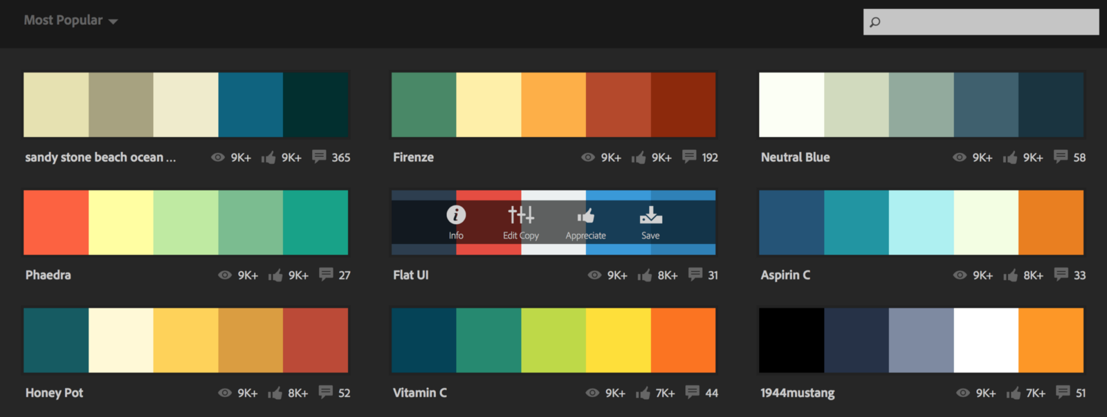
If you’re using the desktop version you can export a colour scheme straight into Photoshop, Illustrator and InDesign.
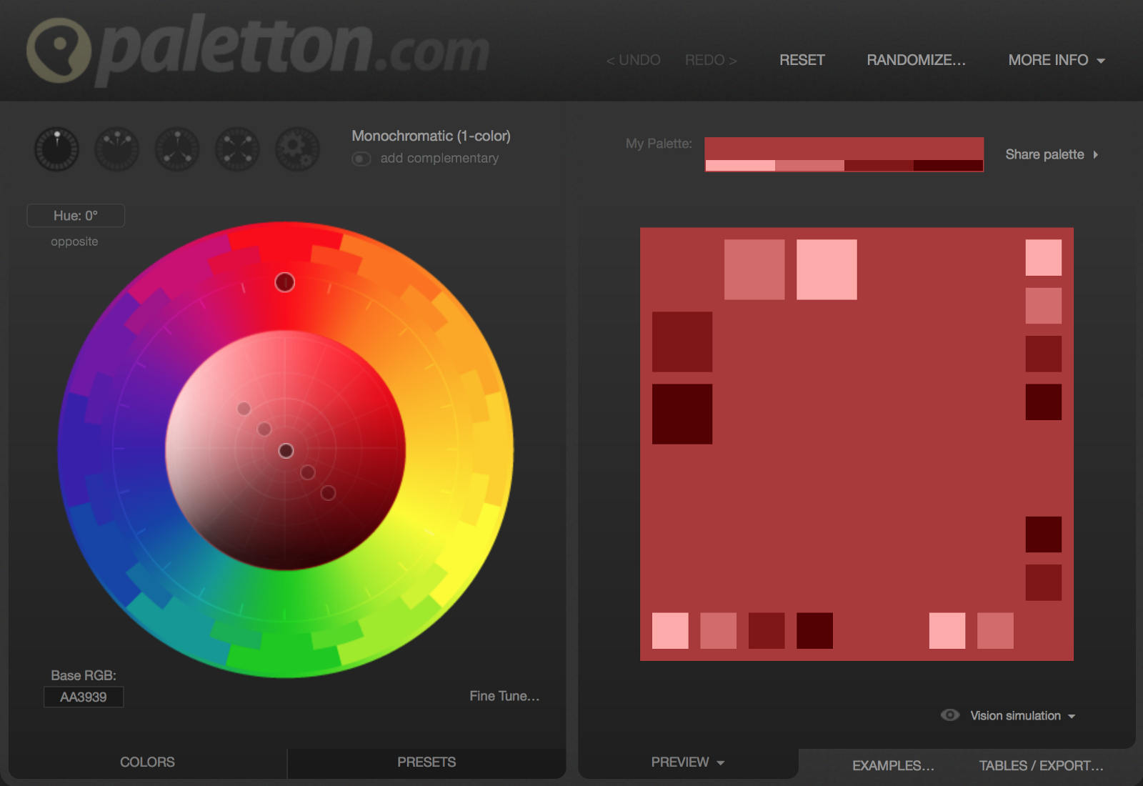
##[Paletton](http://paletton.com)
Paletton similar to Adobe Color CC. The difference is that you are not limited only to 5 tones and can play with additional tones.
#3. Color Accessibility
Vision problems are more pervasive than most of us realize. Upwards of 285 million people worldwide are visually impaired. Many more have low or moderate visual difficulties. It’s essential to make sure that a selected color scheme is accessible for users with visual impairment.
##[WebAIM Color Contrast Checker](http://webaim.org/resources/contrastchecker/)
Some colors go well with each other, while others will clash. It’s surprising how many sites and apps don’t pass AA test. Don’t be one of them! It’s essential to check UI colors for colour contrast accessibility when used with text. Use WebAIM Color Contrast Checker to test color combinations.
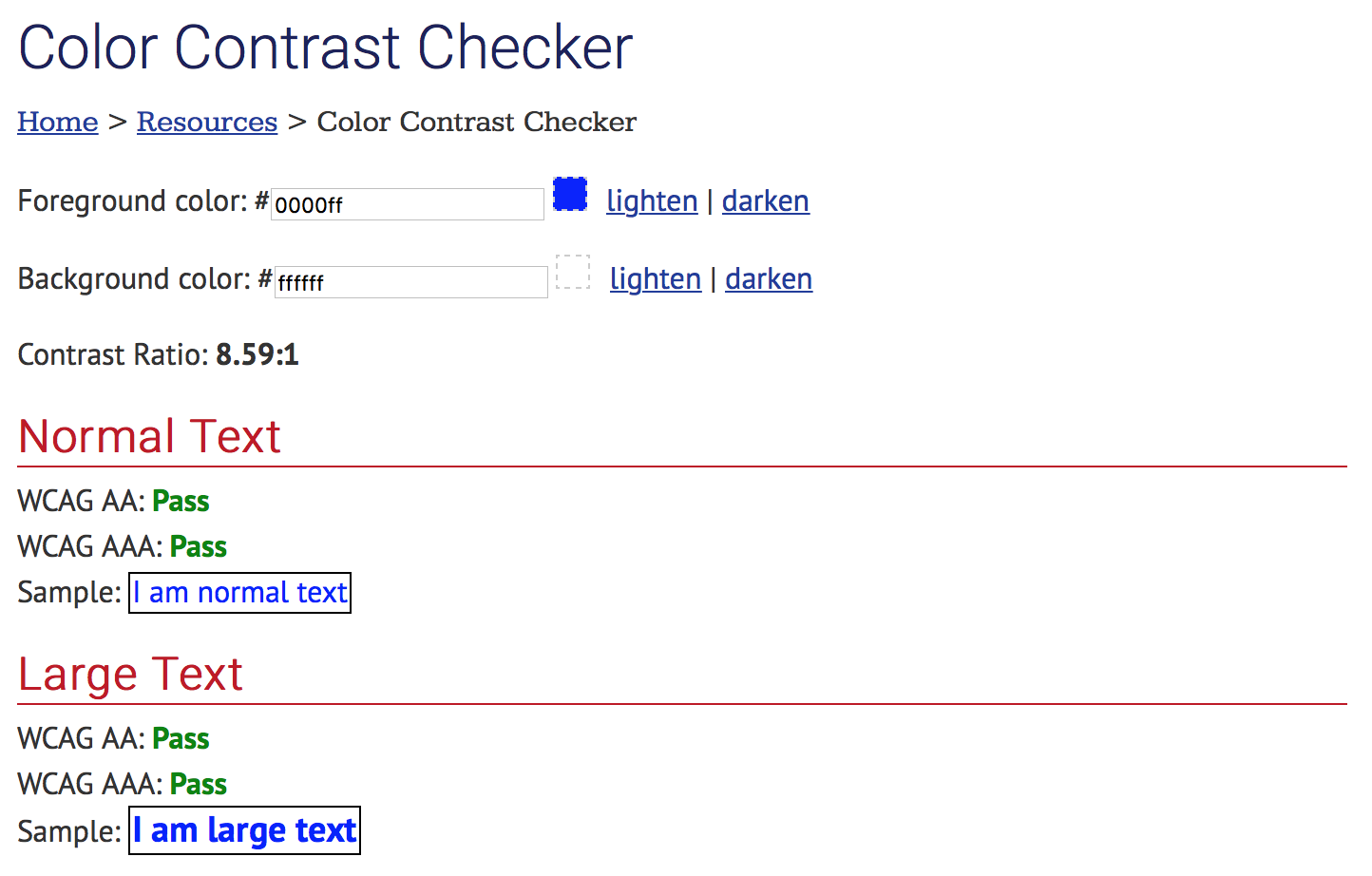
WebAIM Color Contrast Checker is a browser-based tool that tests color codes specified in hexadecimal values.
##[Coolors](https://coolors.co/)
Coolors makes it possible to test your color scheme on color blindness. All you need to do is to select colors in interfaces.
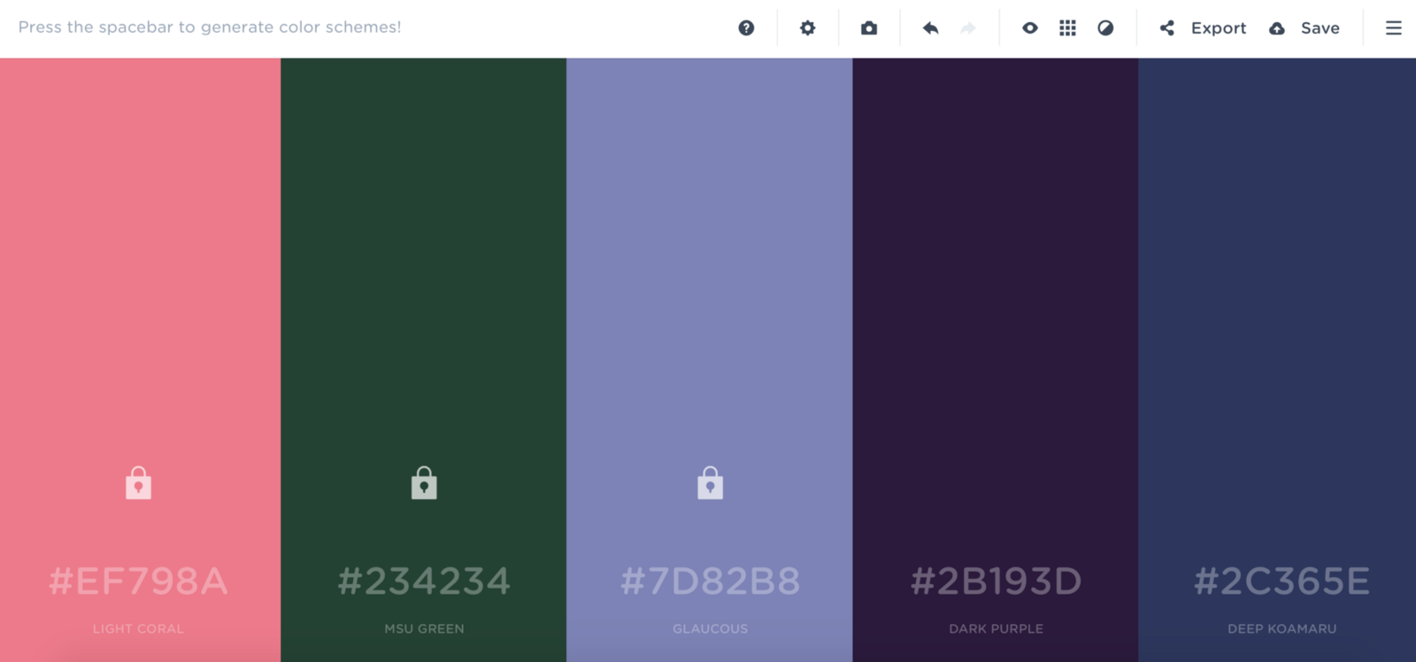
Choose a set of colors that reflect your color scheme
Change the mode from ‘Normal’ to the one that you would like to test.
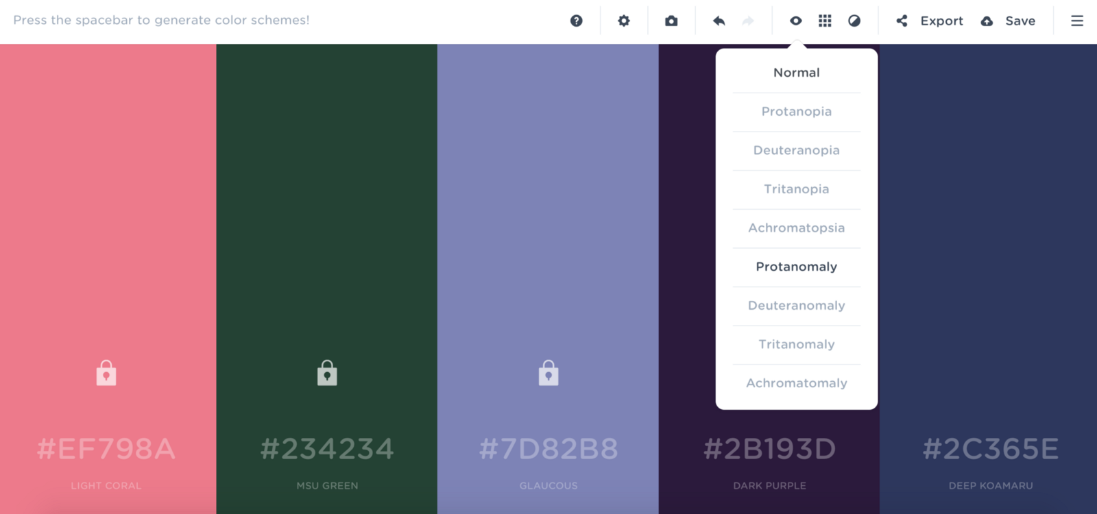
Select a type of color blindness
And you’ll see how a person with color deficiency will see your color scheme.
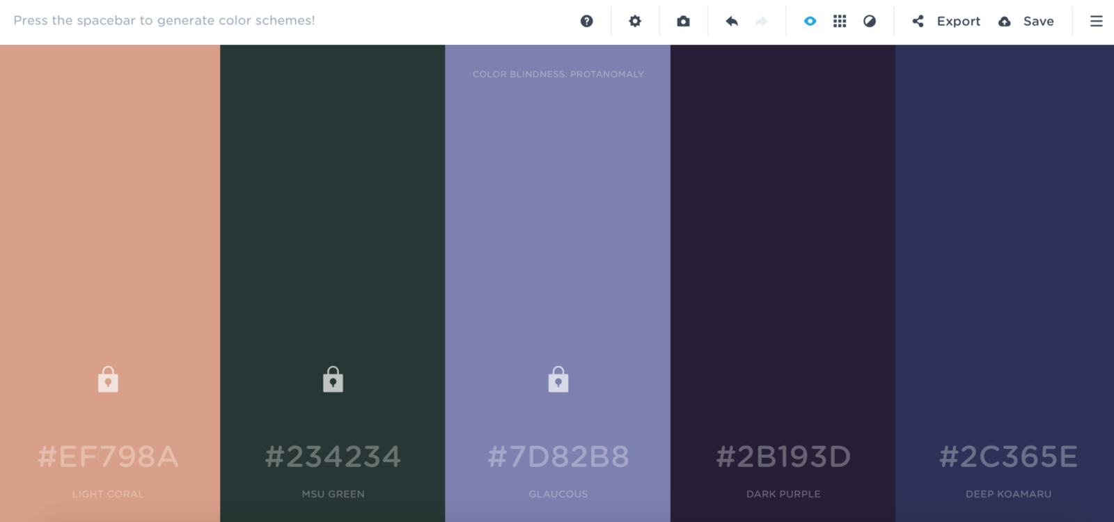
How a person with protanomaly sees the color scheme
##[NoCoffee Vision Simulator for Chrome](https://chrome.google.com/webstore/detail/nocoffee/jjeeggmbnhckmgdhmgdckeigabjfbddl)
NoCoffee Vision Simulator can be used to simulate color-vision deficiencies and low-vision conditions on any pages that are viewable in the Chrome browser. For example, using the “Color Deficiency” setting “achromatopsia,” you can view web pages in grayscale.

How a person with deuteranopia will see CNN website
#Conclusion
Tools mentioned above will ease the job of finding the right color combinations. Keep in mind that the best way to learn to create stunning color schemes is to practice a lot.
Thank you!