Mobile users who use your app or site have a particular goal. Often the one thing that is standing between the user and his goal is a form. In fact, forms are often considered to be the final step of the journey to the completion of goals. That’s why it’s so important that users complete forms as quick as possible and without any confusion.
Make forms quick and easy to complete by following seven rules:
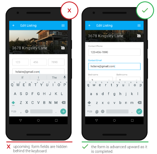
Ensure that form fields are not obstructed from view by interface elements such as the keyboard. As the user completes form fields, automatically advance each field up the screen.

Image credit: Google
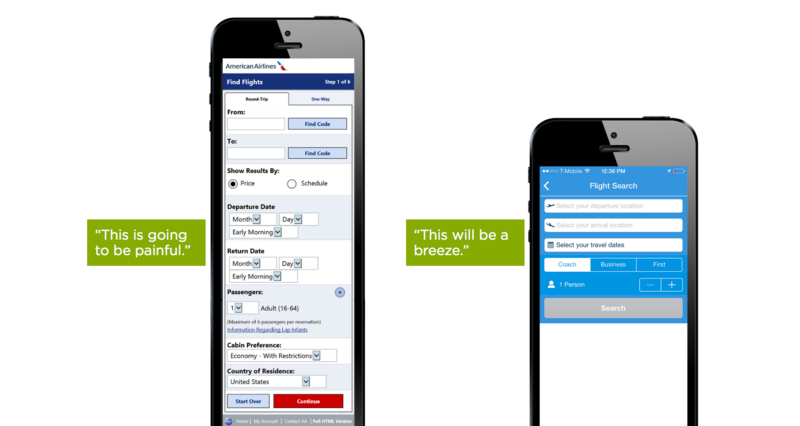
The longer or more complicated a form seems, the less likely users would like to start filling in the blanks — especially on small screens. Minimizing the number of input fields makes your form less loaded, especially when you request a lot of information from your users.

Keep the form as short and simple as possible. Image credit: lukew
But minimizing the number of input fields isn’t enough — you should also pay attention on user effort for data input. Typing has high interaction cost; it’s error prone and time consuming even with a full keyboard (and even more so on a touch screen).
Thus, try to minimize typing and prevent users from making errors:
Smart Defaults
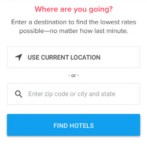
Smart defaults can make the user’s completion of the form faster and more accurate. For example, pre-select the user’s country based on their geo location data.

Auto-detection of location can save users time for a Find a hotel form
##Radio Groups For Closely Related, But Mutually Exclusive Choices
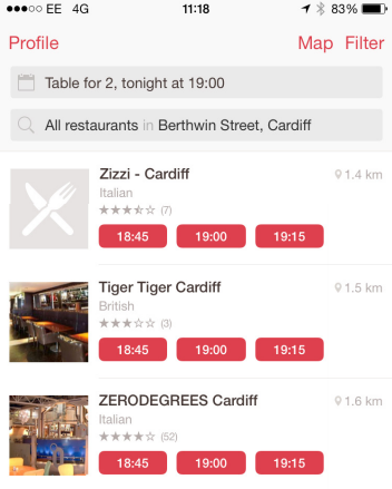
When the user needs to choose from a list of options, consider using a horizontal [tag list](http://babich.biz/radio-buttons-ux-design/), because it makes better use of the available screen space.
##Sliders For Minimum / Maximum Price or Budget Range
Consider using [sliders](http://babich.biz/mobile-ux-design-sliders/) for fields which contain prices or budgets, so user can move a slider control to set a minimum / maximum range. A slider is easy to swipe horizontally and provides simple visual cues to customize this action. But keep in mind, that numbers shouldn’t be hidden when slider is being operated (by fat fingers).
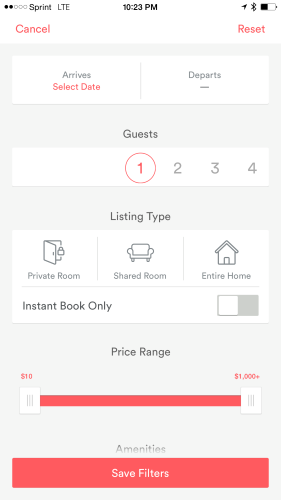
AirBnB dual continuous slider for a price range
#Rule #3: Form Labels are Either Above Form Fields or are Floating Labels
Labels tell the user the purpose of the field and clear label text is one of the primary ways to make UIs more accessible.
Why You Should Never Use Inline Labels
Inline labels (or placeholder text as a field label), is a text located inside a form field, which disappear when the user types in the field.

Inline labels. Image credit: snapwi
While inline labels looks good and save valuable screen estate, these benefits are by far outweighed by the major usability drawbacks, the most significant of which is the *loss of context*. Once the user clicks on the text box, the label disappears and thus the user cannot double check that what he/she has written is indeed what was meant to be written.
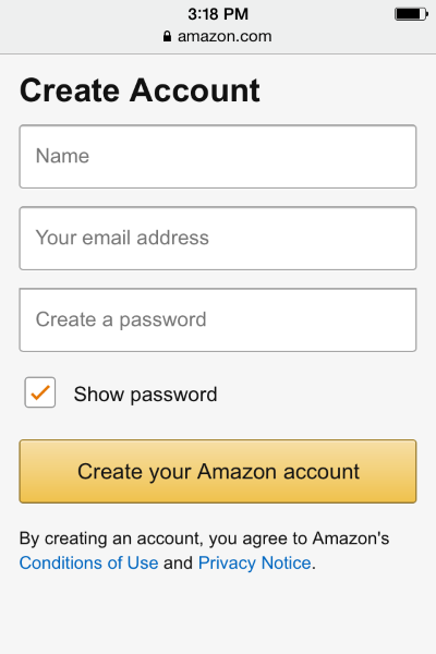
Placeholder text is a poor replacement for a visual label. Image credit: Amazon
Another thing is that when users see something written inside a text box, they may assume that it has already been prefilled in and may hence ignore it.
##Why Left-Aligned Field Labels are Bad For Mobile
The main issue with left-aligned field labels relates to the mobile phone display size and aspect ratio. If a left-aligned label is used in front of the field, the narrow screen leaves very little space left for the field itself. This is a creates usability issue since the form field will often not be wide enough to display the user’s entire input. Not being able to see input data caused trouble for users, because it makes it much harder for the them to spot any typing errors before submitting the form, which leads to more erroneous forms being submitted.
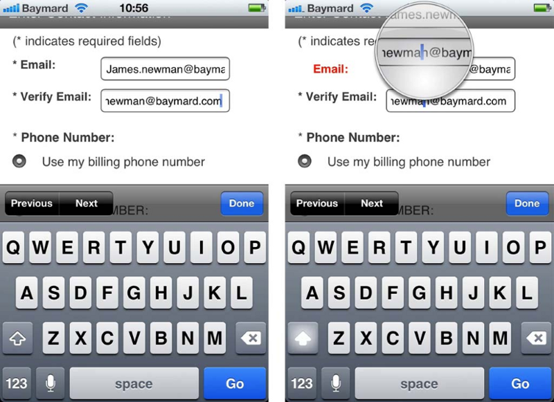
It’s very hard to spot the error if input data isn’t fully visible. Image credit: baymard
##Label Above the Field or Floating Label
Form labels should be above form fields so that users can easily see what they are filling in and why. The main benefit of placing the label above the field on mobile is that you can have the form fields extend the full width of the screen, making them large enough to display the entire user’s input (in a decent font size like 16px). Additional benefit is the much better opportunity for writing clear and meaningful field labels as we don’t have to be limited to 1–2 words.
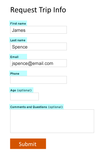
The main downside of placing labels above the field is that it takes up more vertical space, which means users have to scroll more. However, it’s not a serious problem — nowadays [it’s absolutely natural to scroll](http://uxmyths.com/post/654047943/myth-people-dont-scroll).
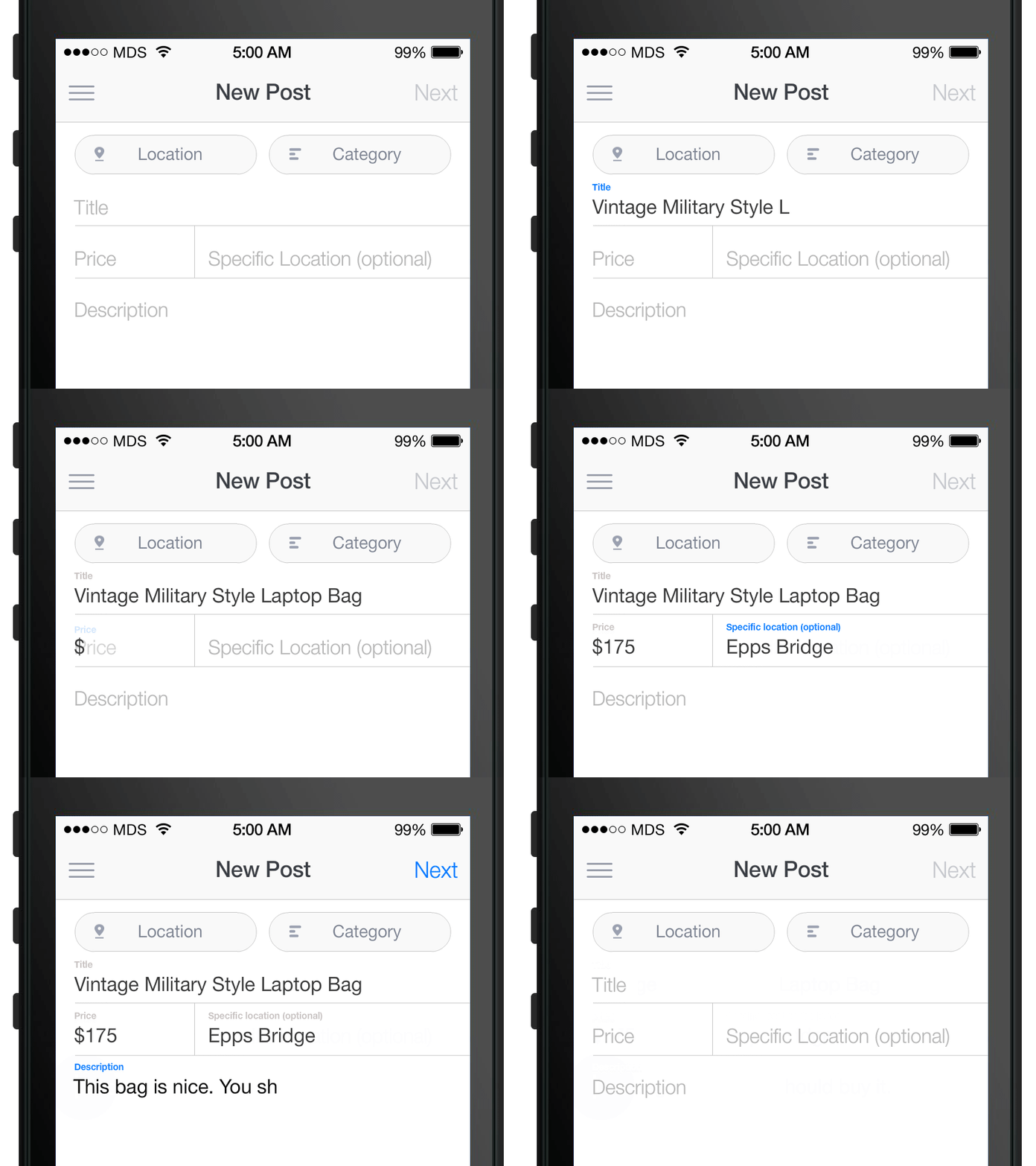
Alternatively, you can use floating label which ensures users that they filled out the correct field. The placeholder text is showing by default, but once an input field is tapped and text is entered the placeholder text fades out and a top aligned label animates in.

Image credit: Matt D. Smith
#Rule #4: Form Input Should Be Validated in Real-time
In an ideal world, users will fill the form with necessary information and finish their job successfully. In the real world, users often make mistakes. But users dislike when they go through the process of filling out a form only to find out at submission, that they’ve made an error. The right time to inform about the success/failure of provided data is right after the user has submitted the information. Real-time inline validation immediately informs users about the correctness of provided data. This approach allows users to correct the errors they make faster without having to wait until they press the submit button to see the errors.
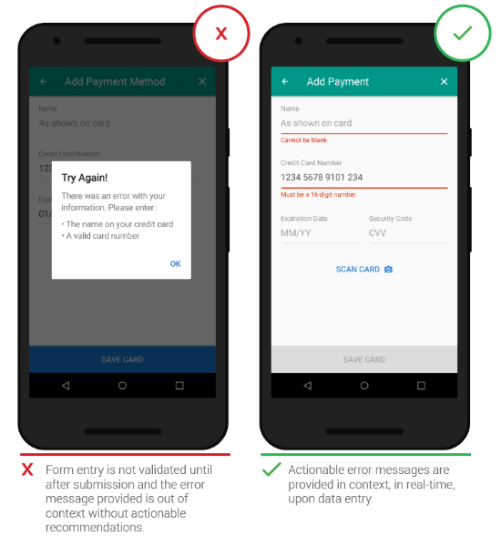
Image credit: Google
If answers are required in a specific format, state this in advance, communicating the imposed rule (format specification) without an additional example.
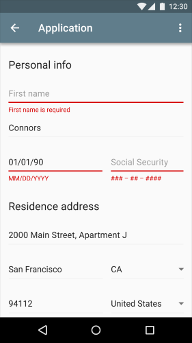
Image credit: Material Design
Inline validation also helps decrease hard bounces. In example below you can see a good example of inline validation which provides a solution for fixing a potential problem.
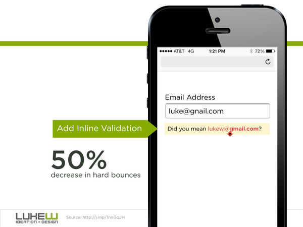
Image credit: lukew
#Rule #5: Match the Keyboard With the Required Text Inputs
Users appreciate apps that provide an appropriate keyboard for text entry. For example, when users need to enter a credit card number, only display the dial-pad, to limit their input to numbers and not characters. This will reduce their choices and mistakes, and accelerate completion.
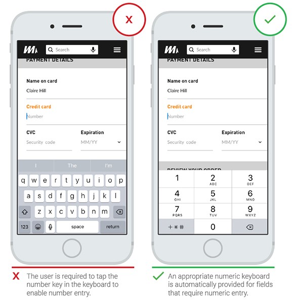
Image credit: Google
Ensure that this is implemented consistently throughout the app rather than only for certain tasks but not others.
#Rule #6: Provide Helpful Information in Context
Sometimes you need to have relevant, in-context information ready to assist users to move through the form easily. But accompanying text should be *used only where it really needed*:
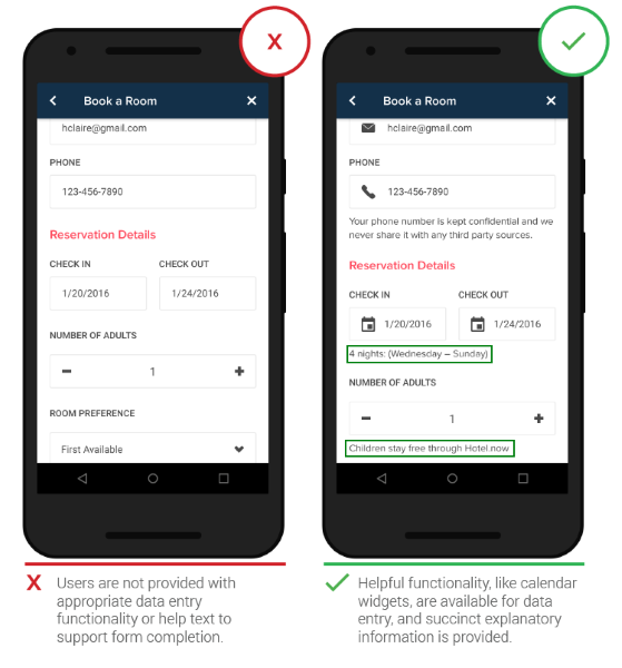
- When scheduling dates, users appreciate context like a monthly calendar to identify days of the week, eliminating the need to leave the app to check the smartphone’s calendar. It also reduces the risk of the user becoming distracted by another task.

Image credits: Google
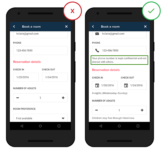
- People may be concern about the security or privacy of their data and you need to reassure them that the data won’t be shared with 3rd party sources.

Image credits: Google
As a rule of thumb, do not exceed 100 characters of explanation.
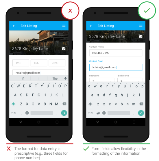
Some tasks really do require users to type very precise information, but forcing people to provide this information in a specific format can be at odds with good usability principles. If you are asking users to input numerical information (such as phone number) into a form, be flexible, and design screens that can interpret multiple input formats and show that information in a way that is easily scannable (by humans, not machines) in order to prevent mistakes.

Conclusion
Users can be hesitant to fill out forms, so you should make this process as easy as possible. All changes described in this article can significantly increase form usability.
Thank you!

