Things move quickly in the mobile app universe. To succeed in the field of UX design, designers must have the foresight and prepare for new challenges around the corner.
To simplify the task, I’ve listed the biggest, impactful trends for 2018 and, most likely, beyond.
1. User Journey Simplification
When we interact with apps or websites, we have a particular goal. And usually, the less effort we spend on achieving this goal, the better experience.
Linear User Flow
A linear design experience is UX with a specific beginning, middle, and end that allows users to complete one action with each step. Linear user flow is good for users because it allows to estimate how much time it’s required to complete a task.
The process of ordering a cab in Uber is a example of linear user.
##Progressive Disclosure
When your app has a lot of information or actions, there’s no need to show everything-all-at-once. Designers will use technique callled progressive disclorure — make an information or action visible only when users need it. Progressive discloure has an opportunity to reduce cognitive load and improve comprehension of the interface.

Progressive disclosure gently introduces interface and features to users as they interact with an interface.
#2. In-app Gestures Paired With Animation
With the release of iPhone X designers faced a new challenge. The lack of physical Home button leads to the fact that even the most basic interactions with a device are gesture-based now. What does it mean for designers? This means that designers will have to pay more attention to gestures.
If you want to understand what challenges gesture-based interface have, read Don Norman’s article on the topic:
[Gestural Interfaces: A Step Backwards In Usability](http://www.jnd.org/dn.mss/gestural_interfaces_a_step_backwards_in_usability_6.html)
The article states critical problems related to gesture-based interactions such as discoverability and learnability issues. In the attempt to solve those problems, designers will focus on motion design and microinteractions.
Animation will be used:
- To make it clear what interactions are available (animated hints)
Animated hint paired with text instruction. Image credit: Material Design
- To clarify spatial relationships between UI elements (animated transitions)
- To provide feedback on the interaction
Providing feedback and clarifying spatial relationships. Image credit: Shakuro
3. Content-Centered Experience
Well-curated and easily accessible content is what makes a mobile app appealing to its intended users. Designers can keep content front and center in 2018 by:
Decluttering
Removing visual clutter and improving comprehension is a popular goal among many UX designers today. Designers remove irrelevant information (noise) and prioritize relevant information (signal) by putting content first and elaborating clear visual language.
Prioritize content over chrome
Stripping away all the visual clutter can help you focus on the core of the message you are trying to communicate.
Clear Visual Hierarchy
Have a clear order with how UI elements are presented to make content comprehension easier. Strong visual signifiers (such as contrasting colors for call-to-action buttons) are used to direct user on certain interactive elements or essential information.
Contrasting color is used for the primary call to action button. Image credit: Google
#4. Full-Screen Experiences
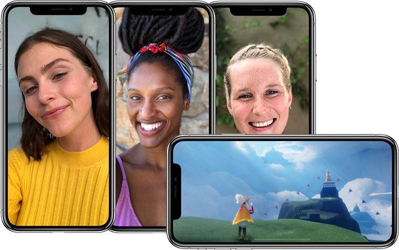
With release Samsung Galaxy S8 and iPhone X, frameless design became a trend. More screens space available for users and they expect to have full-screen experiences.
##HD Images and Videos
Not only the fact that your app should provide full-screen experience is important. The quality of assets will have a direct impact on user expectations about your app. Images should not appear pixelated on a mobile screen.
#5. Vibrant Colors
Color is one of the most powerful tools in the designer’s toolkit. Color can draw attention, set a mood, influence users’ emotions and actions. When it comes to mobile app design, this is definitely the time of vibrant colors.
##Color As Functional Element
Color will be used not only for aesthetics, but it’ll also be a part of the functional experience. For example, designers will use color to visually separate different types of notifications.
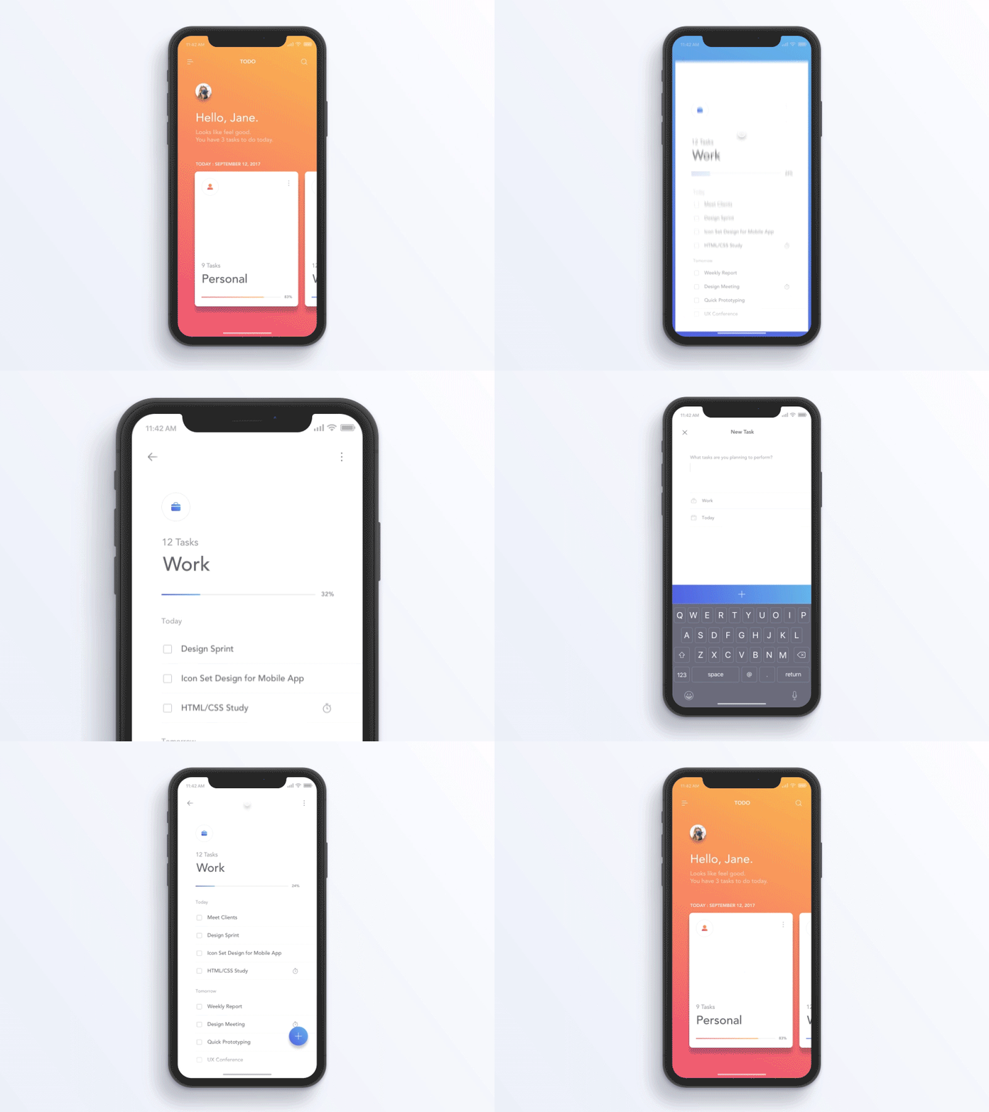
Using colors to separate different types of activities. Image creidits: Jae-seong, Jeong
#6. Emotional Experiences
In 2018 we’ll see more emotional intelligence integrated into the mobile experience. EI is no longer all about animated effects showed when a user completes specific actions. EI it’s a powerful way to make the experience more engaging and delightful.
##Better Way To Express Emotions
Expressing emotions is natural for people. Even in the era of command string interfaces, we used emoticons to make other people understand what we feel.

Scott Fahlman created famous ASCII-based emoticon in 1982.
In the era of mobile devices, we have an opportunity to share even more broad specter of emotions. Face recognition will be used to provide more relevant reactions. One of such technologies is Animoji — animated emoji which respond to facial expressions via the iPhone X camera.

Animoji is an opportunity to share our emotions with other people.
##Natural Interactions With Apps
More focus on gestures will change the way we interact with apps. For example, the way we like our content. Instead of tapping on the button or icon, it’s possible to make it more naturally by drawing ‘hear’ icon on the screen.
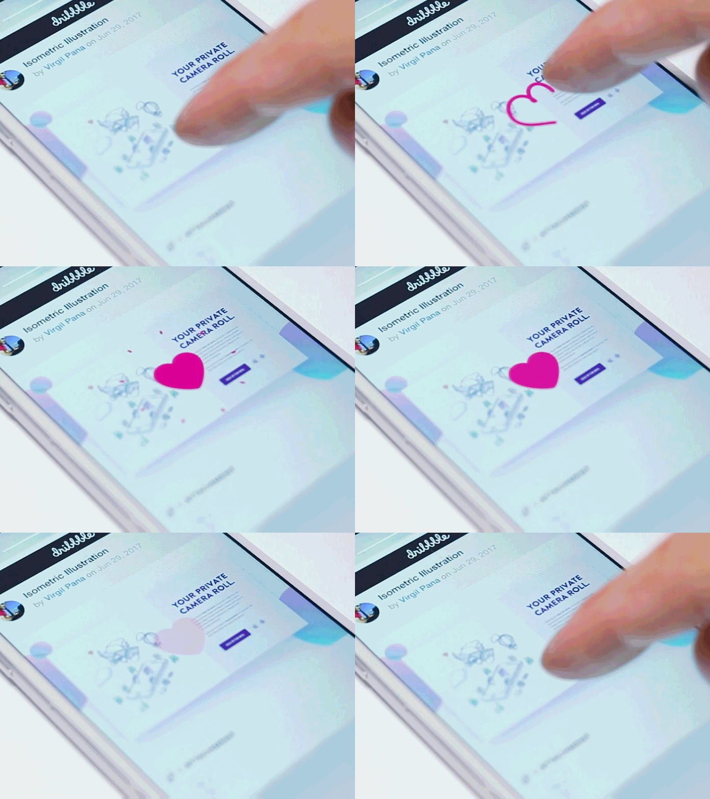
Image credit: Virgil Pana
##Mimic Emotions In UI Feedback
As humans, we establish an emotional connection with all products we use. Therefore, we expect some level of human-like feedback when we interact with products. Even that we know that the products aren’t humans and can’t feel emotions, we want to believe that they can.
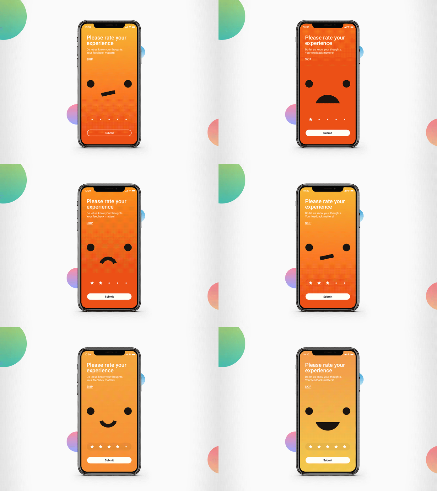
App mimics human reactions when providing a response to user input. Image credit: Adip Nayak
#7. Dominance of Video
2017 saw a surge in the popularity of video as a content marketing format. According to Hubspot, 78% of people watch videos online every week, and 55% watch videos online every day.
In the context of mobile devices, designers will adapt video format for the medium:
Adapting Video For Short Attention Span
The average human attention span has fallen from 12 seconds in 2000, to eight seconds in 2015. New ways of content delivery appear as a result of adapting to the change. Formats like 360-degree videos and Facebook Live were created as a result of such adaptation. In 2018 more users and business will use this format to deliver important and timely information.
Facebook Live video. Image credit: Buzzfeed
##Adapting Video For Portrait Orientation
According to Luke W, 94% of the time mobile phones used in portrait orientation. This means that all content (including video) should be adapted for this orientation.
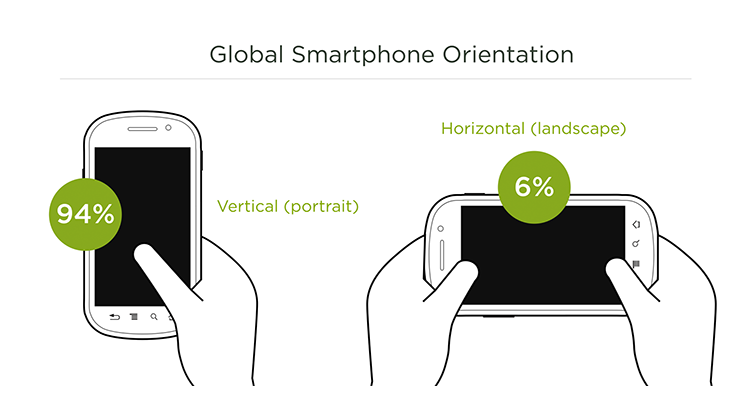
Image credit: Luke W
#8. Biometrical Authorization
Apps that utilize biometric-based technology can bypass the need for a traditional login requirement. With biometrics, all that’s needed is a specific physiological or behavioral characteristics, such as facial recognition, fingerprints, or voice recognition.
##More People Will Use Biometric Authentication
Biometric authorization isn’t exactly a new technology. A lot of people today use biometric authentication as a replacement for passwords. According to Apple, average iPhone user unlocks device 80 times per day, and 89% use Touch ID for unlock. In 2018 biometrics will be more accessible and we’ll see more use of biometrics for authentication and identity management purposes. It’s something that can also boost security for both end-users and businesses that incorporate this technology into their mobile apps.
##Face ID As a Replacement For Touch ID
In 2018 we’ll use one most the most protected and at the same time easy to use object for authentication— our faces. Face ID which became available for iPhone X users has the opportunity to become the most natural way of authentication in the coming year.

#9. Conversational design
2015 comScore study says the average user only uses around three apps frequently, and at least one of them is a messaging app. People love chatting. That is why chatbots and voice-activated assistants, powered by artificial intelligence, will be a hot trend in 2018.
##Chatbots As Assistants Integrated In Messaging Platforms
Most probably we won’t see chatbots as a full replacement for regular GUI experiences, but they will be integrated into messaging platforms (such as Facebook Messages) to serve as assistants. Businesses will have real-time automated conversations with their customers.
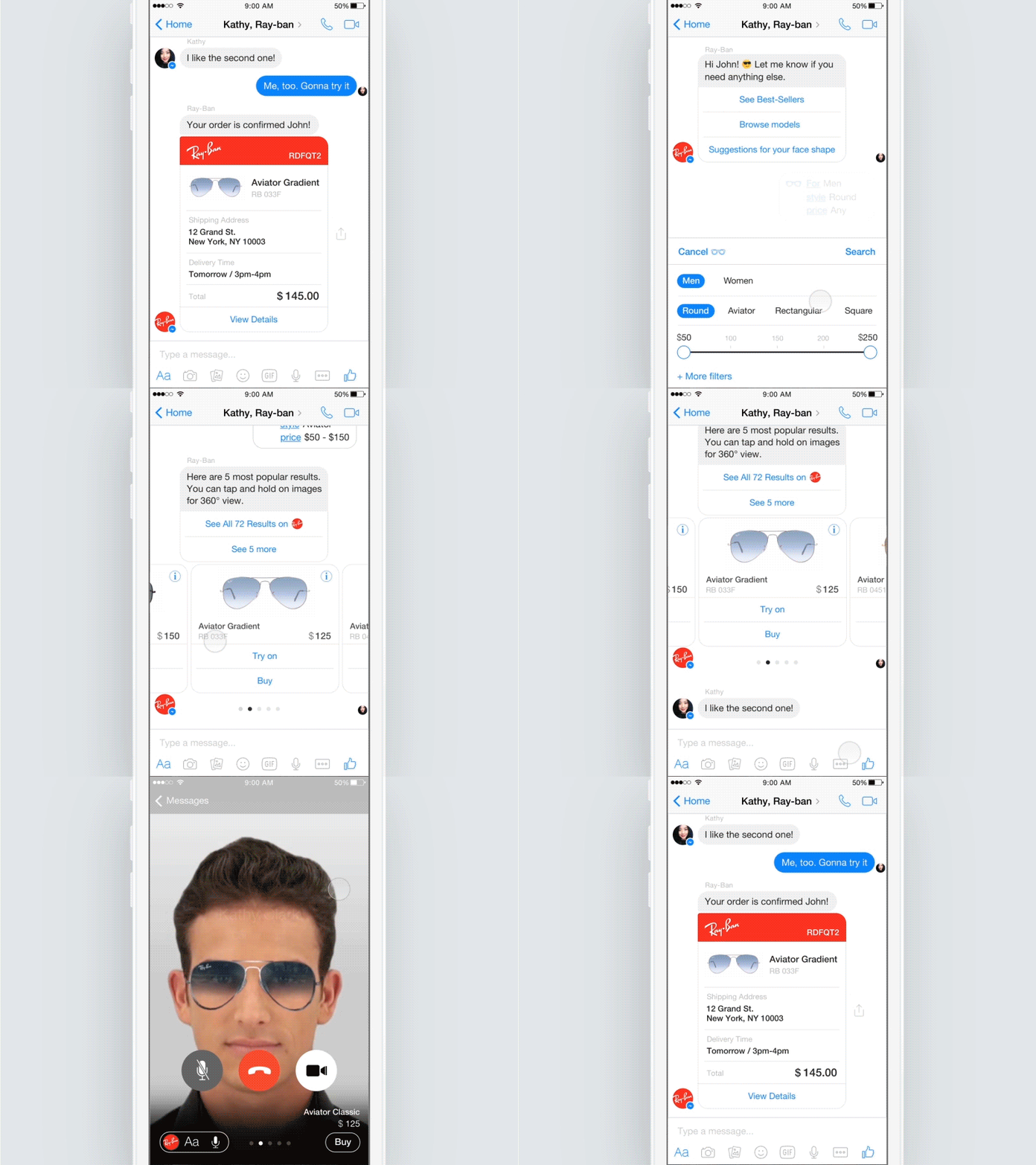
Image credit: Isil Uzum
##More Sophisticated Voice Assistants
Graphical user interfaces aren’t the only way we interact with our apps today. The significant progress in natural language processing and computational power made it possible to use a different type of interfaces — voice-based. In 2016, Google stated that roughly 20 percent of all mobile searches were done with voice activation. It’s easy to see why the next big thing for coming years will be voice-activated interfaces. Voice-activated interactions boost the user experience by eliminating the type, which also eliminates another potential source of friction for app users (since people have to learning to use an app).
>The best interface is no interface
Importance Of Copywriting
The popularity of conversational interfaces amongst designers and developers will raise an awareness of the importance of copywriting for this type of interfaces. Since chatbots are almost entirely based on a word exchange between user and machine; each word has to be carefully selected.
10. Advanced Personalization
Personalized UX will continue to be a hot trend in 2018.
Provide Content Based on User Location
Since mobile devices are travelling with users, the apps installed on the devices can utilize location data to provide content which will be relevant to user’s current location. This make services more responsive to the environments around them. Some apps like Starbucks have already utilize this property to provide special offers for users. In 2018 we’ll see more apps use those capabilities to make experience better.
Tailored User Interface
Personalization in UI design isn’t only about content. All users are all different — some of us have poor eyesight, others might be colorblind. So why should the apps should have the same UI for everyone?
Personalization will be also about adapting a layout to a person. This can be achieved by utilizing information already provided by the user and by using device sensors (tracking how users interact with app and what problems they face). Based on this information, apps can determine if the bigger font size is required, or it’s important to make the sound louder when playing videos.
11. Augmented Reality
Besides conversational interfaces, another direction which promises to completely change the way we see and use apps is the fast emergence of augmented reality (AR). A year ago, Mark Zuckerberg predicted that all screens will eventually be replaced by lenses. It’s already clear that 2018 will be a year of augmented reality. A lot of people will use their mobile phone or tablet as a lens into a virtual world.
It Will Be Much Easier To Create AR Experience
There are already plenty of AR-based apps available on the market today. But until recently, creating AR app wasn’t an easy task. In 2017 both Apple and Google released AR frameworks that allow building AR apps much easier.
AR For Entertainment
Most of us are familiar with Pokemon Go which was a great example of how AR experience can be user for entertaiment. But AR isn’t limited only to games. For example, AR lenses integrated in messaging apps can be used in apps to create more engaging user experience.
Snapchat lenses
##AR As a Solution For Real-life Problems
AR is fastly becoming a technology that solves real problems and delivers real value for users. For example, AR Measure makes it possible to measure the real-world objects without a traditional physical measurement tape.

AR Measure which makes it possible to measure the real-world objects without a traditional physical measurement tape.
#12. Cashless Payments
Cashless payment is quckly becoming a new standard for many users (the number of people who use this method of payment almost doubled in 2017).

According to a report by Juniper Research, the number of Apple Pay and Android Pay users reached 86 and 24 million, respectively.
It’s so powerful that is able to change daily commerce. For example, in regions like China where the percentage of users is especially significant cashless payment is a preferable way of payment.
What does it mean for mobile app developers? This means that in 2018 we’ll have to provide Apple Pay/Android Pay as a default option for our products (both offline and online).