Communication plays a vital role in design —it’s essential to establish a clear connection between the website and user and to help your users accomplish their goals. When we talk about communication in web design context, we usually mean text. Typography plays a vital role in this process:
More than 95% percent of information on the web is in the form of written language.
Good typography makes the act of reading effortless, while poor typography turns users off. As Oliver Reichenstein states in his article “Web Design is 95% Typography”:
Optimizing typography is optimizing readability, accessibility, usability(!), overall graphic balance.
In other words: optimizing your typography also optimizes your user interface. In this article, I will provide a set of rules that help you improve readability and legibility of your text content.
1. Keep The Number of Fonts Used At a Minimum
Using more than 3 different fonts makes a website look unstructured and unprofessional. Keep in mind that too many type sizes and styles at once can also wreck any layout.
In order to prevent situation like this one try to limit the number of font families to a minimum
In general, limit the number of font families to a minimum (two is plenty, one is often sufficient) and stick to the same ones through the entire website. If you do use more than one font, ensure the font families complement each other based on their character width. Take the example of fonts combinations below. The combination of Georgia and Verdana (left) share similar values that creates a harmonious pairing. Compare that to the pairing of Baskerville and Impact (right) where the heavy weight of Impact vastly overshadows its serif counterpart.

Ensure the font families complement each other based on their character width
#2. Try To Use Standard Fonts
Font embedding services (like [Google Web Fonts](https://fonts.google.com/) or [Typekit](https://typekit.com/)) have a lot of interesting fonts that can give your designs something new, fresh, and unexpected. They’re also super easy to use. Take Google for example:
- Choose any font like Open Sans.
- Generate the code and paste in your HTML document’s .
- Done!
So what can go wrong?
Actually, this approach has two problems:
- Not everyone will have access to that same font. Which means you got a problem because the beautiful font you chose is going to show up as something different for your visitors.
- Users are more familiar with standard fonts and can thus read them faster.
Unless your website has a compelling need for a custom font, such as for branding purposes or to create an immersive experience, it’s usually best to stick with the system fonts. The safe bet is to use a system font: Arial, Calibri, Trebuchet, etc. Keep in mind that good typography draws the reader to the content, not to the type itself.
3. Limit Line Length
Having the right amount of characters on each line is key to the readability of your text. It shouldn’t be your design that dictates the width of your text, it should also be a matter of legibility. Consider this advice on readability and line length from the Baymard Institute:
“You should have around 60 characters per line if you want a good reading experience. Having the right amount of characters on each line is key to the readability of your text.”
If a line is too short, the eye will have to travel back too often, breaking the reader’s rhythm. If a line of text is too long, the user’s eye will have a hard time focusing on the text. Image credit: Material Design
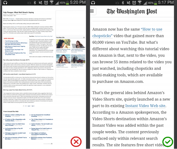
For mobile devices, you should go for [30–40 characters per line](https://designshack.net/articles/typography/tips-for-designing-better-mobile-typography/). Below is an example of two sites viewed on a mobile device. The first one uses 50–75 characters per line (optimum number of characters per line for print and desktop), while the second one uses the optimal 30–40 characters.

Image credit: Usertesting
In web design you can achieve an optimal number of characters per line by restricting the width of your text blocks using [em](http://maxdesign.com.au/articles/em/) or pixels.
#4. Choose a Typeface That Works Well In Various Sizes
Users will access your site from devices with different screen sizes and resolutions. Most user interfaces require text elements of various sizes (button copy, field labels, section headers, etc). It’s important to choose a typeface that works well in multiple sizes and weights to maintain readability and usability in every size.

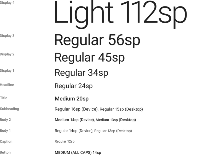
Roboto typeface by Google
**Make sure that the typeface you choose is legible on smaller screens!** Try to avoid fonts that use cursive script, such as Vivaldi (in the example below): although they are beautiful, they are difficult to read.

Vivaldi typeface will be difficult to read on the small screen
#5. Use Fonts With Distinguishable Letters
Many typefaces make it too easy to confuse similar letterforms, specifically with “i”s and “L”s (as seen in the image below), and poor letter spacing, such as when an “r” and “n” look like an “m”. So when choosing your type, be sure to check your type out in different contexts to make sure it won’t cause an issue for your users.

#6. Avoid All Caps
All caps text — meaning text with all the letters capitalized — is fine in contexts that don’t involve reading (such as acronyms or logos), but when your message involves reading, don’t force your users to read all caps text. As mentioned by Miles Tinker, in his landmark work, Legibility of Print, all-capital print greatly retards the speed of scanning and reading in comparison with lower-case type.

#7. Don’t Minimize Spacing Between Lines
In typography, we have a special term for the spacing between two lines of text — leading (or line height). By increasing the leading, you increase the vertical white space between lines of text, generally improving readability in exchange for screen real estate. As a rule, leading should be about 30% more than the character height for good readability.

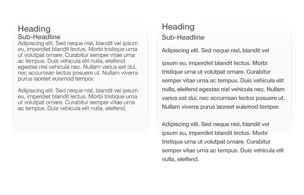
Good spacing aids readability. Image credit: Microsoft
Properly using white space between paragraphs has been proven to increase comprehension up to 20%, as pointed out by Dmitry Fadeyev. The skill of using white space lies in providing your users with a digestible amount of content, then stripping away extraneous details.

Left: Almost overlapped text. Right: Good spacing aids readability. Image credit: Apple
#8. Make Sure You Have Sufficient Color Contrast
Don’t use the same or similar colours for text and background. The more visible the text, the faster users are able to scan and read it. The W3C recommends the following contrast ratios for body text and image text:
- Small text should have a contrast ratio of at least 4.5:1 against its background.
- Large text (at 14 pt bold/18 pt regular and up) should have a contrast ratio of at least 3:1 against its background.
These lines of text do not meet the color contrast ratio recommendations and are difficult to read against their background colors.

These lines of text meet the color contrast ratio recommendations and are easy to read against their background colors.
Once you’ve made your color choice, it’s absolutely necessary to test it out with real users on most devices. If any of the test show a problem with reading your copy, then you can be sure that your users’ll have exactly the same problem.
#9. Avoid Coloring Text In Red or Green
Color blindness is a common condition, especially amongst men (8% of men are colour blind), it’s recommended to use other cues in addition to color to distinguish important information. Also, avoid using red and green colors alone to convey information because red and green colour blindness is the most common form of colour blindness.

#10. Avoid Using Blinking Text
Content that flashes or flickers can trigger seizures in susceptible individuals. Not only can it cause seizures, but it’s likely to be annoying or distracting for users in general.

#Conclusion
Typography is a big deal. Making the right typography choices can give your website a feel of crispness and polish. Bad typography choices, on the other hand, are distracting and tend to call attention to themselves. It’s essential to make typography readable, understandable, and legible.
>Typography exists to honor content
Typography should honor the content in a way that never adds to the user’s cognitive load.