Web and mobile apps move away from pages, towards completely personalized experiences. And this experience built on an aggregation of many individual pieces of content. Cards are the new creative concept.
Regardless of how you feel about the concept, cards are here to stay.
What are Cards?
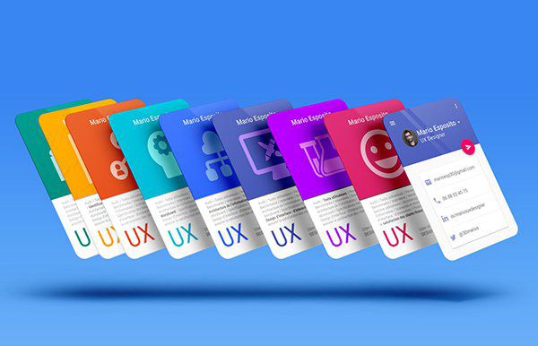
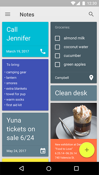
Cards are those little rectangles full of inclusive images and text that serve as entry points to more detailed information. They became almost a default option when it comes to balancing UI aesthetics with good usability. Because cards are convenient means of displaying content composed of different elements.
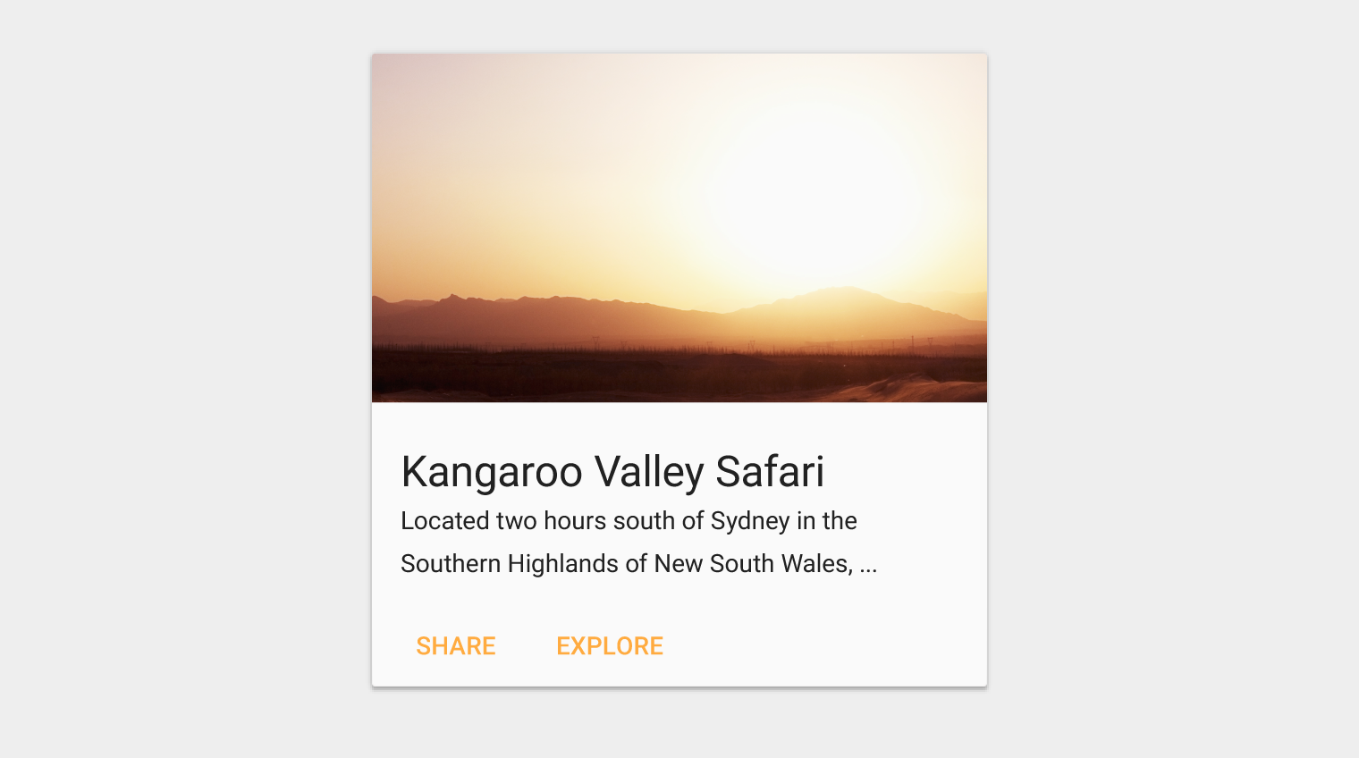
Example of a card. Source: Material Design.
##Excellent Metaphors
The use of cards in the UI is an excellent metaphor since they look like real-world tangible cards. Before mobile devices, they were always all around us — business cards, baseball cards, playing cards and so forth. Cards are an interaction model that are spreading pretty widely, in fact. Thus, it is more intuitive for users to know that these cards are representing piece of content just like in real life.
Cards are a great tool for communicating quick stories. Baseball card is a good example from real-life objects. The basic information you needed to know about a player is contained on both sides of a small card.
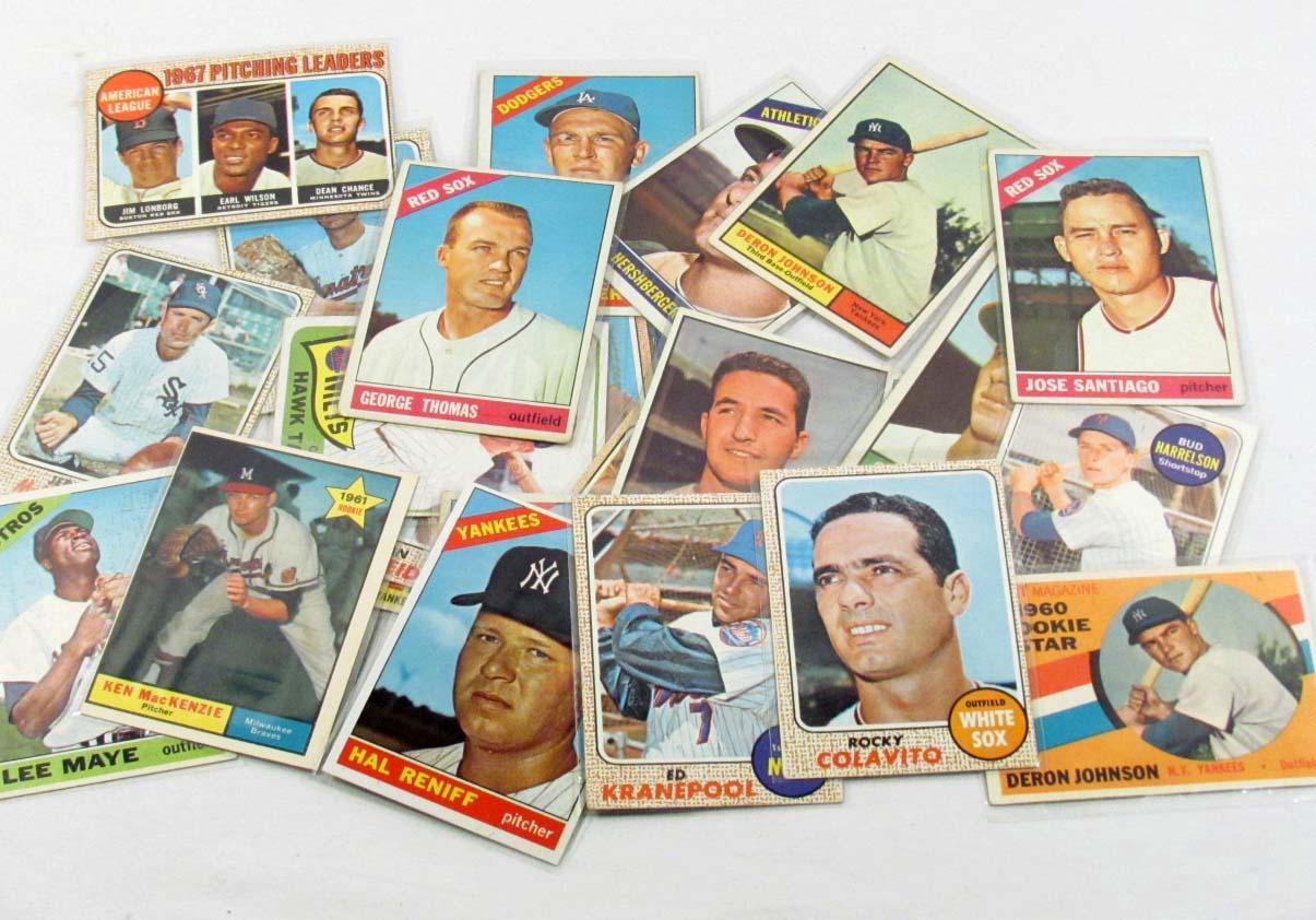
Each card representing a player. Image Source: liveauctiongroup
##Content Organization
Cards divide content into meaningful sections which occupies less screen space. Similar to the way text paragraphs group sentences into distinct sections, cards can gather various pieces of information to form one coherent piece of content.
Card collections example. Source: Material Design.
Card layouts came to the forefront of design when giants like Facebook adopted card-driven interface for their desktop and mobile site and app. Facebook took full advantage of *container-style design* to group together information despite a nearly endless stream of data.
##Visually Pleasing
Card-based design usually heavy relies on visuals. And going heavy on images is a strength of card-based design. Studies already confirm that images elevate site or app design, because images draw the user’s eye efficiently and immediately. The emphasis on using images makes card-based design more attractive to users.
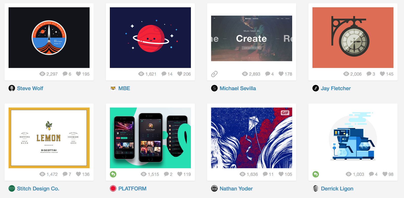
Take a look at Dribble, a well-known site in the online creative community which showcase designers artwork. Card-based design is really the most suitable way for presenting this type of content.
How to Design a Card
Cards from the same layout should have a constant width, but can have variable height. The maximum height is limited to the height of the available space on a platform, but it can temporarily expand (for example, to display a comment field).
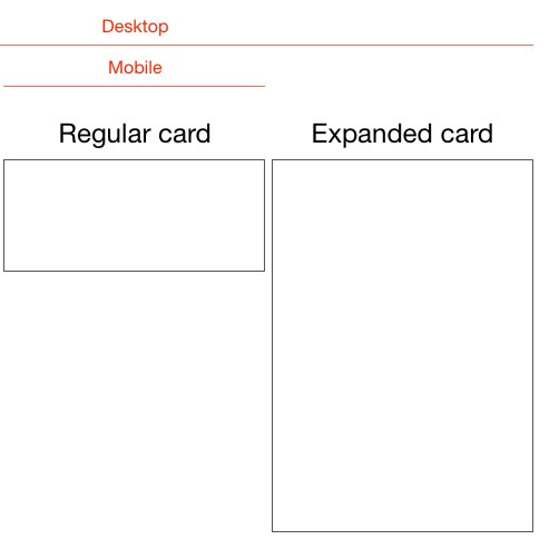
Cards can be a fixed or variable height. Original Image source: Intercom
From design point of view, cards should have rounded corners and short shadow. Rounded corners make card look like a content block, while shadows gives the impression of depth.
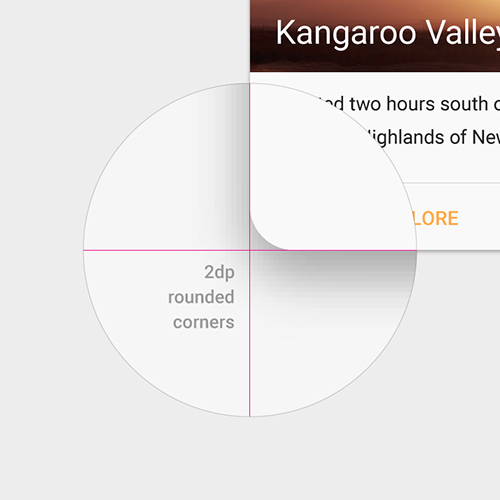
Rounded corners and short shadow. Source: Material Design.
These elements add a bit of visual spice to your designs without becoming a distraction. They also make the card seem to pop off of the page.
In addition, we can take advantage of animation and movement.
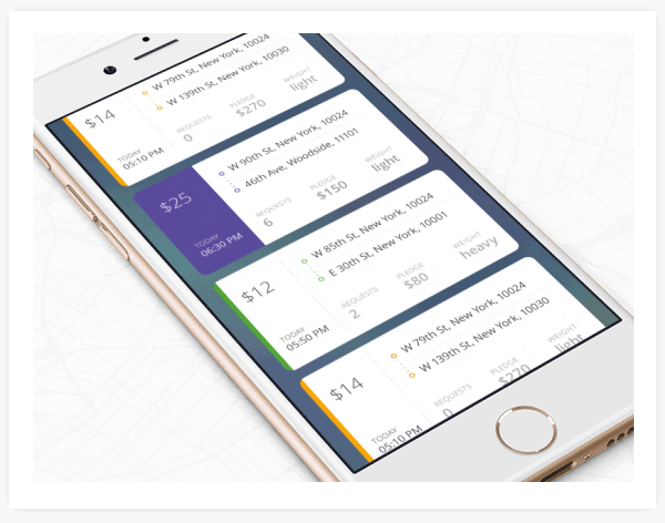
Image source: Behance
#Card Advantages
Implemented correctly, cards can improve the UX aspect of an app. Due to their funcionality and shape, they add an interesting UI element which is intuitive to use.
##Digestible Form
You already know that content is king. Cards are design containers that can hold almost anything. Placing content in cards makes it digestible for users. In this regard, users can easily access the content that they are interested in. This empowers users to engage in any way they want.
This card collection contains cards with varied content types. Source: Material Design.
##Responsive and Mobile Design
The most important thing about cards is that they are almost infinitely *manipulatable*. Card-style design works good both for desktops and mobile devices, because cards offer content in more digestible chunks. They are good choose for responsive design since cards act as content containers that easily scale up or down.
Last but not least, cards make it easier to create a single aesthetic across multiple devices. That is why it so easy to create a consistent experience regardless of device.
Design With Thumbs in Mind
Cards are made for thumbs. Look like cards are a style that seems just made for apps. It is a key part of the popularity of cards when it comes to mobile app design. Digital cards behave in the same ways as physical cards, making a comfortable experience for users. Users don’t have to think about how to make things work. They like the simplicity of the cards and intuitively understand the physics of turning a card over for more information or swiping for next chunk of information.
Swiping. Source: Dribble
Card gestures should be consistently implemented within a card collection. Limit swipe gestures within a view so that they don’t overlap with one another. For example, a swipeable card should not contain a swipeable image carousel, so that only a single action occurs when the card is swiped.
Swipe Down. Source: Dribble
#Where to Use?
##Stream
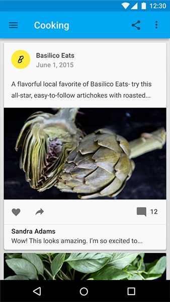
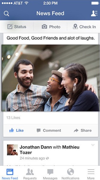
Cards appear in a stream, creating a natural timeline of events. Think about how Facebook uses cards to present a quick overview of recent events in the news feed. Facebook’s news feed is an endless stream whereas cards are individual. The point of cards is disaggregation. They’re taking things out of infinite stream, packetizing them and making them *sharable*.
##Discovery
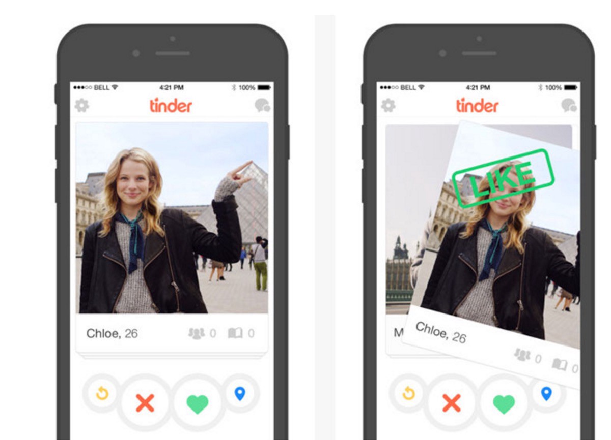
Cards allow relevant content to naturally reveal itself, allowing users to dive deep into their interests. Take a look at Tinder card pattern below: as you swipe right or left, you reveal people that match your tastes.
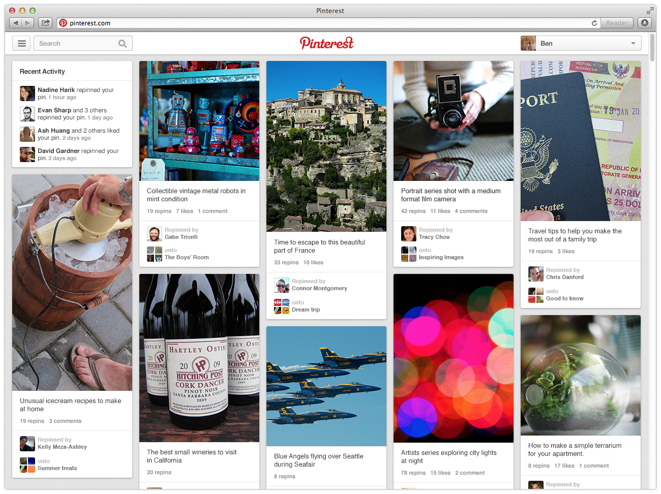
Pinterest uses pins in a dynamic masonry-like grid layout to organize content and engage users in an addictive browsing.
What two services have in common? They’re pulling information out of the service and making it *relevant to the moment*.
##Dialogs
Since cards are content containers, they’re perfect for representing actions. The primary action in a card is typically the card itself. Consider the AirDrop service on Apple devices. When you have incoming request for data transfer, a card pops-up with a notification to accept or decline the transfer.
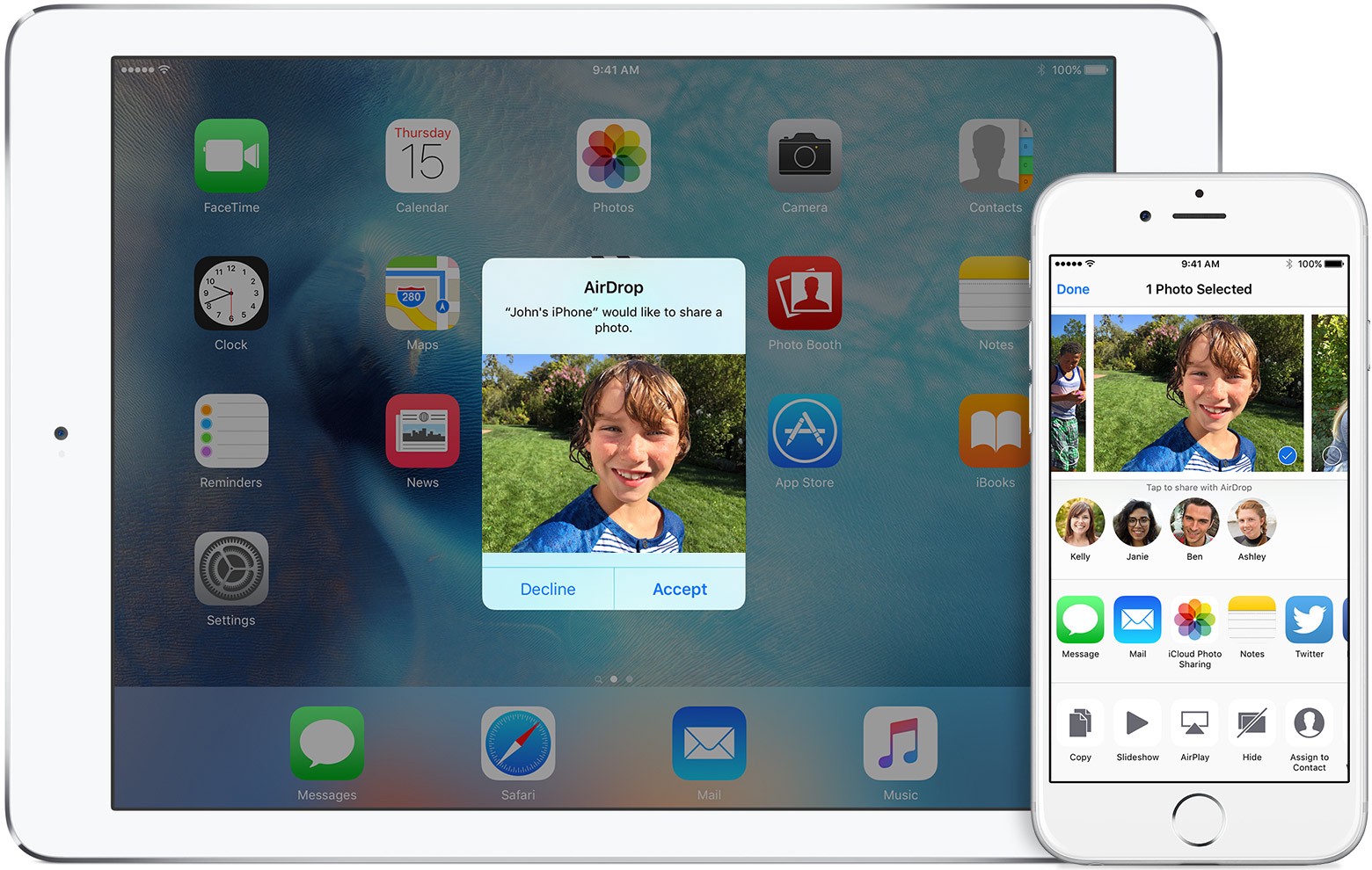
You only have a single action no matter the choice you make. Image Source: Apple
##Workflow
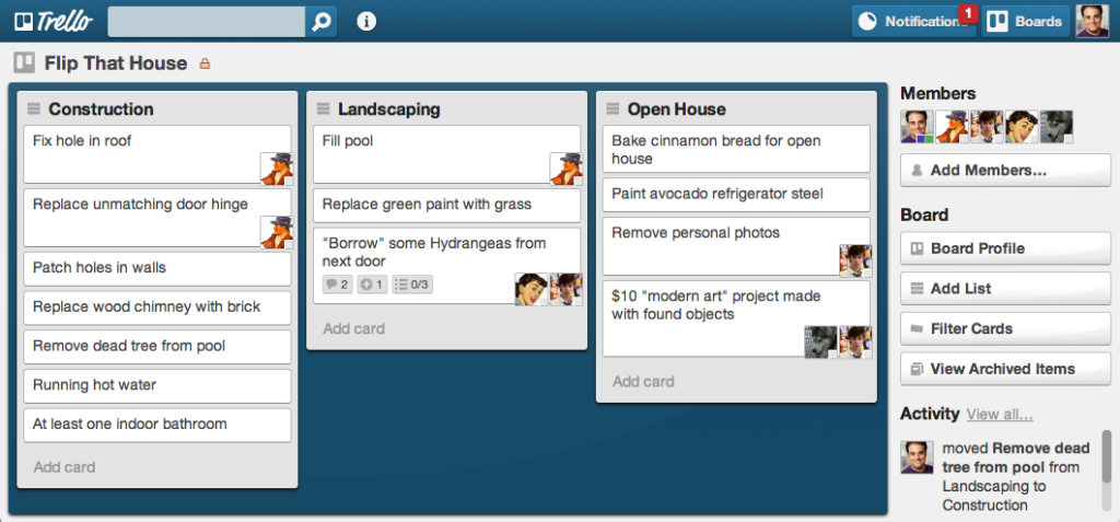
Cards are easily categorized for a scope of tasks. Great example of this use-case is Trello. A Trello board is a canvas filled with cards, each of them represent a separate task.
#Don’t Use Cards
##Homogeneous Content
A quickly scannable list (or grid), instead of cards, is an appropriate way to represent homogeneous content that doesn’t have many actions.
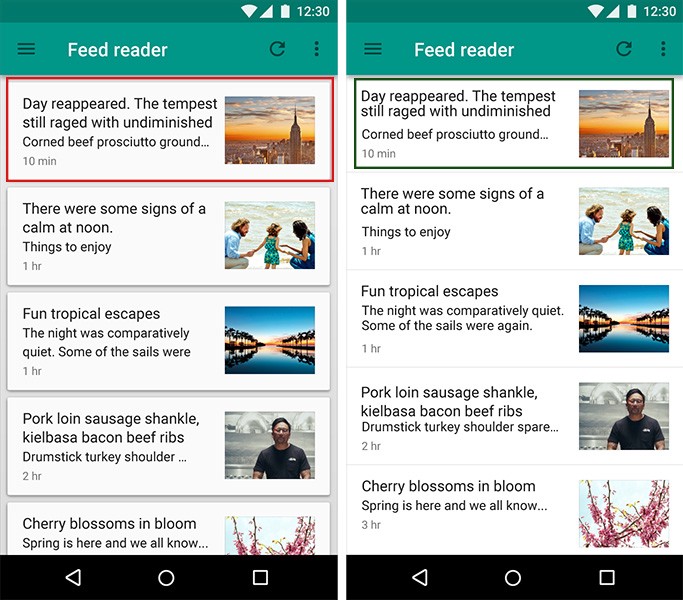
Left: The use of cards here distracts the user from being able to quickly scan. Image source: Material Design.
Cards are unnecessary in a gallery of images. Grid tiles are a clean and lightweight way to present a gallery of images. You can see it in example below.
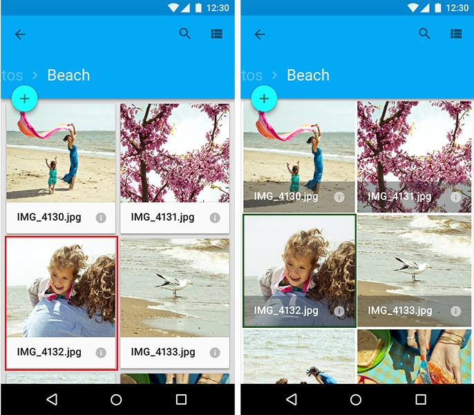
Left: Using cards for images. Right: Using grid list. Source: Material Design.
##Large Screen Size
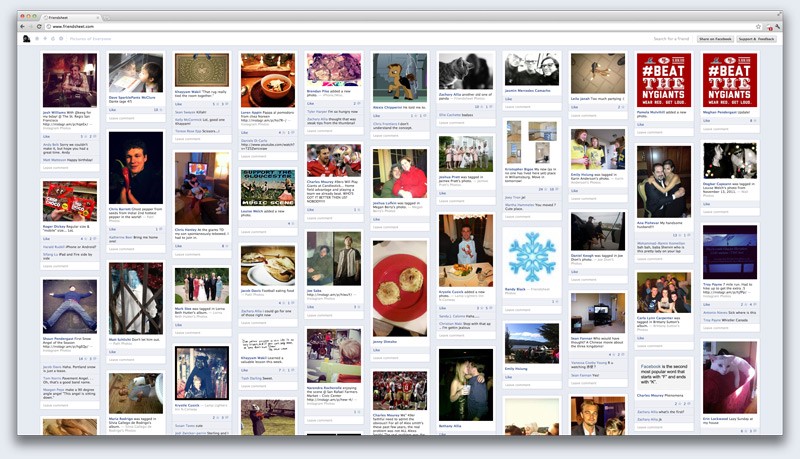
Card-based information design may work well on a small screens, but on a large screens, it tends to get implemented as a borderline-unreadable mess. Visually it still looks great, but they are horrible on objective measures like reading speed and reading comprehension. Below is pinterest page on a large screen.
##Redesign Existing App
Users who find your app easy to use and familiar may balk at the new visual logic. You should get feedback from your users as to what they’d like to see. With that user feedback, you can design tests to incrementally redesign your app, and see the effects of the change.
Conclusion
I hope you‘ve got a good feel for why card-style design is increasing in popularity. And I believe that this trend that won’t die out any time soon. Because cards aren’t just easy on the eyes, they are one of the most flexible layout formats for creating consistent experiences. Today people seek out information quickly, and cards serve it up pretty good, regardless of device. And great user experience centers around people.