5 Types of UI Notifications

Notification is an integral part of many products. Almost all products we design today require some system for sharing updates with our users.
This article will discuss five types of UI notifications, with essential rules on when and how to use them.
What is a notification?
Notification is any system update that we want to share with the user. Notifications provide relevant and timely information about some event.
Notification can vary depending on the following:
- Level of importance. Notifications range from critical updates that users must see to low-priority updates that users might easily ignore.
- Channel. Notifications can be a part of the product (in-app notification) or use external communication channels (i.e., email notification).
- User-triggered or system-triggered. User-triggered notifications are notifications triggered by the user’s actions (for example, a user purchased a product on a website and received updates about the order). System notifications are notifications the system sends to a user (i.e., notifications about planned system maintenance).
Notifications should never be the primary way of communication with your users.
Anatomy of a notification
Notifications should be optimized for fast scanning. A quick glance should be enough to understand what notification is all about and what you can do about it.
Here are four building blocks of a notification container:

- Title (header area). The title should be the most prominent element of a notification. It creates the context for the notification informing the user about the event. You must write a short title that provides context for the notification content.
- Description (body area). The description contains more details about the event. It can include additional information that users find helpful. When writing a description, try to make it under 40 characters long, and don’t repeat what’s in the content title.
- Action area (call to action button). Buttons let the user take immediate action. If the notification requires action, the label for a button should be actionable. It should say “Create,” “Complete,” or “Send.” Ensure the clickable area has enough contrast so the user can easily spot it. The action area can be displayed at the right or at the bottom of the notification container.
- Icon (optional). Meaningful imagery can reinforce the notification’s content. For example, if you notify the user about an incoming message, you can include an avatar of the sender.
Now let’s discuss four popular types of notifications along with rules on how to use them:
1. Icon with badge
A badge is a small, filled oval that can appear on an app icon and indicate not seen updates. The badge can have a number that will inform the user about the number of unread notifications. After the user checks the updates, the badge disappears from the app icon and appears again when new notifications arrive.

Pros:
- Badge doesn’t demand a lot of attention from a user. A badge doesn’t prevent a user from interacting with a product.
- It can create a positive impact on users. In some contexts, users can consider a badge as a valuable reward. For example, a badge informs the user about the new likes they’ve received on the social network. Nir Eyal described this psychological effect in his book “Hooked.”
Cons:
- Require extra action from the user. A badge is not a notification per se; it’s an alert for the notification. It just states the fact that the user has a new update. Users must click or tap on the icon with a badge to see an actual message.
When to use:
A badge can be a perfect solution for notifications with a medium level of importance.
Tip:
Consider providing sound to supplement your notifications. Sound can be a great way to get someone’s attention while not looking at the screen. Unique sound can also help you distinguish your app’s notifications.
2. Push notification
Push notification is a notification that appears on the lock screen of the mobile device and attracts a lot of attention.

Pros:
- Hard to ignore push notifications. High chance that the user will notice a push notification.
Cons:
- Demands too much attention. Push notification force users to read them.
- It can be overused by product creators. Frequent push notifications, even when they are valuable, may annoy users.
When to use:
Push notifications are suitable for important & time-sensitive updates (i.e., a calendar reminder or alarm set up by the user, an update about a delayed flight or delivered order). Before you send a push notification, you need to be sure that the information you will share with the user is valuable and time-sensitive. Otherwise, it is better to use other types of notifications.
Tips:
- Do not use push to prompt users to rate your app.
- Don’t use push notifications for promotion or advertising purposes.
- Don’t use push notifications to encourage users to return to an app. The “We haven’t seen you in a while” notification doesn’t provide much value to users. Give users a clear reason why they should return to the app.
- Allow users to change notification behavior. Users should be able to fine-tune the push notification preferences.
- Create a summary of notifications. Minimize the number of push notifications by grouping them. Android and iOS allow the creation of one notification that summarizes a few notifications. Instead of displaying multiple notifications, you can display a summary.

3. Email
A user receives an email with details about the update.
Pros:
- Give the user more control. It is up to the user to decide whether they want to read the email. If the email title is good enough, the user might understand the context without reading the email.
Cons:
- Long reaction time. It might take more time for the user to see the email notification. Plus, email can be lost in the user inbox (i.e., go to the Spam folder).
- It requires switching the context. When the app sends an email notification that requires user action, a user has to switch to the email app to complete the operation. It might not be very convenient, especially when you interact with an app on your mobile device.
When to use:
There are two reasons why you want to use email notifications. First, you might want to use email as a separate channel for security purposes (i.e., when a user tries to log in to a service, the app sends an email with a notification about the new login attempt).

Second, you might use email for notifications for system updates that don’t require user actions (i.e., informing the user about order updates).
4. Toast
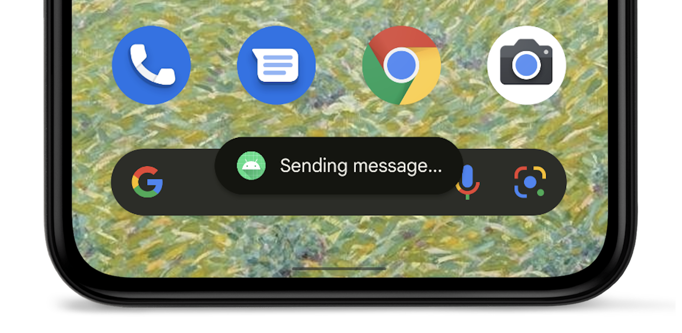
Toast is a rectangular block that appears at the top or bottom of the user screen and notifies the user about the update. Toasts automatically disappear from the screen after a short timeout (maximum of ten seconds).

Pros:
- Toast is contextual. The user doesn’t have to switch contexts to read the information.
- Don’t interrupt the user experience. They appear temporarily and don’t require user input to disappear.
Cons:
- Risk of missing the information. Default timeout might not be enough for some users to read the notification. It’s a bad UX when a toast disappears before the user reads the message.
When to use:
Toast is good as a status of an operation. For example, the messaging app can show a toast “Message send” when the message was sent successfully.
Tips:
- Don’t use toast to show information that doesn’t relate to the current user task. It won’t be nice if you interrupt the user in the middle of a task to tell the user about new features that your product has.
- Don’t use toast for error messages. Because toast will disappear after a short timeout, some users might not be able to read the error message.
- Don’t use toast notifications to provide random tips on how to use apps. Random advice on how to use an app has low user value because it isn’t contextual.
5. Full-screen overlay / modal window
Full-screen overlay / modal window is a dialog window that appears on top of app content and asks users for a decision. This type of notification disables all app functionality when they appear and remain on screen until the user completes the required action.
Pros:
- Users will 100% see the notification when they access the app. It’s impossible to avoid this notification.
Cons:
- It acts as a roadblock. This type of notification interrupts user flow and forces the user to take action.
- It only works when the user accesses the app. It is an in-app notification, meaning if the user doesn’t access the app, they won’t see the update.
When to use:
Full-screen overlay / modal window should be used only for the most critical system updates that require user action. For example, it can be an error that blocks an app’s normal operation or critical information that requires a specific user decision.
Tip:
Don’t use full-screen overlay/modal for promo messages.

How to create a notification strategy
Now that you are familiar with different types of notifications, it’s time to share a few essential rules that will help you create an effective notification strategy.
1. Group notifications with the same subject matter
Conduct a content inventory of all notifications you want to send your users and group them into sets with the same subject matter. For example, “Order updates” notifications.
2. Set level importance for each notification
Aim for four levels of importance (Low, Medium, High, Critical). The level of importance should be selected from the user’s perspective (based on the value the notification provides to users). You can use push notifications for events with a critical level and a high level of importance. When it comes to low importance, you should think twice if you want to send such notifications.
3. Allow users to customize notification preferences
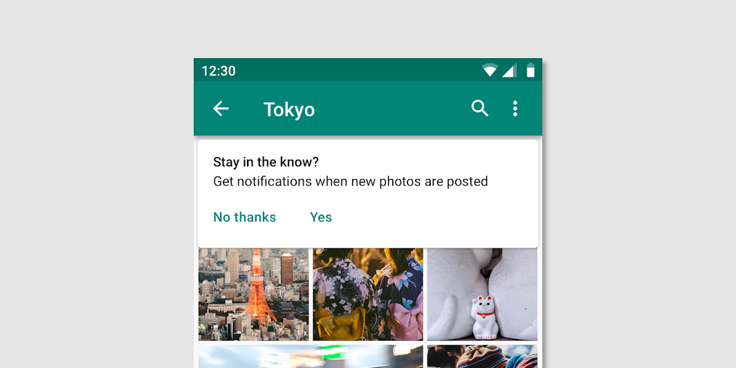
Practice opt-in approach — ask the user if they want to receive a particular kind of information. When users explicitly choose to receive some types of notifications, it’s more likely they’ll be glad to see them.

4. Avoid sending multiple notifications for the same thing
Don’t send follow-up notifications even if the user hasn’t responded. People should attend to notifications at their convenience. When you send multiple messages for the same thing, users are more likely to turn off all notifications from your app or even delete the app.
5. Be careful with sensitive information
Don’t include sensitive information in a notification. You cannot predict what people will be doing when they receive a notification, so it’s better to avoid including confidential information that could be visible to others on the device screen.