Apple Aqua: Exploring the Legacy Of MacOS X User Interface
Apple unveiled Aqua, its next-generation user interface for MacOS X, at the Macworld Expo San Francisco in 2000. Apple described Aqua as the future of Macintosh, and it was one of the most fundamental design upgrades that Apple ever created.
Despite that the appearance of Aqua has changed frequently over the years, the foundation principles of GUI design that Aqua defined stayed the same up to 2020 when MacOS Big Sur was released.
In this article, I want to focus on the visual language of the Apple Aqua and why this language has such a tremendous impact on other products that Apple released.
A very brief history of Apple Macintosh OS
Apple released the Macintosh OS in 1984. Macintosh OS set a foundation for graphical user interface design for the entire industry. If you look closely at Macintosh OS, you will notice that it has many attributes of a modern graphical user interface: the concept of a window, app icon, and system states.

After massive success in the 80s, Apple started to experience problems in the early 90s. The latter half of the 1990s was a dark time for Apple. Microsoft dominated in the field of personal computers, while Apple experienced substantial annual losses. Apple made several attempts to create a modern successor to the classic Mac operating system, but all of them were unsuccessful. Apple ended up purchasing NeXT in 1997.
Before the Aqua release, Apple used a UI called Platinum, a legacy of NeXT. Although Platinum placed a greater emphasis on color than prior versions, it was still an incremental integration of many of the technologies developed from 1988 to 1996.
The new era dictated a new approach, and Apple wanted to create a modern successor to the classic Mac operating system. Apple presented the next version of the graphical user interface called Aqua in 2000. Aqua was much more than just a cosmetic change. Compared to the previous OS released by Apple, the Aqua interface looks both familiar and very novice.
Key elements of Apple Aqua
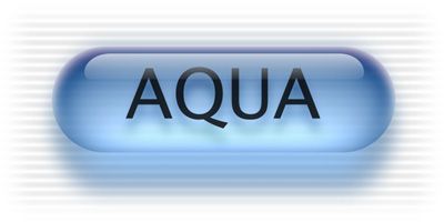
Apple called this user interface ‘Aqua’ because it was originally based on the theme of water. At its introduction, Steve Jobs made a joke about that “… it’s liquid, one of the design goals was when you saw it you wanted to lick it”’
According to the Apple design team, the goal of Aqua was to:
“Incorporate color, depth, translucence, and complex textures into a visually appealing interface” in macOS applications
That’s why Aqua features liberal use of reflection effects and translucency. Another notable thing about Aqua’s visual language is that it visually complements the design of the colored iMac released in the late 90s.


Let’s dive into the visual langauge that Aqua offered:
Colors
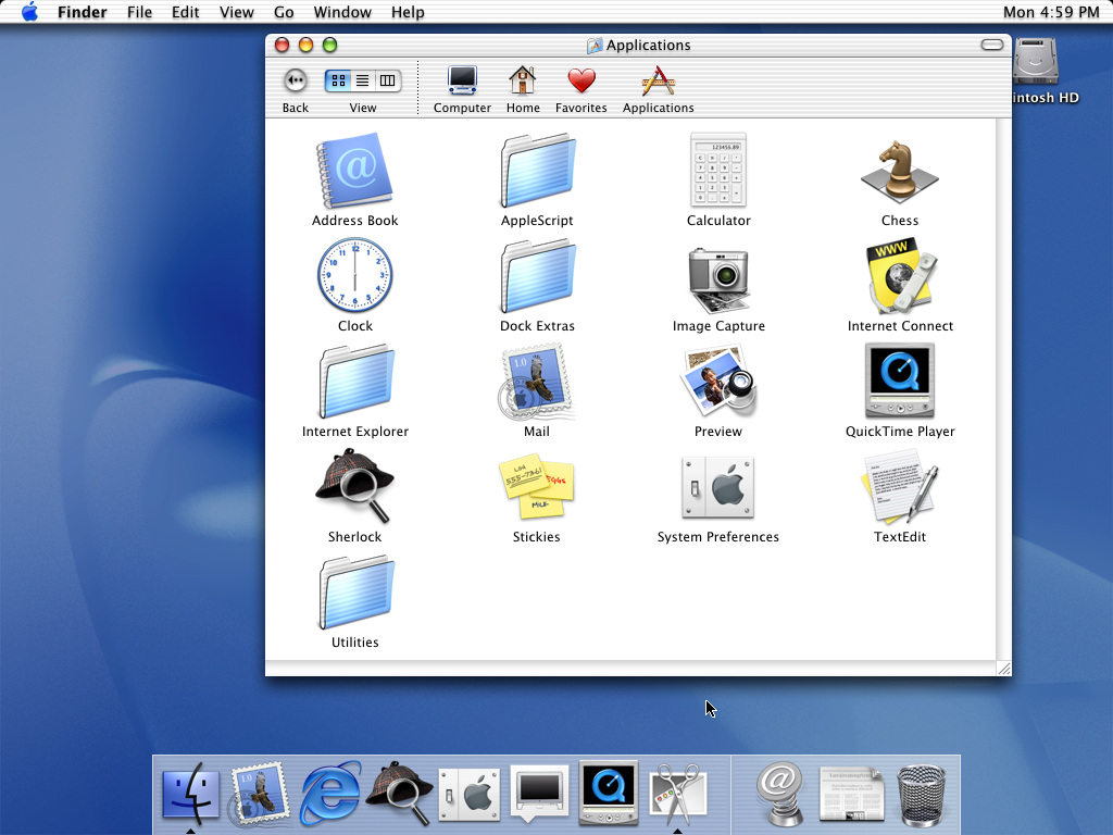
Gray, white and blue were the key colors that defined the Aqua style. All functional and decorative elements (toolbars, backgrounds, functional elements like buttons and menus) were found in either of these colors.
If you look closer at the toolbar, you will notice that they are often grey or metal-colored. It is done intentionally. This design looks less busy for the human eye and can also visually guide the user’s eye towards functional elements (menu items).

Design of functional controls and menus
It’s much easier to understand the visual language when you break it down into the smallest elements. And when it comes to OS, the smallest possible element is functional control.
Aqua brought flatter interface elements, such as new buttons and drop-down menus. Look at that soft focus on the buttons.

The visual style of Aqua buttons will later be used in the first versions of Apple iOS (of course, with some visual modifications).

Aqua brought a radical new look for all the familiar interface elements (scroll bars, windows, menus).


Here are a few notable things about the styling of UI elements:
Shadows. You can notice that most UI elements cast shadows. Shadows are used both in functional controls and windows. Aqua windows have almost no frame or outside border; instead, drop shadows are used to separate and distinguish active from inactive windows. Subtle shadows create a sense of dimension.
Shadows convey a sense of depth and dimensions in a user interface; UI elements look like 3D objects.
Transparency. The transparency effect was used to focus user attention on a particular object. For example, when a window is no longer in focus, the window control buttons become transparent.
Highly detailed system icons
Compared to the Platinum visual style, Aqua system icons were larger and more detailed. The visual style of icons was more visually appealing UI. A similar skeuomorphic kind of icon is later used in the first version of the Apple iOS system.
Skeuomorphism is the design concept of styling digital objects in a way that they can resemble their real-world counterparts.
Dock
Early 2000 was an era of multitasking. Users constantly switched between different apps when they worked on a computer, and Apple wanted to make the process of switching as comfortable as possible. To make it happen, Apple introduced Dock, where all popular and recent apps are located.

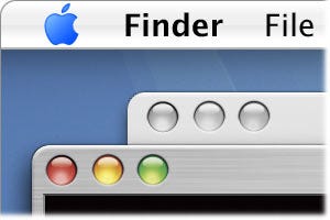
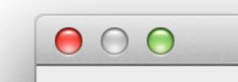
Along with Dock, Apple added a title bar with three buttons on the left side — red to close the window, yellow to minimize, and green to maximize. In the early versions of Aqua visually, these buttons used to be placed on top:

but later appeared ‘sunken’ into the window:
Using a principle of proximity in GUI design
The principle of proximity states that objects located close together are likely to be perceived as part of the same group.
Apple used the principle of proximity in MacOS X design. Understanding the relationships between parent and child windows was one of the most annoying problems of many operating systems with GUI in early 2000. The user has to remember which dialog belongs to which window.

Apple used distance as a property of relation. For example, the “Save” panel was visually connected to the parent window so the user could easily understand which window the save panel belonged to.

Strong motion language
Aqua not only looked nice, but it was also generally impressive in action. Apple paid a lot of attention to dynamics — not only how UI objects look in static, but also how they work when the user interacts with them. The goal was to help people who just recently started using a computer so they can understand how things work much faster.
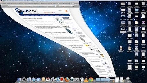
One notable thing is the visual transition of a window minimizing that gives the user a hint where the window goes to in the Dock. When minimized, windows are “sucked” into the Dock using the “Genie effect.” It guided the user’s eyes to where the object went and made the state changes more obvious.
Dock itself can change in size depending on how many objects it has. For example, the icons in Dock can shrink if you put a lot of objects in it. It also has a magnification that allows you to increase the size of an object in Dock on mouse hover.

On a micro level, Apple introduced subtle micro animations to functional controls. For example, OS dims a key call to action button to give the user a hint that this button will be pressed if the user presses Return.

Conclusion
Aqua wasn’t a perfect visual style. MacOS X powered by Aqua was very hardware demanding (it was a huge resource hog, especially RAM), and it was unbearably slow in some contexts. Despite that, Aqua was a huge step forward for both Apple and the computer industry. Even today, the legacy of Aqua can be found in the latest versions of MacOS. Two decades later, the Dock still functions the exact same way. Of course, it looks much nicer than its predecessor, but functionally it’s the same