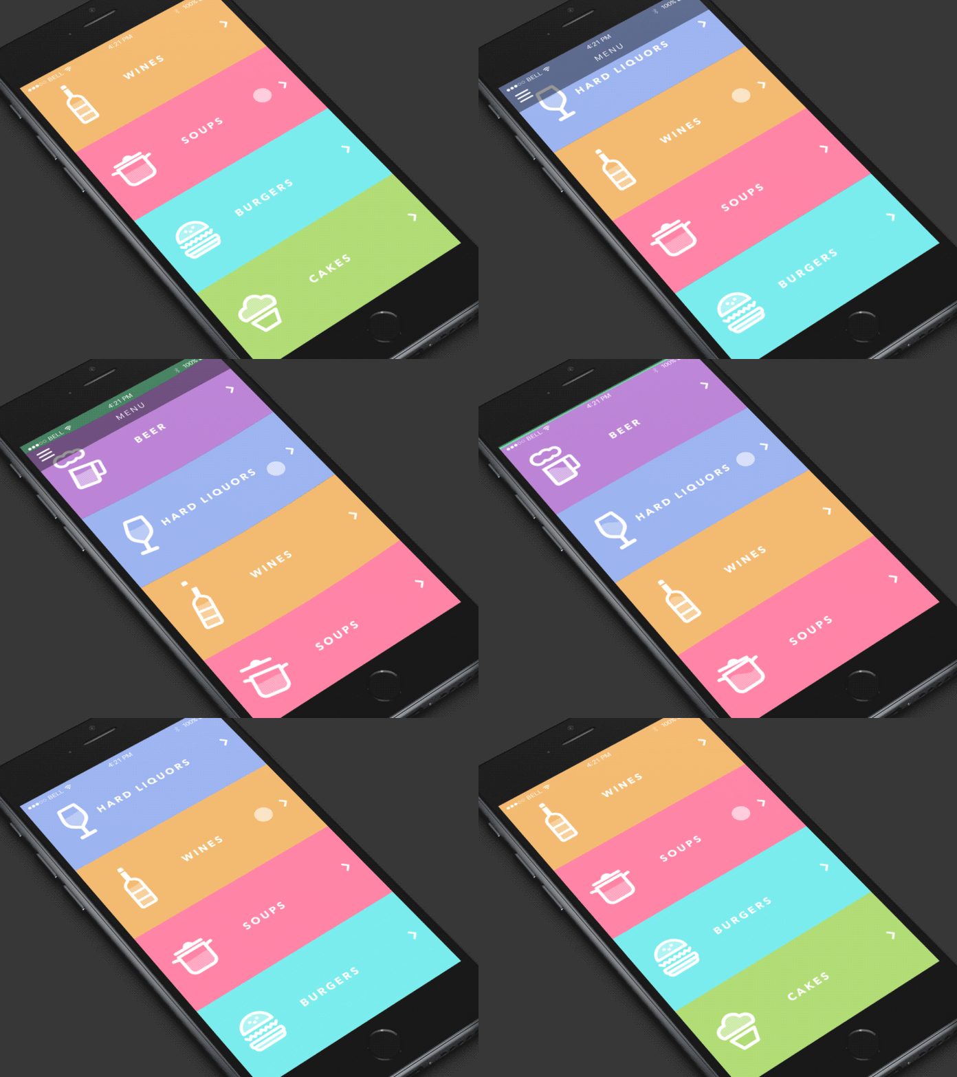
When Motion Creates Emotion

Animated effects are typically thought of by designers as something that improves the user experience, but overall doesn't add much value. As a result, adding motion to design is often happens at the end of the product design process, as a final lipstick.
But what if we rethink the way we implement animation and use it as a foundation for our designs? In this article, I'll describe when and how to apply motion to create emotions
Side note: For the purpose of this article, I stay away from using the word 'delight' to describe animation. The reason why 'delight' is a wrong word in the context of emotions is that the same animated effect can delight one group of users and annoy another group of users.
Use animation to tell stories
Every experience is a narrative. No matter what kind of app or website you're working on, there's something specific message you want to deliver to your users or visitors.
Every designer is a storyteller
There are a lot of different ways you can follow to tell your story, but some ways are more effective than others. "A picture is worth a thousand words," we all familiar with this old saying. It's possible to reinforce the effect of a picture by introducing a motion on the canvas. Motion not only helps designers to deliver the message more efficiently it also makes the whole story more engaging. When designers apply this principle to design, they create truly memorable experiences.
Describe complex concepts using animation
Animation is excellent when designers need to deliver a pretty complicated message to their users or visitors. The idea is pretty straightforward:
Show, don't tell
Let's see how the concept 'Show, don't tell' works in a particular case - websites that stress the importance of recycling. Instead of telling visitors about the importance of giving the right destination for the trash, designers use animation to show what exactly people should do with it.
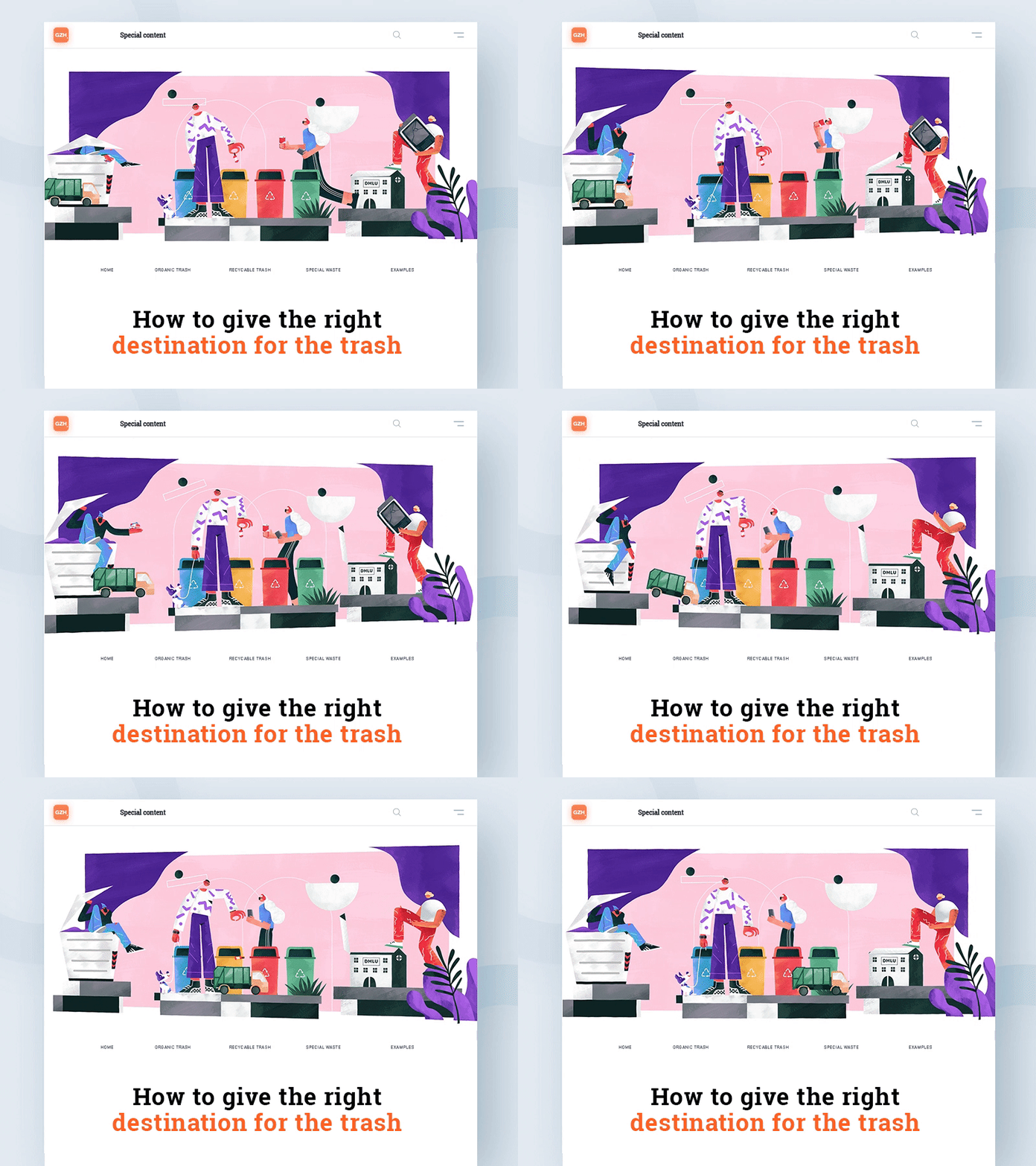
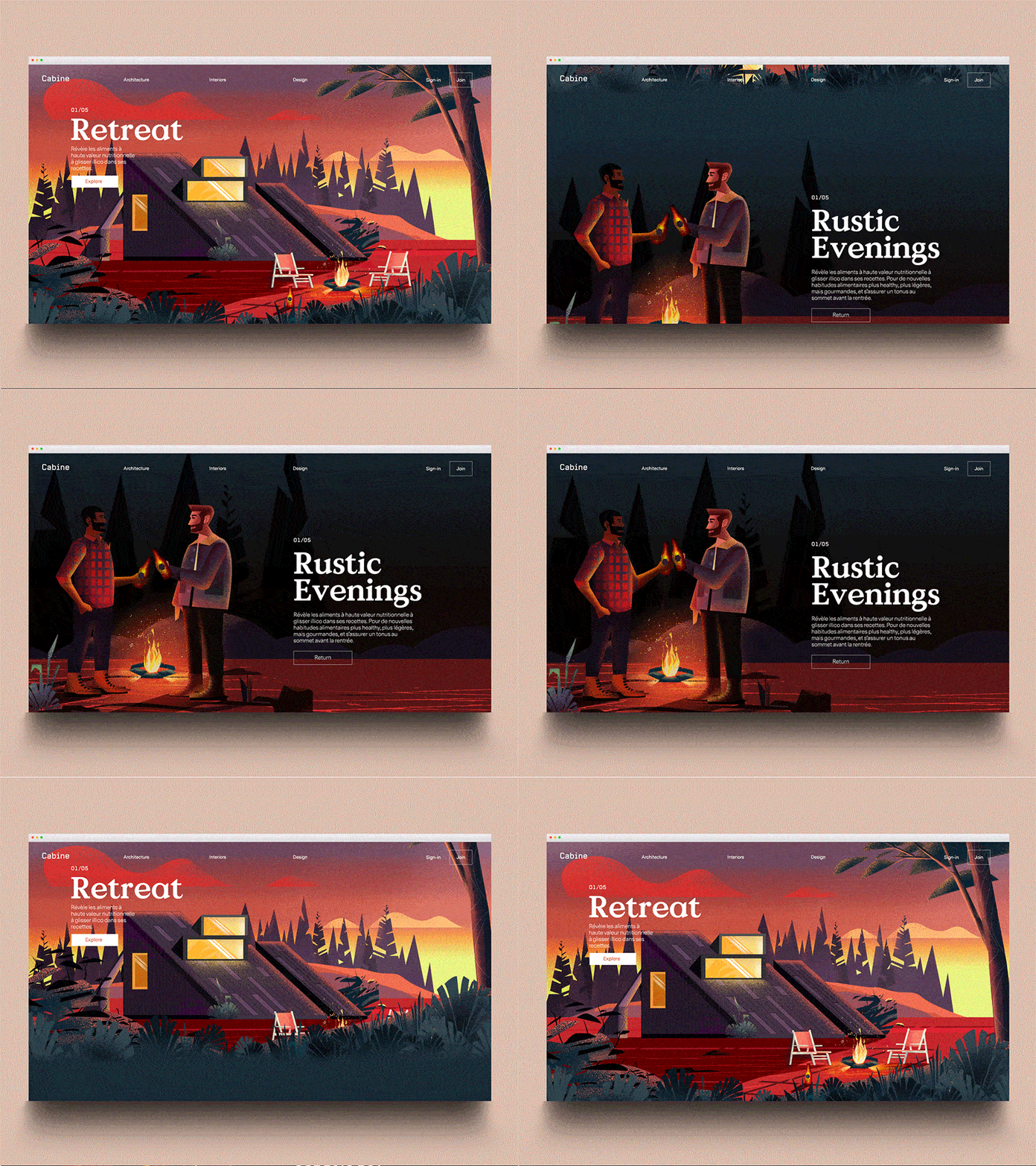
Parallax effect has a clear functional purpose. It supports visual continuity - helps visitors understand where they are in the experience.
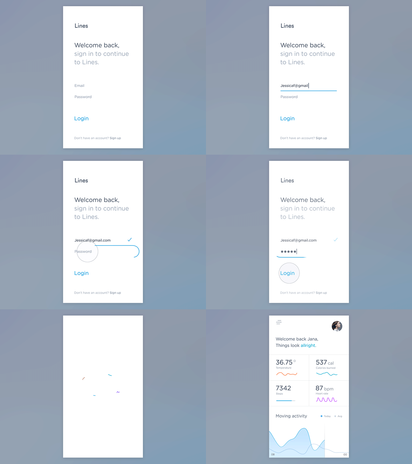
Memorable first login experience
Animation can help users see the effects of their actions. This property is especially good during the first-time experience.
Check the example below. You can see how animated effects guide users to the next view - the surface transforms to communicate hierarchy.
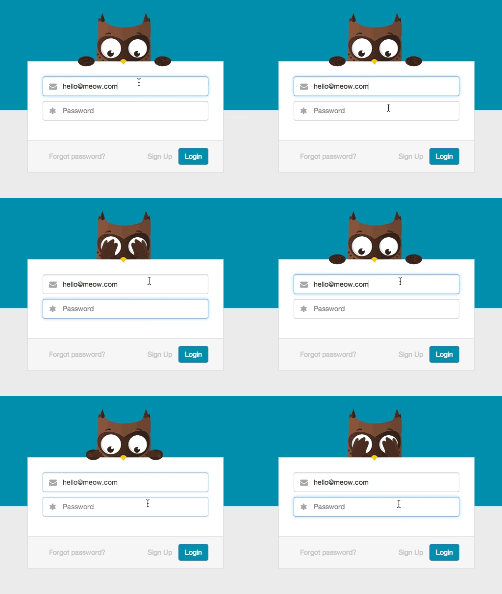
Readme.io app is another great example of how animation can benefit the first-time login. The app uses the owl mascot during the login. When users tap the password field, owl covers its eyes. This animated effect is really fun when you see it for the first time.
Interesting scrolling effects
Animation can take the physical properties of objects into account. The scrolling effect in the example below reinforces the sense of physicality by taking into account how the liquid behaves.
