Animation in Mobile UX Design

Well-designed animations make the experience feel crafted. In a human-centered design approach, where the user is the prime focus, animation actually creates a feeling of well-being once it’s discovered by users.
As a designer, recognizing the invisibility of animations is just as important as designing them. Because you have to create something that feels human and accomplishes a task.
Benefits of Animation
Animation in mobile apps has a clear, logical purpose. It reduces cognitive load, prevents change blindness and establish a better recall in spatial relationships. But there is one more thing. Animation brings user interface to life.
Ideally, in-app animation should:
- Provide clear feedback in response to user’s actions.
- Provide system status to the user.
- Guide and teach the user how to interact with the interface.
Visual Feedback
Visual feedback is extremely important in user interface design. In real life, buttons and controls respond to our interaction, this is how we expect things to work. And responsive interaction encourages deeper exploration of an app by creating logical reactions to user input. Upon an input event, the system should provide instant visual confirmation.
Buttons and Controls
User interface elements like buttons and controls should appear tangible, even though they are behind a layer of glass. To bridge that gap, visual and motion cues acknowledge input immediately and animate in ways that look and feel like direct manipulation.

System Status
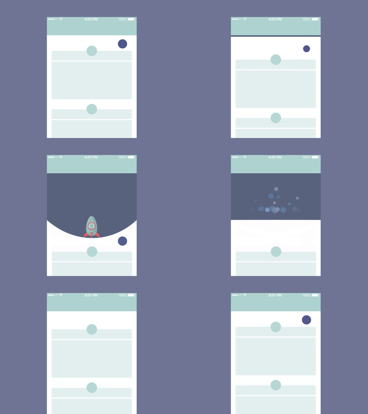
The user wants to be in control, and trust that the app behaves as expected. It could be even said that users don’t like surprises. Animation provides real-time notification of app’s process status, enabling the user to quickly understand what is going on.

A well-known animation for this group is “pull down to refresh,” which initiates a process of content updates on mobile devices.

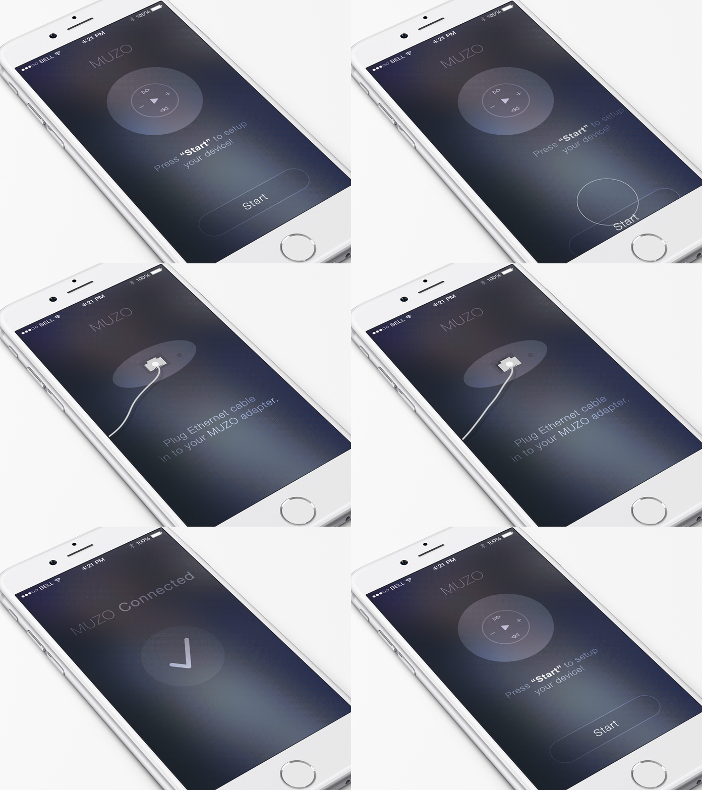
Also animation is very helpful during onboarding. User onboarding demands a flawless UX, and smooth transitions and good animations in the onboarding flow has a tremendous impact on how first-time users will engage with the app.

Takeaway
Provide real-time monitoring of system status. Make it possible for user to quickly understand the current app’s status.
Meaningful Transitions
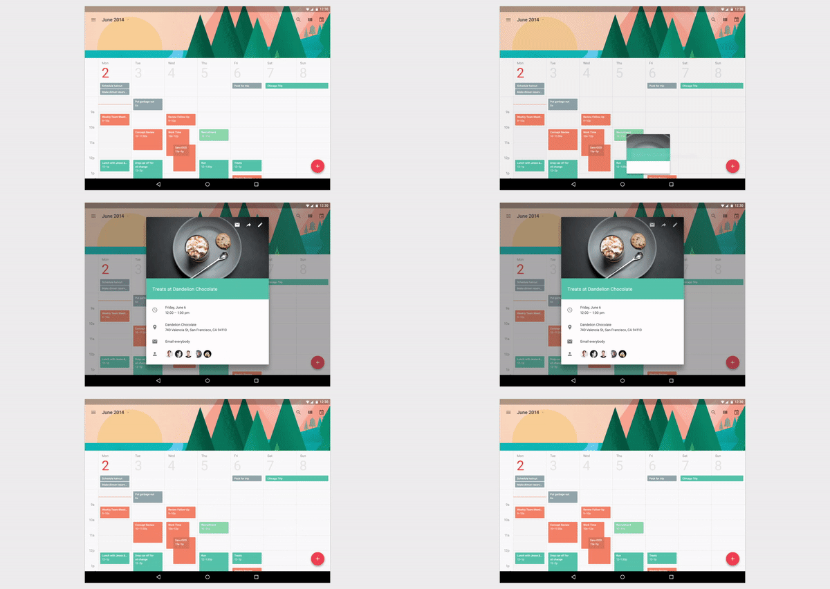
You should use animation to smoothly transport users between navigational contexts, explain changes in the arrangement of elements on a screen, and reinforce element hierarchy. Motion design can effectively guide the user’s attention in ways that both inform and delight.

Avoid disjointed transactions like in the example below.

Avoid haphazard motion like in the example below, because it’s very distracting.

Delightful Details
The most basic use of animation is in transitions, but an app can truly delight a user when animation is used in ways beyond the standard scope of actions. It can exist within all components of an app and at all scales, from detailed icons to key transitions and actions.
