Contrasting design vs. neutral design: when to use each
Design is a language that we use to communicate with our audience. Understanding why products are designed in a certain way is essential to becoming a successful designer. When we understand why certain decisions are being made in the first place, we can apply the same method of thinking when we design our products.
Today I want to discuss two ways we can design products—create a design that contrasts with the surroundings or blurs with the environment. Contrast can be achieved not only by using color; it's possible to create contrast using shape or texture. To clarify the points, I will use two Wi-Fi audio systems as examples—Naim QB and Google Nest Mini.
Contrasting design
Contrasting design is a design that naturally captures the viewer’s attention. It typically has some visual attributes that attract the viewer’s eye.
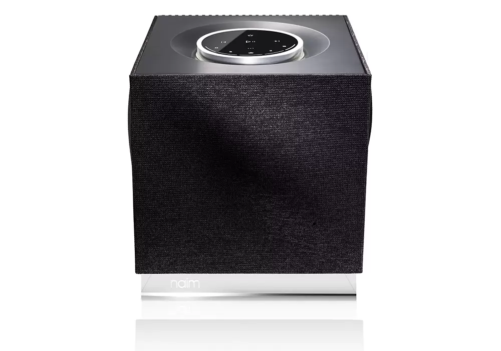
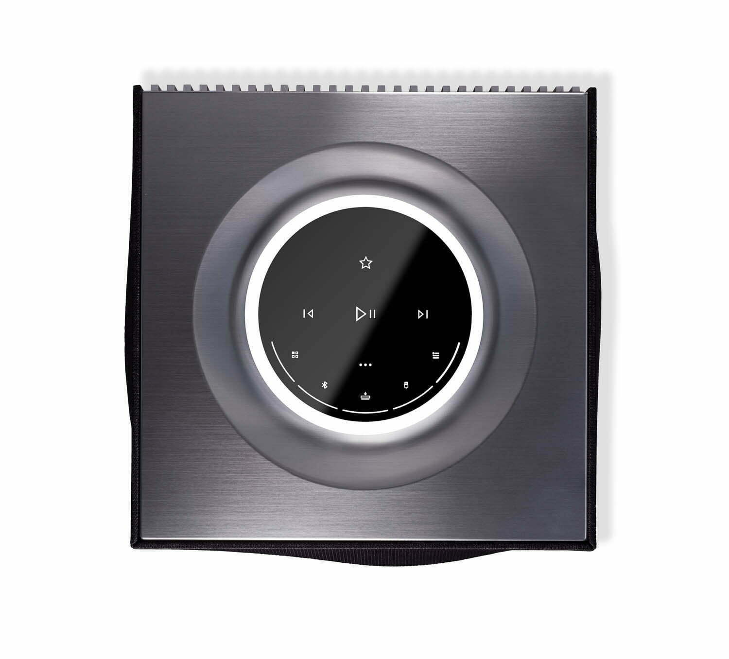
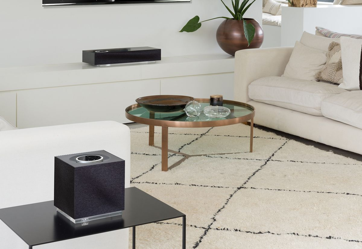
Contrasting design is typically used to communicate a particular message. For example, if you look at Naim QB, you will likely think that this design speaks the luxury of this product. Natural materials like glass and aluminum are used to convey the message that this is a top-of-the-line product. Such design creates visual interest and naturally draws eyes toward it.
Contrasting design is great for creating an excellent first impression. Contrasting design stands out, and people will likely love or hate it. Either way, when a design sparks huge emotional responses, it becomes more viral.
Contrasting design is not solely about decoration; it can also serve a clear functional purpose. A strong contrast between the elements of a product not only can create visual interest but also can guide the viewer's eye to functional controls. When it comes to Naim, it's relatively easy to find a control area—a sensor wheel from black glass on the top of the device highlighted with white light.
The problem of contrasting design is obvious—it is not universal. Contrasting design simply might not fit well in the environment where you want to use it. Naim doesn't look not like an everyday object but rather some artwork that you can find in a gallery. It might look great in a modern interior and odd in a classical interior of the 20th century.
Neutral design
Unlike contrasting designs that attract a lot of attention, the neutral design doesn't stand out; it blends with the environment. The ability to blend with the environment makes a product with a neutral design so versatile; such products fit almost all interiors.
If you look closer at Google Nest, you will notice that it's made of simple elemental shapes. Basic geometric forms plus neutral gray color make this device universal.
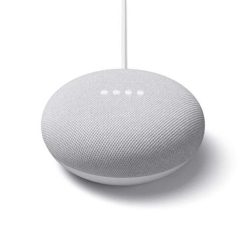
Since there are no straight lines anywhere, when we see this object, there is nothing our eye cannot focus on. And that's one goal designers pursue—they want us to forget that the object is there.
Nest Mini has no distinctive visual details that make this device memorable, but this is another decision made for a purpose. Distinctive details might alienate some groups of users for two reasons. First, they don't need pieces that capture attention. Second, they are not ready to pay extra bucks for expressive and beautiful details.
Surprisingly, the lack of distinctive details makes the device much more approachable. Since Nest Mini has fewer visual details, it naturally conveys an idea that it's easy to use. Compared to Naim, Google Nest Mini looks much more utilitarian and functional.
So, should I go for a contrasting or neutral design?
There is no single right answer to this question. It's all about the context. Context is fundamental for all kinds of design. The key question is how the user will use the product. If the user wants to make a product a center of attention, in this case, the contrasting design will work better. But when the user wants to hide an object, a neutral design is preferable.