As the saying goes, a picture is worth a thousand words. It takes users just a few seconds to evaluate a new site or app, good designer knows that and try to convey complex stories and ideas visually. This makes images a critical component for connecting with users and converting them into dedicated users.
Pictures speak louder than words
However, creating or selecting visual content for you app of site isn’t a easy task. Following best practices can help you successfully incorporate imagery into your design.
1. Use Imagery That is Context-Relevant
If the images you’re using are not clearly tied to your value proposition, or to the central theme of your page, then they won’t help your users.
- At best, they’ll be pointless distractions:

Images without clear relevance, like the one you see on this booking site, are a waste of space
- At worst, they’ll give the wrong impression or even shock your users:

Images that aren’t context-relevant can cause confusion. Credits: hubpages
**Tip:** Use predictive visuals that have a strong relationship with brand goals.
#2. Have a Clear Point of Focus
When the point of focus is obscured, the iconic quality of the image is lost. Avoid making the user hunt for the meaning in the image and ensure that a clear concept is conveyed to the user in a memorable way.

Left: when the point of focus is obscured, the iconic quality of the image is lost. Right: A clear focus communicates the concept at a glance. Credits: Material Design
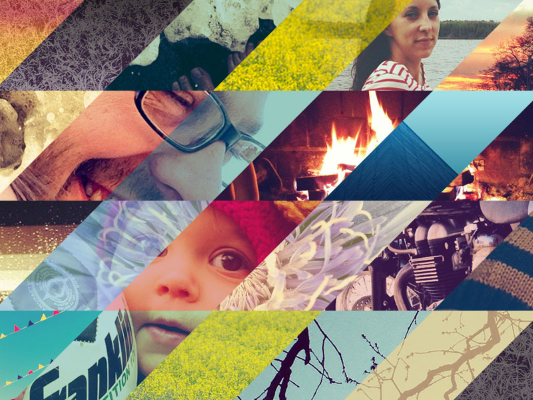
Try to use a limited number of striking visuals in your design, the ones that really capture a user’s attention:

Apple’s homepage features a huge image of the latest product. This page works because the image shows the newest products in details and provides useful information for users.
**Tip:** Try to minimize distraction and focus on meaningful elements in your images.
3. Show Real People
Human images are a very effective way to get your users engaged. When we see faces of other people it makes us feel like we are actually connecting with them, and not just use a product.
However, many sites often use purely-decorative stock photographs that rarely add value to a design and more often harm users’ experience. Such photos become a visual noise: users usually overlook them and might even get frustrated by them. When using photography, ensure that the photo is truly telling your story and reinforcing your message. A very simple rule of thumb is to use high quality photographs of people, who match your app’s or site’s character.

Left: Purely-decorative stock photo are vacuous and soulless. Right: Custom photo represents a real customer service team.
**Tips:**
- Try to avoid crowd shots — use photos that have a single main subject instead.
- Strive for images that represent genuine stories. Take photos of your people doing interesting things. If you have a product, consider ways they can interact with that product.
- For more personality than stock photos, consider using illustrations. Illustrations appeal to user’s imagination to establish a stronger personal connection with the product.
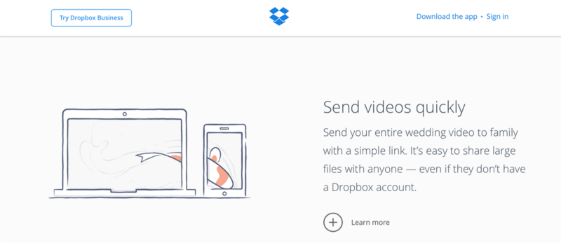
Illustration clarifies a message by boiling down concepts into easily-understood visuals. Credits: Dropbox
#4. Avoid Poor Quality Images
With high-resolution devices quickly becoming the standard, users expect to see HD visuals. Today it’s better to not show anything than to show something pixelated, over-compressed, or of a low resolution.
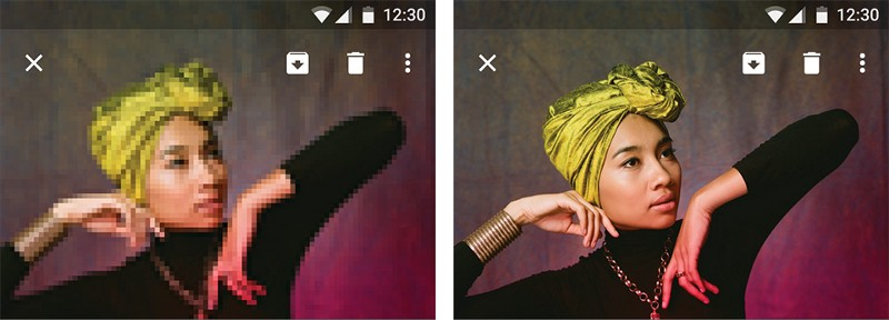
Left: Degraded imagery. Right: Correct resolution. Credits: Material Design
**Tip:** Make sure your images are appropriately sized for displays and across platforms by testing appropriate resolution sizes for specific ratios and devices.
#5. Express Personality
Apps are built to perform a function, and communicate to their users. But beyond this, apps should be engaging and fun to use. [Adding delight](http://babich.biz/delightful-experience/) to a app is a great way to make it not only more human but also make it unique, because a good overall impression isn’t just about usability, it’s also about personality.

Images are a powerful tool to capture users’ attention and communicate a message. Credits: Intercom
**Tips:**
- Use illustrations for instructions, tutorials and empty states. Even sites or apps that don’t incorporate the drawn style throughout still can use cartoons for these purposes.

Choose striking images that capture attention and express personal relevance. Credits: Emptystat.es
- Consider adding creative effects in your design. Animation can establish the connection with the users.
Animations and illustrations have always gone hand-and-hand. Credits: Mailchimp
#Conclusion
Thinking about images in terms of their usability may seem a bit odd, but I believe that these examples show just how relevant and important it is.
Imagery is more than decoration. It’s a powerful tool to help you communicate and differentiate your product.
Take the time to make sure that every part of your visual communication on your site or in your app is reinforcing your message.
Thank you!