Best Practices For Video

With increased internet speeds, videos are becoming more popular, especially considering they extend time spent on site/in app. Today video is everywhere. We’re watching it on our desktops, tablets and phones.
The old saying “a picture is worth more than thousand words” is even more true with video
When used effectively, video is one of the powerful tools available for engaging an audience — it transports more emotion and allow people to “feel” a product or service. But at the same time video can be heavy, in terms of both of megabytes and screen estate, and it should be used with extreme caution.
In this article I’ll give you a few tips on using video in your design. Part of the tips was inspired by NNGroup research on Video Usability.
1. Don’t Rely Solely on Video
You shouldn’t be overly reliant on video to convey information.
There is no standard behavior for users when they are watching video on a site/ in app. Some watch the video right away, some explore the surrounding text first, and afterwards watch the video, some have no interest in watching. As a result there is simply no guarantee that someone will watch video content when it is presented. Thus, if users aren’t able to access the content or simply don’t want to, they should have the ability to receive information in another way.
Tip: At a minimum, ensure that all essential information contained in the video is also presented as text on the site/app.
2. Use Auto-Mute
Set the audio to Off by default with the option to turn it On.
When users arrive at a page, they don’t appreciate being surprised by audio content that begins playing without their consent. Those users who don’t want to watch the video must devote extra effort to figure out how to turn the audio off or pause the video, rather than focusing on their goals. This usually annoys users.

3. Make a Good First Impression
Avoid lengthy introductions, it’s essential to start strong
The beginning of the video is the most important part. Users need to quickly be able to understand what they are watching and see its value, or they will navigate elsewhere. If you manage to make a good first impression and grab people’s attention it is likely that the user spends more time on your app or website.
4. Make Every Second Count
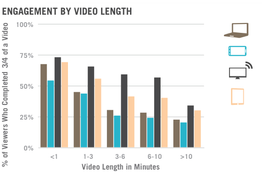
Keep videos as short as possible
Videos require more of users’ time than an equivalent piece of text, because they don’t support rapid scanning for information (users can’t effectively skim video content). Users are careful with their time and want to know how much time they need to dedicate to watch content. In the realm of video content, even a few seconds can feel lengthy to a user. Thus, try your best to keep video as short as possible.
Tip: Smaller chunks of video appeal to users more:

5. Give Users Control
Video content is helpful only if users have control over it
Users should have control over what content they watch. They should easily be able to start, stop or restart a video, as well as adjust the volume on it.

6. Don’t Forget About Accessibility
Provide and alternate way to access content.
Providing content as a video can limit access to the information contained in this format for anyone who cannot see or hear the content. For accessibility, captions and a full transcript of the video should be included.

7. Provide Next Steps
Consider what the user should do at the conclusion of a video.
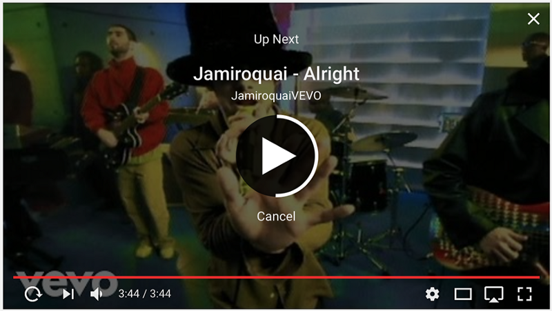
Many videos are essentially dead ends that leave the user with no clear path to additional information. Include a call to action as appropriate, or continue building the story with other information on the page, such as related video content.

Conclusion
Make the most of the video by eliminating unnecessary introductions and by improvin
g content quality to keep viewers engaged and informed.
Thank you!