Designing More Efficient Forms: Assistance and Validation

In an ideal world, users will fill the form with necessary information and finish their job successfully. In the real world, users often make mistakes. This is where form assistance and validation come into play. The goal of these actions is to explain how to fill out the form and to ensure that the user provided necessary and properly formatted information needed to successfully complete an operation.
In this article we will overview the assistance and validation and explore different validation and feedback techniques, methods and approaches.
Assistance and Help
You should never have to explain to users how to fill out a form. This might sound pretty weird, but the main point here is a very obvious— your form should be intuitive. If the form is too complicated to fill out, then redesigning it is your only option. Thus, input fields which require help should be kept to a minimum or avoided completely, especially on mobile.
1. Text to Accompany Form
Accompanying text should be used only where it really needed. As a rule of thumb, do not exceed 100 words of explanation.
Concise help text next to input fields is most useful when.
Unfamiliar Data
You ask user for the unfamiliar data (User might ask “What’s this?”)
Specific Data
People might question why you are asking for specific data (User might wonder “Why are you asking me this?”)

2. Dynamic Help
There are forms that use unique formats or have input restrictions. In such cases, the amount of help text necessary for each input field could quickly overwhelm a form, making it appear quite complex. For forms like this, it make sense to consider using dynamic contextual help.
People’s behavior can automatically trigger access to help systems and show help text only where users really need assistance. A proper way of integrating help is to show it next to the field when the user focuses on it so that it is always in context.
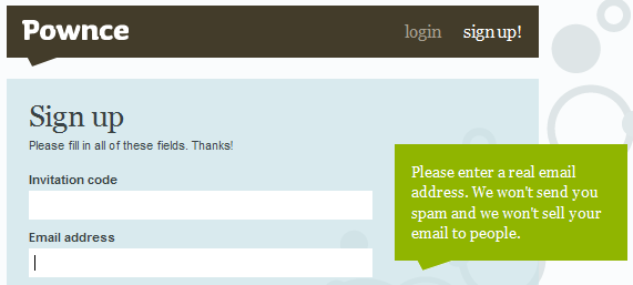
Automatic Inline Help
Automatic inline help reveal itself when a user clicks or tabs to an input field. Usually it has a strong visual connection between input fields and associated help. A potential downside of this type of dynamic help is that people are unlikely to know any help text is available until they begin to fill out the form.
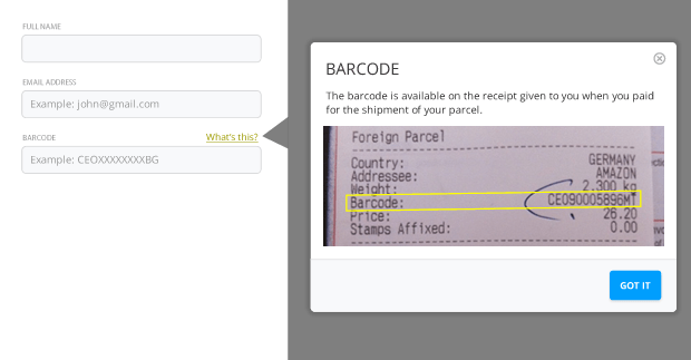
User-Activated Inline Exposure
User-activated inline help lets people explicitly access help text when they need it. This method usually use question mark icons to let the people know the help is available. A person can either click or point to these triggers to reveal relevant help text.
This approach has following benefits:
- Help is available to the users, consistently, every time they need it and at the time they need it but not unless they need it.
- Proximity of control on the form has good effect on users experience. An idea of dedicated help section or panels for complex forms wouldn’t be as close to form elements as the icon could be. In order to find that help area, user’s eye must travel to that part, learn and then return back to form elements.
- It works well for novice as well as experienced users.
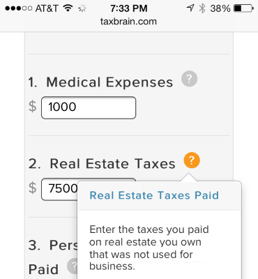
Visual Noise
Dynamic help approach has one major downside — adding help text to a form in this manner can cause content below be covered by the overlaid help text. As you see in example below, 3rd section is completely invisible for the user.

Validation and Feedback
Form validations are meant to have conversations with users and guide them through the difficult times of errors and uncertainty. The output of this process is emotional rather than technical. One of the most important, and often unloved parts of form design, is error handling. It’s human nature to make mistakes though, and your form probably isn’t exempt to human error. This is where validation plays it’s part in a user-friendly form. When done right, it can turn an ambiguous interaction into a clear one.
The primary principle of good form validation is this: “Talk to the user! Tell when them what is wrong!” Generally speaking there are four important elements that good form validation consists of:
- Right time of informing about errors (or success)
- Right place for validation output
- Right color for the message
- Clear language for your message
And all these moments have one major goal — avoid confusion.
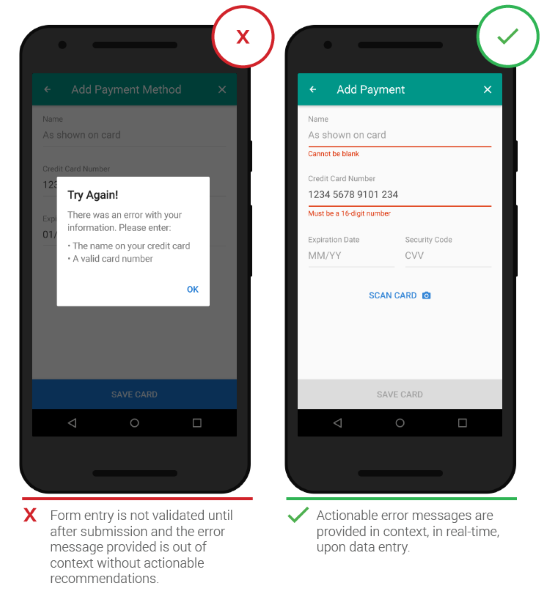
Right Time (Inline Validation)
Users dislike when they go through the process of filling out a form only to find out at submission, that they’ve made an error. The right time to inform about the success/failure of provided data is right after the user has submitted the information. Real-time inline validation immediately informs users about the correctness of provided data. This approach allows users to correct the errors they make faster without having to wait until they press the submit button to see the errors.
This validation shouldn’t only tell users what they did wrong, but it should also tell them what they’re doing right. This gives users more confidence to move through the form.

However avoid validating on each keystroke because in most cases you simply cannot validate until someone has finished typing their answer.

Clear Message (What Happened)
Speak the same language as your users. Your validation message should clearly state:
- What went wrong and possibly why.
- What’s the next step the user should take to fix the error.
And it should avoid using technical jargon. Unknown terms or phrases will increase cognitive load for the user. The rules are simple, but somehow they are very easy to ignore.
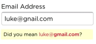
A typical error might state that “the email is invalid” without telling the customer why it’s invalid (Is it a typo? Is it occupied?). Straightforward instructions, or guidelines, make all the difference. There is no guessing for the user who receives this error, and also no confusion or frustration.

In example below you can see good example of inline validation which provides a solution for fixing a potential problem.
Even Before Validation
Password rules. Tell users what your password rules are up front, rather than making them guess and wait for validation errors.

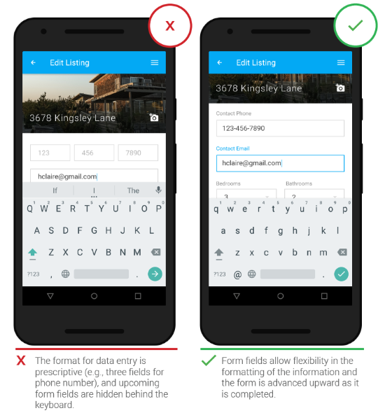
Don’t use fixed input format. The most common reason for forcing a fixed format is validation script limitation (back-end can’t determine the format it needs). Which, in most cases, is an implementation problem. Rather than forcing the format of something like a phone number during user input, you should make it possible to transform whatever the user entered into the format you want to display or store.
Conclusion
Form assistance & validation design is as tricky thing. They are tiny details that can help the user finish the form as fast and as easy as possible. No matter how boring it is for us designers and developers — we need to follow certain rules to make the form help and validation our strength rather than weakness.
Thank you!