Tabs are one of the most used components of mobile UIs. They allow users to quickly move between a small number of equally important views and bring a real world element to the web and mobile applications. When implemented correctly, tabs are considered to be an excellent user interface control that contribute towards improving usability.
In UI, metaphors are ideas or objects that are used to facilitate the familiarity between the user and the application. The use of tabs in the interface is an excellent metaphor since the general idea of tabs comes from the leafing through index cards in a drawer of a card catalog, a real world object most people have some experience with.
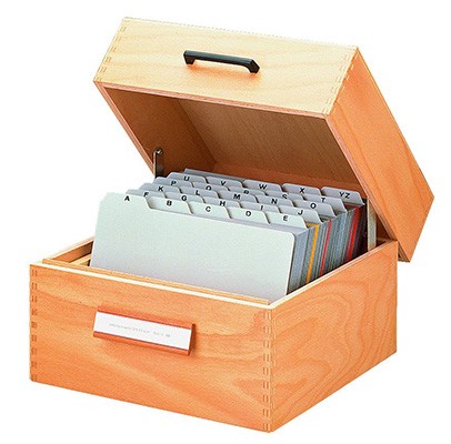
Index card box
Done right, tabs are a great convention and can:
- Make Navigation Self-Evident. Tabs as interface control is a very intuitive and easy to use. Well designed tabs clearly indicate current user’s location using visual appearance that set it apart from other tabs.
- Improve Content Organization. Tabs divide content into meaningful sections which occupies less screen space. In many cases, tabs visually connect with the content of a view. This reinforces the idea of a connection between the space and the active tab, and users can easily access the content that they are interested in.
- Add Visual Consistency. An excellent UI design is one that makes it easy for users to access the most important content quickly and with ease. To do so, it is important that your user interface design prioritizes the content that you would like to show your users in a particular manner.
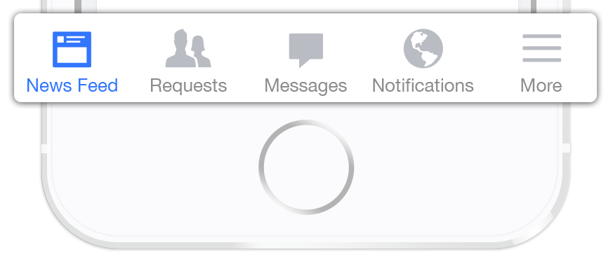
Difference Between Tabs and Navigation Bar
While the two may often share similar design, they have a strong cognitive difference. Tabs are considered to be related to each other where as Navigation Bar are not.
When users click on a navigation bar they expect to be taken to a separate view which might not be related to the current view.
Navigation Bar for iOS
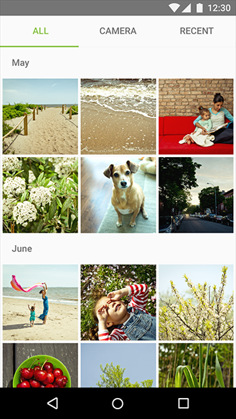
Same user for tabs, thinks that he will be in the same view but will see related data to the parent or the opened tab. He doesn’t expects to see a completely different view with no related data.
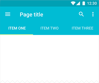
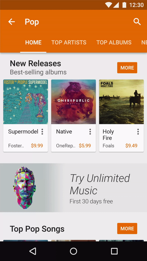
Tabs in Android application
#When to Use
##Group of Sibling Views
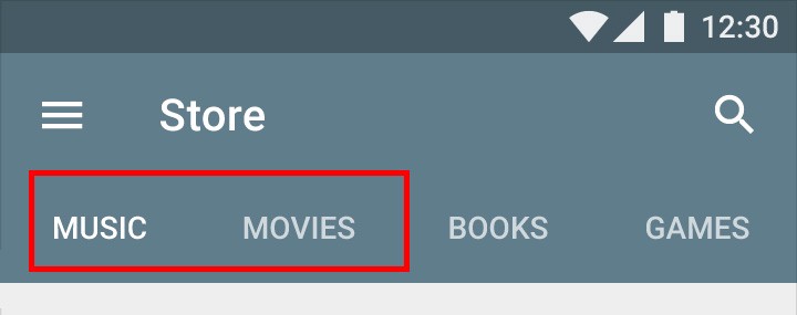
All content within a set of tabs should be related under a larger organizing principle, with each tab’s content mutually exclusive of the others’. For example, tabs can present different sections of a newspaper or different types of settings. Primary use case involves alternation between views within the same context, not to navigate to different areas. Tabs logically chunk the content so users can easily predict what they’ll find when they select a given tab.
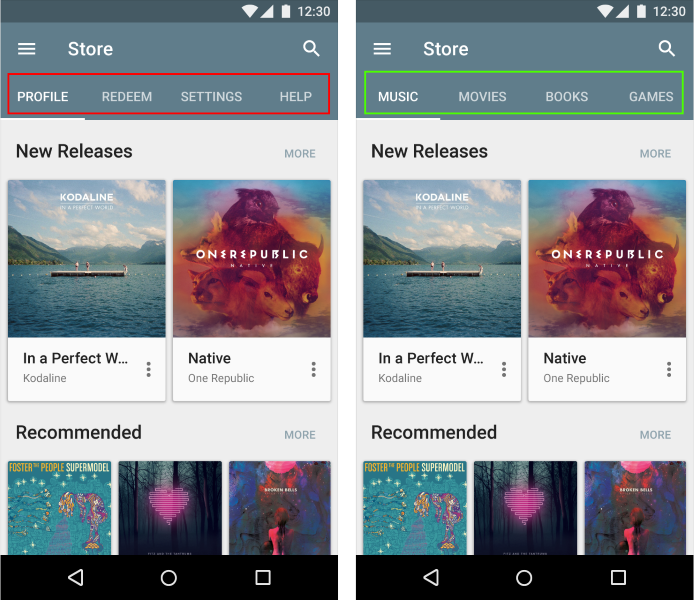
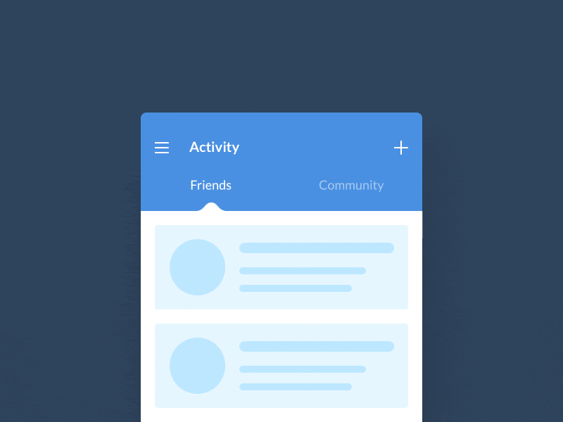
Left: The tabs switch between various destinations within the store. Right: The tabs switch between different groups of the content. Source: Material Design
##Parallel in Nature
Typically, users don’t need to simultaneously see content from multiple tabs. If your content requires people to compare the info from the different tabs, then better no to use tabs at all, because switching back and forth increases users short-term memory load and lowers usability.
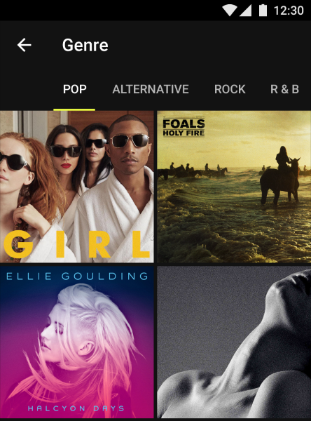
Music genres usually viewed in parallel. Source: Material Design
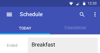
##Scope Bar or Filter
It can be useful to introduce tabs as a scope bar when there are clearly defined or typical categories in which users might want to search.
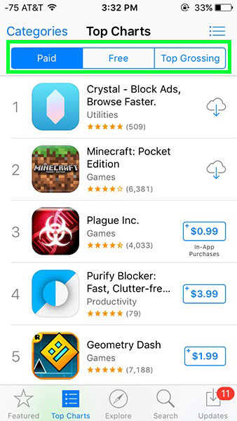
Scope Bar in iOS 9
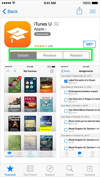
Also Tabs can be used to segregate data which are somehow related. In Apple AppStore each app’s view has Tabs with Details, Reviews and Related sub-views.
#Tab Usability Guidelines
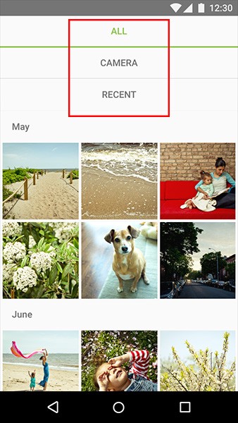
##Place Tabs on Top
The row of tabs should be on top of the view — not on the sides or the bottom. Natural hierarchy of things go from top to bottom and users scan a new screen from top to bottom. Another reason is tabs are headers and higher in information hierarchy than content on a screen.
Tabs in Android application
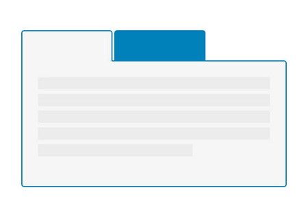
##Highlight Active Tab
Failing to indicate the current location is probably the single most common mistake to see on apps menus. “Where am I?” is one of the fundamental questions users need to answer to successfully navigate.
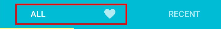
If tab is not properly highlighted (like in this example), it would be harder to tell which one was selected.
That’s why the currently selected tab should be properly highlighted with a fine color and visual cue (underlining or selection). In addition to highlighting, you can mark the current tab by a boldfaced label.
##Always Have One of the Tabs Pre-selected
If your app uses tabs one of the tabs must always be selected when the tabs are visible. There simply can not be a situation where the tabs are shown to the user but not pre-selected, because this will make your users feel lost.
##Arrange Tabs in Order
Arrange tab labels in an order that makes sense for your users: You should determine if there is an order in which your tabs should be presented so as to facilitate the use of your app. Remember, it is your user’s logic that should prevail rather than yours.
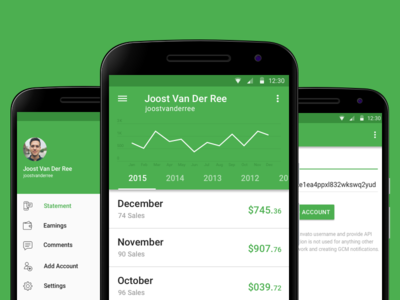
Information about sales can be ordered by years.
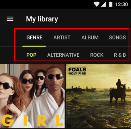
##Use Meaningful Text Labels
Tabs should be easy to scan and users should be able to understand what exactly happens when they tap on a element. Text labels should provide short and meaningfully definitions to the tabs:
- The labels should use plain language, rather than made-up terms.
- Avoid long text labels as these labels do not truncate or wrap. If you generally need longer labels, it’s a sign that the choices are too complicated for a tab control.

Truncating labels can impede comprehension. Source: Material Design
##Be Careful With Icons
Tab labels may be either all icons or all text.
Do not combine text labels with icons. Source: Material Design
It’s essential that you base your usage of an icon on its semantic meaning, not its appearance. This will help your app’s UI make sense even if the icon associated with a specific meaning changes its appearance. Usually [it’s very difficult to come up with descriptive icons](http://babich.biz/icons-as-part-of-an-awesome-user-experience/) for all the possible navigation option, so often text is much better.
Bad example: It’s really hard to read the meaning behind all these icons.
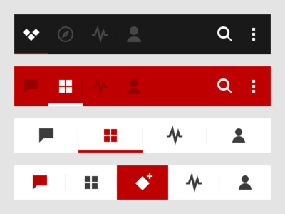
##Don’t Use Multiple Rows or Nested Tabs
*There’s should be only one row of tabs.* Multiple rows are a sure symptom of excessive complexity: if you need more tabs than will fit in a single row, you need to simplify your design.
Tabs are not presented as a single column. Image credits: Material Design
Nested tabs create jumping UI elements, which destroy spatial memory and thus make it impossible for users to track tab-content relationships (to remember which tabs they’ve already visited).
##Make Tabs Big Enough
Make targets big enough to be easily tapped. To calculate the width of each tab, divide the width of the view by the number of actions. Alternatively, you can make all tabs the width of the largest tab.
Android guideline suggest following dimensions for the tabs on mobile.
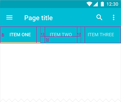
Units in density-independent pixels (dp). Source: Material Design.
##Make Unselected Tabs Visible
The unselected tabs are clearly visible and readable, reminding the user of the additional options. If the non-highlighted tabs are moved out of sight, there’s a risk that users will never click them and never discover the many hidden features.
Scrollable tabs with a subset of tabs is the only exception for this rule. But still scrollable content is less efficient, since you have to scroll once before you’re even allowed to see the option you want.
Often mobile app have more pages or sections than can fit on a mobile screen at once, and extra row of tabs or buttons wastes a lot of valuable real estate on a small mobile display.
If the screen is a scrolling feed, the tab bar can be hidden when people scrolling for new content and revealed if they start pulling down trying to get back to the top. However, you must be sure that this behavior won’t limit users actions (you should A/B test it).
Source: Dribbble
##Use Slide Animation For Transitions
To enforce the feeling that different tabs are on the same screen you should not use the default animated activity transitions between the tabs (users associate them with moving deeper into the app). The tabs are side by side and any animations used should reflect that. The best animation is sliding animation. This also encourages users to use swipe gestures to move between tabs.
Source: Dribbble
##Don’t Forget About Swipe Gesture
While tapping the tabs is OK swiping between them is even better. For swipe gesture users won’t have to reach to the top of the UI. All tabbed UIs on Android should always support swipe gesture.
Source: Dribbble
##Strive for Consistency
*Don’t remove a tab when its function is unavailable.* If you remove a tab in some cases but not in others, you make your app’s UI unstable and unpredictable. The best solution is to ensure that all tabs are enabled, but explain why a tab’s content is unavailable. For example, if the user doesn’t have any posts, the Posts tab in the Modspot app displays a screen that explains how to add one. This feature called [Empty state](http://babich.biz/empty-state-mobile-app-nice-to-have-essential/).
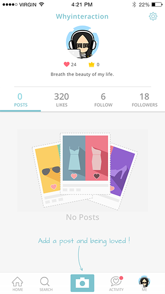
Modspot for Apple iOS
Conclusion
Tabs are great if implemented correctly. It is a relatively simple UI component but it is also very easy to get them wrong. Follow the guidelines and your app will look and function great. And a great app is one that helps users accomplish any task in the most efficient way possible.
Thank you!