Effective Writing For Your UI: Things to Avoid

Clear, accurate, and concise text makes interfaces more usable and builds trust.
Below is a list of 16 things you should avoid in your writing:
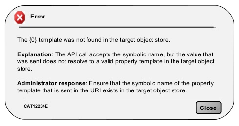
1. Jargon Words and Specific Terms
Unknown terms or phrases will increase cognitive load for the user. Do your best to avoid ‘geek speak’. A safe bet is to write for all levels of readers and pick common words that are clearly and easily understandable to both beginning and advanced users.
Below is an example of using jargon in error message:
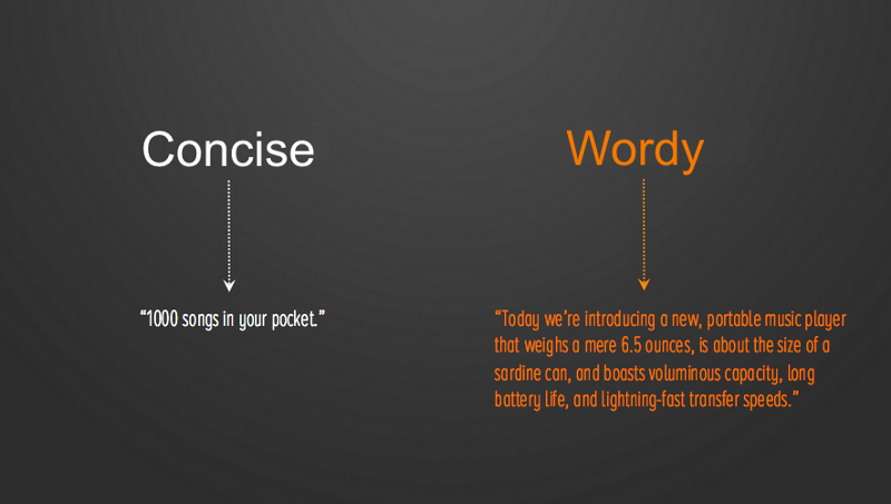
2. Long Content Sections With a Lot of Details
In most cases, it’s not necessary to describe every detail in the first interaction. It’s better to reveal increasing detail about features when the user explores them and actually needs the information.
Practical tips:
- For every message, ask yourself: does the user really need to know this?
- Write in small, scannable segments to facilitate discovery. Keep sentences under 30 words when possible.
Don’t: “Message has been sent”
Do: “Message sent”
4. Mixing “Me”/”My” With “You”/”Your”
It can cause confusion to see both forms of addressing the user in the same context.
Don’t: “Change your preferences in My Account.”
Do: “Change personal preferences in My Account.”
5. Using Words For Numbers
Save screen space — use numerals in place of words for numbers.
Don’t: “You have three messages”
Do: “You have 3 messages”
6. Pronouncing “We”
Focus on the user and what they can do with your app, rather than what you or your app is doing for the user.
Don’t: “To get you started, we’re showing you popular posts on Facebook.”
Do: “Get started with these popular posts on Facebook.”
However, there’s an exception for this rule — when a human actually does take action for a user, such as reviewing an appeal or responding to a suggestion. In such case, the use of “we” is appropriate.
Don’t: “Your appeal will be reviewed, and you will receive a response within a few days.”
Do: “We’ll review your appeal and respond within a few days.”
7. Capitalizing All Letters
All caps text — meaning text with all the letters capitalized — is fine in contexts that don’t involve reading, such as acronyms or logos. However, when your message involves reading, don’t force users to read it. As mentioned by Miles Tinker, in his landmark work, Legibility of Print, all-capital print greatly retards speed of reading in comparison with lower-case type. Also, most readers judge all capitals to be less legible. Faster reading of the lower-case print is due to the characteristic word forms furnished by this type. This permits reading by word units, while all capitals tend to be read letter by letter.
Thus, use sentence-style caps for all titles, headings, labels, menu items.
Don’t: “SEARCH SETTINGS”
Do: “Search settings”
8. Absolutes and Over-promising
Never say “never” is a great rule to follow.
Don’t: “We’ll never send you promo emails”
Do: “You’ll receive only important information”
Don’t brag — reveal what a feature does, but don’t say how great it is.
Don’t: “Amazing deals at places you’ll love”
Do: “All your savings in one place”
9. Exclamation Points
Exclamation points should be avoided as they could come across as shouting.
Don’t: “Learn about the new features of the app!”
Do: “Welcome”
10. Gender Ambiguity
English is one of the few languages that allows gender ambiguity (for example, “you can see their picture”). Most other languages must be more specific (“you can see his or her picture,” for example).
Be specific about gender whenever possible — use his, her or another names preferred or considered appropriate by the person concerned.
11. Common Introductory Phrases
Cut out the wordiness. You should use simple, direct language that is easy for users to understand. All extra or common introductory phrases such as ‘you must,’ ‘due to the fact that’, ‘in order to’ should be omitted.
Don’t: “Would you like to save your changes?”
Do: “Save changes?”
12. “Are You Sure”
This part rarely adds any value for the question and in most cases isn’t beneficial for the user.
Don’t: “Are you sure you want to delete this photo?”
Do: “Delete this photo?”
13. Culturally Specific Idioms
Culturally specific language can be difficult to translate and may be inappropriate in some contexts.
Don’t: “You really hit it out of the park!”
Do: “Great job!”
14. “OK” Button in Dialogs
A good dialog box isn’t just about asking users which action they want to do. It’s also about making each button clear. While ‘OK’ button is the standard convention for many dialogs, most apps can use a more user-friendly approach to dialog boxes. Instead of providing users the ‘OK’ button to confirm the action they want to do, it’s more efficient to give users a button that’s labeled with the specific action. This approach also reduces the likelihood of user errors, since not all users read the question or message in a dialog box.
For example, buttons for “Remove photo” dialog
Don’t: “OK|Cancel”
Do: “Remove|Cancel”
15. Vague Error Messages
Error messages are an inevitability. But you should make them a seamless part of user experience. Your error messages sound like they’ve been written for humans and in order to achieve this your messages should clearly state:
- What went wrong and possibly why.
- What’s the next step the user should take to fix the error.
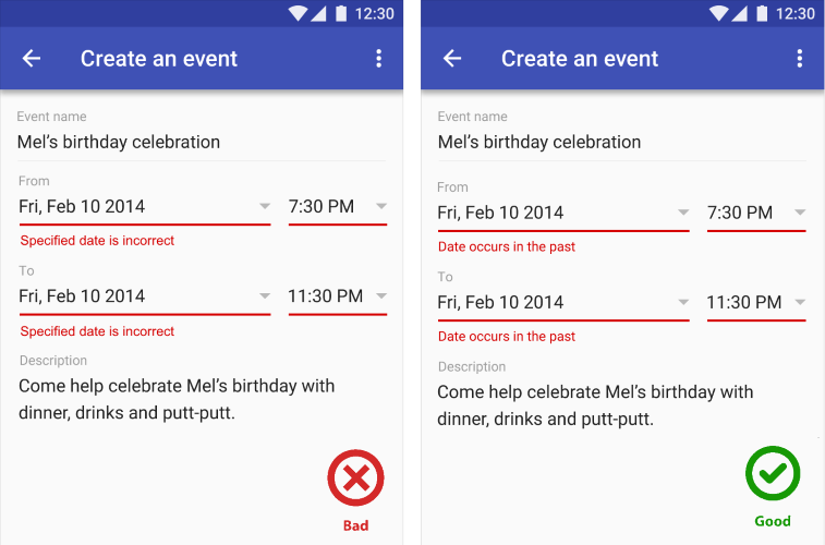
Don’t: “You’ve provided an incorrect email.”
Do: “This email address cannot be used. Please ensure that the spelling is correct.”
Conclusion
Text in your app should complement your visual UI: simple, concise, direct, and efficient. It should be understandable by anyone, anywhere, regardless of their culture or language.
Thank you!