How To Make Users Think Your App Loads Faster

When we are designing, we don’t have the means to simulate different loading speeds. So we don’t always design the uncomfortable moments when users must wait for content to display.
But internet speeds are not always guaranteed. This is especially true when an image or music is downloading. In such cases, we have to decide what to show to satisfy users and fill the gap.
Loading Spinners are Evil
Loading spinners aren’t the right way to indicate loading or thinking. Default loading icons (like the iOS spinner of gray lines radiating from a central point) tend to have negative connotations. They serve a variety of operating system functions, indicating the status of everything from device boot to problems connecting to network or loading a data. Because of that, people hate to see only a loading spinner with no indication of progress or time. Making the user stare at a loading bar or spinning wheel can increase bounce rates.
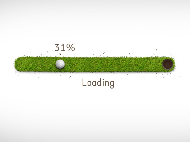
Uncertain waits are longer than known, finite waits. You should give your users a clear indication of how long they need to wait. Design for operational transparency by providing progress-UX that’s robust and meaningful. Try to make loading feel natural by using progress bars:

Progress bars tell users how long an action is taking, but they’re not always correct. You can disguise small delays in your progress bar by moving it instant and steady (fast in the beginning and slowing it down as it ends). The progress bar should never stop, otherwise users will think the app froze.
Background Operations
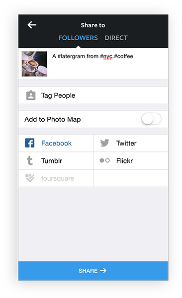
Actions which are packed into background operations have two benefits — they are invisible to the user and happen before the user actually ask for them. Give users other things to focus on as a process is going on in the background. A good example of this is uploading pictures on Instagram. As soon as the user chooses a picture to share, it starts uploading. Instagram invites the user to add title and tags as the picture uploads in the background. By the time when users’ll be ready to press a share button, upload will be completed and it’ll be possible to share their picture instantly.
Dummy Content and Placeholders
You should always try to make the wait more pleasant if you can’t shorten the line. And it’s a right time for temporary information containers. To keep users engaged, use dummy content as text and image placeholders.Here are a few tips:
- The load screen shouldn’t highlight much. It doesn’t need to be eye-catching. Facebook’s gray placeholder is a good example. It uses template elements when loading content and makes the user familiar with the overall structure of the content being loaded.

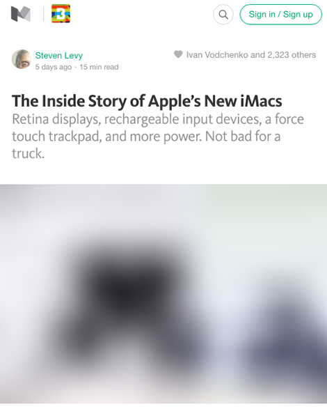
Facebook app for iOS - For a loading image you can use a placeholder filled with the predominant color of the loading image. Medium has a nice image loading effect. First, load a small blurry image, and then transition to the large image.

Medium placeholder for a loading image
Using placeholders and dummy content is no speeding-up a loading process, but in the user’s mind it feels like it is.
Distract Your Users
To ensure people don’t get bored while waiting for something to happen, offer them some distraction. This can be something fun, something unexpected or anything else that catches your users’ attention long enough for your app to load. Conclusion
Users don’t want to wait for content. But if you make it seem like they’re never waiting, they’ll always enjoy your app. Help make the user perceive that loading times are shorter than they really are.PS: There is a very good article on this topic: iOS App Performance: Instruments & beyond
Open discussion on topic is here