How to Use Animation to Improve UX

Motion tells stories. Not long and complicated stories, but simple stories, like “hey, you need to look at this now” or “hurrah, your operation has just competed successfully.” However, the goal of animations isn’t entertaining the user, but rather they are helping the user understand what’s going on or how to use your app most effectively. This idea is clearly expressed in the Zurb’s quote:
We’re no longer just designing static screens. We’re designing for how the user gets from those screens to actually view content.
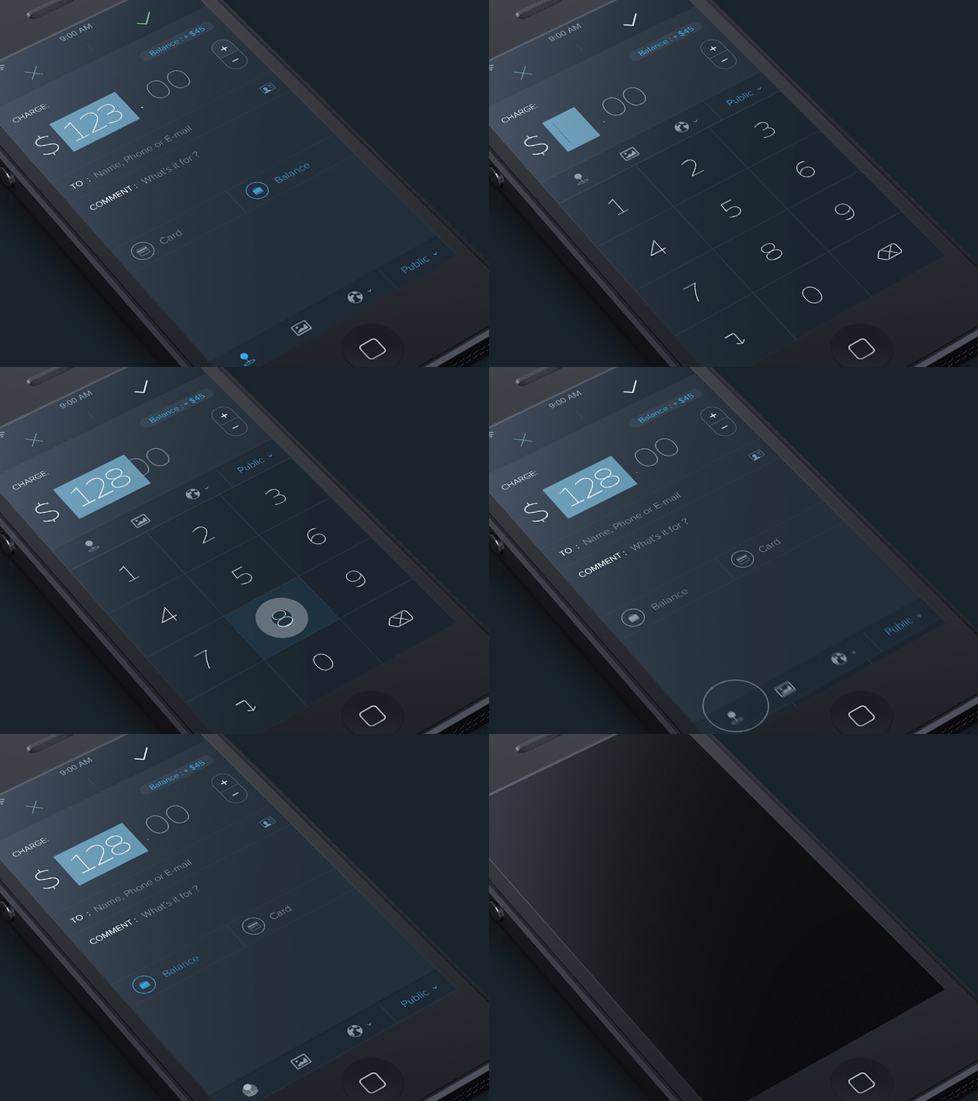
Animation may be used in a wide range of scales and contexts to unite beauty and function: it can influence behavior, communicate status, guide the users attention and help the user see the results of their actions. Here are just a few examples to illustrate places where you can add some animations in your UI to improve the experience:
Loading Doesn’t Have to Be Boring
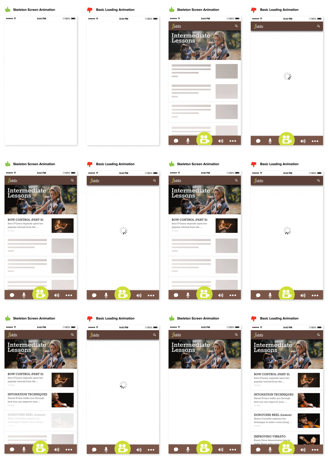
You should always try to make the wait more pleasant if you can’t shorten the line and animation can be used in replacement of an annoying spinning loading indicators (which basically just reminds reminds the user that they are waiting). Almost any site or app can utilize a skeleton screen together with a subtle animation when loading it’s content to keep users engaged.

Design State Change Without Hard Cuts
Animation can be used to make transitions more obvious, so it’s clear what happened between where the user started and ended up. A well-designed transition enables the user to clearly understand where their attention should be focused.
Adrian Zumbrunnen has a great example on how scrolling animation can help user maintain context when they click on a link. Just compare this static instant change which feels like a hard cut:

With an animated behavior:

Explain Relationships Between Elements
Animation can enhance the sense of direct manipulation.
For example, a menu icon may smoothly transition to a playback control, and back again. This effect both informs the user of the button’s function while adding an element of wonder to the interaction. Transforming the play icon into the pause also signifies that the two actions are connected, and that one cannot exist while the other is present.

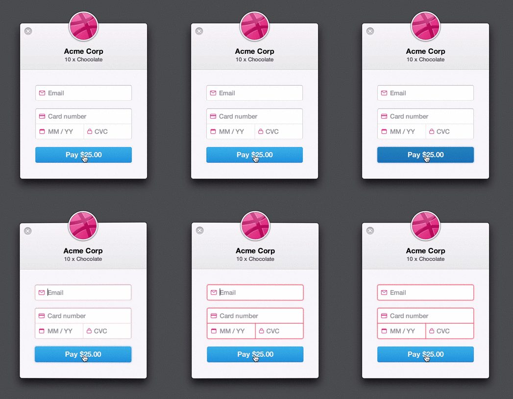
For example, form entry can be greatly enhanced with some animation. If correct data has been entered, a simple ‘nod’ animation can be introduced upon completion. Whereas a horizontal shake can be used when denying the input. When users notice such animation they instantly understand the action.

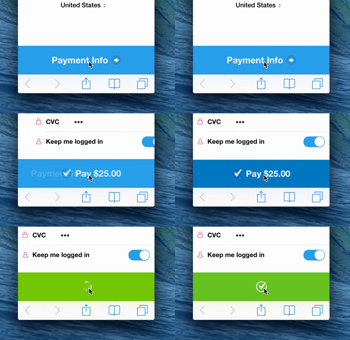
In Stripe’s example below, when the user clicks “Pay”, a spinner briefly appears before the app shows the success state. Checkmark animation makes user feel like they easily did the payment and users do appreciate such important details.

Thank you!