4 Concepts of Mobile Notifications

Today I want to talk about one of the universal tools in mobile user experience - mobile notifications. Notifications can act as reminders (e.g., when your Calendar app notifies you about an important event). They can also be excellent marking tool - notifications are a great way to get users back into an app (e.g., e-commerce apps send a push notification to share the latest offering with their users).
Product designers know that good notifications are relevant, timely and contextual.
Today I want to share a few interesting mobile notification concepts. I stress the fact that those are just concepts, not final solutions.
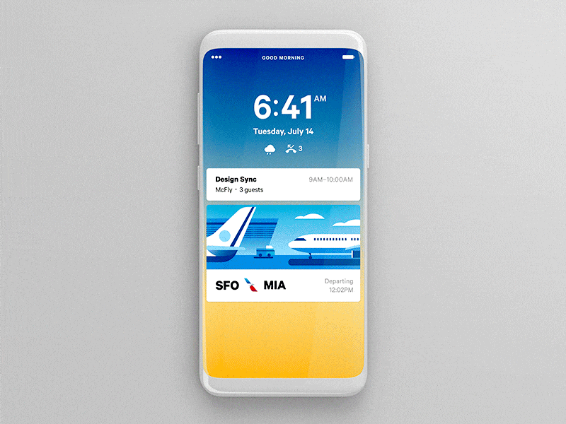
1. Lock Screen Notifications and Day schedule
Creating an efficient notification for lock screen is extremely challenging. The goal is not only to create an initial context but also provide the maximum value for users.
The concept Calendar created by Alex Sol is a clear example of how to combine push notifications and daily activities. Users can slide to day plan and see specific information about their activities. What I particularly like about this concept is the way users see an information about the flight. When all required information is available at a glance, it makes things much more comfortable for users.
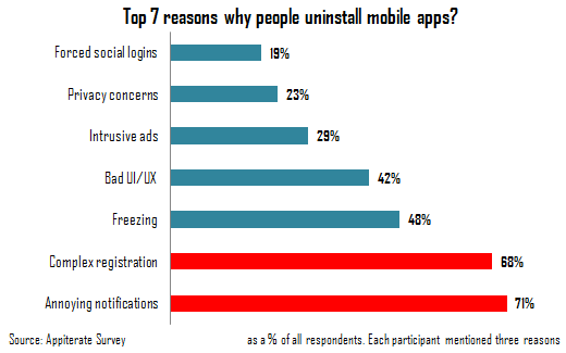
Everyday, mobile users are bombarded with useless notifications that distract us from our day-to-day activities. Impersonal, irrelevant and poorly timed, they often force us to disable notification or even delete the app.
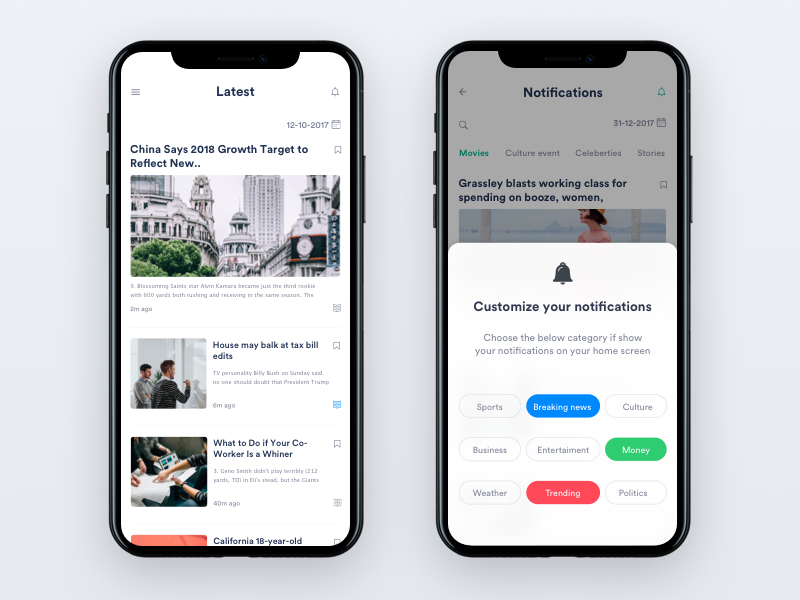
Johny vino's concept demonstrates how users can customize notification settings in a news app. When users have control of the process, they can adjust notification settings according to their needs. As a result, much better chance that users will receive the information they care about.
Here you can see Passbook Notification created by Azís Pradana. When users want to see more details, they can simply choose Show More.
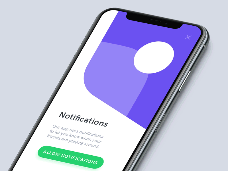
The concept created by Anton Tkachuk can be used as a foundation for permission request. The first screen is used to describe why users need to provide permissions and the second screen is actual permission request. The subtle animated transition between two screens creates a mental connection, so users will understand that a system iOS dialog is directly relevant to the information they saw previously.
Heading image: Rahul Khobragade