4 Creative Mobile Onboarding Concepts

Onboarding is a term used by UX designers to describe a process of getting users "up and running" with a site, app, or service. Successful onboarding increases the likelihood that a first-time user becomes a full-time user after adopting a product.
In this article, I want to explore four creative mobile onboarding concepts.
1. Tell a story
Mobile apps often use swipe-through tutorials or value proposition tours during the first launch. In most cases, this onboarding doesn't bring too many benefits to users. In the worst cases, such onboarding acts as a road blocker - users try to swipe it as quick as possible to start using an app.
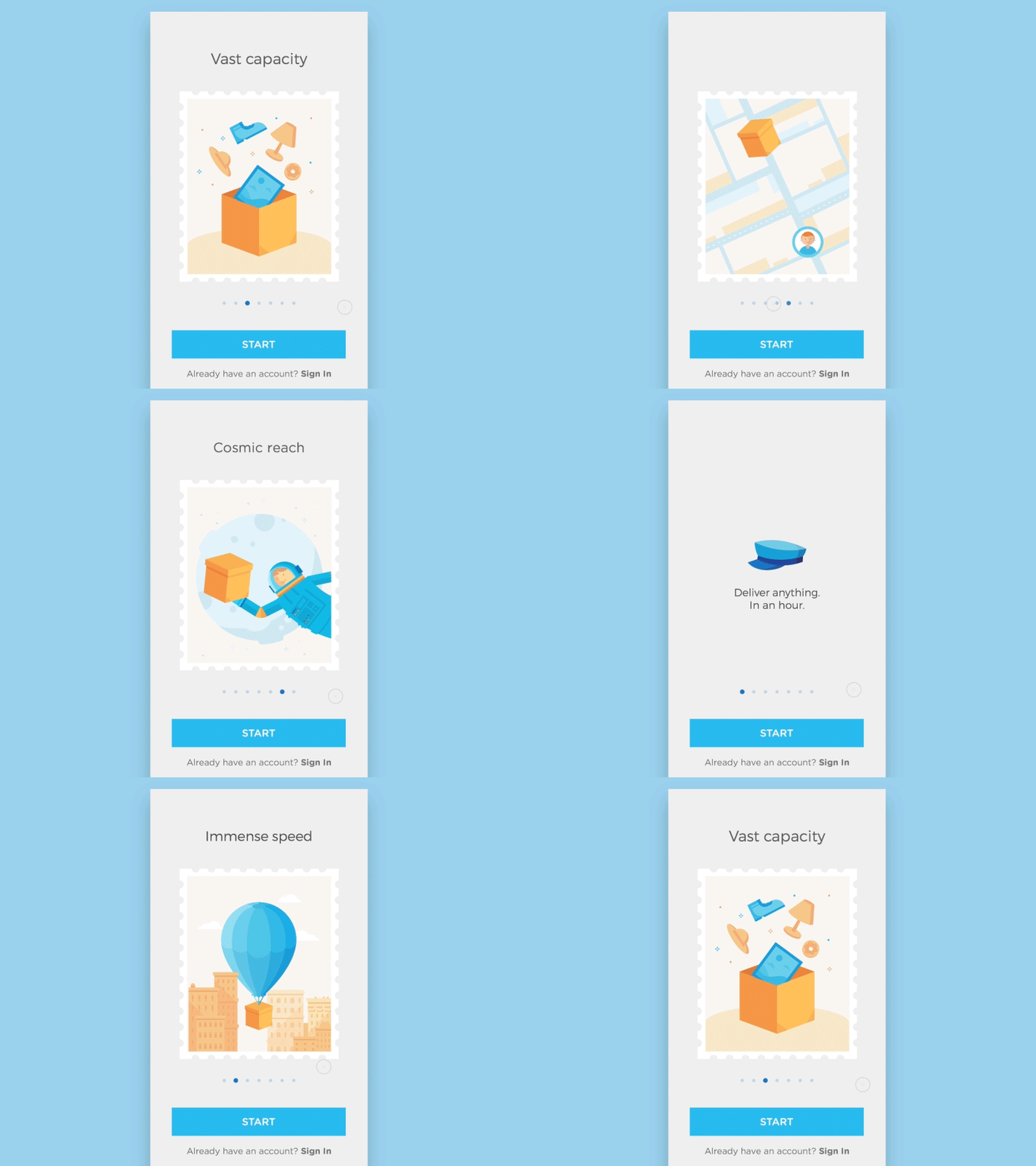
But it's possible to take such a boring concept and make it truly valuable for users. Take a look at the concept of onboarding for a delivery service which is shown below. This onboarding is an excellent example of how to tell a quick story about using a service using subtle animated effects - the box travels through screens and makes it easier for users to comprehend information.

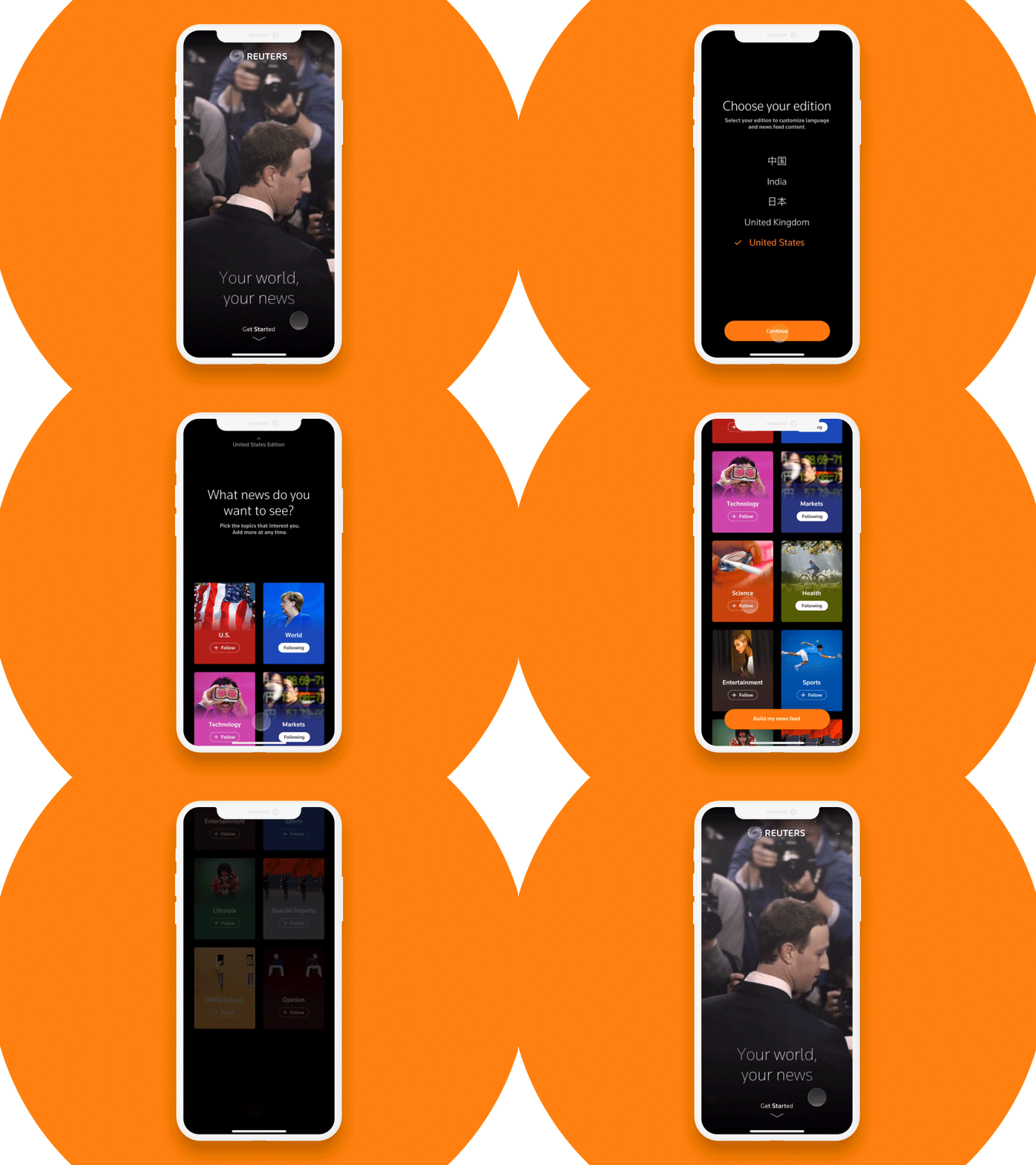
The concept of Reuters onboarding allows users to choose the news they want to see. Such onboarding creates an experience that feels personal.

3. Use device capabilities to simplify data input
Many apps request user data during onboarding. Usually, users have to fill out a form to provide the required information. But there's one serious problem with filling out a form on mobile - typing. Typing isn't the most exciting activity. In fact, typing on a small mobile screen is error-prone.
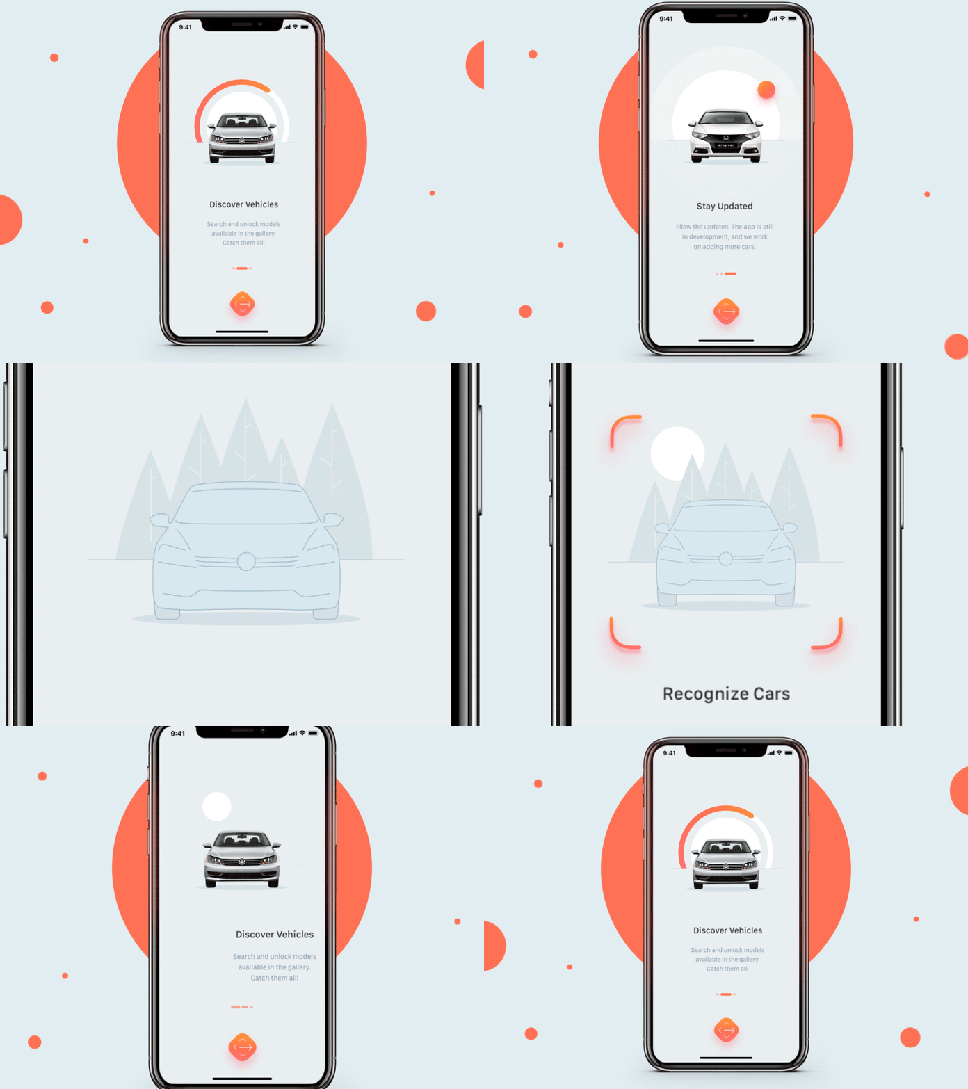
It's possible to use the power of mobile devices to simplify the procedure of data input. For example, designers can rethink the process of selecting a car make and model using device capabilities. CarLens (a concept that you can see below) uses photos that users take using a mobile camera and apply a machine learning algorithm to recognize a particular car.

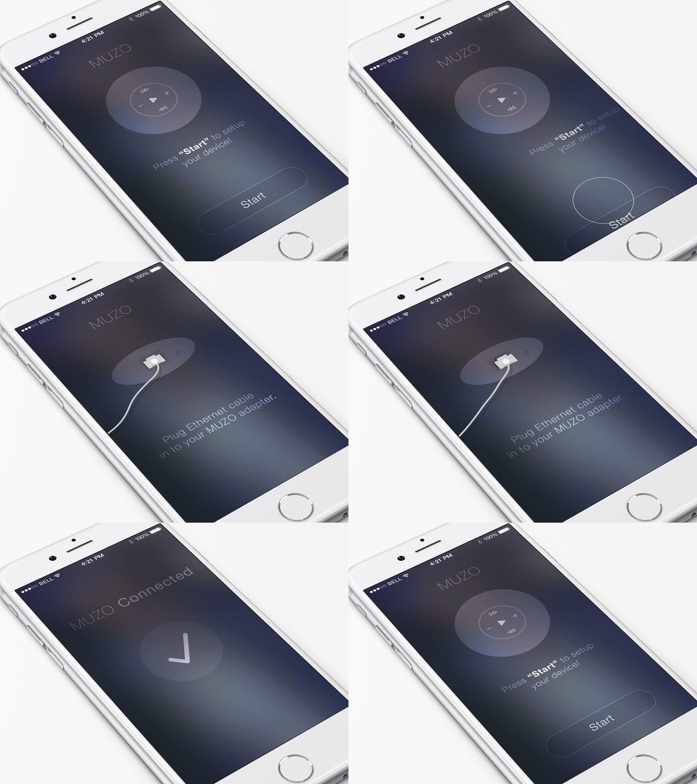
Designers can help users to solve the problem of configuration by presenting the information in a visual way. Below you can see a concept of onboarding for Cobblestone system. Cobblestone is a WiFi & HiFi music system for speakers. It uses your smartphone to control music to any speaker over WiFi. Mobile app requires some actions from the user side - users need to plug the ethernet cable to Muzo adapter. But the app makes this task much more straightforward for users because it shows what users have to do.
