Why do we install apps in the first place? To make our lives convenient. But when an app fails to fulfill this requirement, then it’s for certain that users will go elsewhere. Your app’s success is contingent on a combination of factors, but the overall mobile user experience tops them all. Great UX is what separates successful apps from unsuccessful ones
When it comes down to designing for mobile UX, sticking to best practices is a solid way to go. In this article we’ll focus on the basics that need to addressed to avoid interrupting or forcing users to think about things that should be simple.
A huge factor in making your app’s mobile UX shine is its UI. Most developers want to distribute their apps on multiple platforms. As you plan your app for multiple platforms, keep in mind that each platform has a distinct set of conventions and qualities. Design decisions that make perfect sense on one platform will look and feel misplaced in the context of a different platform.
As you build your app for Android/iOS, don’t carry over themed UI elements from other platforms and don’t mimic their specific behaviors. Because if you replicate elements from one platform to another, you risk compromising the user experience and conversion.
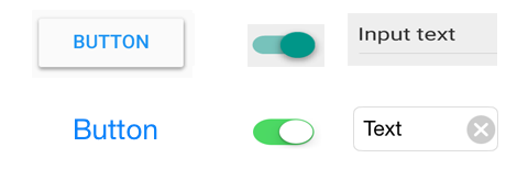
Input fields, check boxes, switches and other functional components should give a native feel. You should use the native components as much as possible, so that people know how to use them, and trust your app with their sensitive data or payment details. In the example below you can see equivalents for Android and iOS.

UI elements from Android (top) and iOS (bottom)
Compared to Material Design, iOS apps are typically flat in appearance, making no use of depth or drop shadows. iOS also has a plain text style button, but it doesn’t share Android’s uppercase styling, and is lighter in font weight.
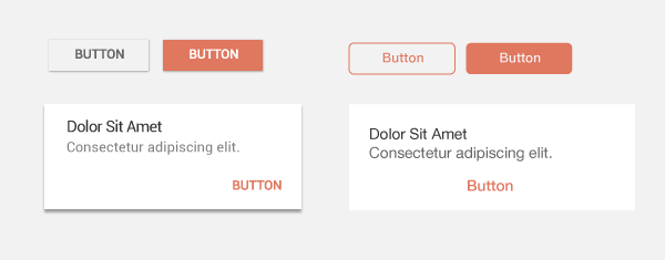
Material design for Android (left) vs. iOS (right). Image credit: tutsplus
Typeface also needs to comply with the standards of each platform: Android’s typeface is [Roboto](https://www.google.com/fonts/specimen/Roboto), while iOS uses [San Francisco](https://developer.apple.com/videos/play/wwdc2015/804/) font family.

Typography can immediately tell you if you’re dealing with an Android or an iOS app.
If you want to customize UI elements in your app, customize carefully according to your branding — and not according to the conventions of a different platform.
##Don’t Carry Over Platform-Specific Icons
Platforms typically provide sets of icons for common functionality, such as sharing, creating a new document or deleting. As you are migrating your app to another platform, you should swap out platform-specific icons with their counterparts.
Also you should pay attention for a distinct style native to each platform: Android system icons have thicker strokes, while iOS popularised line icons, with very thin strokes. Below is a quick example with several icons for comparison:

Icons for common functionality from Android (top) and iOS (bottom).
##Don’t Replicate The Web Experience To Apps
Users expect certain interaction patterns and interface elements in mobile apps. What we design on the web often feels awkward in a mobile app — not necesssary because something is wrong, but because it’s simply different from what users expect to see. Let me give you an example that will make things clear: *underlined links.* You should avoid using text with underlined links, which are part of the browser-page model, and not part of the app-view model (apps use buttons, not links).
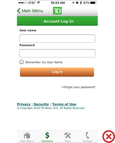
Below is an example of sign-in form from TD Bank app for iOS. It definitely feels like they design for mobile web, not mobile app. As result, they simply port over web code and wrap it as an app: links are underlined, and there’s even a copyright notice in the UI.

TB Bank app lacks the distinctive feel of an app
#User Flow
##Nothing in Your App Should Be a Dead-end
Designing a UX is designing for flow, and flow is, in most cases about moving *forward* to accomplish a goal. You should avoid creating dead-end pages in your apps, because dead-ends create confusion and lead to additional and unnecessary actions. Sometimes designers see error messages and empty states as blank canvases, but actually there’s a good opportunity to do something useful. Take this error-state screen from Spotify:
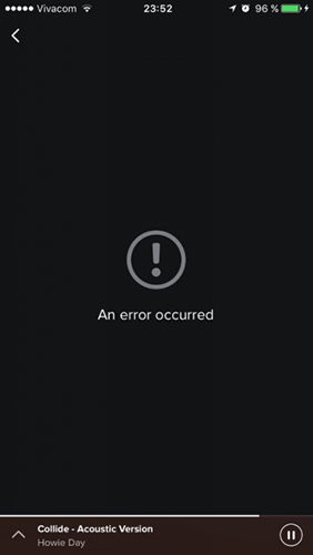
Dead-end empty state. Image credit: Spotify
It simply doesn’t help users understand the context and don’t answer the question: “What can I do about it?”
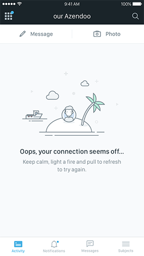
Empty state (and especially error-state) shouldn’t be a dead-end state, instead it should tell users exactly actions are required so that content can appear and the app will function as promised.

Error-state in Azendoo has a simple ‘how-to solve the problem’ instruction
##Don’t Take Users To the Browser
*Keep users in-app at all times.* If your app lacks a specific feature or content, try to use an in-app browser; but do not invoke the smartphone browser, or you will cause users to lose their track and not return to the app, which will increase abandonment and reduce conversion.
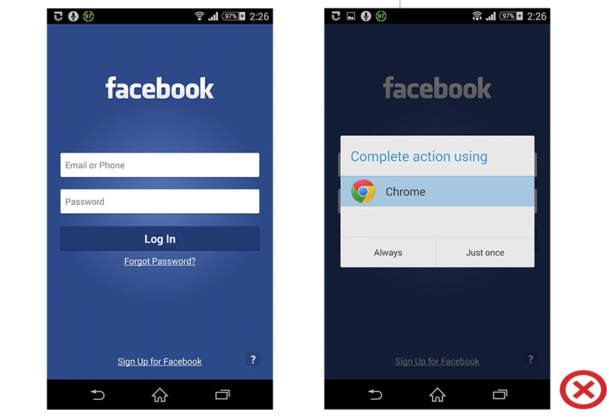
“Forgot Password?” button in Facebook app for Android
##Don’t Ask User To Rate Your App Too Soon After Downloading It
No one really wants to be interrupted, much less for something useless while they’re in the middle of something important. Avoid interrupting users by asking them to rate your app if they’ve only recently downloaded it or only used it a few times. Instead, wait until they prove to be repeat users and they’ll be more likely to rate your app and provide more informed feedback.
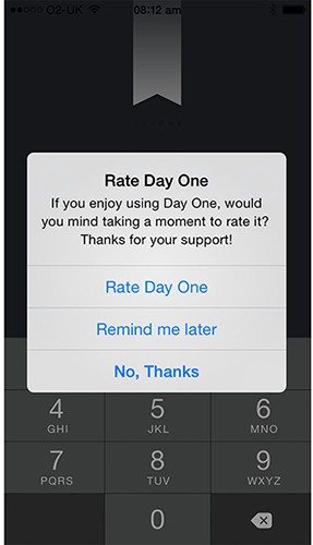
Prompting at launch is the worst possible time to ask for a review.
You can trigger the rating request after a specific number of app openings or goals have been completed. Dan Counsell has some good [insight](http://dancounsell.com/articles/prompting-for-app-reviews) on the right time to ask for feedback. Here’s what he says about [Clear](https://itunes.apple.com/en/app/clear-tasks-reminders-to-do/id493136154?mt=8), a to-do app: “Clear for iOS shows the ‘Rate app’ dialog after a few conditions have been met. First, the user must have been using the app for a few weeks. Secondly, Clear will only ask after the user has cleared the remaining tasks from a list. This is a great moment in the app; users are feeling good for having just cleared their to-do list and in most cases are just about to exit the app.”
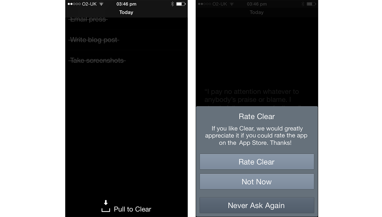
Choose the perfect moment, after a positive interaction is best.
There’s nothing wrong in asking for a review, but remember you want to give your users a great experience.
Conclusion
People expect a lot from app interfaces today, and the standards are just getting higher. You need to work hard to meet these expectations and make your app delightful, not annoying. Improving the user experience isn’t a one-time task, it’s an ongoing experience.

