Mobile UX: Great Typography Enables Clear Communication
Communication plays a vital role in design. Whether you design sites or mobile apps, your products have to clearly communicate their intent and purpose. The purpose of text on your site or in app is to establish a clear connection between the app and user and to help your users accomplish their goals. And typography plays a vital role in this interaction.
But how do you choose the right type for a site or app? Unfortunately, there are a lot of conflicting opinions out there about typography for web and mobile, and there isn’t one strict set of rules that apply in every case. However, there are several things you can do to make sure the fonts you choose for your site or app are working with you and your users, not against you.
Font Size and Line Length
The size and layout of your text can make a huge impact on the experience of reading something on screen. It takes the user much longer to process smaller text, small leading and paddings. As result, the users are skipping most of the information. This is especially true for mobile, where tiny type on a small, bright screen can be a real headache for users.
Two of the most important considerations when designing type for mobile devices are size and space. Type must be large enough to read easily and there should be enough space between lines so that text does not feel cramped in the small space.
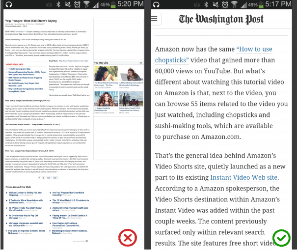
Having the right amount of characters on each line and proper font size is key to the readability of your text. If the user can’t read it, the design does not work. A good rule of thumb is to use 30–40 characters per line for mobile.
Below is an example of two sites viewed on a mobile device. The first one uses 50–75 characters per line (optimum number of characters per line for print and desktop), while the second one uses the optimal 30–40 characters.
- One says that higher contrast is better, and provide black on white combination as a prove for this statement.
- The other says too much contrast is actually harder on the eyes, because higher contrast can cause more eye fatigue over long periods of time. Thus, shade of grey is more accessible.
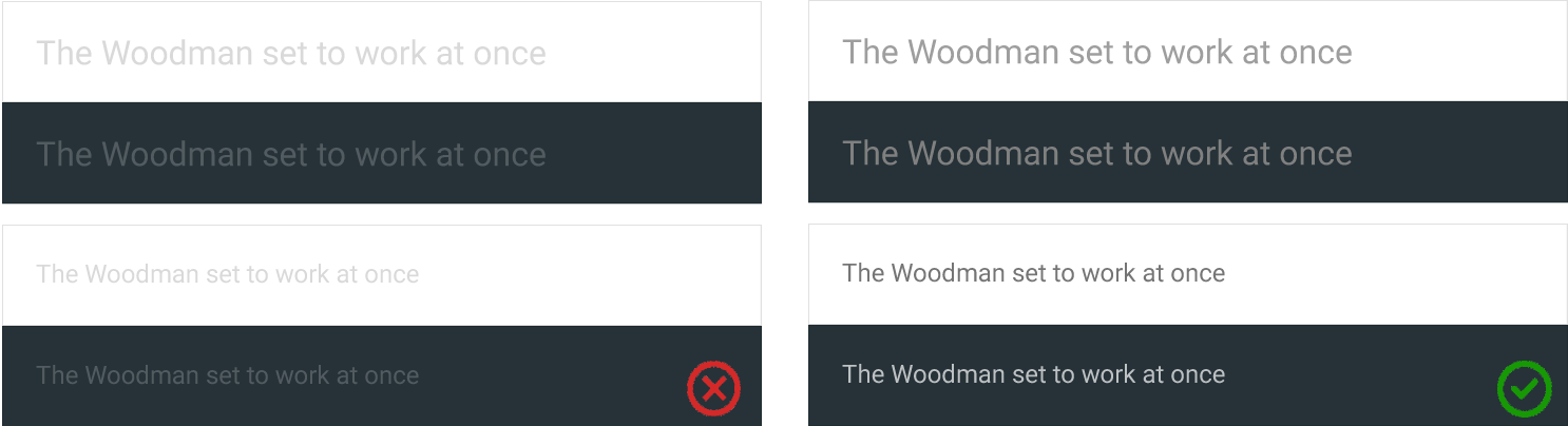
In general, the right amount of contrast is a tricky thing. Because of the variation between screens, a color contrast that seems good enough on the designer’s monitor could appear much different on the user’s screen. But it’s especially important have enough contrast on mobile: users might be outdoors with low contrast on the screen because of lighting.
- Small text should have a contrast ratio of at least 4.5:1 against its background.
- Large text (at 14 pt bold/18 pt regular and up) should have a contrast ratio of at least 3:1 against its background.
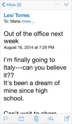
For example, when users choose a large accessibility text size, Apple Mail displays the subject and body of the message in the large size but leaves the less important text — such as the date and the recipient — in a smaller size.
- Text isn’t smaller than 11 points, even when the user chooses the extra-small text size.
- Text always uses either regular or medium weight; it doesn’t use light or bold, because light and bold weights don’t read well at small sizes.
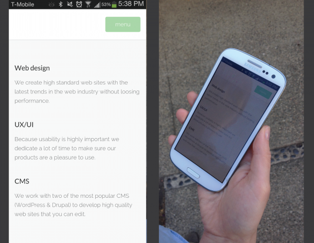
User shouldn’t see UI like on example below, where portions of content are overlapping or cut off.

If your design requires not standard typeface, consider following moments:
- Choose a typeface that works well in multiple sizes and weights to maintain readability and usability in every size.
- Choose a typeface with easily distinguishable letterforms, because many typefaces make it too easy to confuse similar letterforms. Take a look at the uppercase I and lowercase L for Lato font in example below.

"Optimizing typography is optimizing readability, accessibility, usability(!), overall graphic balance."
This statement is relevant not only for web, but for all UIs. Because text directly related to the communication, and in order to create a proper communication structure you need a solid understanding of typography. In other words: optimizing your typography also improving your UI.
Just like with any other design elements, guidelines and tips specified above are just a place to get started. Make sure to mix and match these ideas with your own for the best results. Just remember that design isn’t just for designers — it’s for users. Your type should support user goals, honoring the content in a way that never adds to the user’s cognitive load. Great typography draws the reader to the content, not to the type itself.
Thank you!