Ghost Buttons in UX Design
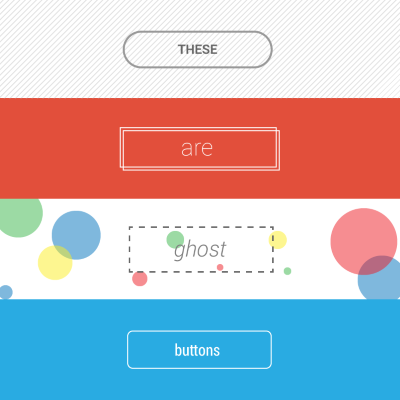
In 2014, one of the dominant design trends to pass through the UI design world has been the ghost buttons. Ghost buttons are those transparent and empty buttons that have a basic shape form, such as a rectangular or perhaps squared. They are also have titles like “empty”, “naked” or “hollow” buttons.
Ghost buttons are generally bordered by a very thin line, while the internal section consists of plain text. They most often appear as Call to Action (CTA) buttons and offer a clean look.
Ghost Button’s Origins
The first website that mentioned the term “Ghost Buttons” came from the Tumblr blog Websites with ghost buttons. The origin of the Ghost Button came from the flat design revolution and ghost buttons become trendy when Apple released iOS 7. Many of the buttons on iOS’s UI are what we would call a ghost button.
I Ain’t Afraid Of No Ghost!
Let’s now have a look at some of the positive aspects that the ghost buttons can bring to your design and user experience:
- Easy to create. Simplicity is a key reason that makes ghost-style buttons so popular. They are easy to create even for a novice designer. The most popular shape for the ghost button is a classic geometric shape (flat rectangular or oval box) with no visual decorations or animated elements.
- Create a focal point. Ghost buttons are great at keeping the eye focused on a page’s primary imagery. With properly chosen background and well-outlined contrasting border ghost button attracts attention without giving a user overwhelming impression.
- Improve aesthetics. Ghost buttons can compliment the overall clean aesthetic of the layout. They’re excellent space savers and aren’t distracting since a background image is completely viewable. The simple nature of the button allows the primary design of the page to really stand out more.
- Easy to integrate. Ghost buttons work with almost any design schema because they are transparent. They easily blend into the environment of your design.
Ghost buttons may appear alone on a page or be combined in groups. The main idea is to use a ghost button in prominent places of the page to make it noticeable for users.
Things to Consider When Designing Ghost Buttons
While ghost buttons come with a lot of design pros, there are some moments to consider as well. Before designing your app or site, make sure to weight both pros and cons to determine if this concept will work in your project.
Ghost Button as a Call-To-Action Button
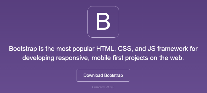
In most cases, using ghost button as a primary CTA isn’t a good idea. You can see the problem in Bootstrap example below where the ghost button Download Bootstrap looks almost the same way as their main logo.
Often it’s better to use ghost button for secondary or tertiary content, since it will not (or shouldn’t) compete with your primary CTA. You ideally want the user to see your main CTA and then if it’s not relevant skip over it to the secondary button.
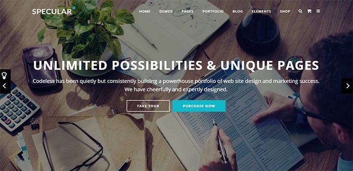
Specular site is a good example — it has a flat button as a primary ‘Purchase Now’ action and a ghost button ‘Take Tour’ as a secondary button.
Ghost Button Doesn’t Look Like a Traditional ‘Button’
Ghost buttons do break from the established design concept of ‘button’ — or even real world buttons for that matter. Sometimes just spotting a ghost one can be difficult, particularly if it hasn’t been placed wisely.
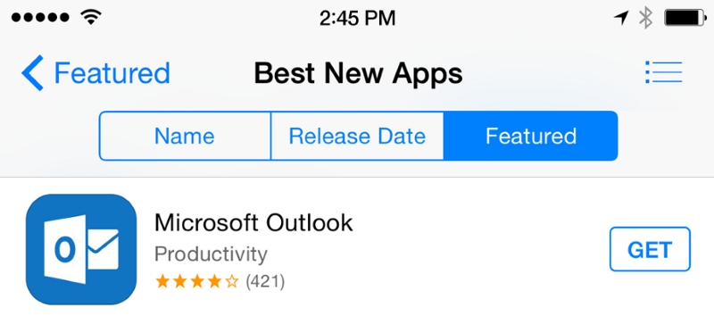
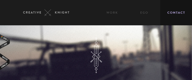
Not all users may be design savvy; many users that aren’t used to this element may not notice the ghost button or consider it’s not a clickable element. For example, can you spot a button ‘Get Access’ on the page below? It not a simple task even for savvy users.

Provide a Focused State
Offering a good visual feedback to users that they’re hovering over a button is good practice. But this moment is especially important for the ghost button, since users might be in doubt if this is a button or not.
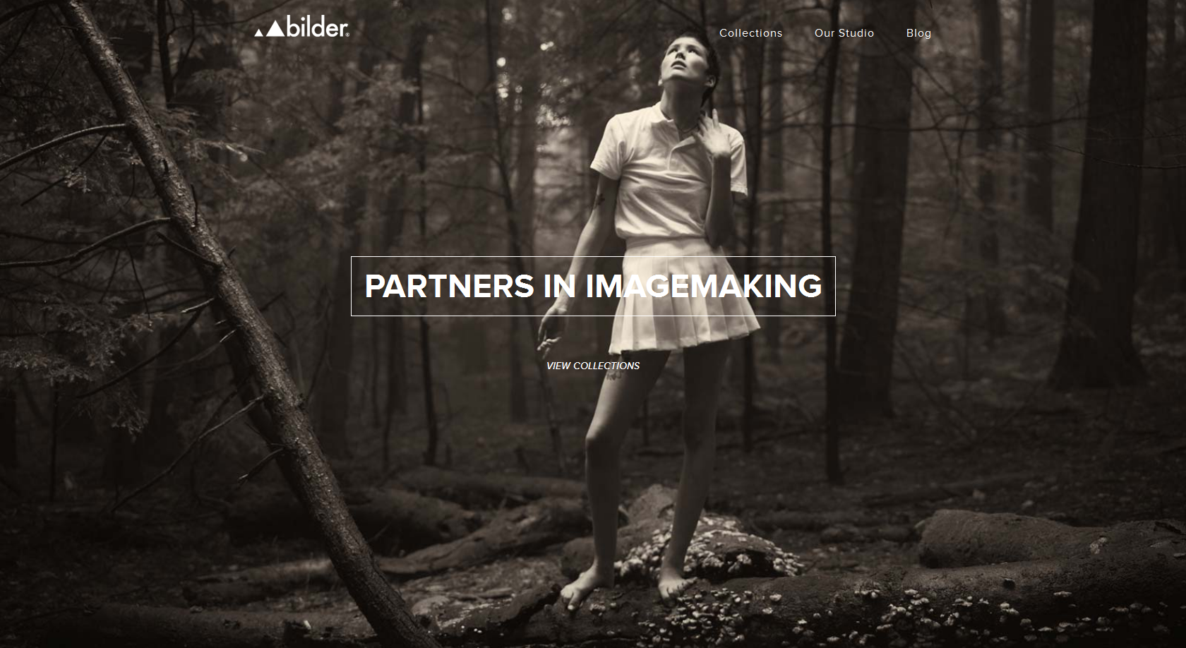
Be Careful With a Background Image
Ghost buttons can fall too far into the background and frustrate users. The transparency of ghost buttons can lead to problems of legibility. Many times there isn’t enough visual contrast when you place text in a ghost fashion over an image.
In example below, site uses a full screen photo as background. The button is CTA which invites users to click in order to discover more information about the company. But since the color chosen for the button is white, the word ‘imagemaking’ isn’t in contrast with the light dress of the girl. In result, the readability is significantly affected.
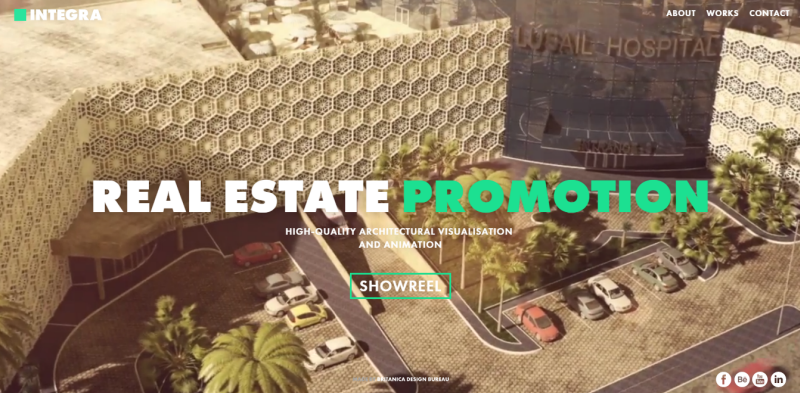
Use Meaningful Text for the Ghost Button
Ghost button text is more complicated than just ‘Click here’ or ‘Save It’. The words used in these buttons needs to be clearly thought out and placed in context with the rest of the design.
You can definitely notice this moment in Integra example where you can see a showreel of moving images behind the focused text on the homepage. And a ghost button ‘Showreel’ indeed look like it is telling you what is going on.
As a solution designers tend to add small decorations around buttons or use creative fonts (not just sans-serif) to add some personality. You can see example below.
Conclusion
Every button (classic or modern one like ghost button) is meant to direct users into taking the action you want them to take. Button UX design is always about recognition and clarity. A smooth handover keeps the conversation flowing along; glitches such as an unable to find a right button, at best, as interruptions and, at worst, as breakdowns.
For more information about button design you can read following article: Button UX Design: Best Practices, Types and States
Thank you!