A typical site or app form (or dialog box) usually has several options. In most cases users see two options — one stands for a primary to the user’s task and other, which tends to be less utilized, stands for a secondary task (e.g. allow users to retract the data they’ve entered in form or to cancel the conversation).
In this article we overview basic UX moments for action buttons and answer the most common question among designers ‘Which button should come first — ‘OK’ or ‘Cancel’).
Error Prevention
As Jakob Nielsen’s usability heuristic says: “Careful design prevents a problem from occurring in the first place.” You should try to eliminate error-prone conditions which might happen when users accidentally select a wrong option.
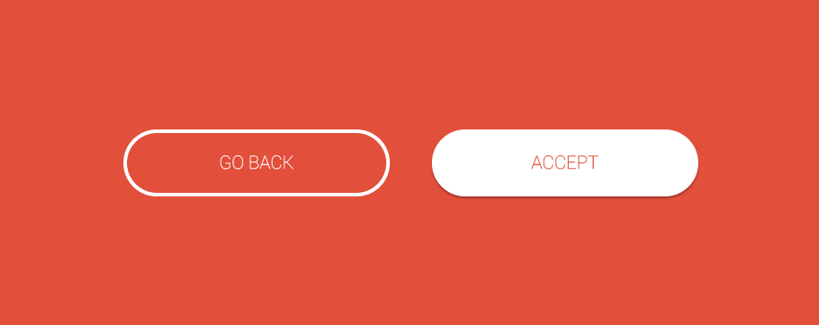
Visual weight. To make clear distinction between two options, you have to use different visual weight for buttons. The button with the strongest visual weight will get more attention.
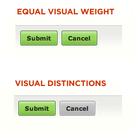
Visual distinction for ‘Submit’ button. Image credit: Lukew
**Clear and distinct label.** A good dialog box isn’t just about asking users which action they want to perform. It’s also about making each option as clear as possible. That’s why it’s so important to have a distinct label for each option. An explicit label serves as “just-in-time help,” giving users more confidence in selecting the correct action:
- It’s often better to name a button to explain what it does than to use a generic label (like “OK”).
- Use a verb whenever possible instead of ‘Yes’ or ‘OK’ because your buttons will make sense out of context with the explanatory text or title.
Below is a very good example of what not to do:
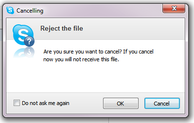
Never use ‘Yes’ or ‘OK’ when you could use a verb instead!
Here is an another example of dialog: in the first example, the dismissive action text ‘No’ answers the question, but does not suggest what will happen afterwards. A better action pair would be an explicit ‘Cancel’ and ‘Discard.’ The affirmative action text ‘Discard’ clearly indicates the outcome of the decision.
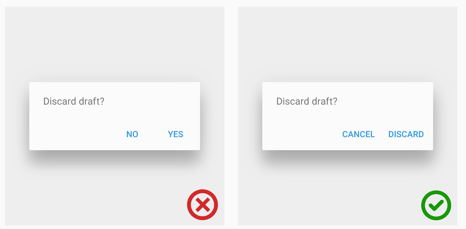
Image credit: Material Design
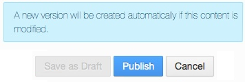
##When a Primary Action Is Positive (‘Send’ or ‘Submit’)
The primary action associated with a form needs to carry a *stronger visual weight*. Secondary actions should have the weakest visual weight, because reducing the visual prominence of secondary actions minimizes the risk for potential errors and further directs people toward a successful outcome.
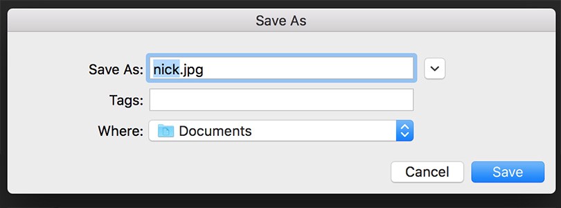
‘Save’ is a positive primary action button
##When a Primary Action is Negative (‘Replace’ or ‘Delete’ )
In this case, giving the button which stands for irreversible action more visual weight is *dangerous.* The user can choose the irreversible action as a safe option and proceed it by mistake. For example, when it comes to replacing a file, the speed of a task processing isn’t important. What’s really important is choosing the proper action so that users don’t regret their decision.
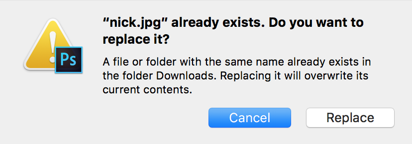
‘Cancel’ is a secondary action in this dialog but it has more visual weight
‘Delete’ and ‘Erase’ operations require additional attention. How many times have you accidentally deleted something and found that you couldn’t recover it? Often users don’t read the confirmation dialog and just push the button. But sometimes they actually read the notification, but even after that accidentally click the wrong button (‘Delete’ when they actually meant to click ‘Cancel’).
You should provide a single and obvious confirmation action the user can take without the disrupting concern for accessibility, cultural bias and decision confusion which can come from splitting the options by color alone.
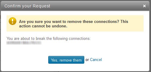
LinkedIn dialog is very clear and leaves no ambiguity
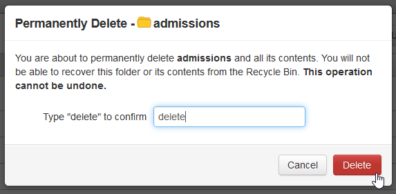
However, you should design a *fundamentally different mechanism for critical operations with a valuable user data.* Instead of using an action button that users could accidentally press, you should provide a text field and request to type the word “delete” to confirm the operation.
##Secondary Actions as Disabled Buttons
Inactive (or Disabled) buttons are useful when you need to let the users know that the action is possible. Even if button isn’t in context, the user has a chance to learn that the option is available.
You may even have a tooltip explaining the criteria for use for a disabled button
Another good use-case for a disabled button is an “emergency exit” out of a situation users may have entered. Undo options is truly one of the greatest advances in usability, because users usually prefer to use the Back button when they want to escape from an undesired state.
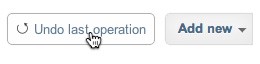
Undo is an emergency exit for undesired state
#‘OK’-’Cancel’ or ‘Cancel’-’OK’?
‘OK’/’Cancel’ button debate is very popular among designers: “Should the primary action button come before or after the secondary action button?” Actually there’s neither a significant difference in performance nor in user preference.
Apple, Google and Microsoft Guidelines
Consistency with platform conventions is the most important thing to consider when designing dialog buttons. Sadly, the Windows User Experience Guidelines differ from the Apple Human Interface Guidelines and Google Android Guidelines when it comes to the sequence of ‘OK’/’Cancel’ buttons:
Microsoft guidelines for Windows suggest following order:
- ‘OK’/[Do it]/’Yes’
- [Don’t do it]/’No’
- ‘Cancel’
So ‘Cancel’ is always on the right of OK button for Windows platform.
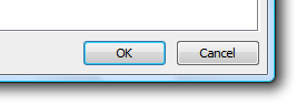
Dialog box in Microsoft Windows
Apple MacOS Guidelines says that *“A button that initiates an action is furthest to the right. The Cancel button is to the left of this button.”* So for MacOS users ‘Cancel’ is on the left of ‘OK’ button.
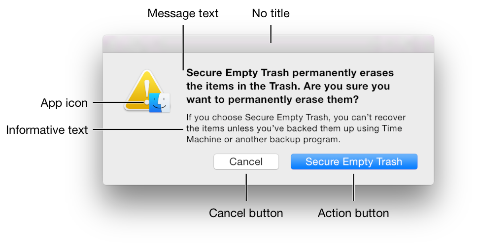
Apple MacOS dialog box. Image credit: Apple
Google Android guideline says “The dismissive action of a dialog is always on the left. Dismissive actions return to the user to the previous state.The affirmative actions are on the right. Affirmative actions continue progress toward the user goal that triggered the dialog.” And this means that for Android, ‘Cancel’ is on the left of the ‘OK’ button.
Google Android dialog box. Image credit: Material Design
If you’re designing an application for one of these platforms, your choice is pretty obvious: **Do what the platform owner tells you to do.** Why? Because applying *consistent design that follows user expectations* saves people much more time than doing something that might be a tiny bit more optimal for your app, but introduces an inconsistency. Deviate from the standard, and you’ll easily cost users several minutes (or hours if it was fatal mistake) as they overlook or misuse the button.
If you’re designing a web-based application, the decision is harder, most probably you will go with the platform preferred by most of your users. You can use web analytics to find out the most used platform for your product, but whatever button sequence you choose, it won’t be consistent for all your users due to the different OS. In this case your buttons sequence should be selected based on usability perspective. Let’s figure out very basic moments about information comprehension by users.
OK — Cancel direction supports normal reading flow and sentence structure for western culture, where we ask a question: “Do you agree with me— Yes or no?”. The positive option comes first, the negative comes second. Further, assuming users need ‘OK’ much more frequently than ‘Cancel’, it’s better to place this option first so that keyboard-driven users who tab to the buttons can get to their preferred choice with one less keystroke.
On the other hand, Cancel — OK improves the logical flow, because the dialog “ends” with its conclusion and the final element to interact with is a primary action button.
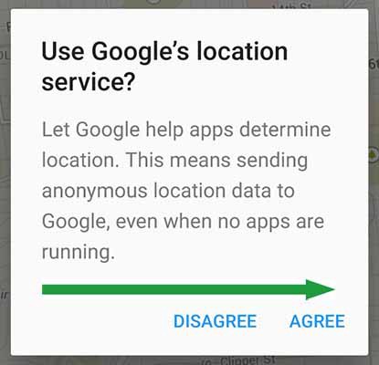
Green arrow shows the scanning direction
Either choice has good arguments in its favor, and no choice is likely to cause usability catastrophes.
Takeaway: In most cases, following platform GUI guidelines is the right things to do figure out the proper direction. But in case of web-based apps you should think which placement truly works best for your users and testing is the right way to figure it out.
Conclusion
Button is meant to direct users into taking the action you want them to take. That’s why button UX design should always be about recognition and clarity. Think of the site or app as a conversation started by a busy user. The button plays a crucial role in this conversation.
Thank you!