How to Use Images to Improve Mobile App UX

How to Use Images to Improve Mobile App UX

As the saying goes, a picture is worth a thousand words. Images can be a powerful way to capture users’ attention and differentiate your product. They are more than decoration and have the power to make or break a user experience.

The following principles and best practices can help you successfully incorporate images and bring your apps to life.

Principles

Compelling images have a unique ability to inspire and engage your audience. But not all images improves the experience, some of them just take up space or, in the worst case, confuse the user.

Relevant Images

One of the most dangerous elements in any design is imagery that conveys the wrong message. They causes confusion or leaves the user with a question about the app’s reliability or trustworthiness.

You should select images that have a strong relationship with your app goals and ensure that they are context-relevant. For example, images can convey specific information that makes comprehension easy and immediate.

Image credit: Google Material Design
**Takeaway:** When designers use the right images, they improve the users’ experience. The purpose of your app isn’t just to showcase images (unless you’re Flickr). Instead, the images you select should showcase the purpose of your app.

Bring Delight

Apps are built to perform a function, and communicate to their users. But beyond this, apps should be engaging, exciting, even fun to use. Adding delight to a app is a great way to make it not only more human but also make it unique, because a good overall impression isn’t just about usability, it’s also about personality.

Even error screen with a proper image can be funny and helpful. Image credit: Azendoo
**Takeaway:** If you already have satisfying customer experience, adding delight to your app helps create an emotional connection with users.

Don’t Overdo It

Visceral appeal is not the only requirement for a good user experience. Apps also need to deliver content and functionality to users. Adding too much focus on images in your design can be counterproductive, because they might create a visual overkill (can seriously detract users from any meaningful engagement with the content).

Getting people’s attention with attractive images certainly has value, but comes at the price of making other elements harder to see and use. You can see this effect in SoundCloud’s app main screen where the image takes all the attention and you barely notice two buttons.

Image credit: Soundcloud for Android
**Takeaway:** Most apps will do best with a balanced approach —  images that support the product, without obscuring other important content or functionality.

Best Practices

Formatting Content

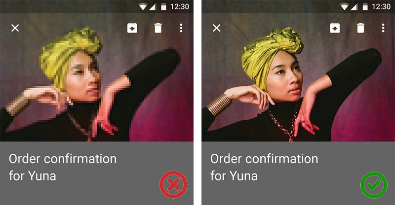
Create a layout that fits the screen of a device. Users should see primary content including images without zooming or scrolling horizontally.

Image credit: Apple
##Use Multiple Mediums Both illustration and photography can be used within the same app. Photography automatically implies a degree of specificity and should be used to showcase specific entities and stories. Illustration is effective for representing concepts and metaphors where specific photography might be alienating. ![](/content/images/2016/05/1-ZgyjIc_PIqT2o-i_lOj6ig.png)
Left: photographic representation. Right: illustration. Image credit: Google Material Design
**Takeaway:** For specific entities, look first to photographic representation. Illustration conveys approximation of content to aid comprehension when total specificity isn’t available.

Have a Point of Focus

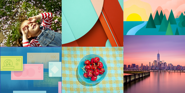
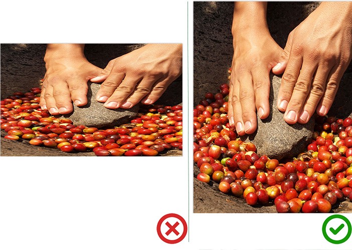
Use images as a visual communication tool and reinforce of your message. You should have an iconic point of focus in your imagery. A clear focus communicates the concept at a glance, opposite a lack of focus makes the image meaningless.

The most powerful iconic images consist of a few meaningful elements, with minimal distractions. You can also use color in order to give image a clear focus.

Left: when the point of focus is obscured, the iconic quality of the image is lost. Image credit: Google Material Design
**Takeaway:** Avoid making the user hunt for the meaning in the image. ##High Resolution Make sure your images are appropriately sized for displays and across platforms. Images shouldn’t appear pixelated so test appropriate resolution sizes for specific ratios and devices:
  • For Apple devices you can find appropriate image sizes here.
  • And here is a very detailed guide by Google for Android.
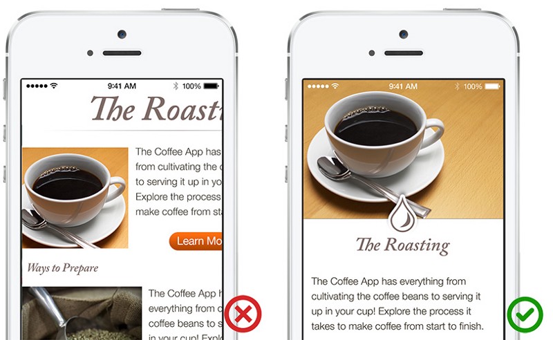
Left: Degraded imagery. Right: Correct resolution. Image credit: Google Material Design
**Takeaway:** Provide high-resolution versions of all image assets.

No Distortion

Display photos and graphics in their original aspect ratio, and don’t scale them greater than 100%. You don’t want the artwork or graphics in your app to look skewed or too large. Let users choose whether they want to zoom images in or out.

Image credit: Apple
**Takeaway:** Always display images at their intended aspect ratio to avoid distortion. ##Be Careful With Photographic Stock Usability tests show that purely decorative stock photos rarely add value to a site/app and more often harm than improve the users’ experience. That’s why for specific entities or branded content you should use specific imagery and be interpretive for more abstract content. In most cases, photographic stock and clipart is neither specific nor interpretive. ![](/content/images/2016/05/1-SYcFTHj8d47tSxhQbuRPlg.jpeg)
Left: Stock images can feel inauthentic. Right: Strive for images that represent genuine stories or related to the topic of the site/app. Image credit: Google Material Design and Popsugar
**Takeaway:** *Your images should’t be a visual noise.* They should be related to the product and hold useful for users information.

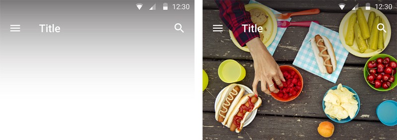
Learn the Method of Overlaying Text on Images

There are several methods to make typography legible on top of image, perhaps the easiest method is to overlay the entire image. If the original image isn’t dark enough, you can overlay the whole thing with translucent black. Here’s an example of large image with a dark overlay.

Image credit: Squarespace
While this method works great in general, it can make the image look too dark as in example below. ![](/content/images/2016/05/1-BixLf32HqKhtJz_M0qSUBw.jpeg)
The image looks too dark. Image credit: Google Material Design
For large images you should target specific areas for text protection instead of blanketing the entire image and apply text protection in the form of scrims. A scrim is a piece of photo equipment that makes light softer. Scrims are lightweight, translucent gradient layers: ![](/content/images/2016/05/1-3dxn_SudtmUbB3AMMYkakQ.png)
Image credit: Google Material Design
1. Dark end of gradient: the gradient’s opacity should be chosen based on environment. 2. Center point of gradient: 3/10ths closer the the darker end 3. End point of gradient: Opacity of 0

To avoid banding (the formation of distinct stripe shapes), the gradient should be long with the centerpoint about 3/10 towards the darker side of the gradient. This gives the gradient a natural falloff and avoids a sharp edge.

For this image the dark end is 60% black. Image credit: Google Material Design
Now let’s see how our image would look like with the use of scrim technique: ![](/content/images/2016/05/1-CWc91ot1iqyvtqx2kc-eQQ.jpeg)
Image is bright and text is legible. Image credit: Google Material Design

Conclusion

Thinking about images in terms of their usability may seem a bit odd, but I believe that these examples show just how relevant and important it is. A picture, an infographic, a screenshot, all visual communication in your design leaves a cumulative impression on the user. Using them you can create an immersive story, a sense of context, and eventually humanize your app. So take the time to make sure that every part of your visual communication in your app is reinforcing user experience.

Thank you!

Subscribe to Nick Babich

Don’t miss out on the latest issues. Sign up now to get access to the library of members-only issues.
jamie@example.com
Subscribe