4 Creative Concepts of Slider Control

Sliders have been around for a long time and became the de facto standard UI control for selecting a value or a range of values. A slider is helpful because it allows users to explore a range of options quickly.
In this article, I'm going to review a few creative concepts of this familiar UI element.
1. Visualize the output
Slider is a control that allows users to select a specific value (or range of values). All too often users get the information of what the value is all about by reading the label on a slider. At the same time, it's possible to create a much stronger effect on our users by visualizing the data connected to the slider.
"A picture is worth a thousand words"
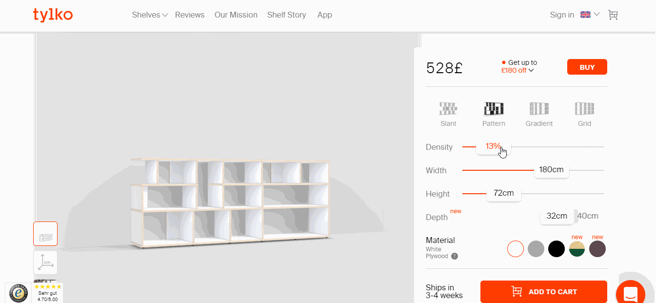
No matter what users do, whether a user selects the number of rooms in a house they want to buy:
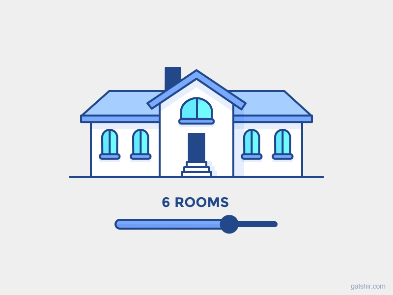
In some cases, it's almost impossible to make an informed decision without seeing the output first. On Tylko, the visual output allows users to understand what furniture will look like. It's hard to get this understanding just by reading the measurements.
2. Help users to select a value
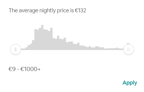
Sliders allow users to explore available options, but in some cases, users might be wonder what values they should choose.
Good user interface helps and guides the user
Sliders can aid users in making an informed decision.
One good example can be found on the Airbnb website. Airbnb pairs a price range slider with a histogram which displays the distribution of prices and the average price per night. This diagram makes it easier for users to select a filer for a price range.
3. Allow users to set a specific value
Many sliders have the same problem - it's impossible to select a precise value using a slider. Without any doubts for precise input, a slider can never beat a regular input field. That's why if your design requires a precise input, it's better to use an input field together with a slider.
SGS' housing cost calculator provides two ways of setting a value - either by using a slider or by putting a value in a relevant field. If you want to use this technique in your design it's critical to ensure that everything stays in sync: when users change the value using a slider, the value in the input box should be updated, and when a value in the input box is changed, the slider should be updated.
![]()
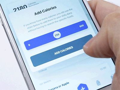
4. Solve a problem of blind spots
Slider in mobile apps often suffers from an issue of blind spots. This problem happens when a finger covers important data (selected value). The concept of the fluid slider created by Virgil Pana tries to solve a problem of a blind spot by allowing users to see the value the select right at the moment they interact with a slider.