The Hamburger Icon. To Kill or Not to Kill?
The hamburger icon — three little bars used to indicate a link to a menu. It is easily scaleable and it fits cleanly into a pixel grid. But when the hamburger icon is used in web design it indicates a significant problem.
When and why is it used?
There are new constraints that come with the new medium — smaller size screen, necessity of finger-friendly interface, loads of content with varying hierarchies, etc. Anything complex on mobile needs to be designed in a way that more complicated parts can be revealed after performing intuitive actions.
And the hamburger icon is the result of a design problem presented by trying to condense a desktop site on a mobile device. It saves us a ton of screen by shifting the menu items off the screen.
Problems
Menu Indicator?
Is the hamburger icon useable as an indication of a menu? Not exactly. Usability tests have proved inconclusive results. It’s universally accepted that users do not recognize the hamburger icon as a single link. But if a web site is geared towards an older demographic, a hamburger is almost unknown icon to that age group.
Unfortunately, the hamburger menu has horrible usability for desktop use. Out of sight is out of mind, and the lack of persistent global navigation is a disaster on the desktop. Also using the hamburger icon on desktop version of the site where there is more then enough room for at “normal” navigation is a sign that some designer completely misunderstood the mobile-first approach.

Extra Action
Apart from the design of the icon itself, the approach to using a hamburger icon is also problematic. The hamburger icon adds an extra action to your navigation; reaching a particular page usually takes at least two clicks (one click on menu icon and the other — to the target page).
Hides Navigation
The hamburger icon hides context. It hides the current state of your site and user don’t know his position in it.
Hides Content and Options
The hamburger icon also conceals content. From a UX point of view, users shouldn’t have to take an action in order to find out what actions they can take.
Solution
The hamburger icon tends to be used because designers aren’t fully committed to a mobile-first approach. Designers tend to create a website, which should look good both on laptop’s screen and mobile device. But in order to solve the hamburger icon problems, we have to rework our view.
Site as Application
As Christian Heilmann said, “The use case of an application is always to DO something with it”. The same is true of sites. Let’s see what we can do:
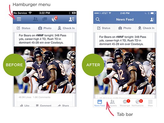
Add a Tab bar
When critical parts of an application are made more visible, usage of them can increase. Facebook’s app famously swapped their hamburger icon for a tab bar, and as a result saw improved conversions.
Make It Simple — is only one right way to solve the problem
Good apps are highly focussed. So if you have one complex application or site you can split it’s functions between two (or more) simple apps. Facebook released their Messenger app in order to solve this problem of complexity. The reduced functionality results in a reduced set of menu options, and less need for a hamburger menu.

Example
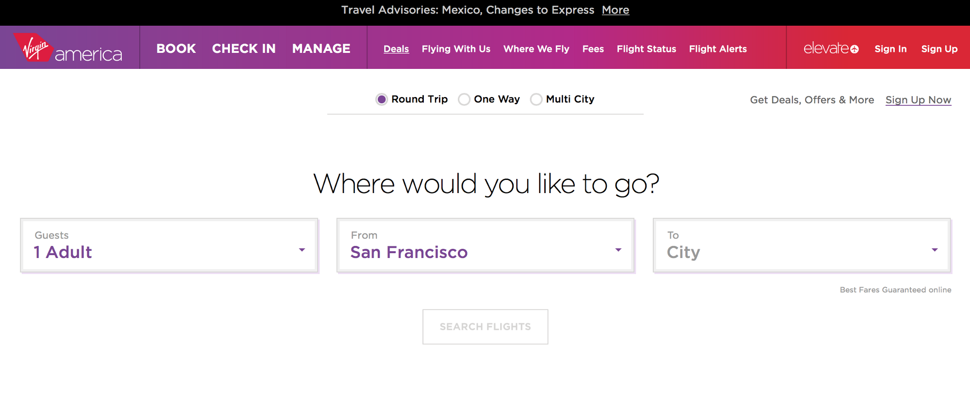
Virgin America is a good example. New website represents the first significant improvement to the airline websites user experience in years. Luanne Calvert, CMO at Virgin America, said “Our new website, like our plane cabins and most other aspects of the Virgin America experience, was created by listening to what travelers liked and didn’t like. The goal of the redesign was to better reflect their needs and how people book and manage travel today.”
Conclusion
We shouldn’t kill the Hamburger Icon. But in order to create an app-style experience we need to simplify our sites. If necessary, break our architecture down into manageable mini- or even micro sites. When we present users with a simple set of options, the problem of a hamburger icon never arises.
Of course not every site can be stripped to the couple of things that can be fitted into a “mobile” navigation. The hamburger menu works because it has become an understandable standard that maximizes the available real estate.
But if we fully embrace a mobile-first approach together with simplification, apply them to design, to content and to architecture, then it helps us to solve the root cause of the problem.