Tooltips in UI Design

Tooltips help users understand unknown or unfamiliar objects that aren’t described directly in the user interface. They are a powerful way to simplify a UI — provide information users need when they need it, with minimal effort on their part, and help app developers use screen space more effectively (reduce screen clutter).
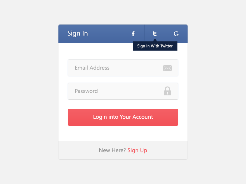
However, poorly designed tips can be annoying, distracting, unhelpful, overwhelming, or in the way.
How It Works
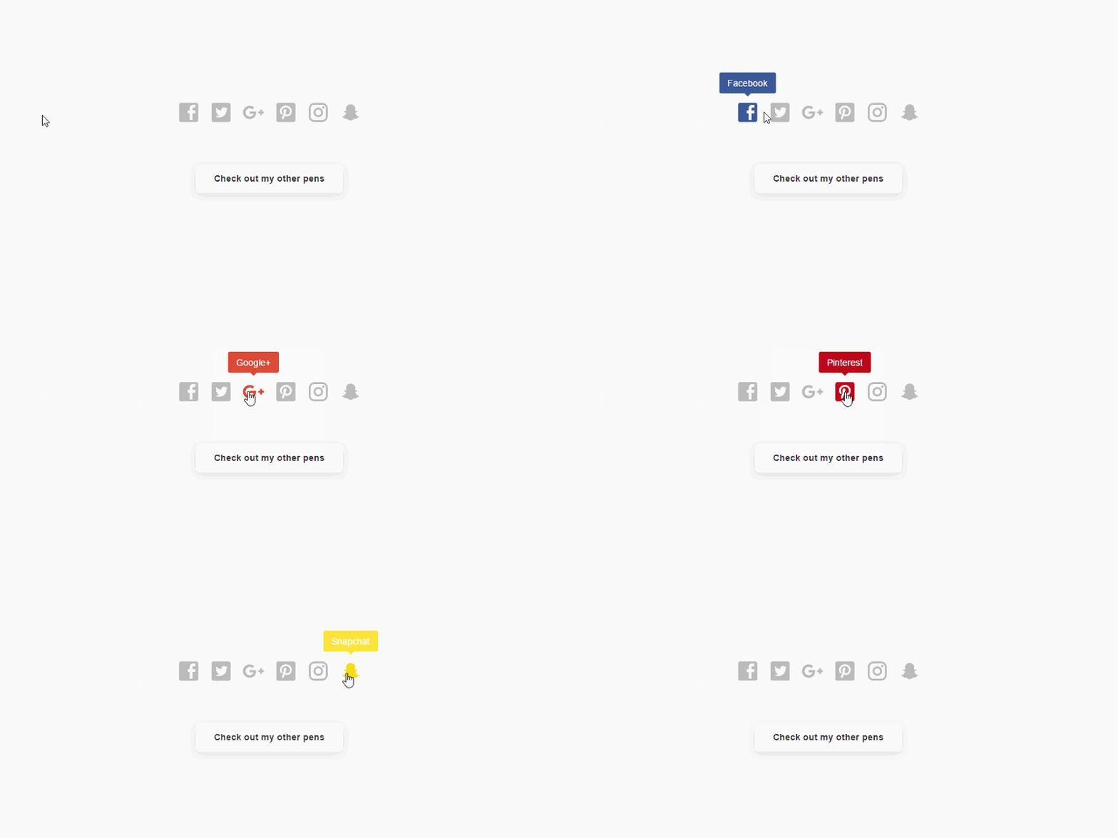
Tooltips are displayed automatically when users hover the pointer over an object, and removed when users click the control or move the mouse, or when the tip times out.
To Tooltip or Not To Tooltip
When To Use Tooltip
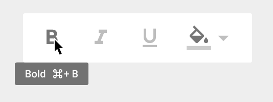
- Control doesn’t have a text label. If a button, label, or icon has little to no descriptive text or needs some short explanation, then a tooltip works well for this — toolbar controls and command buttons with graphic labels should have tooltips.
- Control benefits from a supplemental description or further information. Tooltips can be a form of progressive disclosure controls, eliminating the need always to have descriptive text on screen. However, the text must be supplemental — that is, not essential to the primary tasks. If it’s essential, put it directly in the UI so that users don’t have to discover or hunt for it.
- Rarely used features or features that can be interpreted differently. Tooltips work good for rarely used features users tend to forget about and context-specific features.
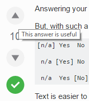
Also you shouldn’t use tooltips in following situations:
- When users need to interact with the tip’s content. Users can’t interact with tip’s content because moving the mouse makes them disappear.
- When users run your app or site on a mobile device. Because tooltips fails to translate well on touch devices. Yes, you can design tooltip to be activated upon touch, but it’s not the most predictable interaction for your users. If you need more information for a certain control use a dotted underline to make it clear that the user can interact with the work but to set it apart from a link.

Good Tooltip Design
Good tooltip has following properties:
Easily discoverable
The problem with tooltips is that they lack of visual clues —there’s simply no visual clue, such as pointer change, that indicates that an object has a tooltip. But users still have to know that an object has a tip, either through past experience or by experimentation.
You can improve discoverability by using tips consistently, which in turn fosters predictability. If you provide tips for some objects, you should provide them for all similar objects for which users are likely to want supplemental information. Sometimes doing so can be challenging, because you must also make sure that the tips are helpful and not obvious.
Provides appropriate information
Good tooltip contains concise and helpful information:
- The pop-up windows used by tips are perfect for short sentences and sentence fragments, as well as formatted text.
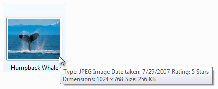
- Tip text must be informative. It shouldn’t be obvious or just repeat what is already on the screen. If the text you use in a tooltip is a redundant rehash of the label, then it’s pointless.
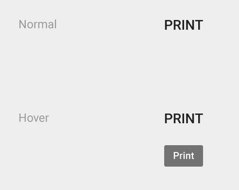
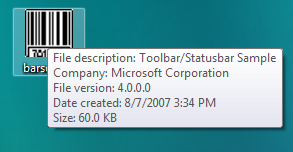
However, there’s exception for this rule — notification area icons. These icons communicate status, and there is no other screen space available for status text.

