UX Design: Drop-Downs in Forms
Select, or drop-down, menus can be great when used correctly — they conserve screen space and prevent users from entering erroneous data, since they only show legal choices. They come with a lot of nice features, such as grouping options, keyboard navigation and reliable rendering across platforms. And designers employ them for a variety of different purposes, including form fill-in, which lets users select an option to enter into a form field.

It’s a well known fact that people don’t like filling in forms. And the longer or more complicated a process seems to be, the less likely users are going to go thought — especially on small screens with imprecise inputs (like our thumbs). And the element that’s often makes this process even worse is the select menu.
Select Menu and a Number of Options
Sometimes you’ll find a select menu with 2 options and sometimes with more than 20 options. In both cases, the select menu is used wrong.
Too Many Options
When select menu grows larger than 15 options they become difficult to scan and navigate. Huge drop-down lists can be real nightmare for your users, because they will have to start scrolling inside the list and, since they hide the part of options from the screen, it creates a painful user experience and slow down overall process.
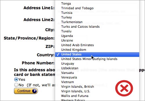
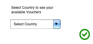
A good illustration of this is a country-selector with more than 100 options. It’s simply impossible for the user to get a good overview and there’s no quick and easy way to find the option you’re looking for. I often find myself struggling to select United States: due to ‘popularity reasons’ United States is often found at the top of country list, other times Afghanistan tops the list due to alphabetical sorting and United States is far down the list, just after United Arab Emirates. So usually the first thing I need to do is to figure out the sorting logic.
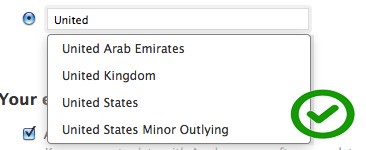
In cases the users know what they are looking for, consider using a text field with auto-complete functionality instead of select menu. Country-selectors are a good candidate for this solution. Also, from a programmatic standpoint, you could try to auto-detect their location and have your best guess selected for them.
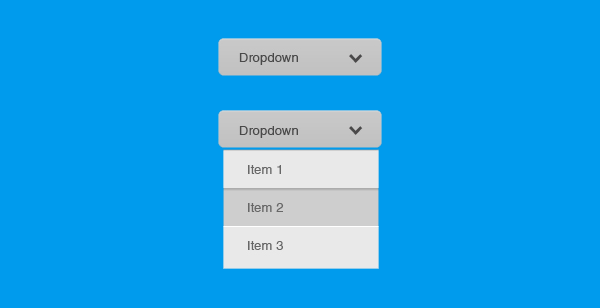
Too Few Options
When select menu has less than 7 options it suffers from a lack of up-front information. The user has to click in order to see the available options.
In this case you should use radio buttons. Your users will be able immediately scan how many options they have and what each of those options are, without clicking (or typing) anything to reveal this information.

Takeaway: If your list of options has less than 7 options, consider using radio buttons.
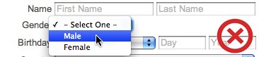
Select Menu and Labels
Like other form inputs, a select menu should always have a label next to it (W3C standard). However, you should also have a meaningful label (not generic ones like “None” or “Please select”) inside the select menu that tells users what exactly they’re selecting. The label should clear and distinct in order to fully describe the group of options.
Why? Because you’re likely to introduce errors because people go through forms quickly — don’t assume they will take the time to parse through all the choices and may accidentally miss something that already has a value. In most cases, it’s safer for users to show an error message for not selecting an option than to submit the form with the wrong option.
Select Menu and Mobile Devices
As Josh Brewer once said “Mobile is a magnifying glass for your usability problems.” Select menu isn’t totally bad element on a desktop browser, but on mobile the pain grows and the contextual relations are easily blurred.
Mobile devices have very limited screen real estate, which means users have even less page context when scrolling, and actually finding the option they’re looking for takes longer. And still too often designers use select menus for inputs in mobile forms when simpler or more appropriate controls would work better.
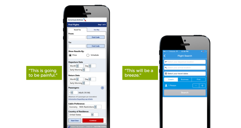
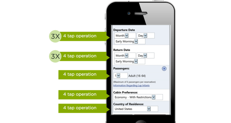
Interacting with select menus on mobile and the desktop is a multi-step process often requiring more effort than necessary. Here is the number of actions required to complete the form with drop-down menus from previous example.
Problem #2: Screen Estate
Select menu UI interaction makes bad use of screen estate on mobile devices. On an iPhone with iOS 9 the select menu takes up almost 50% of the screen space and this simultaneously limits gesture space to the same 50%.

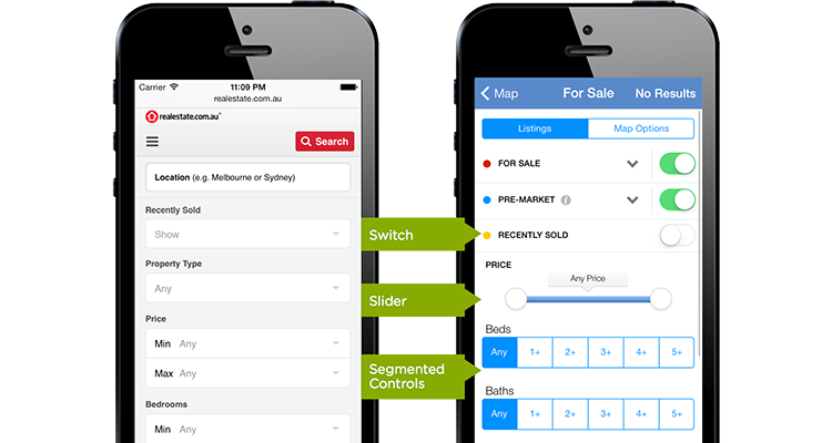
- Radio groups, or segmented controls, are a set of closely related, but mutually exclusive choices (e.g. select a region).

- Steppers can be used to increase or decrease value by a constant amount and are great for making small adjustments (e.g. select the number of passengers).

- Switches support two simple, diametrically opposed choices.

- Sliders allow you to select fine-grained values from an allowed range.

When starting with a drop-down heavy form, look at each question and consider if any of these controls is a more appropriate way of getting an answer.
But what is most important — you should try to simplify the form by removing all unnecessary inputs. In some cases multiple select menus can be condensed into one input control. This solution decreases the cognitive load on the user significantly.
Conclusion
Select menus have a lot of problems — they are hard to navigate, hide options by default and only enable selection not editing. But still this doesn’t mean you should never use them in a user interface design. Bad user experience usually happens when designers don’t know how and when to use this element.
What is the main difference between poorly-designed and well-designed forms? Well-designed forms should make use of the most appropriate input control for each question they ask. Sometimes that’s a radio group, an auto-complete field or even a select menu.
Thank you!