Website hero section: 6 design best practices
The first impression is crucial. It can make or break an opportunity to engage visitors. When it comes to web design, the hero section has a tremendous impact on user experience. A good hero section design can maximize the chances that the users will scroll for more information.
Today I will discuss 6 tips to help you design a better hero section.
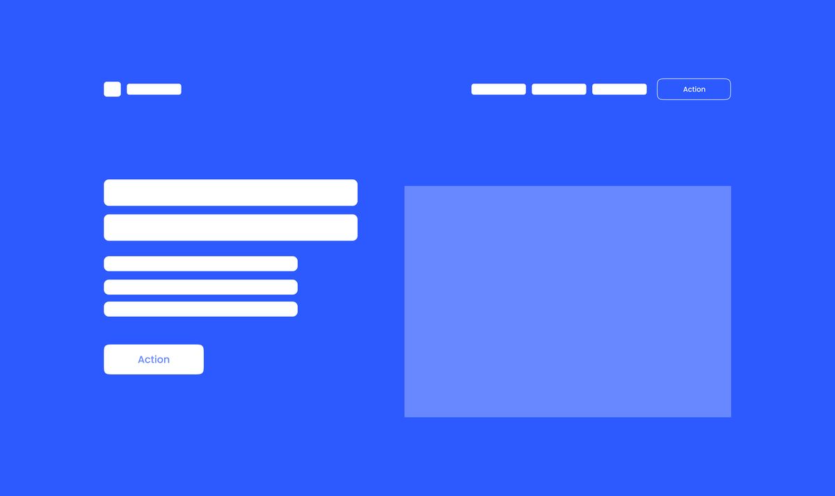
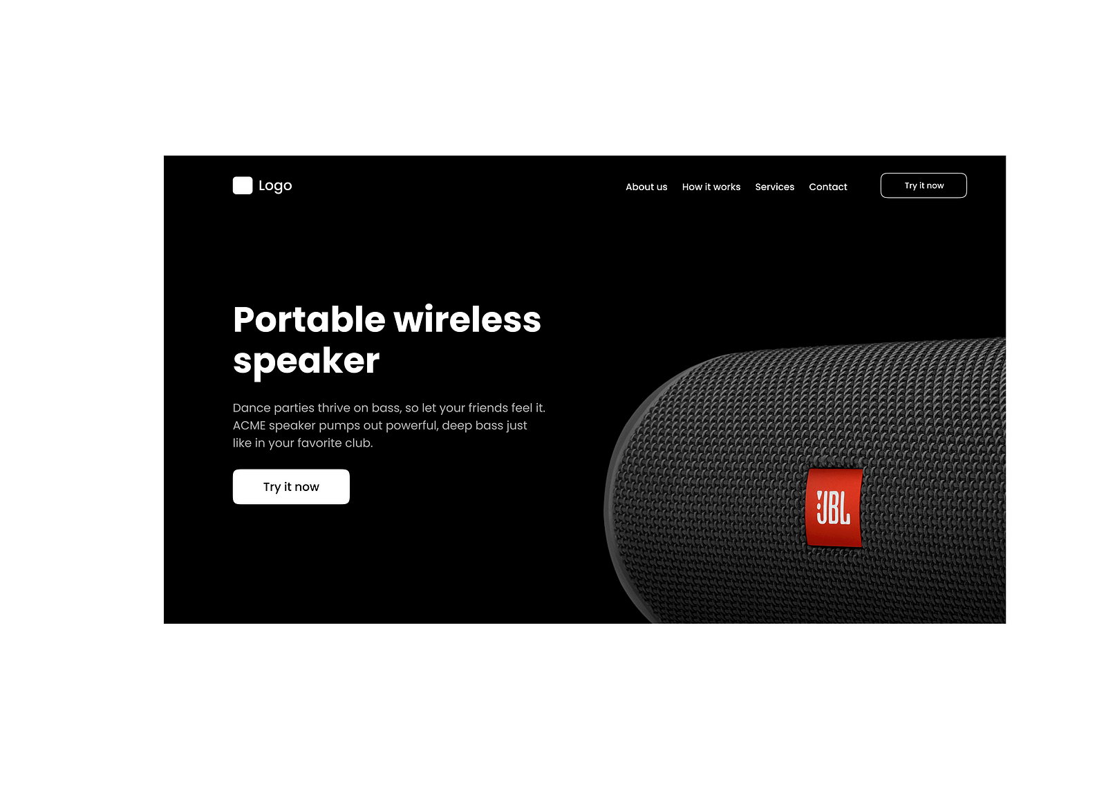
Anatomy of the hero section
Hero section design can vary depending on the nature of a product. For my article, I want to focus on the landing page design for a new product. Note that intentionally focus on functional elements and skip decorative elements.
1. Imagery
Imagery is an image or video in the hero section. The imagery should communicate the key message at a glance. Ideally, visitors should check the image and understand what the site is all about.
2. Text block
The text block contains two elements — header and description. Text blocks reinforce the message that you communicate using imagery.
3. Call to action buttons
The call-to-action button (or buttons) allows users to take actions you want them to take. Depending on your goal, you might want to use one or two call-to-action buttons in the hero section.
4. Logo
The logo is the company logo you typically place at the top left corner of the page. Apart from communicating the brand, this element also serves purely functional purposes — visitors click on it to navigate the home page.
5. Menu
The menu offers a list of options that allow the user to navigate to different pages or parts of the page (if the landing page is a one-pager).
6 Design best practices
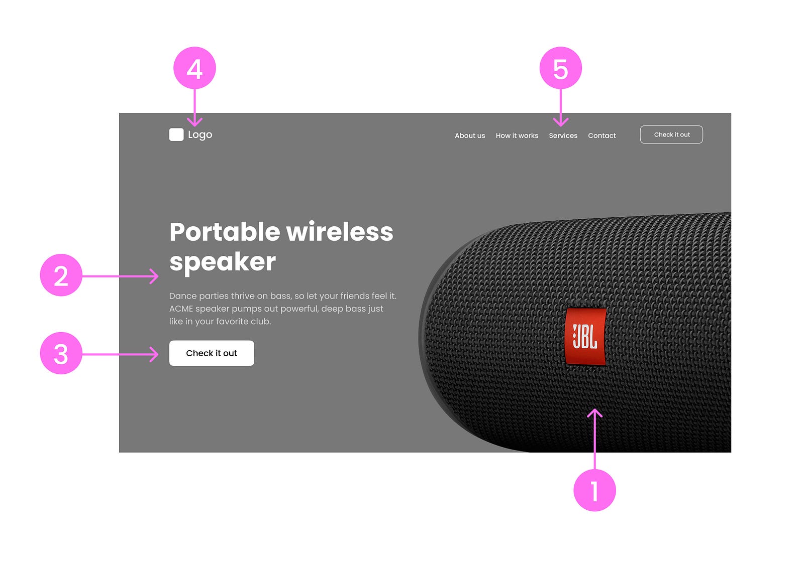
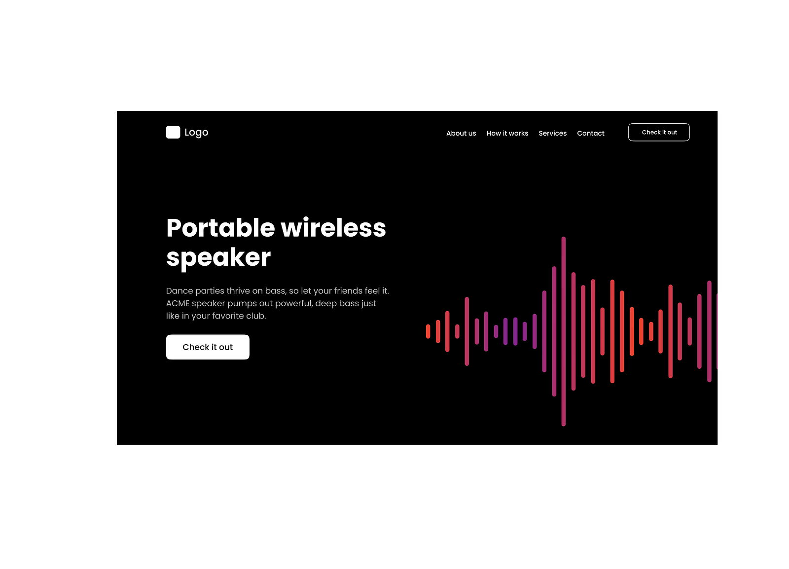
1. Use relevant imagery
Image or video is typically the first thing that users notice when they land on the page. That is why it is vital to ensure that the image’s meaning is clear to your target audience.
Try to avoid abstract or purely decorative images in this section. They won’t help you to communicate your message and only can confuse your visitors.
2. Write a short and effective text
The text you will use in the hero section tremendously impacts user engagement and conversion rate. Remember that users don’t read; they scan. And it is essential to make your text scannable. Nobody wants to read long passages of text.
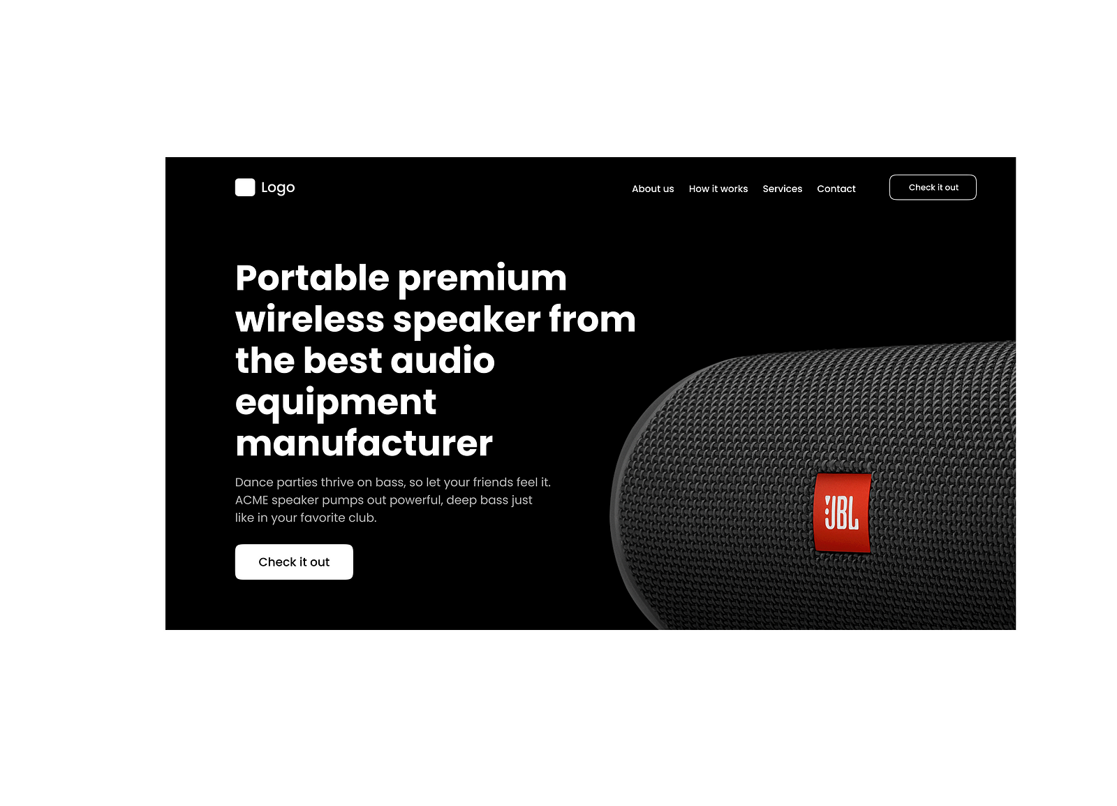
- Header. The header should be clear and concise. Aim for 5–7 words.
- Description. The description adds more context to the information in the header. Aim for 20 words max (half the size of one sentence).
You can highlight one or a few words in the header section using distinctive visual styles. Here are a few good examples that you can use in your design:
3. Actionable labels for call-to-action buttons
The call to action button is about action that visitors might want to take. It is vital to use verbs when you write labels.

“Join”, “Create”, “Start” are great candidates for the labels.
Ensure that the user has enough information to make a decision. For example, if you design a promo page for a new car, visitors might want to learn more about the car before buying it. That’s why it is better to use a label like “Check available options” rather than “Buy now.”
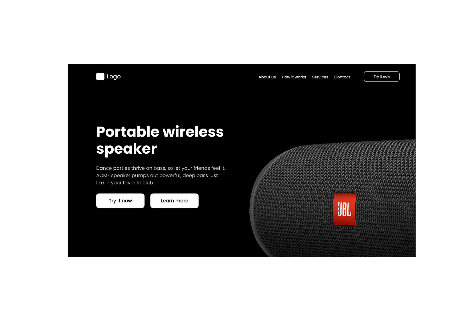
4. Limit the number of call-to-action buttons
Ideally, you should have only one call to action button in the hero section. This button should be directly connected to the conversion goal — the action you want your users to take.
If you have two actions with relative weights (say 60% and 40%), then you can use primary and secondary CTAs. Just ensure you use a different visual style for buttons so your users can understand what you want them to do on this page.

5. Try to avoid purely decorative elements
Fancy visual effects like animations and motion effects can look very impressive to first-time visitors, but they don’t give much to them. Of course, they can impress some groups of users, but this impression can be nullified if the visitors won’t see any valuable information at the top area of the page.
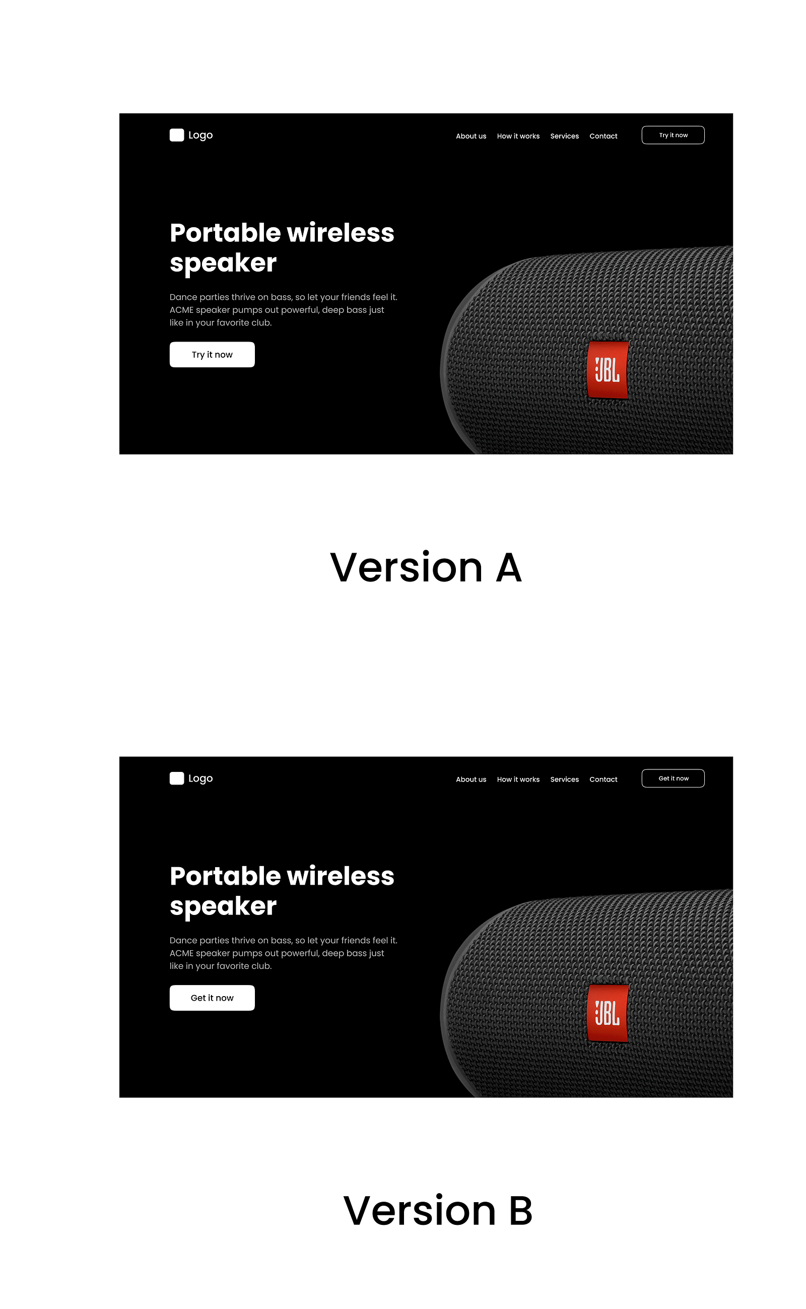
6. A/B test your design decisions
It is typical when you have two competitive design variants and are unsure which one to go for. In this case, you should A/B test your design to find the winner.
- Define a conversion goal. The action you want a user to take.
- A/B test versions of your design based on this goal to find the winner.
Remember that you need to change only one variable on both versions. For example, it can be a label for a call to action button.
If you’re interested in learning more about A/B testing, check out this video: