Radio buttons, checkboxes, toggle switches, and dropdown lists: design tips for using selection controls
Plus 7 common scenarios for using controls
Radio buttons, checkboxes, toggles, and dropdowns are UI controls that allow users to make a selection. Although they have been in user interfaces for a long time, product designers still have a lot of trouble choosing the proper control for their tasks.
This article will review 4 popular types of selectors, teach general rules on when and how to use them, and explore 7 common scenarios of using selection control.
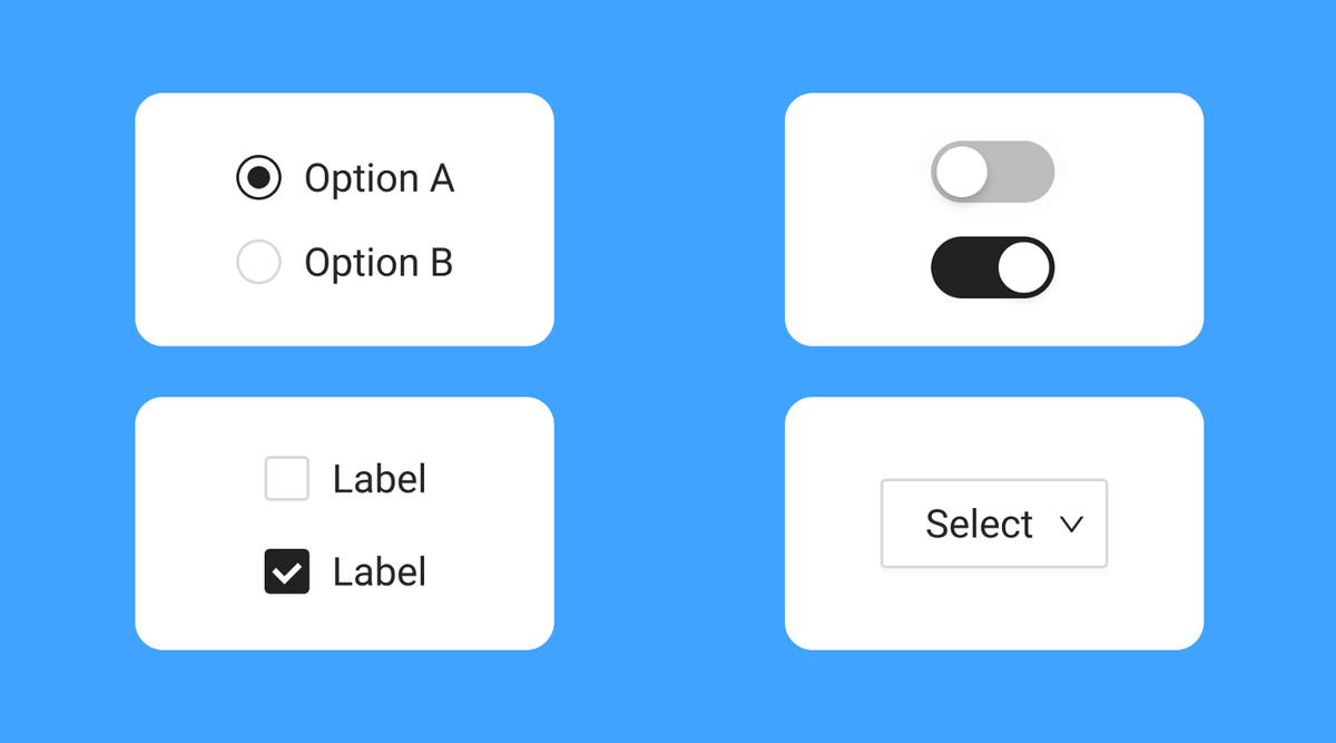
1. Radio buttons
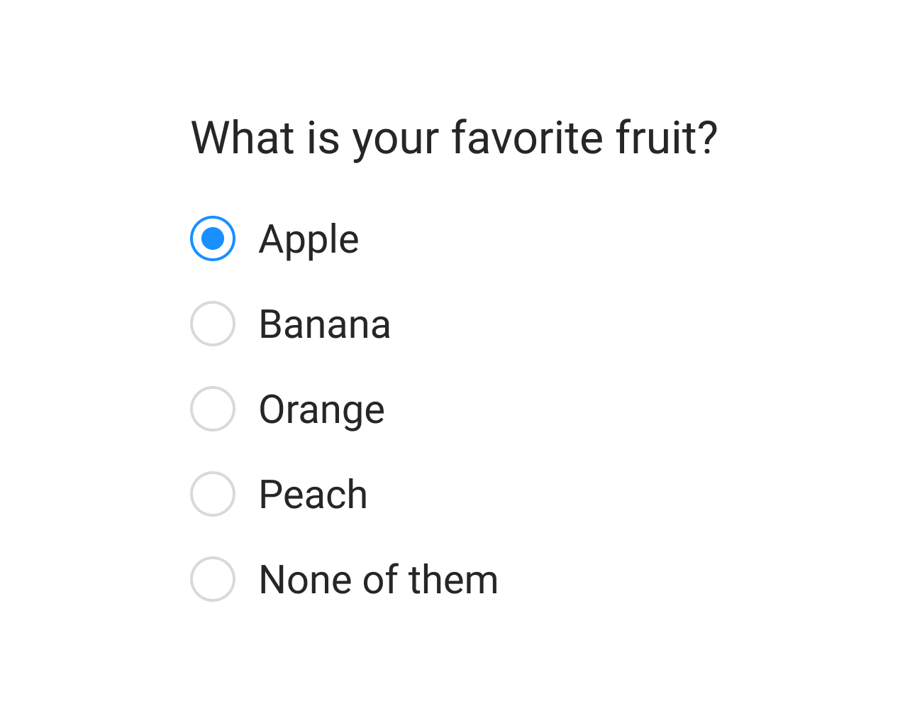
Radio buttons are selectors used for the list of two or more options, and all options in this list are mutually exclusive. Users must select exactly one option. When users click on a non-selected radio button, it will deselect whatever other option was previously selected in the list.
How to design radio buttons
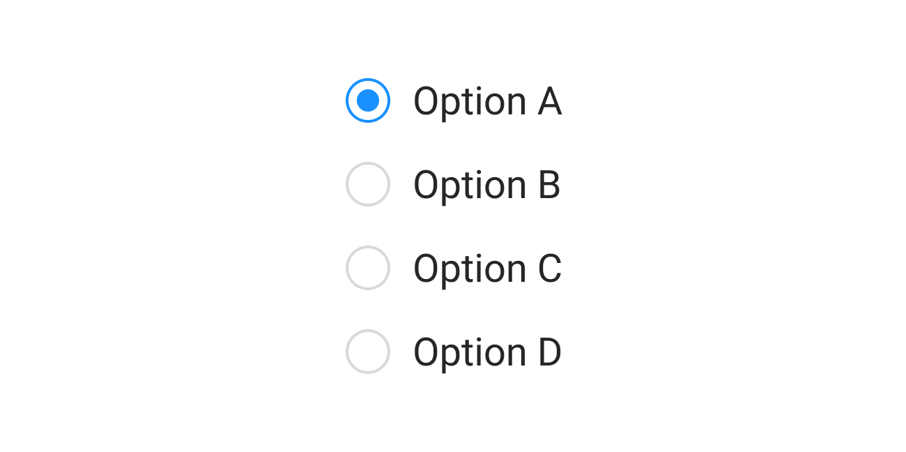
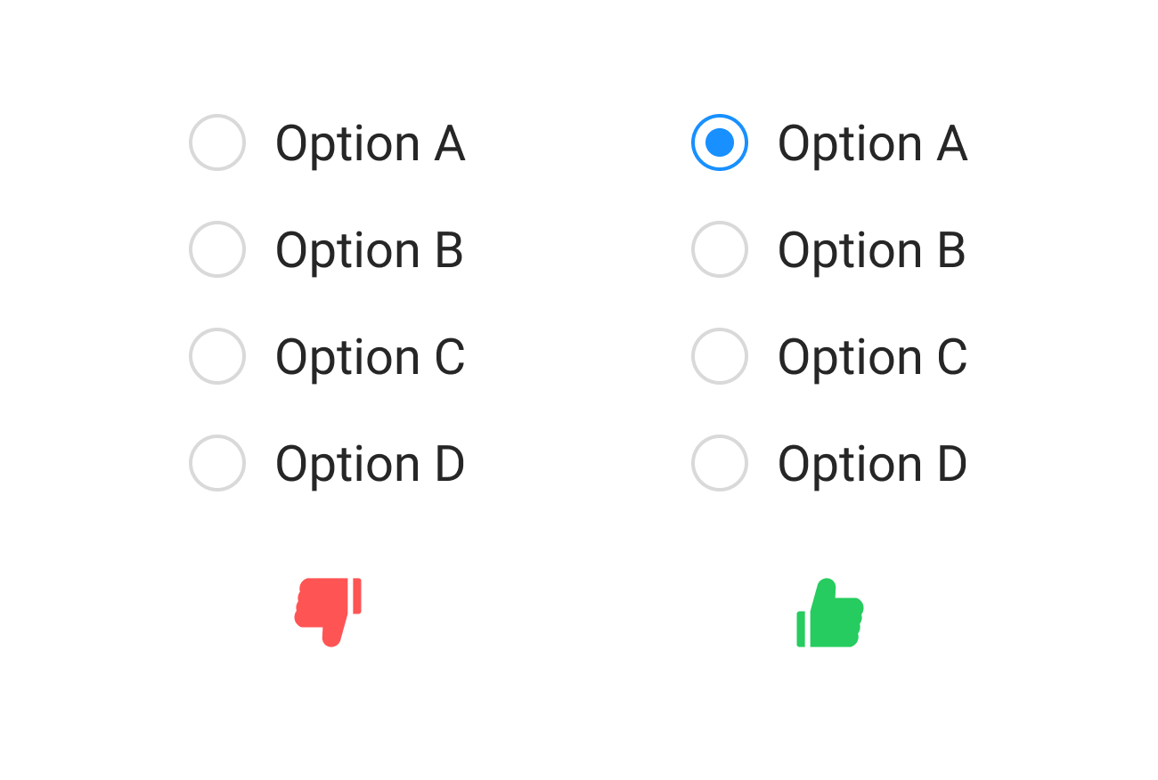
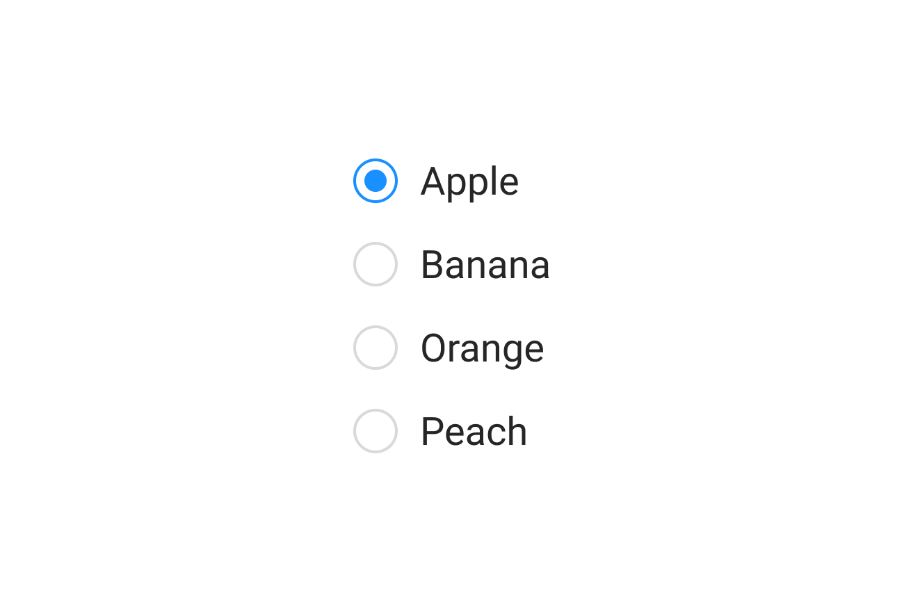
Here is a quick tutorial that shows how to design radio buttons in Figma:
Benefits of using radio buttons
Radio buttons expose all available options. Users can see all available options at a glance and make a selection.
Downsides of using radio buttons
- Take screen esteate. Each option takes a row of the screen. It might be a problem for mobile screens.
- Can be ignored by users. Since radio buttons always come with one option pre-selected, users might simply ignore it. They might assume that the system already chooses the best possible option for them.
Design best practices for radio buttons
- Radio buttons always have exactly one option selected. You should never display radio buttons without a default selection.
- Use radio buttons when all options in the list have the same weight. There is an equal possibility that the user can choose any option from the list.
- Provide option “None” if users might want to refrain from making a selection. Never force users to choose the option they don’t want to choose.
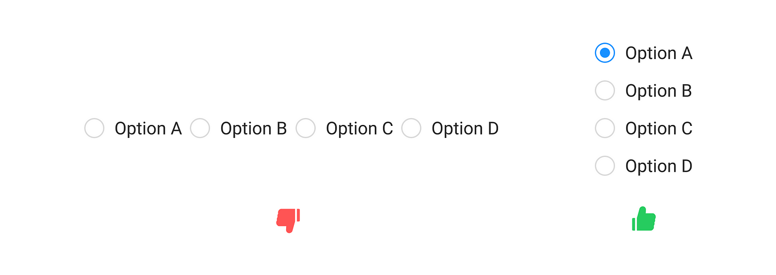
- Try to avoid the horizontal arrangement of radio buttons. Horizontal radio buttons can be difficult to scan — it can be challenging for users to tell which label the radio button corresponds to.
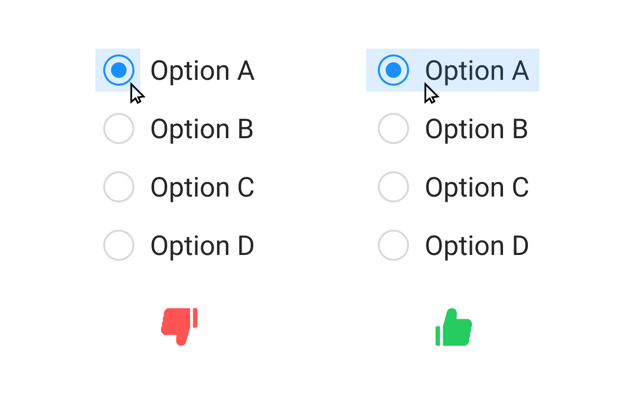
- Make both the circle and label clickable. Ensure the user can click either on the circle or label to select an option.
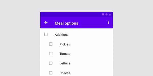
2. Checkboxes
A checkbox can be a single option or a set of options available for selection. Checkboxes are used when the user may select any number of choices, including zero, one, or several. Each checkbox in the set is independent of all other checkboxes, so checking one box doesn’t do anything to the others.

How to design checkboxes
Here is a quick tutorial that shows how to design checkboxes in Figma:
Benefits of using checkboxes
Checkboxes expose all available options. Users can see all available options at a glance and make a selection.
Downsides of using checkboxes
Take screen estate. Each option takes a row on the screen. It might be a problem for mobile screens that have limited screen estate.
Design best practices for checkboxes
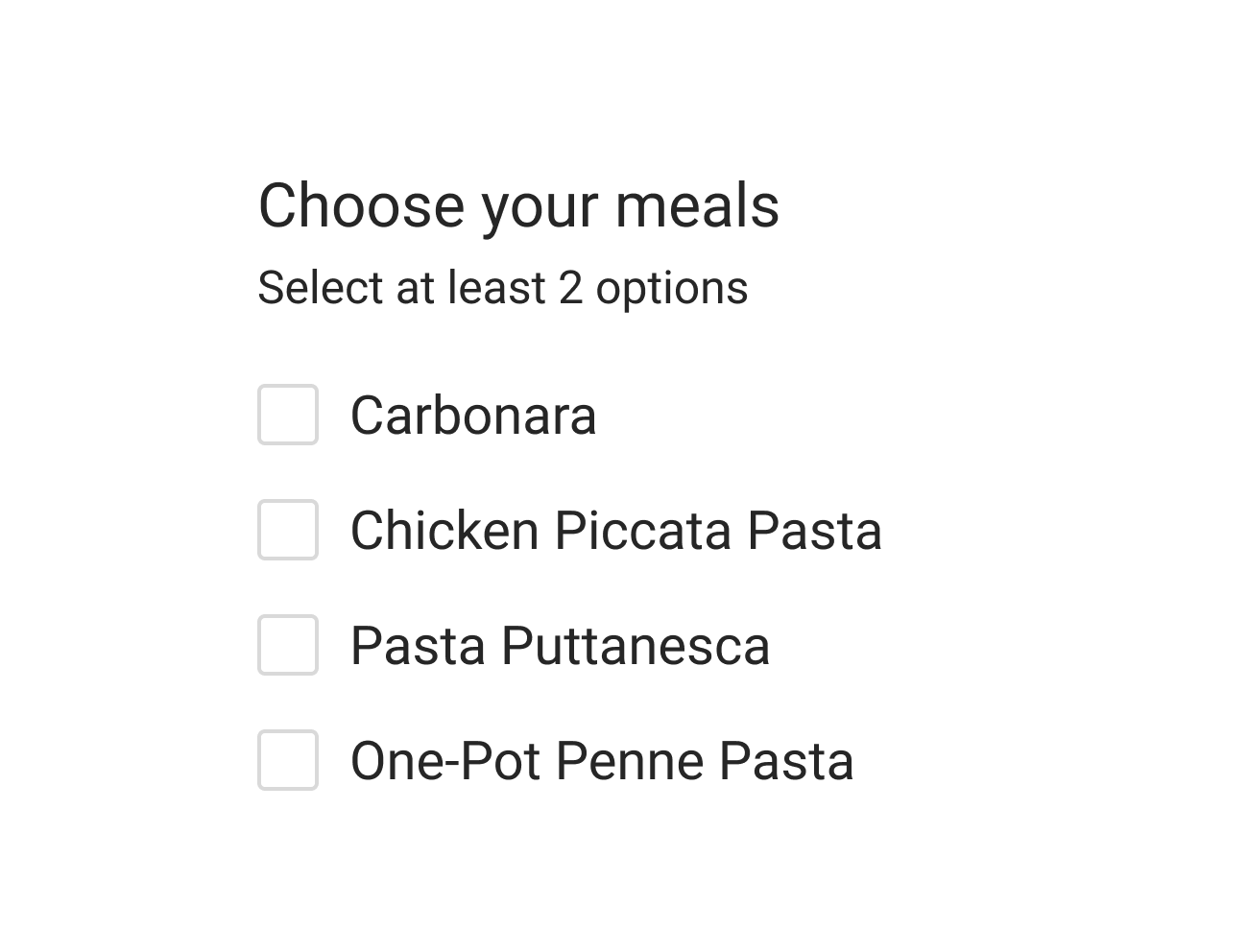
- If the user has to select a few options from the list, you should tell the user before they start doing that. By showing the message, you minimize the chance of displaying an error message like “You should select at least X options.”t
- Checkbox can present a list containing sub-selections. When the user clicks on the parent element, all options in the sub-section become selected.
- Use positive and active wording for labels. It will help users understand what will happen if they turn on the checkbox.

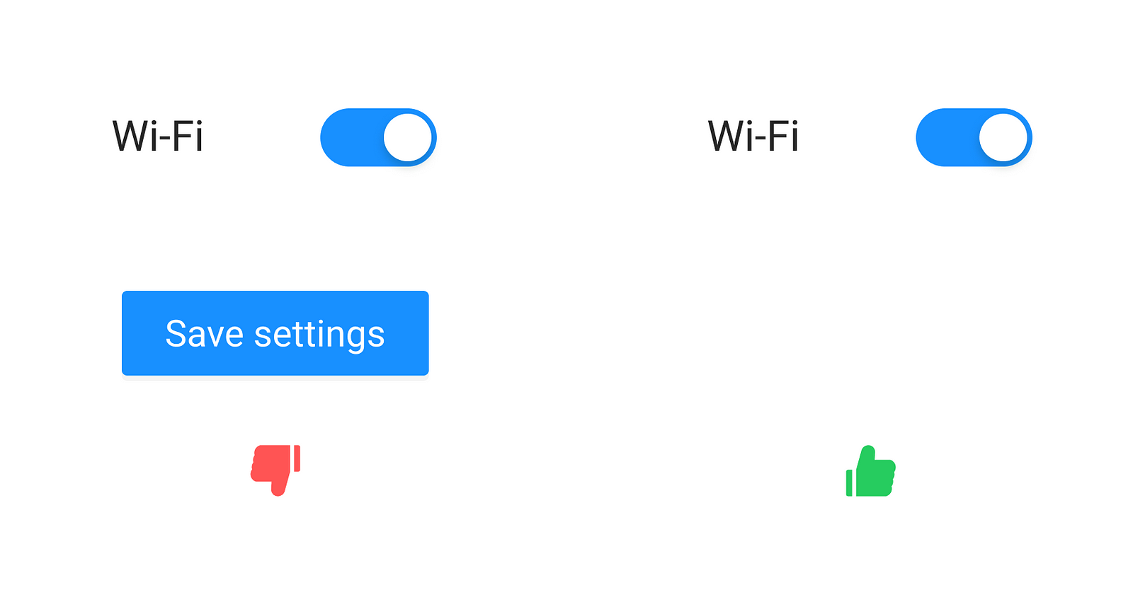
3. Toggle switch
Switch prompts users to choose between two mutually exclusive options and always has a default value. It works well when users have to answer Yes/No questions and for binary operations (such as enabling or disabling a particular setting).

How to design switches
Here is a quick tutorial that shows how to design an interactive toggle switch in Figma:
Benefits of using switches
Toggle is easier for the thumb. This property makes it suitable for mobile devices.
Downsides of using switches
- Take screen estate. Each option takes a row on the screen.
- A user might accidentally trigger the wrong option. Once pressed, switches immediately activate or deactivate something.
Design best practices for using toggle switches
- Toggles should provide immediate results. They should not require the user to click Save/Submit button to apply the new state.
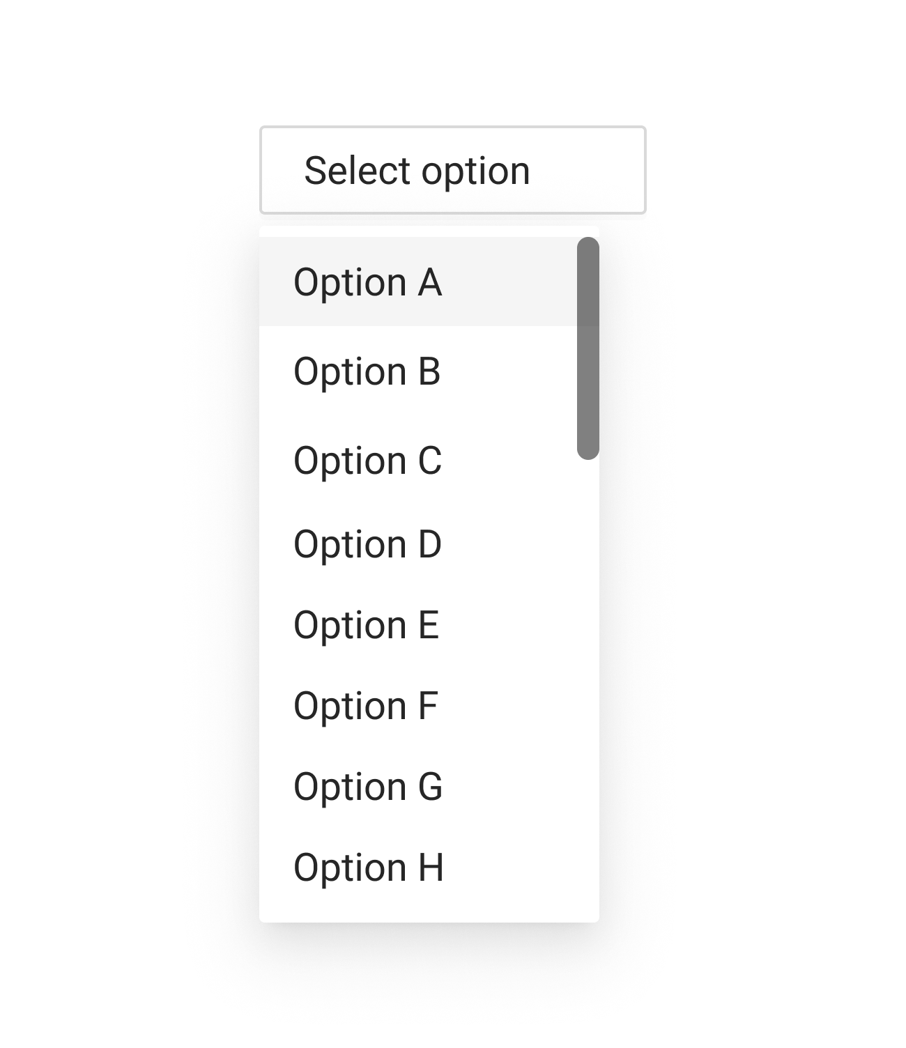
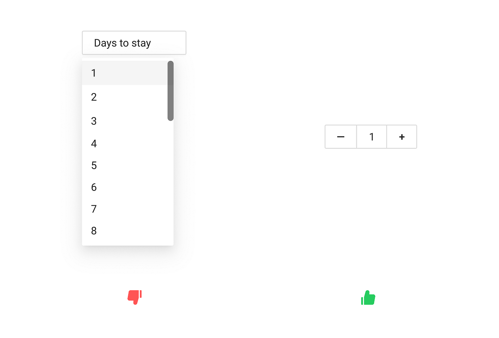
4. Dropdown
Dropdown is a list of options that become visible when the user clicks on the input box. This control is typically used for a longer list of options (6 or more).

How to design dropdown
Here is a quick tutorial that shows how to design an interactive dropdown list or menu in Figma:
Benefits of using dropdown lists
Dropdown saves screen estate. It uses less space because all options become visible only when the user presses the Selectbutton.
Downsides of using dropdown lists
- Require extra action to see the options. Options are hidden by default, and the user should click the Select button to see them.
- It might require a scroll to see the options. Long lists of options (such as Country selector) will force a user to scroll to find the suitable choice. This problem becomes even more noticeable on mobile because scroll within the scroll is a terrible solution.
Design best practices for using dropdown lists
- Dropdowns should be the last resort. Whenever possible, instead of dropdown, try to use alternative controls that help the user to complete the task but have better usability.
- Use dropdown with the autosuggest mechanism. Once the user starts typing the sentence, the list of options becomes narrow to show the relevant results.
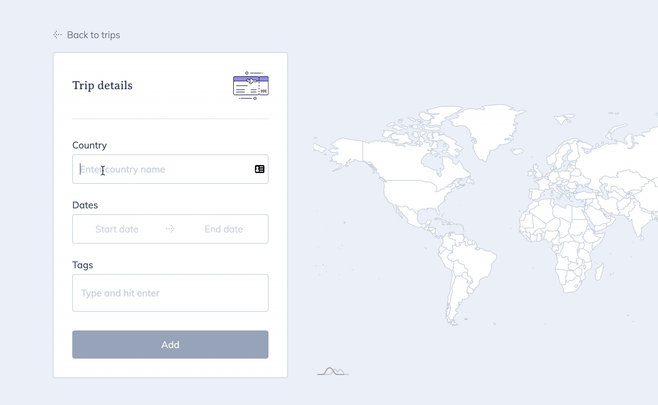
7 typical scenarios for using selectors in UI design
Scenario 1
Q: I have a list of options (i.e., different types of health insurance policies), and the user has to pick one option from the list.
A: If you have 6 or fewer options, you should use the radio button with the most convenient option pre-selected. Typically you should pre-select the option that provides the most benefit for users, not your business. If you have more than 6 options, you should consider the dropdown selector.
Scenario 2
Q: I have a list of options (i.e., different types of toppings for pizza), and the user can choose zero, one, or a few toppings.
A: You should use a set of checkboxes. The set should not have any options pre-selected, and UI should not force the user to make a selection.
Scenario 3
Q: I have a setting that the user can be turned On or Off (i.e., turn Wi-Fi on or off)
A: You should use a toggle switch. The toggle switch reinforces the feeling of action (turning something off or on).
Scenario 4
Q: I want to ask users if they want to receive notifications
A: You should use a toggle switch. Just make sure that the label is clear “Receive Notifications.”
Scenario 5
Q: I want to ask the user if they want to subscribe to the newsletter
A: You should use a checkbox. Make sure the label says, “Subscribe to promo emails.”
Scenario 6
Q: I want to ask the user if they agree with terms and services
A: You should use a checkbox. The fact that the checkbox requires users to click the Submit/Save button gives users more time to think about their choice.
Scenario 7
Q: I want to ask the user a direct question “Are you older than 21?”
A: Use radio buttons “Yes/No.”