Why ordinary design (almost) always wins

When we think about ordinary design, the first words that come to mind are "simple" and "boring." And while the simple design might be good property, boring is not something we as product designers usually aim to create. Does it mean that ordinary design will negatively impact product success? No. In fact, its effect can be quite the opposite. Many of the best-selling products in the world have completely ordinary designs.
Let’s discuss why ordinary design can bring a significant competitive advantage.
Ordinary and no ordinary design
Designer's instinct tells us that one of our goals when we design a new product is to create something new and exciting. We try to avoid ubiquitous design as hard as possible because we want to innovate and create something cool and trendy. But quite often, the best way to make an impact is to design something ordinary.
If you look at a modern Toyota Corolla, you probably won't notice anything special about the car. It looks like any modern you can find on the road today; there is absolutely nothing exceptional about it. Toyota Corolla is a prime example of a ubiquitous design, a design that can be found everywhere.
The lack of unique style and personality makes Corolla’s design hard to describe. At the same time, when you look at Mitsuoka Orochi, many details can stay in your memory. The car has a sporty silhouette; the front grill of this car is designed to look like a fish mouth, making the car so recognizable. This design screams, "look at me!"
So the question is why we see many cars with designs like Toyota Corolla and a limited number of cars that follow the design approach like Mitsuoka Orochi. The answer is simple—consumer preferences.
Ordinary design and product success
Distinctive details impact how we comprehend products. The more products look different from the rest, the more impact their design has on people. But distinctive design can also alienate our potential customers. When people see Mitsuoka Orochi, some people love it, while others hate it. But when people see Toyota Corolla, most feel indifferent towards it. Corolla doesn't spark a lot of emotions, and that's exactly what Toyota wants. It makes design great for many people, people from different target segments. You can imagine a middle-aged man driving a Corolla, a grandma driving a Corolla, or even a young fellow driving a Corolla.
One of the objectives of product design is finding a solution that satisfies the biggest number of people. When it comes to ordinary design, only a few people hate it, but a large majority are tolerant of it, which makes ordinary design so successful.
But why are people so tolerant of ordinary design? Because ordinary design is both easy to the eyes and feels instantly familiar. People love familiar design because it makes them feel comfortable.
Another reason ordinary design can be better than distinctive design is simply that it can work in various contexts. You can imagine a Toyota Corolla used as a family car, taxi, or corporate car. But you cannot imagine Mitsuoka Orochi being a family car. The ability of ordinary design to work in various use cases makes it so good.
Last but not least, with the increasing polarization of opinions in our society, it's much safer for product creators to design products that don't offend the audience. The ordinary design makes products as unoffensive as possible. Such products blend with our environment, and we barely notice them. Yet, if a product works well, we are happy with it.
Using design to make a statement
Some car manufacturers use design to make a bold statement. Think of the Tesla Cybertruck for example.
When the Tesla Cybertruck first appeared in the media space, it created a lot of hype. Many memes were born almost the same day the Cybertuck was announced.
Elon Musk mentioned that the truck would go on sale in late 2021, yet it's mid-2022, and the truck is unavailable. The fact is, Tesla's primary goal wasn't to release trucks on the market to make money but rather to create hype around the brand itself. And that is why they've used a design that is so different from what we used to have. So when the Tesla truck becomes finally available on the market, its design might be different from what was advertised.
Going back to the roots: what good design is
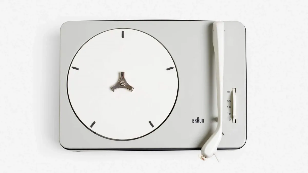
Dieter Rams, one of the most influential designers of the 20th century, coined 10 Principles of Good Design. One of the principles states that good design is unobtrusive. Products are neither decorative objects nor works of art. They are just tools that fulfill a purpose. Their design should therefore be both neutral and restrained.
The ultimate purpose of any product is the ability to solve the problem effectively. As long as it happens, the product doesn't need to have unique details that make it stand out from the crowd.

Does it mean that we should always create ubiquitous designs? Not necessarily. We should always understand the needs of the target audience we design for. Design should always be tailored to your target audience. When we design cars like Mitsuoka Orochi, we know we are not making mass-market products. Quite the contrary, we create the vehicle for car enthusiasts and rich people who want to make a statement and, as a result, are willing to pay for a bold design. So we can evaluate our design from the perspective of eliciting a strong emotional response in this particular group of customers.
Design is all about problem-solving. And designers should always know what problem they are solving and for whom.