Arthrex AR Surgeon & Design System
At Arthrex, a global medical device company specialising in minimally invasive surgical technologies and arthroscopy, I lead product design initiatives that address two challenges: making complex surgical information easier to access during clinical workflows, and scaling consistent user experiences across a diverse medical software ecosystem.
My work spans the released AR Surgeon application for Microsoft HoloLens and the Arthrex Design System, which supports products built with different technologies and interaction models. Both initiatives required balancing specialist user needs, technical constraints, usability and cross-functional alignment.
Tenure: June 2024 – Present
Domains: MedTech, Surgical Workflows, Regulated Systems
Platforms: Web, Mobile, Embedded Products, Spatial (HoloLens, VisionPro)
Product ecosystem reach: Approximately 10,000 surgeons and clinical assistants globally
Cases: AR Surgeon app design for Microsoft HoloLens and design system architecture and implementation (both cases provided below)
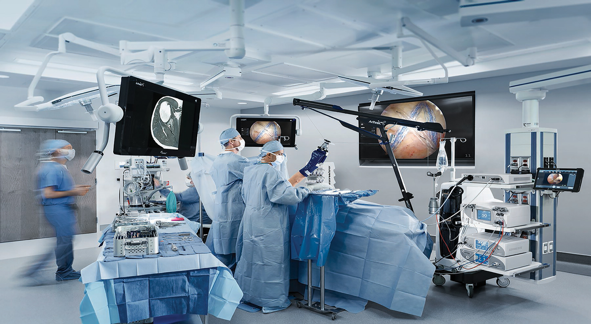
Strategic Impact & Leadership
- Design Leadership in Regulated Environments: Own the end-to-end design strategy for surgical software and workflows under strict FDA and regulatory constraints, balancing usability, safety, and compliance across products.
- Innovation Through Emerging Interfaces: Pioneered spatial interface design first on Microsoft HoloLens and then on Apple Vision Pro to streamline everyday surgeon tasks, helping them make the most during the surgery.
- Built a Scalable Design System for ecosystem of products: Designed and rolled out a comprehensive design system spanning mobile, web, and hardware interfaces — improving consistency, accelerating engineering delivery, and enabling long-term product scalability across teams.
- Making Critical Data Human-Readable: Transformed dense, high-pressure medical datasets into clear visual narratives that reduce cognitive load for surgeons .
Methods & Practice
- Design systems architecture for regulated products
- Cross-platform interaction models (mobile, web, hardware, spatial)
- Design strategy under regulatory and technical constraints
- Complex data visualization for expert users
- Stakeholder alignment across product, engineering, and leadership
- Prototyping and experimentation with emerging technologies
Tools
Figma, Claude Code, design system frameworks, spatial interface tooling
Case study 1: Arthrex AR Surgeon app for surgeons
The Problem: Surgical planning information was disconnected from the operating environment
Augmented Reality (AR) is a powerful technology that is particularly valuable in medical environments.
The idea for AR Surgeon app originated from another Arthrex product: OrthoVis, preoperative planning software integrated into the Arthrex ecosystem. OrthoVis allows surgeons to review implant properties before surgery, helping them prepare for each procedure.
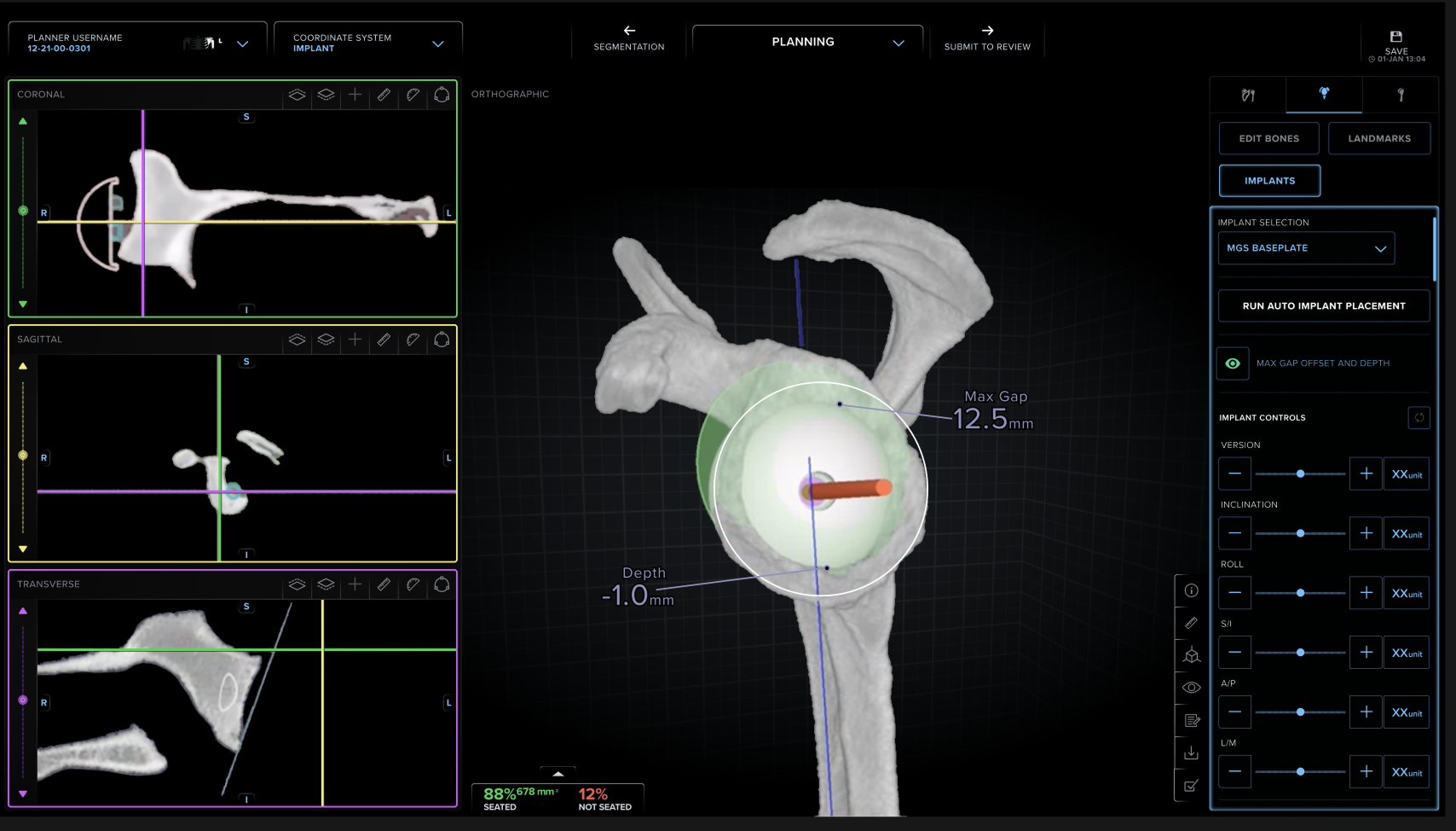
OrthoVis allowed surgeons to review anatomy, implant configurations and preoperative plans before a procedure. However, accessing the same information during surgery was less straightforward.
Surgeons often relied on printed plans or communication with assistants to retrieve information that had already been prepared digitally. This created an opportunity to improve access to information without requiring surgeons to shift their attention to a separate desktop interface.
The product challenge was to determine which planning information mattered during surgery, how it should be presented in an unfamiliar spatial environment, and how to avoid introducing unnecessary complexity into a high-stakes workflow.
The Opportunity: A Focused Spatial Interface
Augmented reality offered an opportunity to bring relevant planning information into the surgeon's field of view.
I was responsible for designing and validating an initial AR experience for Microsoft HoloLens, translating selected OrthoVis workflows into an interface suited to the operating room.
Unlike conventional desktop products, surgical AR introduces a different set of design considerations: limited display space, specialised interaction methods, technical constraints, and an environment where maintaining attention on the primary task is essential.
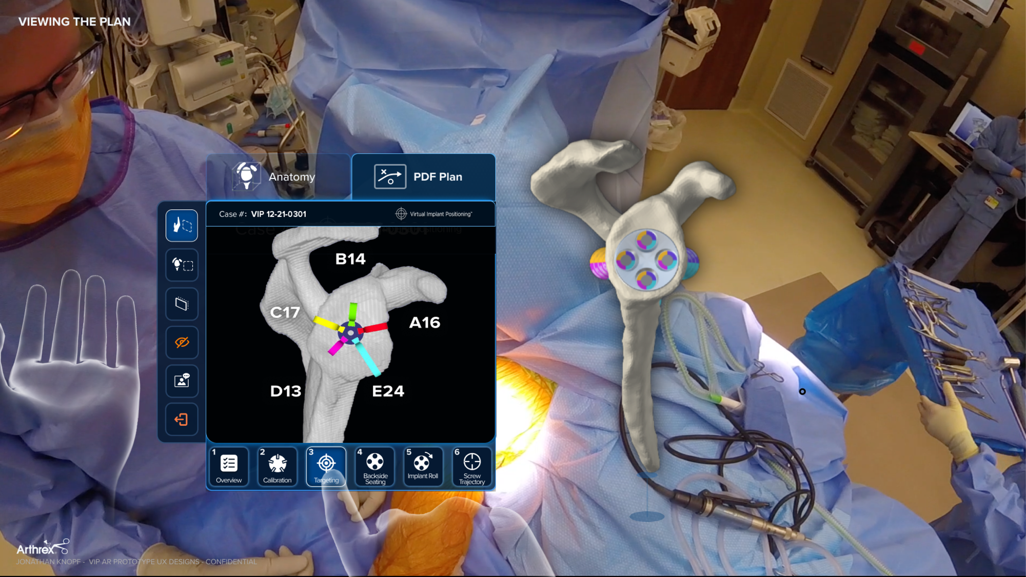
I focused on 4 design challenges:
1. Prioritising Information for the Surgical Context
OrthoVis provides detailed information for preoperative planning, but not all of it is equally relevant during surgery.
Simply transferring the desktop interface into a spatial environment would have preserved unnecessary complexity.
Instead, I focused on identifying which information surgeons needed during the procedure and how to present it without overwhelming the interface.
The resulting design prioritised access to the surgical plan, relevant anatomy, and implant information, with contextual controls for navigating between tasks.
The key design principle was to prioritise information according to its relevance to the current surgical task, rather than reproduce the full desktop experience.
2. Building on Existing Surgeon Behaviour
During conversations with surgeons, I learned that printed PDF plans remained an important reference during procedures. Their value was not simply the information they contained, but also their familiar structure and predictable organisation.
One direction was to redesign the plan into a completely new set of AR-native information panels. While this could offer a more visually integrated experience, it also risked introducing new navigation patterns into an already demanding workflow.
I chose to retain access to the familiar PDF Plan alongside the interactive anatomical model. This gave surgeons a recognisable reference point while introducing spatial interaction where it offered additional value.
The trade-off: The solution was less radical than a completely redesigned interface, but it prioritised workflow continuity and reduced the need to learn a new information structure.
Preserving familiar information structures was an important part of the design strategy.
3. Designing Within Spatial Hardware Constraints
Microsoft HoloLens introduced technical and interaction constraints that needed to be considered from the beginning.
The interface had to remain focused and readable, support the interaction capabilities of the headset (including natural gestures), and be feasible for engineering implementation.
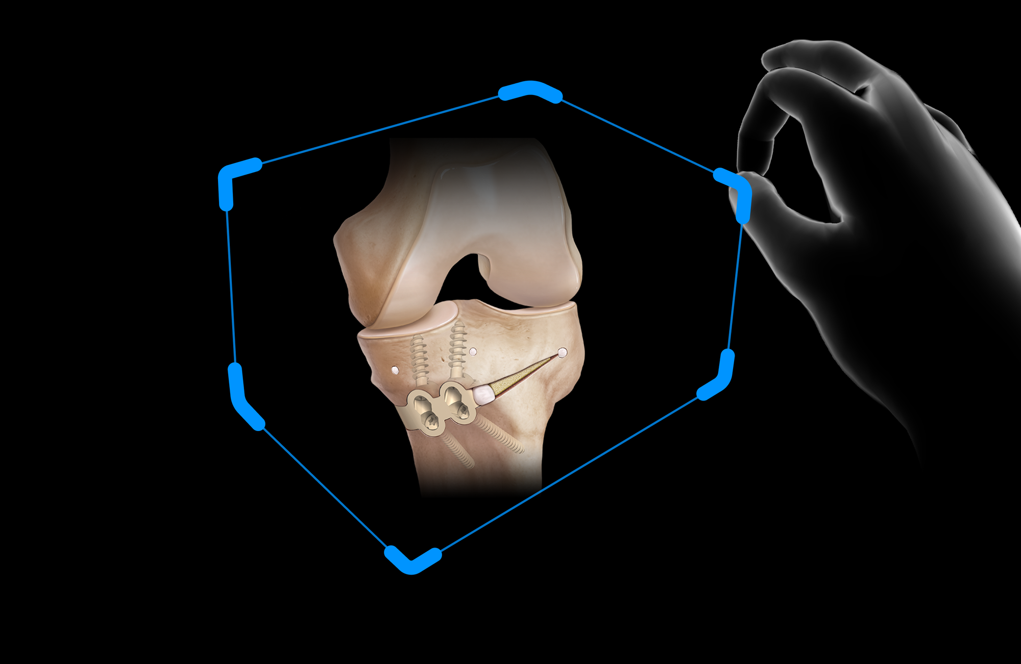
I explored spatial layouts and contextual interface patterns, including implant selection, access to planning information, and navigation between relevant views.
This required balancing the amount of information displayed with the need to keep the experience understandable and suitable for the operating environment.
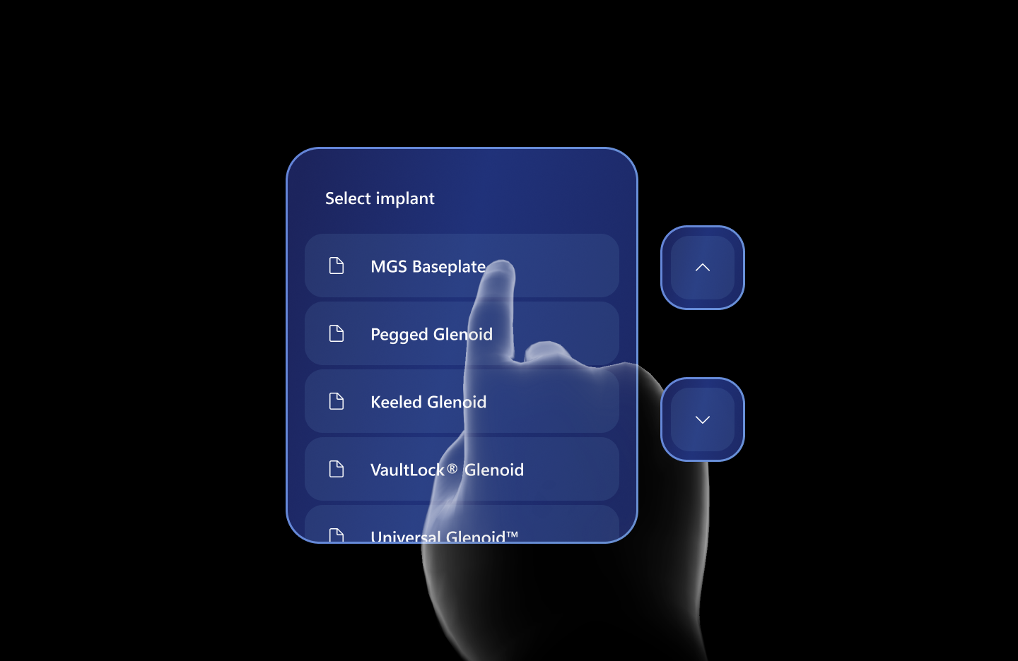
4.Designing for failure and recovery.
Beyond the primary interaction flow, surgical AR required careful consideration of situations in which information could become difficult to read, gestures might not register, or planning information might be unavailable.
Rather than treating these as secondary interface details, I considered how users could recognise an issue, recover from it, and return to the primary workflow without unnecessary interaction complexity.
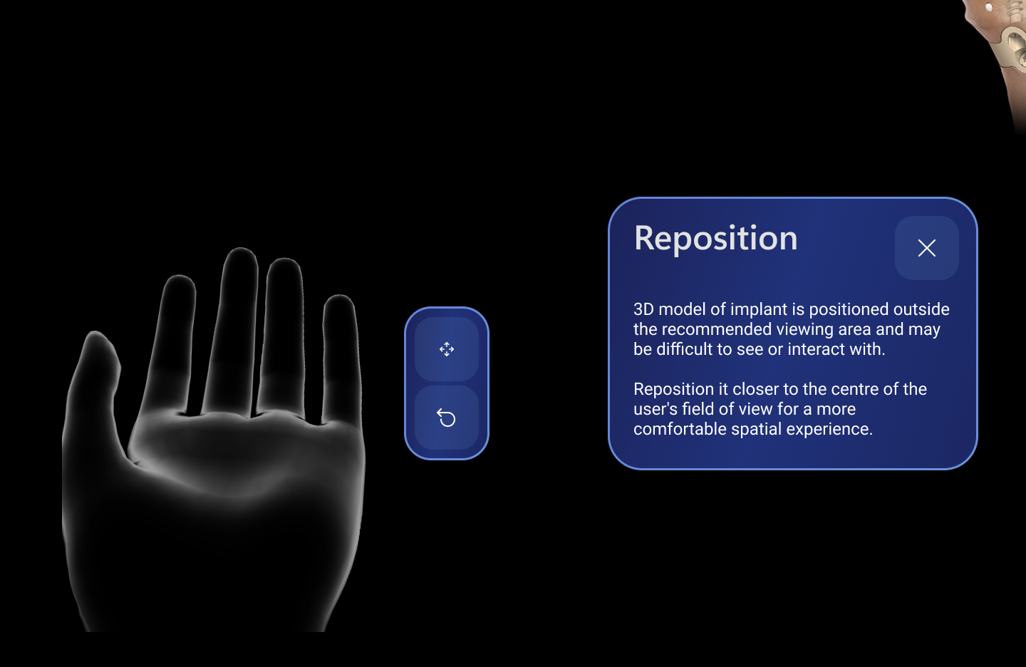
Product Delivery and Evolution
The first generation of Arthrex AR Surgeon was released in 2024 and is currently used by 15 medical organisations in the US.
The project also established a foundation for further exploration of spatial computing within Arthrex.
I am currently working on the next generation of the experience for Apple Vision Pro.
The transition creates an opportunity to revisit the interaction model, make use of visionOS capabilities where appropriate, and explore greater consistency with the broader Arthrex product ecosystem.
Why Vision Pro? Because it offers more powerful hardware at a more affordable price point than HoloLens. Additionally, Vision Pro is part of Apple's broader product ecosystem, which makes it particularly valuable from a design system perspective, enabling greater consistency and reuse of existing design patterns and components.
Case study 2: Arthrex Design System (ADS)
The Problem: Inconsistent Experiences Across an Expanding Product Ecosystem
While working on Arthrex AR Surgeon, I became increasingly involved with the Arthrex Design System (ADS).
And the more I used ADS, the more I realised that the challenge extended beyond the visual consistency of one application (Arthrex AR Surgeon).
Arthrex products were built using different technologies, including Unity-based medical applications and Qt-based embedded interfaces. As these products evolved independently, common styles and interface patterns became fragmented.
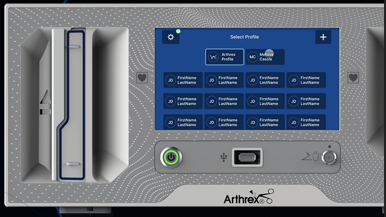
During my audit, I identified variations of the same component, such as toast notifications that I'll show below, with different typography, colours, spacing and interaction conventions.
This fragmentation created three challenges:
- For users: Similar interface elements did not always behave or appear consistently across products.
- For designers: Teams repeatedly solved problems for which established patterns already existed.
- For engineers: Differences between implementations made shared standards and reusable solutions harder to maintain.
This could be clearly illustrated using a simple component (toast message).
Component example: Standardising toast notifications across all platforms
I selected toast notifications as one example of the inconsistencies emerging across products. Although the underlying purpose was similar, implementations differed in their visual hierarchy, typography, spacing and behaviour.
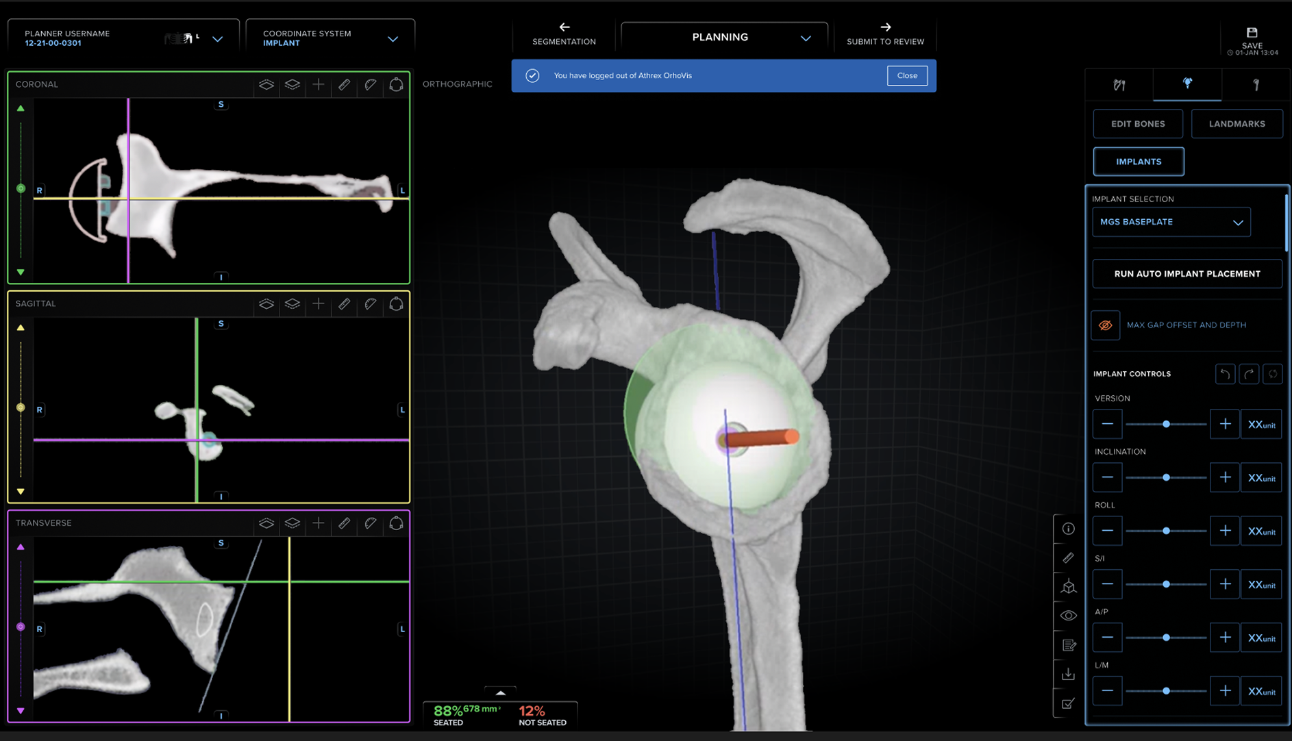
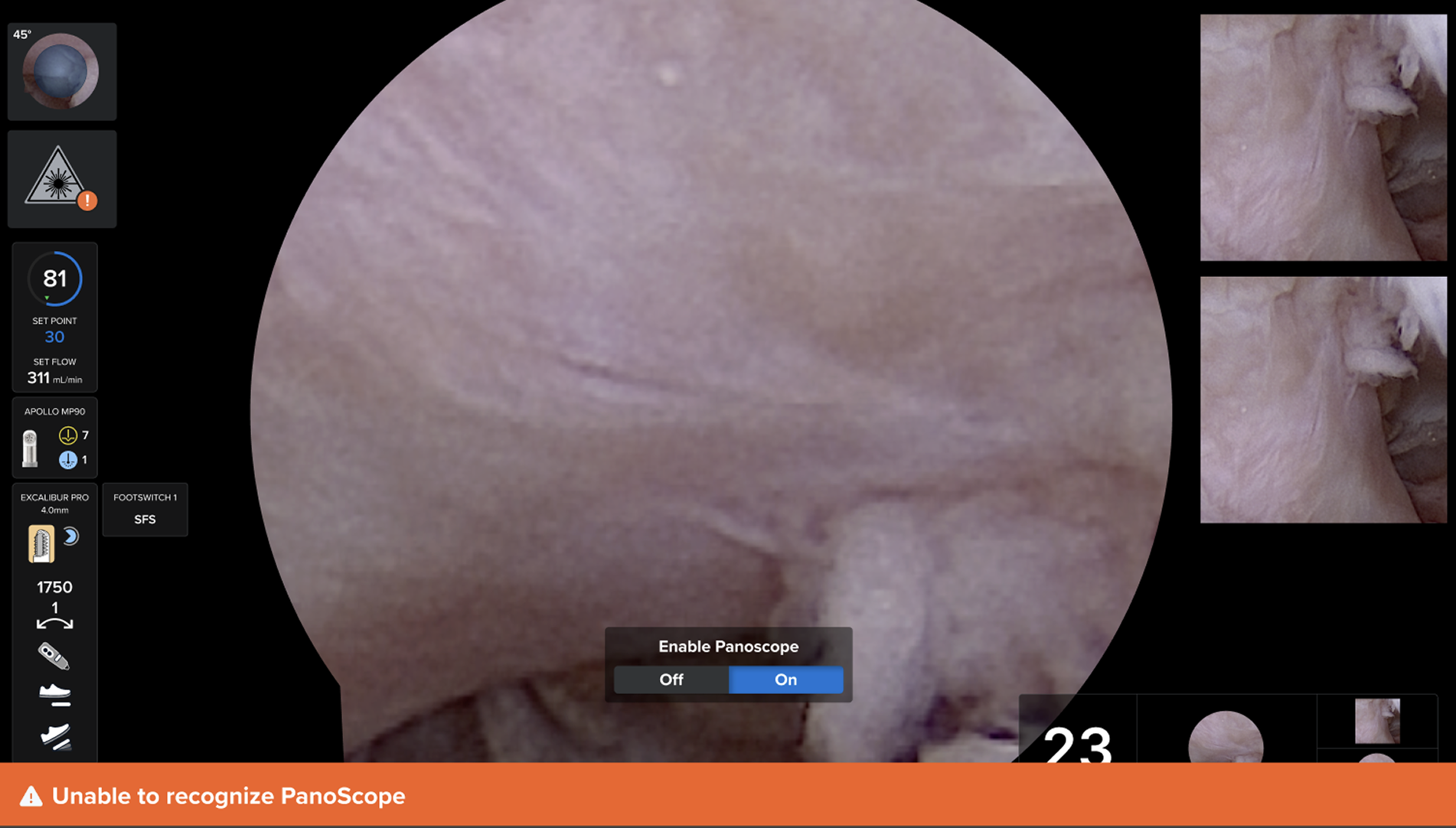
These inconsistencies made it harder to maintain a coherent product experience and reuse established design solutions.
My goal was to establish a shared interface foundation that improved consistency without ignoring the requirements of individual platforms and clinical workflows.
My Approach: Audit, Consolidate, Validate, and Scale
I structured the work into four stages.
- Prioritise high-impact components. I evaluated existing components according to their frequency of use, relevance across products, and importance to user tasks. This helped identify which patterns would provide the greatest value if standardised.
- Audit existing implementations. I collected variations of the same component into a single review space to identify differences in typography, colour, spacing, states, and behaviour. The audit made inconsistencies visible and provided a concrete basis for discussing design decisions with product teams.
- Design reusable components. I designed and refined shared components and interaction patterns that could be reused across products. The objective was not to make every interface identical. It was to establish consistent design principles, shared visual foundations, and predictable behaviours while accommodating platform-specific requirements.
- Review solutions with cross-functional teams. I organised design review process with designers, engineers, product stakeholders, Human Factors specialists, and QA representatives.
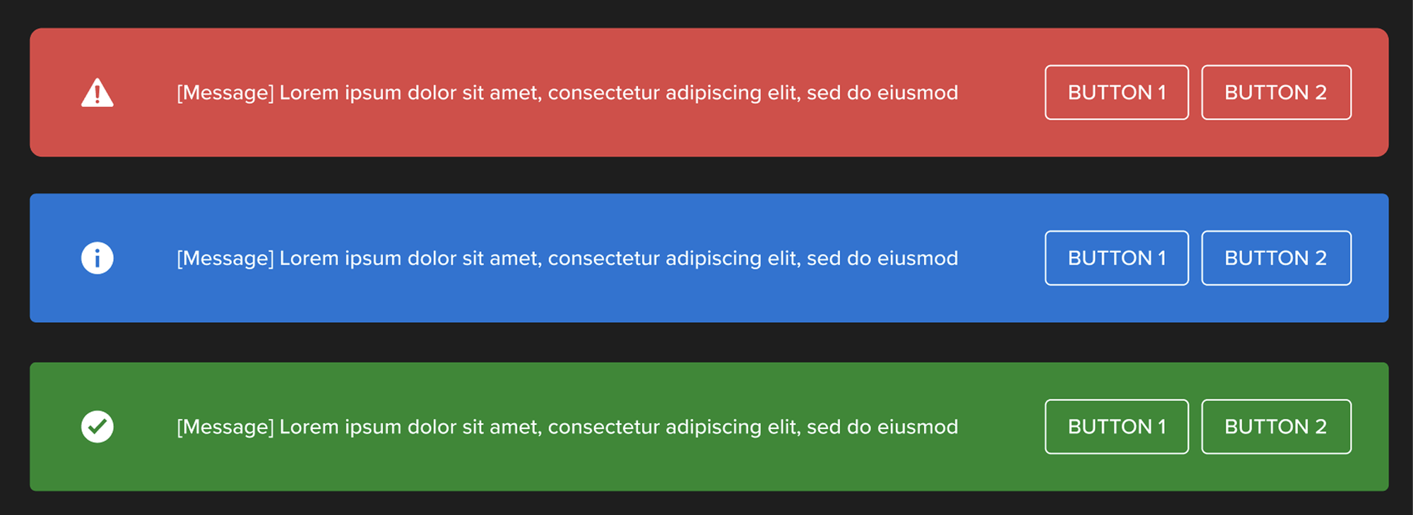
These reviews helped evaluate proposed components against real use cases, technical feasibility, usability considerations, and applicable quality or regulatory requirements.
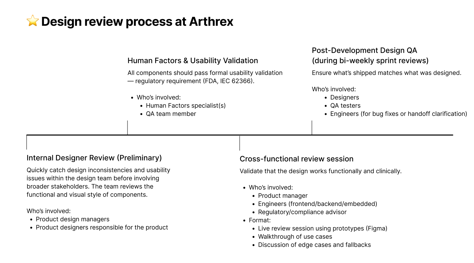
Standardising existing components was only one part of the challenge.
As product teams continued to develop new functionality, they regularly proposed additions to ADS. Without a structured process, the system risked accumulating duplicate patterns, unnecessary variants, and components that addressed highly specific use cases without broader value.
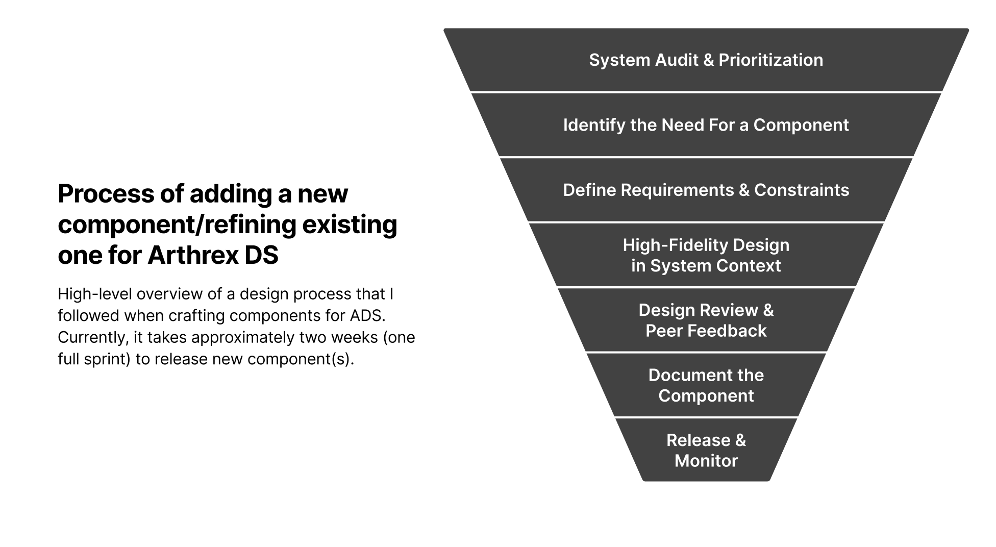
To address this, I established a component contribution workflow covering:
- System audit and prioritisation
- Evaluation of the proposed component need
- Definition of requirements and constraints
- High-fidelity design in product context
- Design review and peer feedback
- Component documentation
- Release and ongoing monitoring
This gave teams a shared framework for evaluating new additions and helped keep the design system maintainable as the product ecosystem evolved.
Quick note: I also developed custom Claude Skills to automate UI component reviews. These skills are automatically triggered when a new component is added to the code repository, supporting two key stages of the process: Design Review and Release & Monitor.
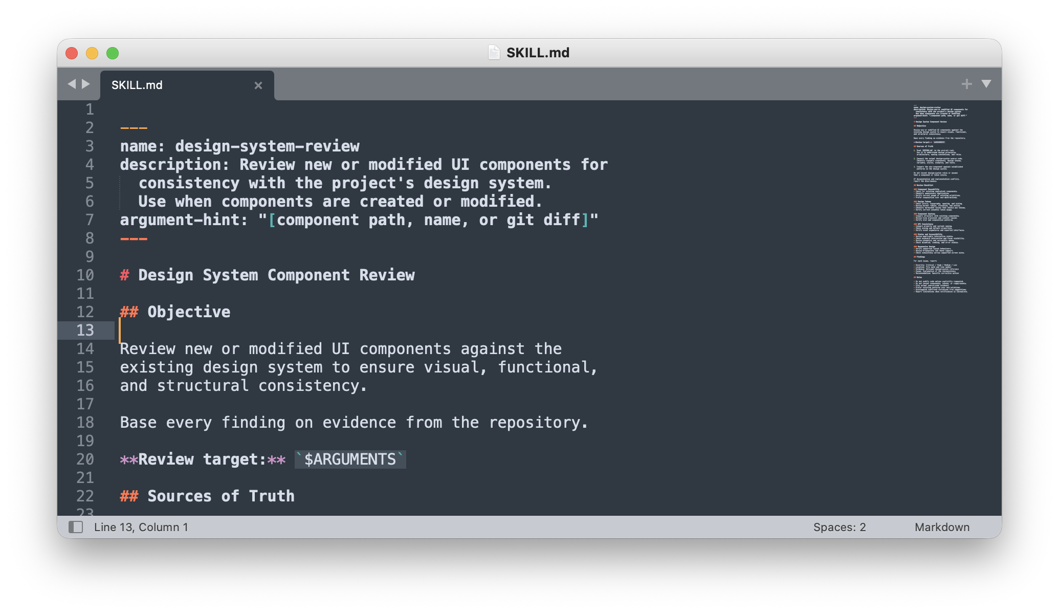
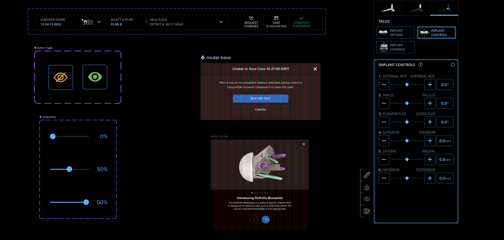
I was also directly involved in designing and refining design system components, as I genuinely enjoy hands-on design work and believe it's important to stay close to the craft, even in a leadership role.
Measuring Design System Success
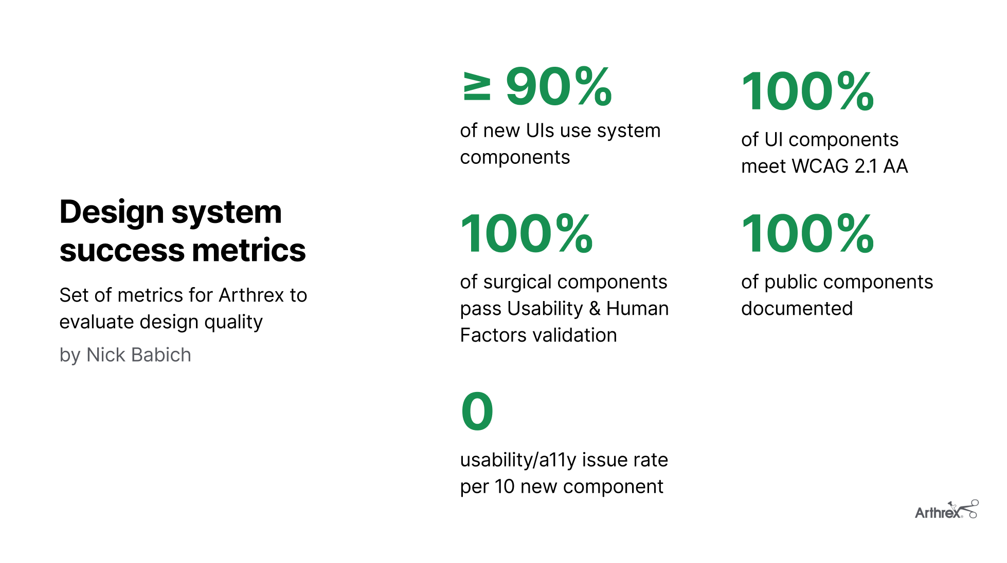
To evaluate the effectiveness of ADS, I established a measurement framework covering two dimensions:
- Design system adoption: Whether product teams consistently use shared components and patterns.
- Design quality: Whether the resulting interfaces meet usability, consistency, accessibility, and applicable human-factors expectations.
The metrics include component adoption across new interfaces, documentation coverage, accessibility conformance where applicable, relevant human-factors validation, and usability or accessibility defects.
These measures provide a framework for tracking design system quality over time and identifying areas where further work is needed.
The positive impact from my initiative became noticeable during the annual review of design system and inspection of particular products.
And below is real impact that design system had during the period of 24 months of adoption across multiple Arthrex product teams. These are measured company results:
| Metric | Before | After |
|---|---|---|
| Screens passing a consistency audit | 60% | 90% |
| Accessibility defects per 100 audited screens | 20 | 2 |
| New screens using ADS components | 60% | 85% |
| Time to implement a familiar UI pattern | 10 hours | 2 hours |
| Design-consistency QA issues per 100 screens | 20 | 1-2 |
| Manual component review effort | 5 hours | <1 hour |
Looking Back: What I Would Improve
One lesson from building ADS was that establishing shared styles & components is only one part of making a design system successful. The harder challenge is ensuring that those styles & components are adopted consistently and remain appropriate as product requirements evolve.
If I revisited the initiative, I would make three improvements:
- First, I would establish a more comprehensive baseline before standardising components, making it easier to quantify changes in consistency, adoption and delivery efficiency. I would likely use dedicated Claude skills for streamlining this step.
- Second, I would bring engineering teams into component API and implementation discussions even earlier, ensuring that shared specifications translate into practical, maintainable implementations across technologies.
- Finally, I would invest further in automated design-system checks, while making the boundaries between automated validation and human design judgment explicit.