Design Patterns: Progressive Disclosure for Mobile Apps

Before we begin, let’s quickly define design patterns. Design patterns were first introduced by Christopher Alexander, an architect and design theorist who noticed that many things in our activities happen according to patterns: patterns describe a problem and then offer a solution. He adapted his observations to his work and published a great book “A Pattern Language” on the topic. Since then, design patterns have found their place in many areas of our lives, and can be found in the design and development of user interfaces as well.
Different design patterns help us provide solutions to most common problems that all designers and developers face in their work. In this post we’ll explore progressive disclosure and how to apply it to your mobile prototyping.
What is Progressive Disclosure?
Progressive disclosure is a strategy for managing information complexity. When you use progressive disclosure, you show only the information necessary at that point in the interaction. And you display more advanced functionalities of the app interface as the user interacts with it. It’s a simple, yet powerful design pattern:
- Initially, show users only a few of the most important options.
- Disclose a larger set of specialized options only if a user asks for them.

Know Your Users
The main danger of progressive disclosure is incorrect assumption that you understand what is the most popular, common or important task. When designing an app, it’s easy to assume that everybody is like you. You evidently know a lot about your app, because you’re passionate about it. But most probably your users aren’t care that much. As Jakob Nielsen stated: “One of usability’s most hard-earned lessons is that ‘you are not the user.”
That’s why you should design to optimize the user experience for outsiders, not insiders (you or your team). Users have goals and want to get things done using your app. To design a good progressive disclosure, you need to learn about your users, involve them in the design process, and interact with them.
Progressive Disclosure in Mobile Apps
Examples of progressive disclosure are everywhere. A simple “learn more” link that reveals more information is one of the simplest forms of progressive disclosure. But there are more complex and interesting cases, like mentioned below.
Progressive Onboarding
Interactive progressive onboarding is a good example of progressive disclosure. It’s a user-guided tour where hints are only triggered when the user reaches the appropriate point in their experience. Thus, hints may appear in different orders for different users.
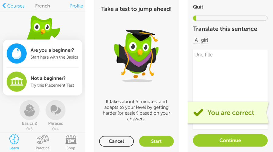
Duolingo uses an interactive way of progressive disclosure to show users how the app works: users are encouraged to jump in and do a quick test in the selected language.
YouTube Android app, for instance, uses instructional overlay to explain an unfamiliar interaction. These hints appear on the first launch for new users, one at a time, as the user reaches the relevant section of the app.

For example, Pudding Monsters uses an animated hand to explain a sliding motion and it becomes clear for users what to do next.

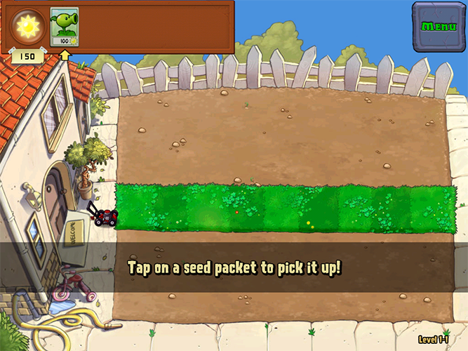
Playground
A playthrough is another example from the game industry, it’s a tutorial-like experience in which the user is taken into a dedicated flow to complete tasks that represent the main interactions. Playthroughs often establish a goal up front (“let’s build a house!”) and are performed in the context of the app’s normal interaction. Users progress at their own pace, while UI guides them and they learn by doing.
Conclusion
We’re always trying to get the most out of our interfaces and maximize whatever space is made available to us. Progressive disclosure is a powerful design pattern that is able to keep user interface clean and uncluttered and to help people manage app complexity without confusion or frustration.
When you design a progressive disclosure try to follow a simple rule — show less, provide more. In order to achieve good UX, you must get the right split between initial and secondary features. You have to disclose everything that users need up front, so that they only have to progress to the secondary display on rare occasions. The primary list just can’t contain too many options.
Last but not least, when designing instructional overlays and any other types of hints for progressive disclosure, the main thing to remember is to keep them as short as possible. Focus on user tasks and design for maximum scannability.
Thank you!