Netflix: Review of the First-Time User Experience
Netflix is a popular video streaming platform with over 200 million paid subscribers worldwide. This review covers the first steps of the user journey, such as landing, account setup, onboarding, and engagement.
This review is also available in a video format:
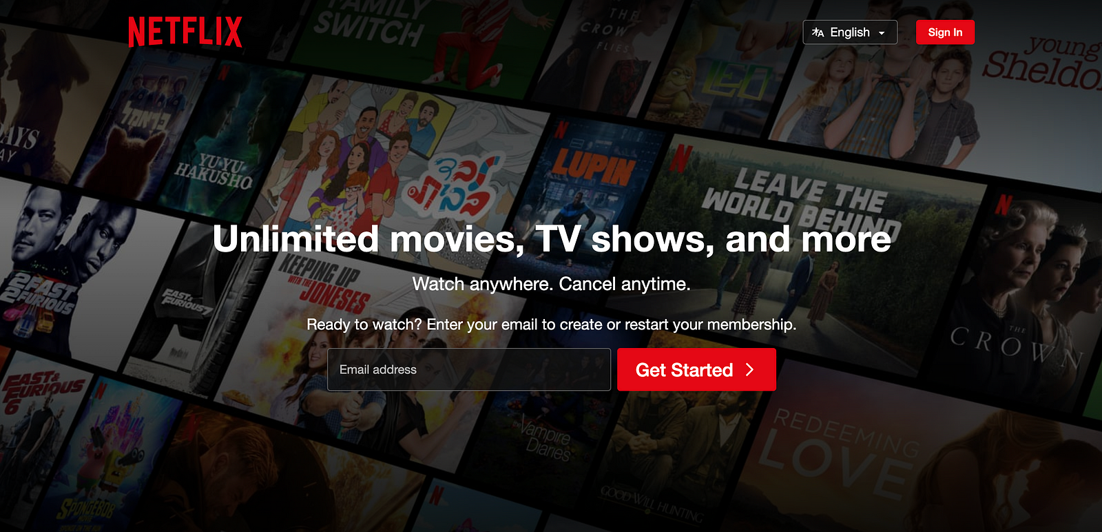
Landing page
The Netflix landing page is pretty minimal. The hero area features a value proposition along with essential details about using the service.
Statements “Watch anywhere” and “cancel anytime” increase the chance that the user will convert.
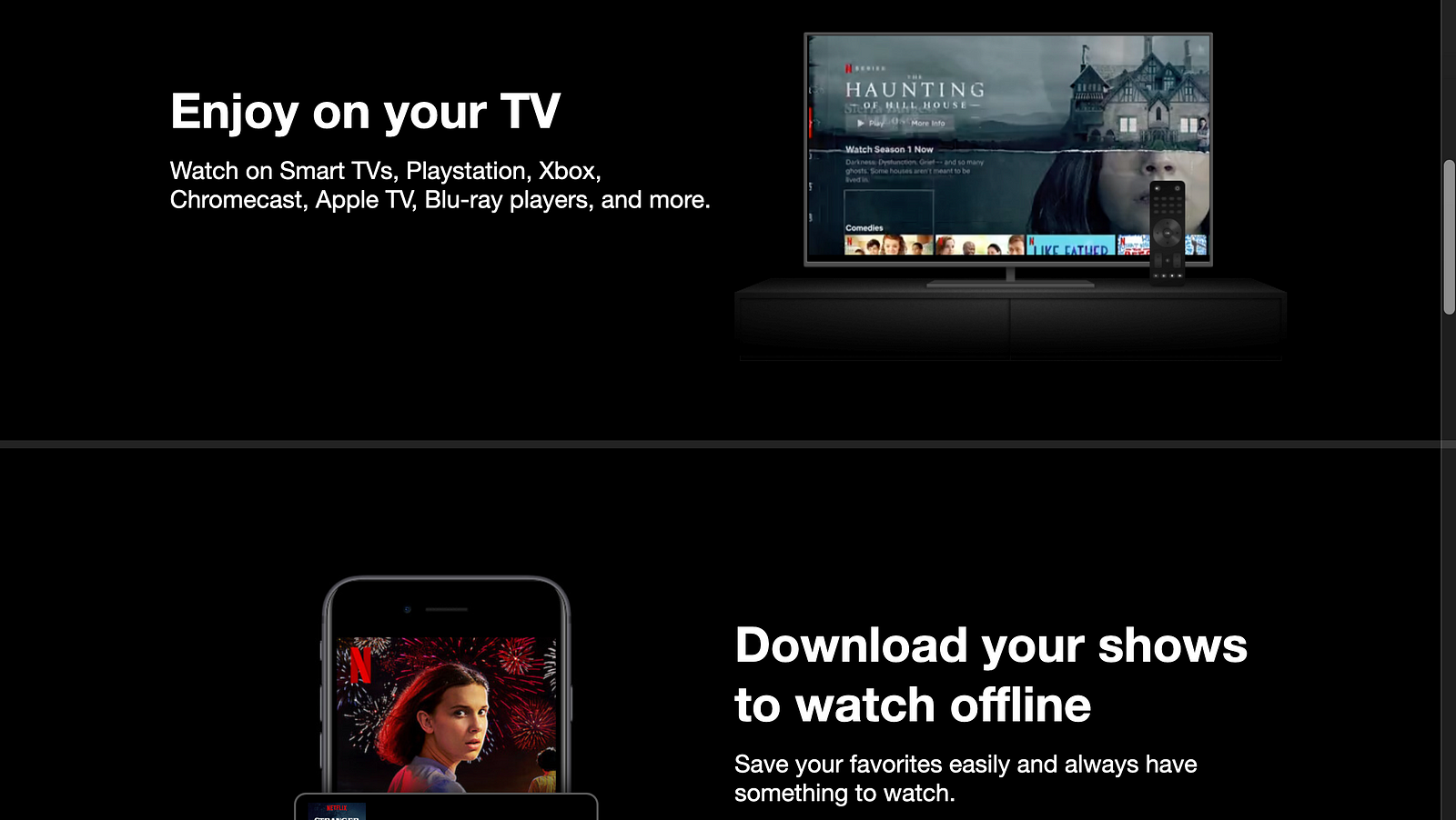
When you start to scroll, you go through a few sections that describe the benefits of using the product.
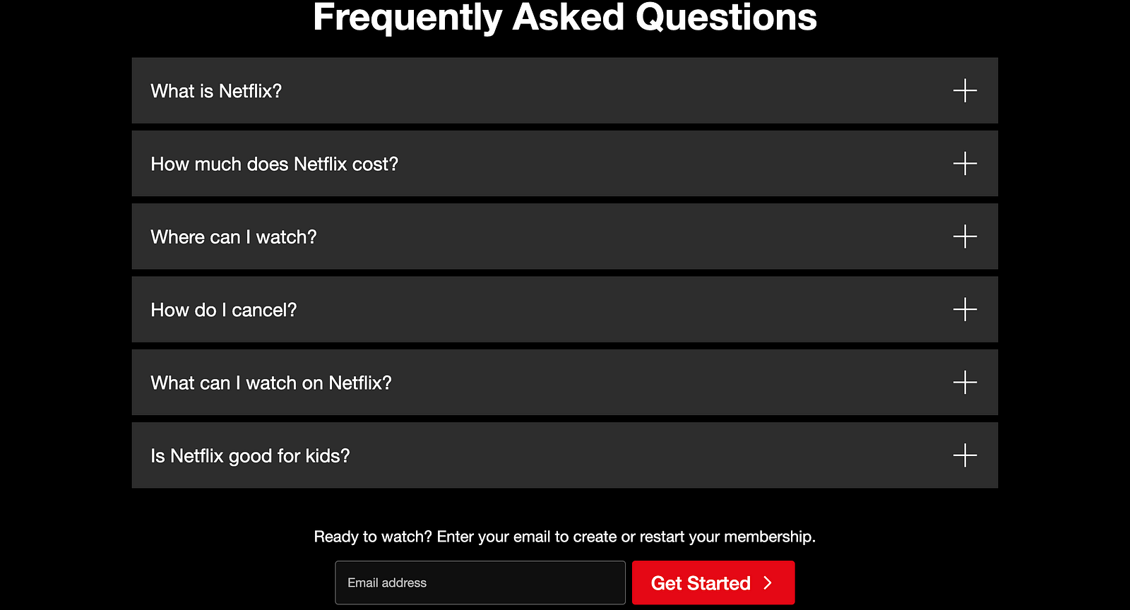
At the end of the page, you will find frequently asked questions and answers about Netflix.
Once you reach the end of the page, you will see a Get Started button, which is great because, at this point, you have more information to make an informed decision.
Pros and cons of Netflix landing page
Pros:
- It has a clear value proposition. You understand what this service is all about and what benefits you will get from it.
- FAQ section answers popular questions, so you don’t need to search for the answers anywhere on the web.
Cons:
- There is no way to explore the collection of TV shows and movies. This can be a problem because you don’t know whether the show you want to watch is streaming on Netflix or not.
- Lack of information about the pricing at this point. Although you can check the FAQ on this page to learn about the pricing, Netflix doesn’t show the price prominently at the beginning. Since Netflix is a paid service, it’s essential to be transparent about pricing.
Account setup
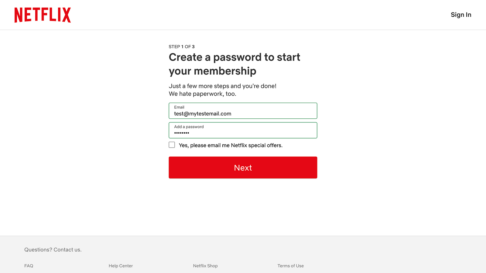
Once you provide your email, you go through a 3-step setup process.
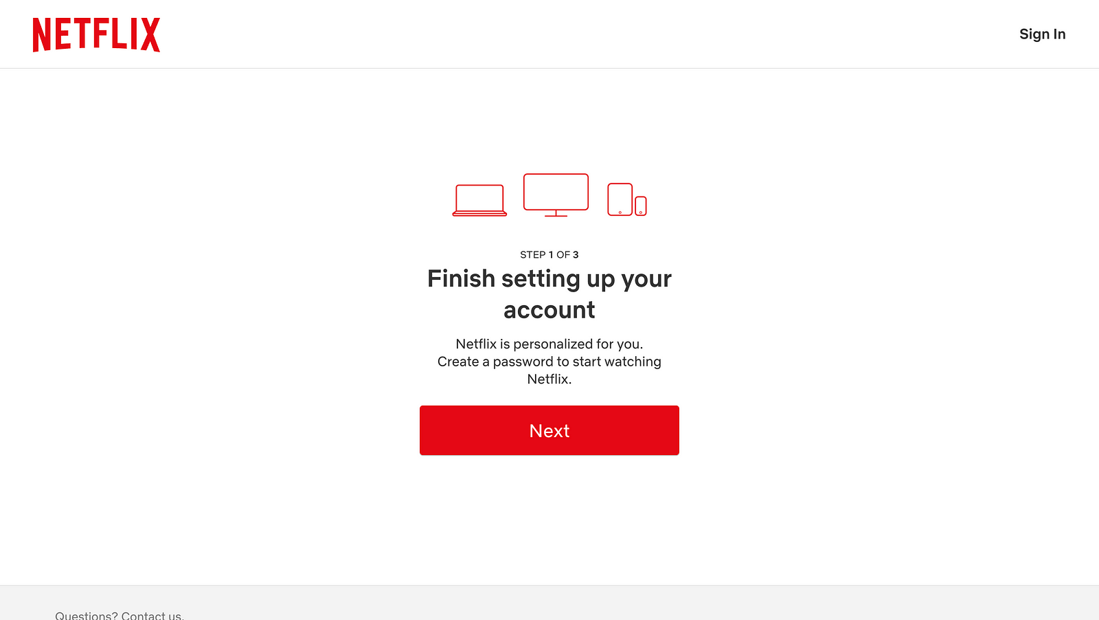
In the first step, you have to provide a password to create an account. You can choose if you want to get special offers in their email. There is no option to use social media signup. So, you cannot sign in to Netflix using your Google account. You have to use an old-fashioned email/password combination.
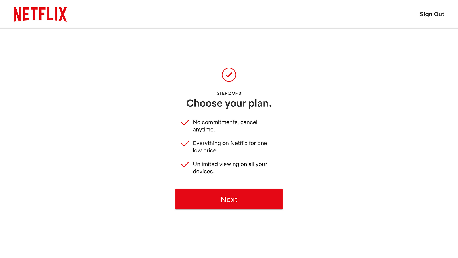
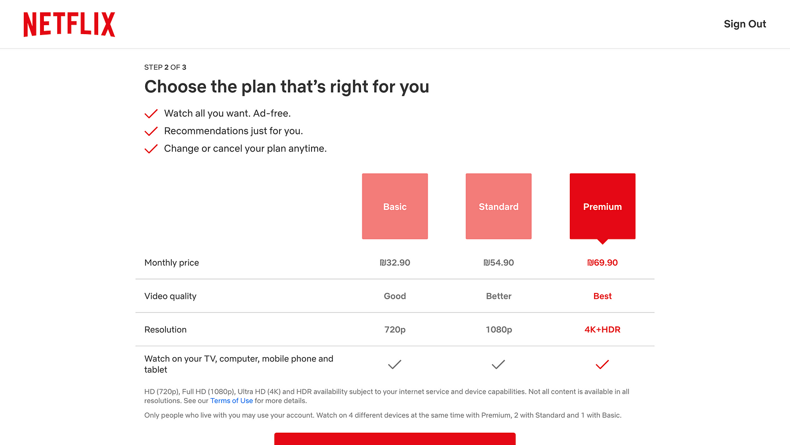
Next, you need to choose a plan. And Netflix is clear about the benefits of using the service, such as canceling anytime or unlimited watching on all your devices.
But the problem is that Netflix pre-selects the most expensive plan by default. It’s called Premium. Of course, it offers the best video quality. Yet, not all users are willing to spend extra money to get it.
Lastly, you will be asked to provide payment information. Depending on your location, you will have the option to pay using a credit card or PayPal.
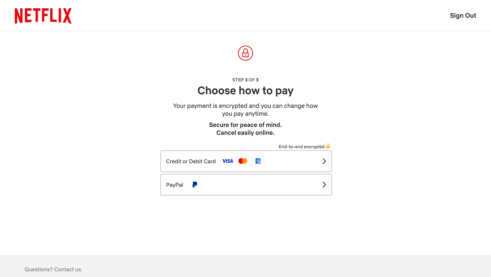
If you choose the credit card option, you will see information about the plan you’ve selected and a call to action button, Start Membership.
Pros and cons of Netflix setup flow
Pros:
- Clear step-by-step process. At each step, you have to complete only one action, which makes the interaction really focused.
- Contextual information. Netflix provides all the essential details to help you make informed decisions.
Cons:
- No option to sign in using your social media account. You have to create a password and remember it.
- Paywall. Netflix doesn’t offer free trials. So once you sign in to Netflix, you start your paid membership.
Onboarding
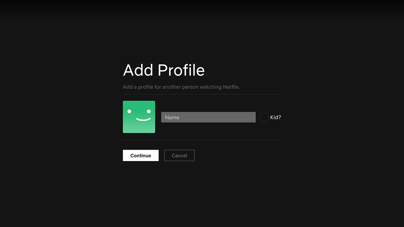
Once you start a membership, Netflix will ask you to create your profile.
You need to provide your name and mention if you’re creating a profile for a kid.
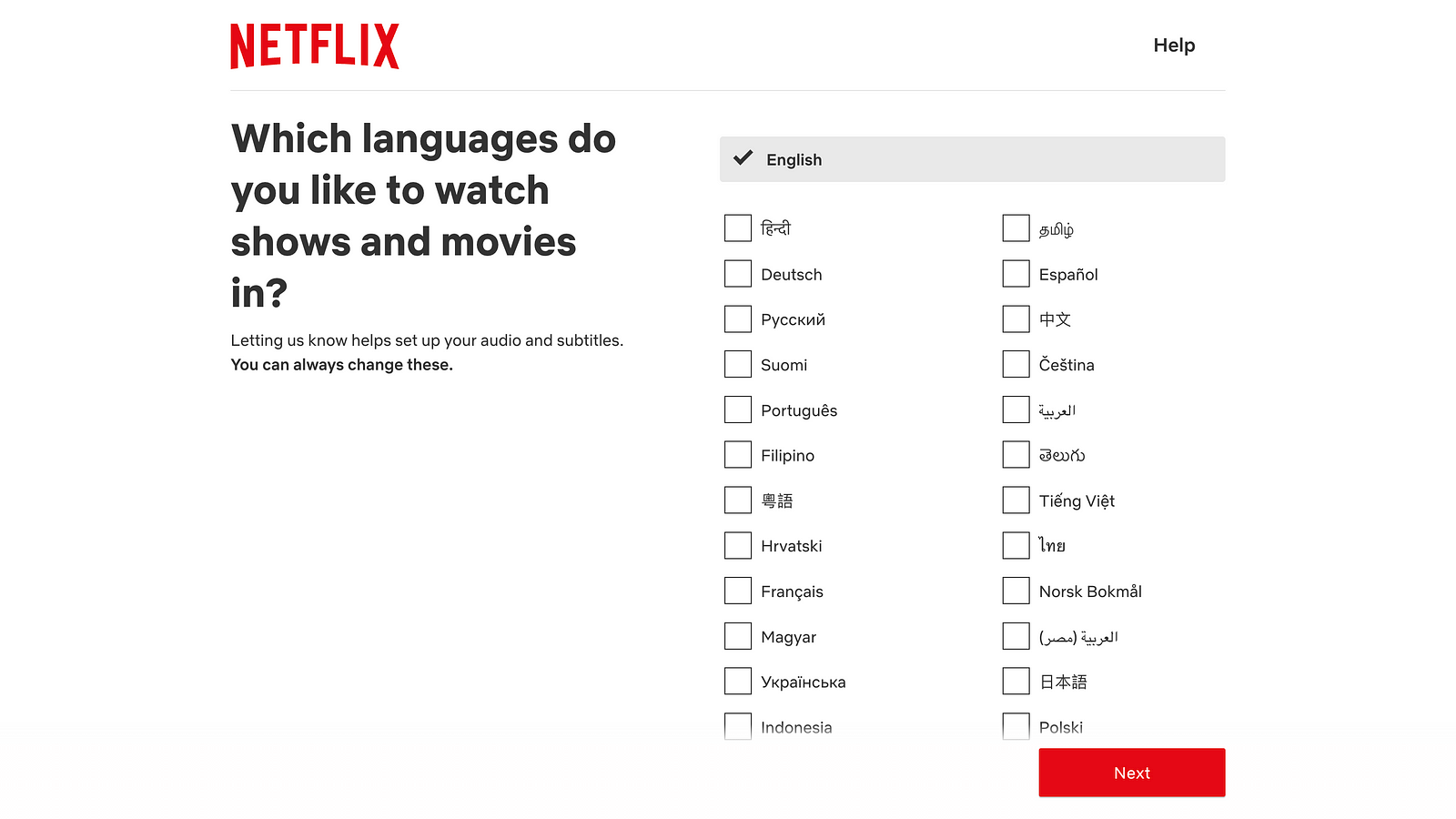
Then, you will need to choose your language.
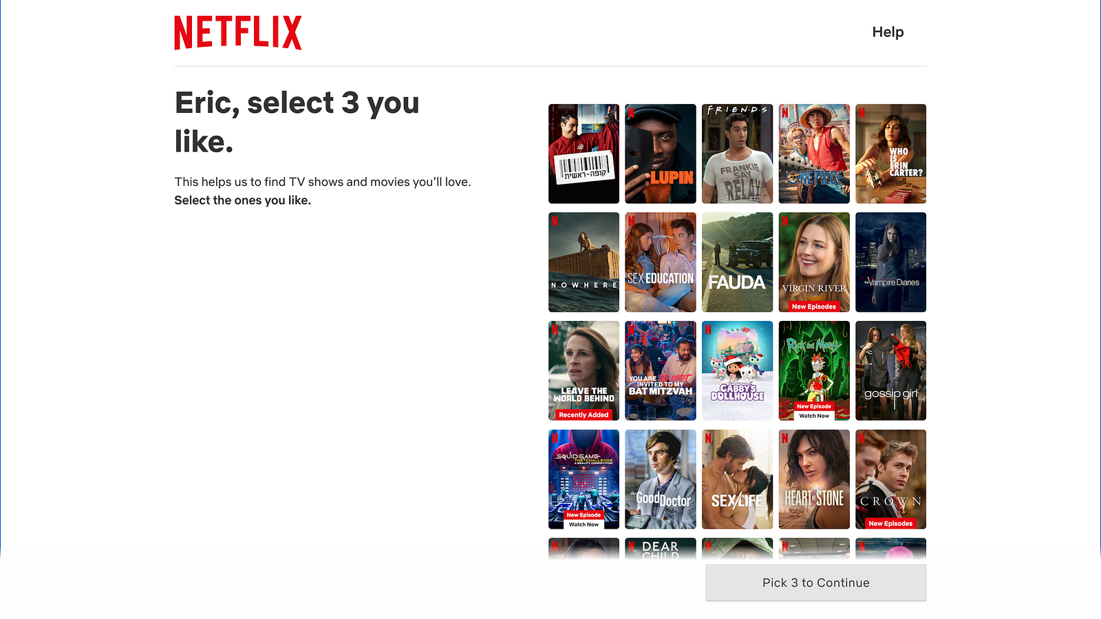
And select 3 shows or movies that you like. Netflix will use this information to provide personalized recommendations for you.
Once Netflix finds a collection of movies that you are supposed to like, it will guide you through the interface. Netflix uses contextual hints to explain how to interact with a product.
The final step is a modal window with information that you can watch your movies on all kinds of devices.
Pros and cons of Netflix onboarding
Pros:
- Simplicity. Netflix asks for the bare minimum information — your name, whether you’re a kid, your language, and 3 movies you like.
Cons:
- The kid option is unclear. At this point, it’s hard to tell what the difference between Kid and adult content will be. The user will learn that once they start using the service, but it might be unclear during the onboarding.
- Low efficiency of the contextual hints. Many users will simply pass by this type of onboarding because they want to start using a product as quickly as possible.
Engagement
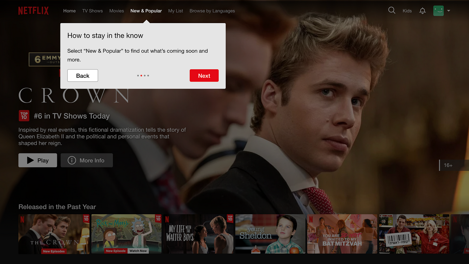
Netflix has a relatively simple UI design. The hero section on the home page features the latest show of the service selected for you. In my case, it is a Crown.
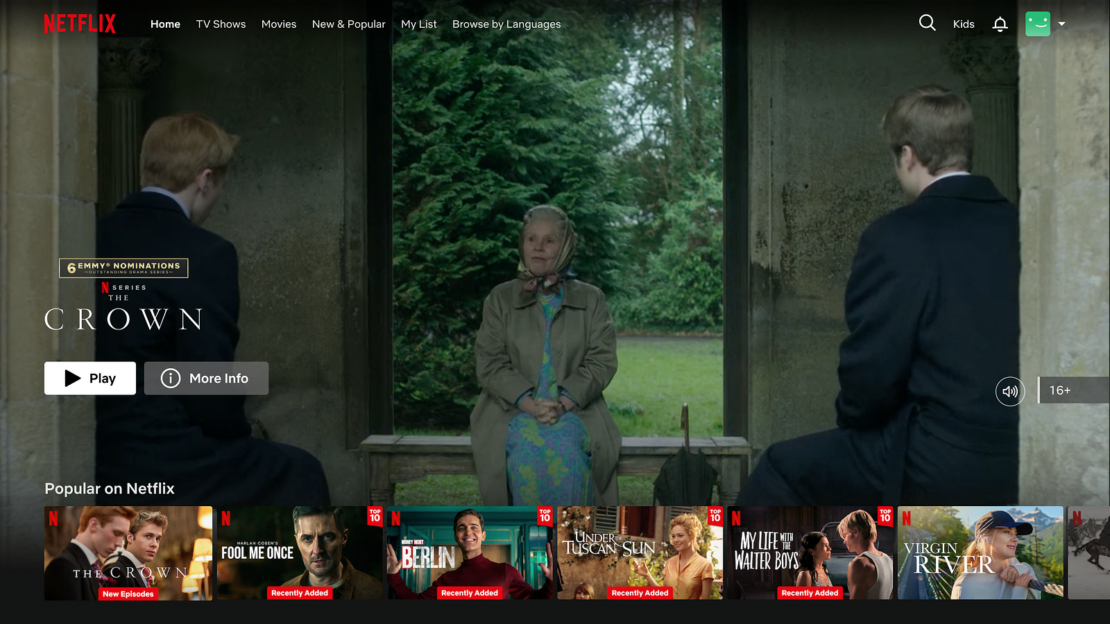
And then, when you start to scroll, you will browse through various collections of shows and movies. There are a lot of collections to browse, so your eye will scan a lot of thumbnails during the scrolling. Considering the fact that the layout is very monotonous, it will create a really uncomfortable experience.
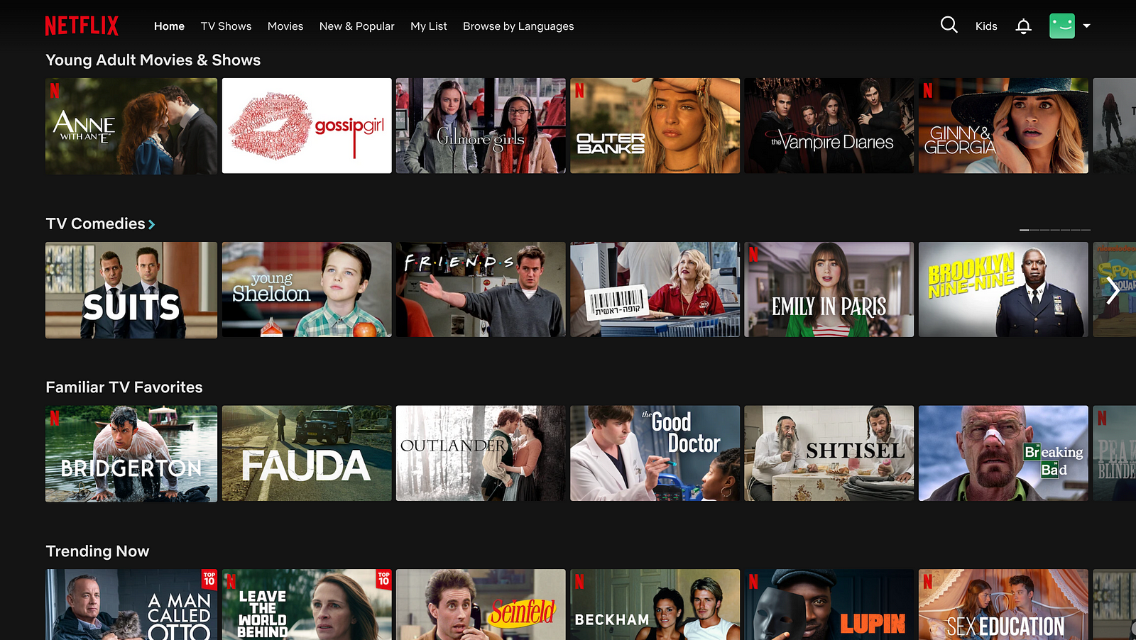
Netflix tries to break the monotony of layout by adding sections like Top TV Shows In Your Country, but this feels more like a patch rather than a solution to this problem.
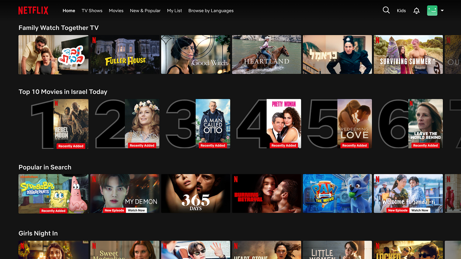
Another problem with this layout is that every collection is a horizontal scrolling list. It means that you can scroll the page in two different directions — vertically and horizontally.
All tougher, it makes it harder to choose the movie that you might want to watch if you don’t have a particular title in your mind. Because there are a lot of options to choose from and absolute freedom of choice, users often face a situation called decision paralysis.
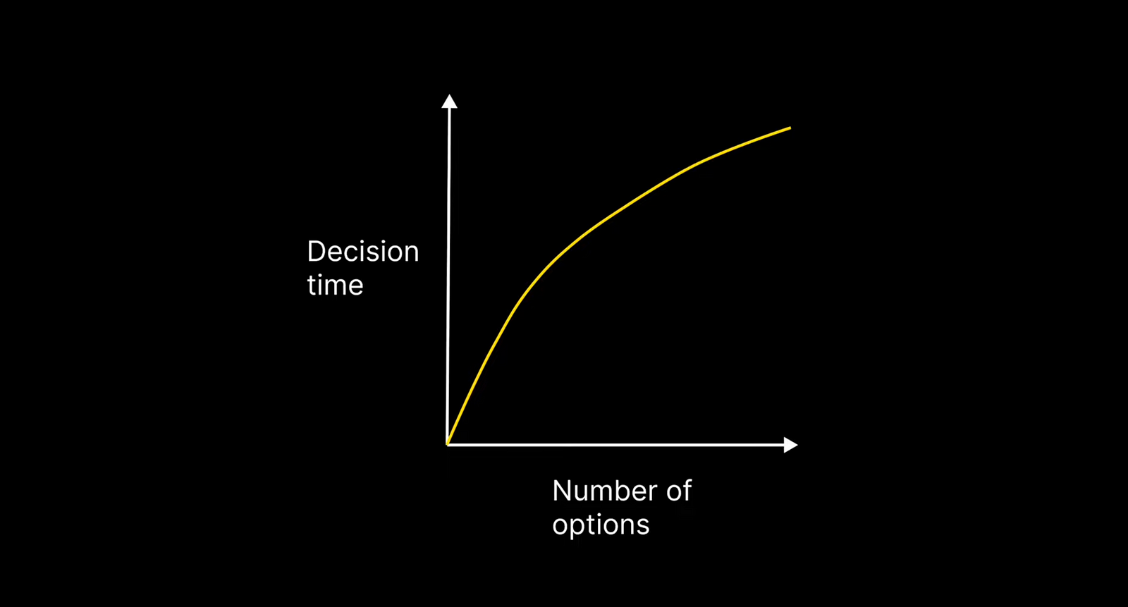
When we have a lot of options to choose from, our decision time starts to increase exponentially.
Enough about layout design; let’s talk about personalization. Netflix attempts to help users decide what they want to watch next. Take a look at the cards with movies.
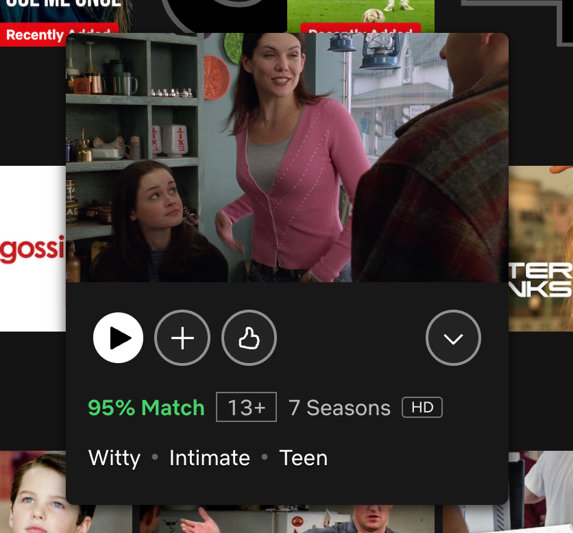
When you hover the mouse over the movie or TV show thumbnail, you will see a nice preview of this show along with essential information about it. The most notable element in the card is the match score. You see green text like 97% match. This number is calculated based on your selection during the onboarding as well as your history of watching Netflix. The top part of the page — the hero section and the first few collections feature the movies with the highest match scores.
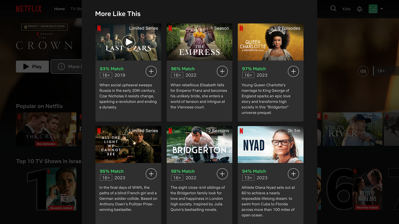
If you click on details for individual TV series, you will see a nice window with information about the show, its episodes, and More Like this section. Netflix thinks about the user journey holistically and wants to guide you to the next step — the next TV show or movie that you will want to watch.
Finally, let’s see if I can find a particular movie on Netflix. For example, I want to watch a movie called The Game. It’s a 1997 thriller directed by David Fincher.
Type The Game in the search field, and you will see a page full of movies, but I don’t see a movie, The Game.
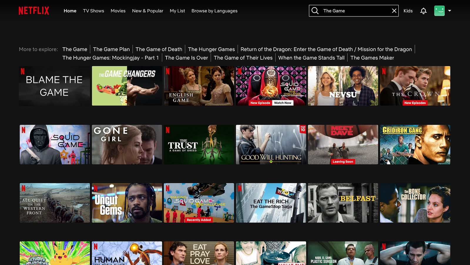
Netflix suggests trying The Game, which is exactly what I’ve typed, by the way. But let’s click the link to see what happens.
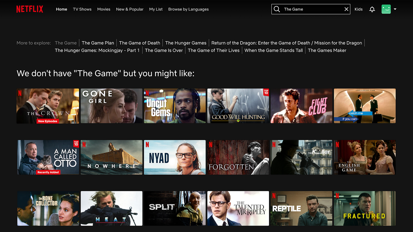
Now Netflix tells me that there is no movie The Game in its collection. And it recommends movies and TV series that I might like to watch. The problem is there is no explanation of how this selection was created in the first place. I suppose that I see Crown because I mentioned that I liked Crown during onboarding and Flight Club because this movie was also directed by David Fincher, but as a user, I have to guess how Netflix created this recommendation.
Pros and cons of Netflix engagement
Pros:
- Content personalisation. Netflix collects and analyses information about user watch preferences and uses this to suggest content that they like.
- A holistic view of the user journey. Netflix aims to increase the chances that the user will switch to another show or movie after finishing the current one.
Cons:
- Decision paralysis. Netflix offers a lot of options to choose from and gives a user total freedom of choice. It ends up in situations where users spend a lot of time finding the movies that they want to watch.
- Not really an honest search. When you search for a particular movie, and Netflix doesn’t stream it, instead of saying that there is no movie in its collection, Netflix offers a lot of alternatives that you are supposed to like. Yet, the services don’t create a proper context of how this selection was created in the first place.
This is the end of our review. Let me know what you think about this format in the comments.