Perfect Menu for Mobile Apps

Perfect Menu for Mobile Apps

In both applications and sites, users rely on menus to find content and use features. Menus are so important that you can find them in every site or app you encounter, but not all menus are created equally. Too often we face problems with menus — part of menus are confusing, difficult to manipulate, or simply hard to find.

Make It Visible

At lot of posts have been written about the hamburger menu and arguing against it.

That little three-lined button is the devil. And it’s not about the icon itself but rather about hiding the navigation behind an ico.

Out of Sight, Out of Mind

Hidden navigation is a pretty obvious solution for small screens— you don’t have to worry about the limited screen estate, just place your whole navigation into a scrollable drawer that is hidden by default.

But hamburger buttons are less efficient, since you have to tap once before you’re even allowed to see the option you want.
Drawer example

In Sight, In Mind

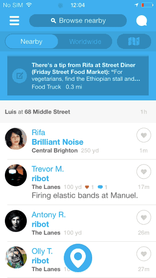
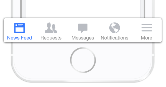
Interaction theory, A/B tests, and the evolution of some of the top apps in the world show that exposing menu options in a more visible way increases engagement and user satisfaction.

That’s why many apps are shifting from hamburger menus towards making the most relevant navigation options always visible.
Tab bar: Instead of hiding the navigation options in a drawer, you splay them out

Tab bar: Instead of hiding the navigation options in a drawer, you splay them out.
YouTube makes main pieces of core functionality available with one tap, allows rapid switching between features. ![Redesigned YouTube app for Android](/content/images/2016/03/0-PRgRsqrOnAHvjKWM.png)
Redesigned YouTube app for Android.
There are also clever ways to make the *tab bar disappear when it’s not in use*. If the screen is a scrolling feed, the tab bar can be hidden when people scrolling for new content and revealed if they start pulling down trying to get back to the top. ![Hidden Tab Bar](/content/images/2016/03/0-tGr9SfmB_H-i5GXi.gif)
Hidden Tab Bar.
Last but not least, many designers make the mistake of putting their sorting items in a dropdown menu. But this led to the same problem — users only see the selected option, while the other sorting options are hidden. ![Lower visibility (Dropdown Menu) and Higher visibility (Toggle Button)](/content/images/2016/03/1-wYYXbYt8V_qAFOvXu6_NXQ.png)
Lower visibility (Dropdown Menu) and Higher visibility (Toggle Button). Image source: uxmovement.
Toggle button example for iOS: ![](/content/images/2016/03/1-C5T6A7tJu4FMi6EnU5j52A.png) **Takeaway:** Many apps still use the hamburger because it’s an easy way to jam a ton of links into an app. But it’s wrong direction because if *your navigation is complex, hiding it does not make it mobile friendly*. #Communicate the Current Location Failing to indicate the current location is probably the single most common mistake to see on site or apps menus. “Where am I?” is one of the fundamental questions users need to answer to successfully navigate.

Users rely on visual cues from menus to answer this critical question. But sometimes what they see isn’t what they actually expect to see.
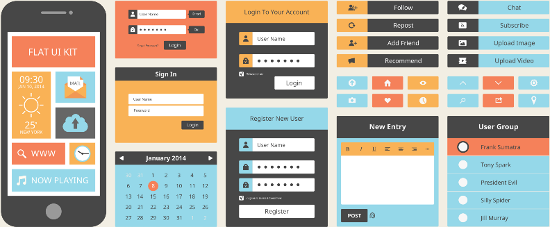
Icons

There are a universal icons that users know well, mostly those representing functionality like search, email, print and so on. Unfortunately “universal” icons are rare. And app designers often hide functionality behind icons that are actually pretty hard to recognize.
Previous version of Bloom.fm app for Android. It’s really hard to understand current location for user

Previous version of Bloom.fm app for Android. It’s really hard to understand current location for user.
I’ve highlighted this problem in [this post](http://babich.biz/icons-as-part-of-an-awesome-user-experience/).

Colors

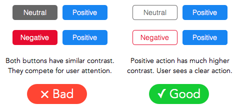
Current state can be directly presented in the tab bar using contrasting colors and properly selected label.

How button color guides users to action. Image source: uxmovement.
Good example for color selection. ![Selected element Updates in tab bar.](/content/images/2016/03/0-CyDztMxKGjKNy0-y.png)
Selected element Updates in tab bar.
**Takeaway:** [Properly selected icons](http://babich.biz/icons-as-part-of-an-awesome-user-experience/) and colors can help users understand the current location. If you use icons, always have them [usability tested](https://www.nngroup.com/articles/icon-testing/). #Coordinate Menus with User Tasks You should use *only understandable link labels*. Figure out what users are looking for, and use category labels that are familiar and relevant for your target audience. Menus are not the place to get cute with internal jargon. So stick to terminology that clearly describes your content and features.

Users love mobile apps that nail a specific use case really quickly. And you can reduce the amount of time users need to spend understanding menus.
Twitter menu for iOS

Twitter menu for iOS.
Complex features should always be displayed with a proper text label.

Takeaway: Menu elements should be easy to scan. Users should be able to understand what exactly happens when they tap on a element.

№Make It Easy to Manipulate
Elements that are too small or too close together are a huge source of frustration for mobile users. So make menu links big enough to be easily tapped or clicked.

An MIT Touch Lab study found that the average width of the index finger is 1.6 to 2 cm for most adults. This converts to 45–57 pixels.

Pixel Width of the Average Index Finger. Image source: uxmovement.
A touch target that’s 45–57 pixels wide allows the user’s finger to fit snugly inside the target and provides them with clear visual feedback that they’re hitting the target accurately.

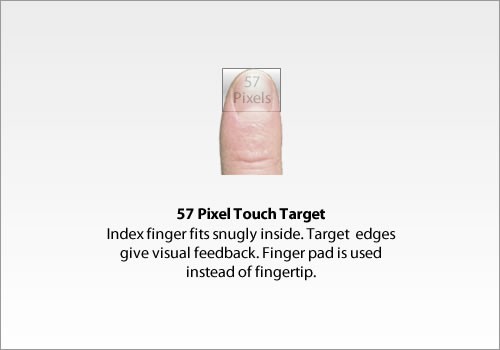
Takeaway: Menu should have finger-friendly design. Matching your touch target sizes to the average finger size improves mobile usability for many users.

Conclusion

Helping users navigate should be a high priority for almost every site and application. The goal behind this moments is to create an interaction system that naturally aligns with the user’s mental models.

Simple user flows, clear visuals, and forgiving design help create the illusion that the user’s abilities allowed for a seamless experience. And your interaction system should aim to address problems for your users through clear visual communication.

You’re designing for your users. The easier your product is for them to use, the more likely they’ll be to use it.
Thank you!

Subscribe to Nick Babich

Don’t miss out on the latest issues. Sign up now to get access to the library of members-only issues.
jamie@example.com
Subscribe