In-app Gestures and Mobile App Usability
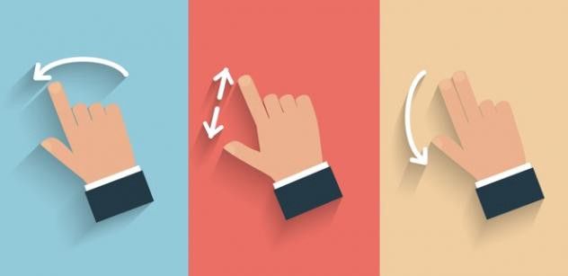
When Apple introduced the iPhone in 2007, touchscreen-centered interaction got mainstream attention and users learned that they could not tap on the interface but also zoom, pinch and swipe it.
Parents are amazed by how fast their children understand how a tablet or smartphone works. And today success of a mobile app can dramatically depend on how well gestures are implemented into its user experience.
What Gestures do People Use?
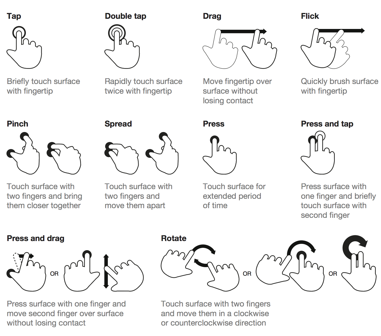
According to the Luke Wroblewski article, the study asked 40 people in nine different countries to create gestures for 28 different tasks like deleting, scrolling, zooming, etc.
- Less clutter. The more an app relies on gesture controls, the less buttons on-screen, thus more space for valuable content. This make the app very content-focused.
- More delight. A gesture, once discovered and learned, can become a delight to use and can improve user experience by reducing steps in the user flow.
- More potential. While buttons might seem to be useful triggers, gestures have great potential to make interaction with content more intuitive and fun.
The rise of touch and gesture-driven devices dramatically changes the way we think about interaction. Animation paired with gesture-control essentially tricks the brain into thinking that it’s interacting with something tangible. So we become that much more immersed in the experience.
There are several ways around this, but Max Rudberg in his post “If You See a UI Walkthrough, They Blew It” , advises against walkthroughs.
Mailbox was a good example of onboarding— users get a walkthrough where they have to try each gestures before actually starting to use the app.
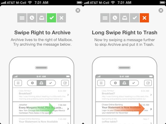
- Without visual cues, users could get confused about how to interact with the application. A bit of exploration is no problem, but users should know where to begin.
- Walkthroughs should explain only the most important interactions. Don’t explain everything at once. Users will skip it.
Consistency
Most gestures are not standard and consistent across apps yet. They are not obvious for users.
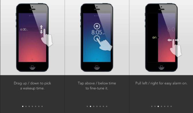
Even a simple gesture like swiping over an email works differently in various mail apps. In Apple Mail client swipe to the right gesture stands for Unread action:

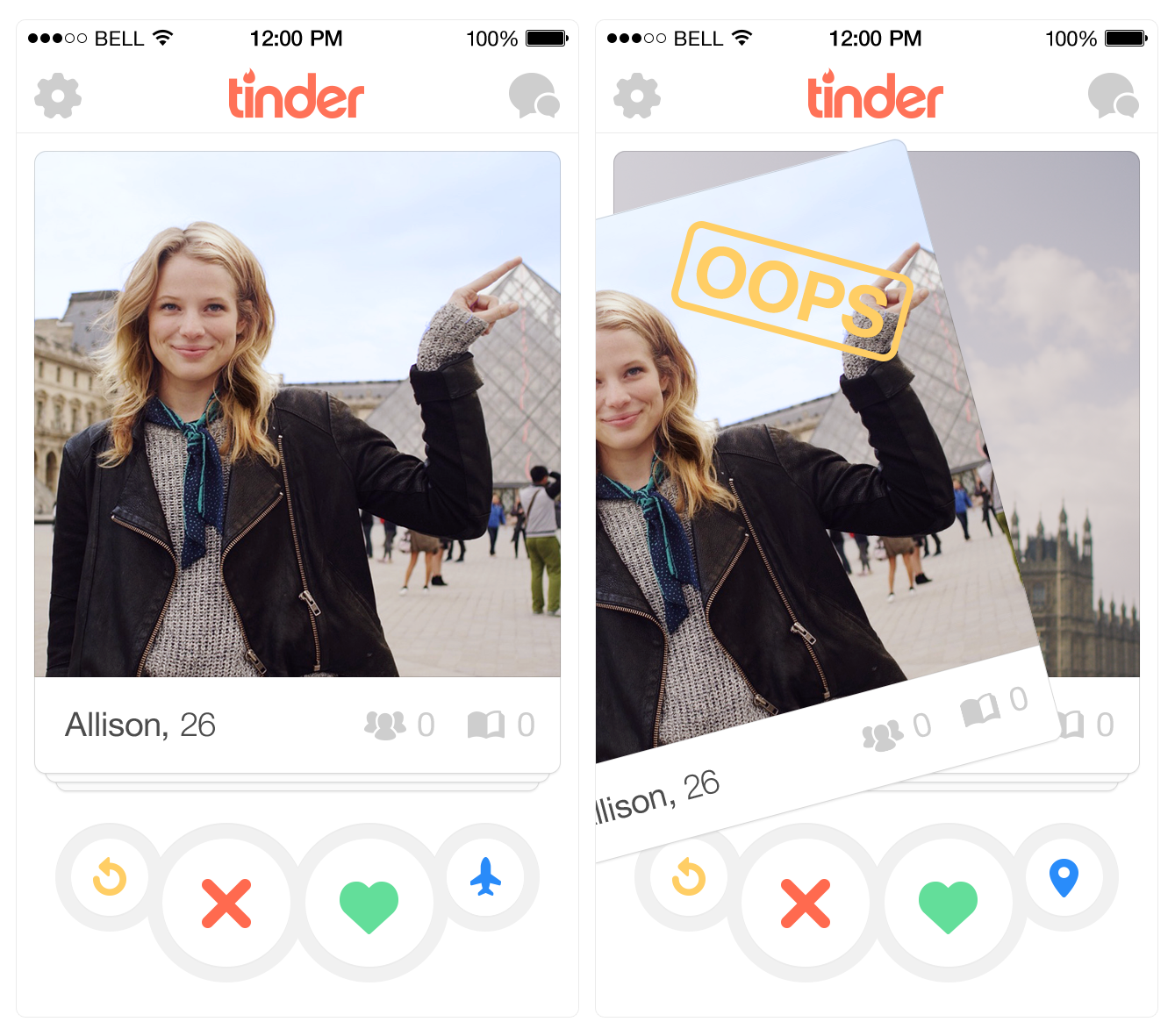
But What About Tinder?
Tinder changed industry with the swipe gesture. They literally teach the whole world what swiping right means. This interface choice is about as good as it gets — simple and easy to understand.
Moreover, their looping capabilities are phenomenal — using Tinder becomes addictively fun. This keeps users on the app “for just five more minutes.”
Conclusion
Gestures are a great way to make an app more content-focused, original and fun. But when designing an innovative mobile product, predicting user behavior can be very difficult. Never forget that gestures are hidden controls and have to be memorized. And visibility is still a very important principle to consider when designing mobile apps.
In order to make a “good” gesture, you have to start by looking at the current state of gestures in the mobile world.
When it comes to selecting button or gesture, think of it this way: Does the action the user is completing in their experience directly correspond to an action on the screen? If so, a gesture might be a good alternative to a traditional button click action.
That’s all. And now let’s stop talking and start making!