The Most Creative Mobile Navigation Patterns

Designers know that design is more than good looks. Design also covers how users engage with a product, whether it’s a website or app. It’s like a conversation. Navigation is a conversation. Because it doesn’t matter how good your website is if users can’t find their way around it.
In this post, we’ll help you better understand the principles of good navigation, then show you how it’s done with some of creative patterns. But first, let’s start with a quick overview of mobile navigation fundamentals.
The Principles of Mobile Navigation
Navigation UI patterns are a shortcut for good website usability. They do wonders for learnability, since there’s less your user has to figure out on your site. While thinking outside the box is usually a good idea, there are some rules that you just can’t break.
Simple
First, and the most important, a navigation system must be simple. Good navigation should feel like an invisible hand that guides the user along their journey. Also the obvious difference between mobile and desktop design is the screen size. Mobile screens are smaller, so all parts of the screen become more valuable.
Coherent
The function must be self-evident. Visitor should know how to go from point A to point B based on their first glance and without any guidance from the outside. You should use the proper signifiers (such as a sound, printed word, or image) so that the navigation doesn’t require any explanation. Also it’s a very important to provide an orientation for your visitors by letting the visitors know where their current page is in relation to other pages.
Consistent
The navigation system for the all pages should be the same. Don’t move the navigation controls to a new location on different pages. You should choose which type of navigation system will work best for your site, but once you make a decision, stick with it.
Be Creative
The problem with patterns is that it’s hard to stand out when you’re doing the same thing everyone else is doing.
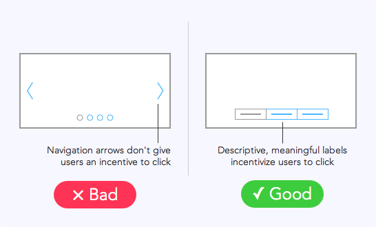
Sliders
Sliders (not carousels!) work especially well for progressive or closely related pages. If you have only a few elements to go through, sliders are a great navigation tool.
Pictorial Icons
Pictorial icons is one of the most interesting solutions to the problem of saving mobile screen space. The picture on the icon should explain where it will take user. Everyone knows that an envelope icon represents email, but how you choose to draw the envelope is up to you. This makes navigation simple and easy-to-use, but still with enough freedom to separate you from others.
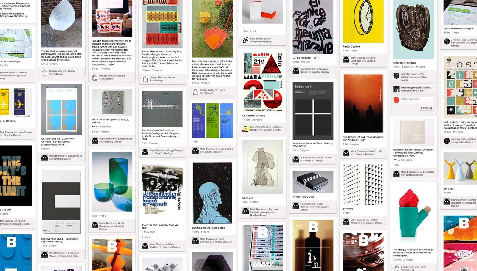
Pinterest and many other popular services are built around cards.
Full-Screen Menu
While many apps and sites are struggling to minimize the space their navigation systems take up, the full-screen pattern takes the exact opposite approach. It unobtrusively dishes up lots of data, neatly displaying text and multimedia and at the end it has one major benefit — it is very easy to use.
Cookly has a massive navigation system with menu that takes up the whole screen in order to handle image links more efficiently. The simplicity of the navigation ensures that the user will get where they want to go.

Conclusion
There’s nothing necessarily wrong with more traditional navigation UI patterns like navigation drawers, tap bars and pulldowns except that they’re used quite a lot. Sometimes you need to stand out from the crowd and bring creativity in user flows. Just remember that you can’t sacrifice usability.
The only thing worse than getting lost in the crowd is being clever for the sake of being clever. You need to find that sweet spot (golden mean) right between familiarity and creativity.