Responsive Design Best Practices

Responsive design is not a single technology but a set of techniques that allow web pages to serve the needs of both mobile and desktop users.
The most important thing about responsive design is flexibility. Everything must be flexible: layouts, image sizes, text blocks —absolutely everything. Flexibility gives your site the fluidity it needs to fit inside any container.
And now let’s focus on the core components:
Pick Major Breakpoints
A breakpoint is the media query values that will mark the transition to a new class of devices. You need a minimum of 3 breakpoints — one for each type of device (mobile, tablet, and desktop).
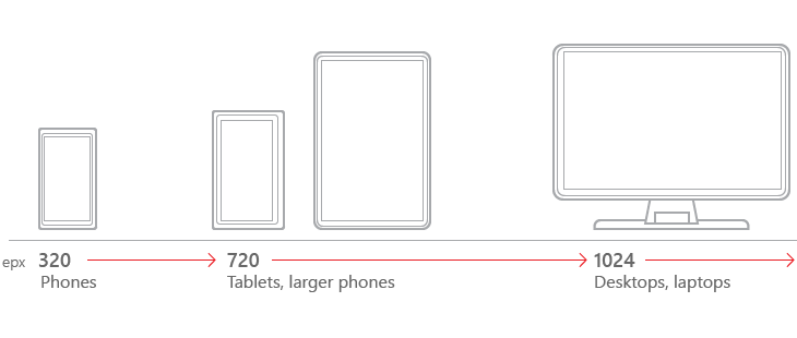
There is no universal set of breakpoints or best practices, however you should use at least 4 breakpoints for the most device flexibility (see illustration).
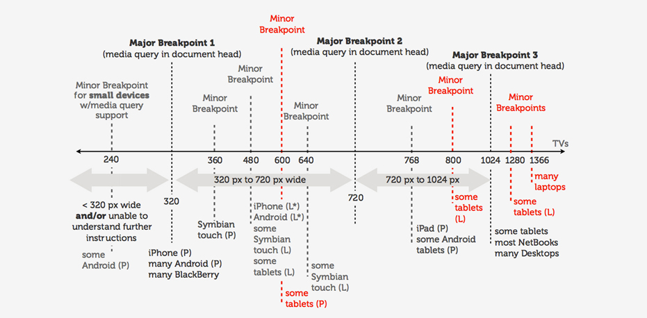
Tips: When designing for specific breakpoints, design for the amount of screen space actually available to your site (an actual browser’s window). When the site is running full-screen, the site window is the same size of the screen, but in other cases, it’s smaller.
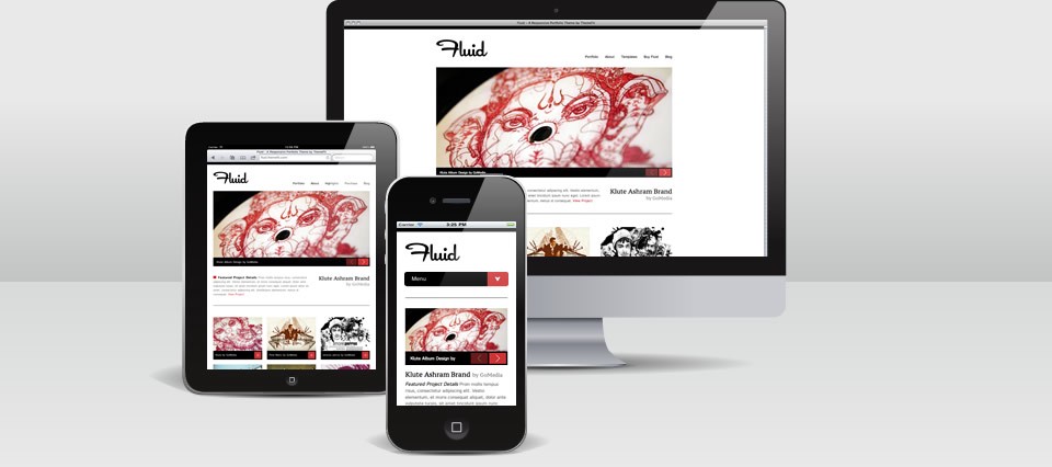
Use Fluid Images and Video
Images are not naturally fluid. But you should modify them. Fluid images and video are non-negotiable for responsive design — not only for size, but for cropping.
- Images should be rendered at their native dimension so long as there is enough room in the HTML container to do so. On smaller screens, crop some images so they retain their impact. Great tutorial from Ethan Marcotte has answers on the most technical related questions.
- Try Scalar Vector Graphics. Unlike raster graphics, SVGs alter their resolution based on image paths, not pixels, so they remain the same at any size.
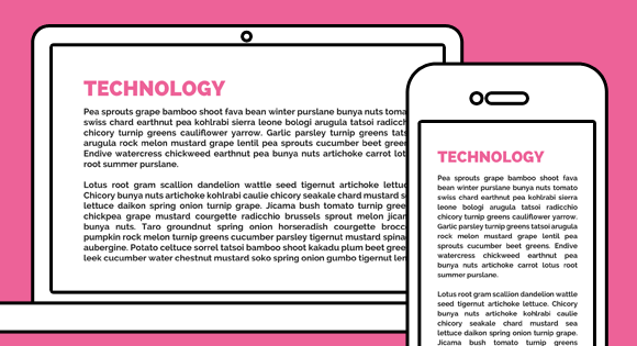
Pay Attention to Font Sizes
Typography is the cornerstone of the web making up approximately 95% of all things web. When choosing a typeface, be sure that your selection works well and maintains the overall feel you want whether you scale it larger or smaller.
Tips:
- Make text accessible. You need to make sure that your text is legible and accessible by using sufficient color contrast and an easily readable font.
- Use “real” text rather than text within graphics. Because text can be transformed into sound through the voice synthesizers in screen readers. And text can also be enlarged by screen enlargement or magnification software, without any loss of quality.
- Make big headlines responsive. Make headings clearly headings, at least 1.6 times as large as the text they support.
- Make body text responsive. Ethan Marcotte, the guy behind the whole “Responsive Web Design” idea, wrote an excellent article on the Adobe Typekit blog explaining why using em (and rem, coming in the next section) is a lot better than using pixels to size your fonts.
Design the Smallest Views First
Designing with the mobile (smartphone) layout first will help you separate the essential elements from the secondary ones. Once the mobile design questions are answered, designing for other devices will be easier. The mobile-first approach is also a content-first approach. The heart of the site is content — that’s what the users are there for.
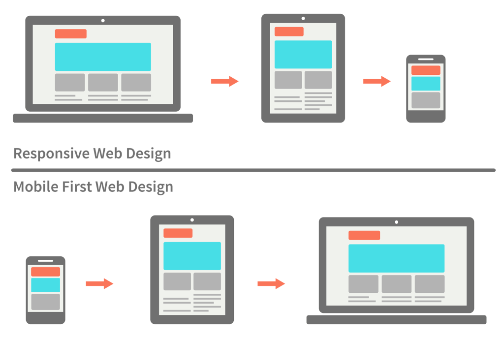
Takeaway: Build the mobile wireframe first, then use that as the model for larger breakpoints.
Tips:
- Avoid large graphics. Cater to mobile users with images that are readable on handheld screens.
- Test it in a real device. Just try your site on a real phone or tablet. Nothing beats discovering for yourself how usable a website is. 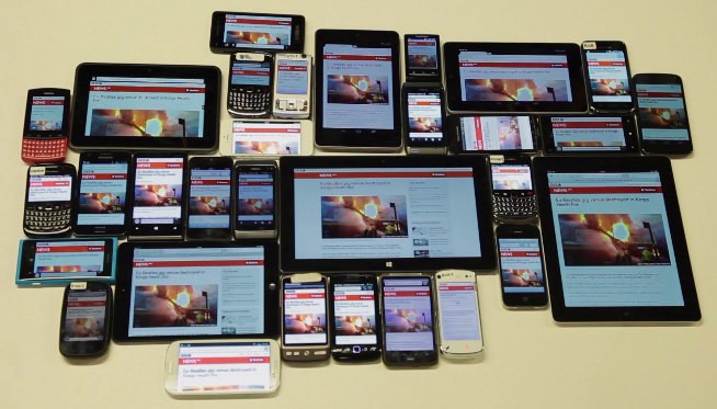
- Design Scalable and Smart Navigation. What works perfectly well for larger screens could break down completely on other devices. Also you should be as consistent as possible in your navigation, including the labels used on buttons.
Use Design Patterns
Google product director Luke Wroblewski described five broad categories of responsive layouts. For this article I select four most popular:
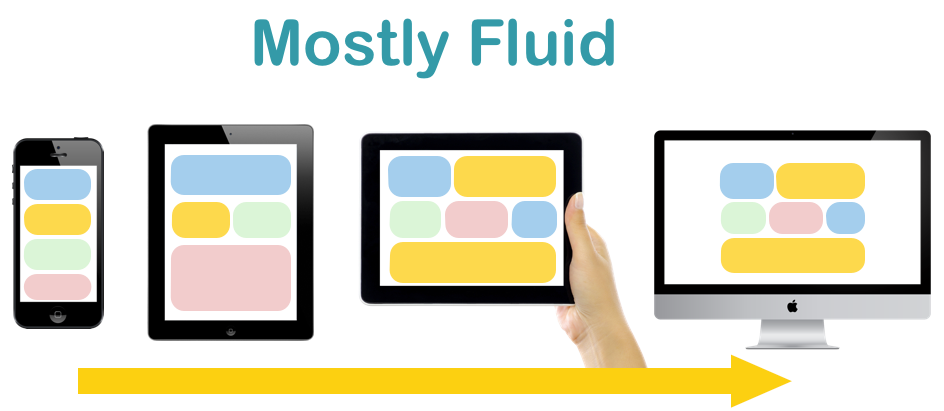
Mostly Fluid pattern is a multi-column layout that introduces larger margins on big screens, relies on fluid grid. It works well on sites with a diverse set of layouts among its many pages like marketing sites, ecommerce sites, news sites — anything with more than one type of content.
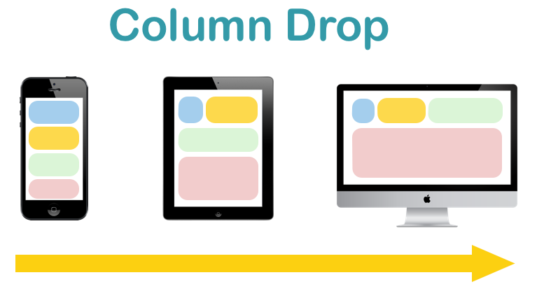
Column Drop pattern tends to fill the available viewport regardless of size. It is ideal for responsively designed sites that users will view on a very wide range of displays.
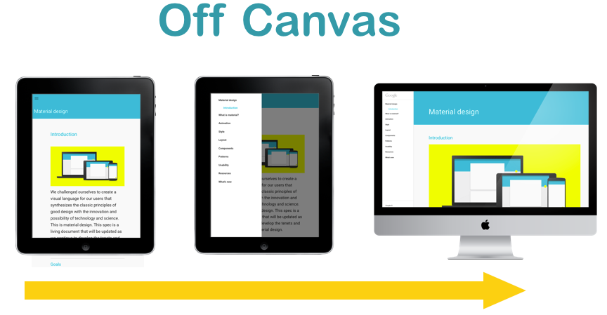
Off-canvas pattern pushes secondary content out of sight, literally outside of the viewport until called upon. This pattern is a really good not only to navigation, but also to sites that need to focus on large amounts of content and keep asides literally to the side.
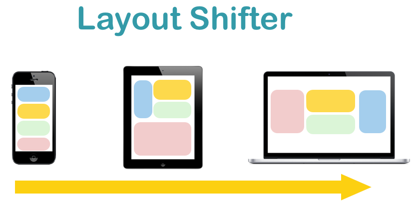
Layout shifter pattern does the most to adapt across different screen sizes. This requires designers to consider each breakpoint range as if it were an independent design. It usually works well for visual-heavy sites like photo galleries.
Takeaway: Patterns cover most situations that occur across the web. And you can choose from these patterns to give your layouts basic direction.
Don’t Forget About Visual Hierarchies
Visual hierarchies take center stage when you’re designing for mobile devices. Some content should be viewed first, some second, some third, and on down the line. The most important content is at the top of the hierarchy. Fancy hover menus, sliders, flash-based animations — all the clutter should be taken away at the beginning, and instead of focusing on effects what is being considered is how to display the content in the most rational way.
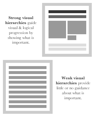
Takeaways: Prioritize the elements in the content inventory and determine how to display the most important elements prominently.
Conclusion
Responsive design is still progressing, and there’s no consensus as to what might constitute the “perfect pattern.” Responsive design must be able to adapt to any size including wearables. I hope these best practices would be helpful.