Animation is a big part of user experience. When it comes to transitions in mobile apps, there are a lot of things you can communicate very subtly with animation. Send the message, open Settings, check the box, navigate to another page — these are all moments of change. Animating a transition is an excellent way to reinforce the user’s action.
In this article, we’ll review the common cases when functional animation can complement the visual design and support interactions.
Provide system status
When users trigger some action they expect to see a visual response — the system should make it clear that it received the request and working on it. Here are a few cases when animated feedback can benefit user experience:
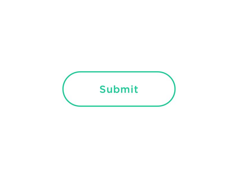
- Confirm user action. Users get an acknowledgment that system receives the action. When users have visual feedback, this prevents them from tapping on the element again.
Notify users of the results of their actions. Image: Colin Garven
- Update content on the page using pull to refresh. Visual feedback in the format of loading indicator helps users understand that system is working on their request.
Subtle animation helps users understand what is going on. Image: Ramotion
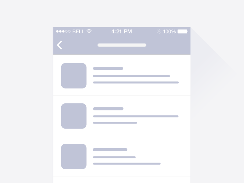
- Waiting for content to load. Loading doesn’t have to be boring. Almost any app can utilize a subtle animation when loading it’s content to prevent users from going away. Loading animations keep the user occupied with visual feedback and as a result, users perceive a shorter wait time.
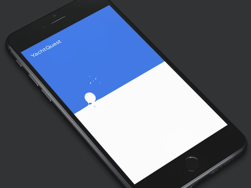
Animation can keep the user engaged even before the app fully loads. Image: UI8
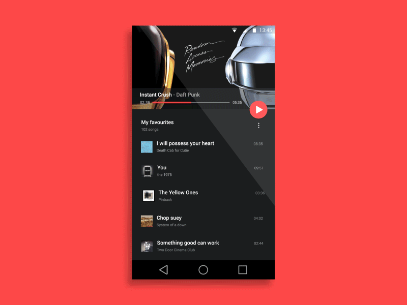
Connect different steps in multi-step process
Sometimes users need to go through a series of steps to complete an action. It should be clear that steps are connected to each other. Animation can help you to connect each step to create a whole journey.
Below is an excellent example of how using animation can create a linear progression of events.
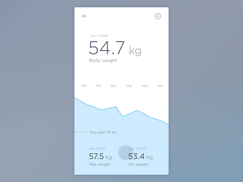
Image: Jakub Antalík
Animation can help designers to create progressive disclosure. Progressive disclosure makes the interface easier to learn by reducing the amount information presented at one time. Here are two great examples of using progressive disclosure to provide information in meaningful chunks:
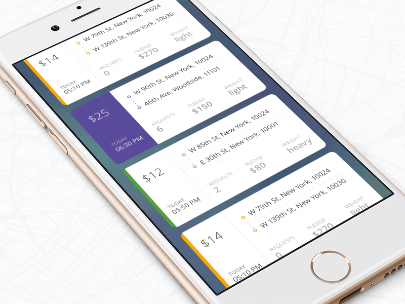
Image: Ramotion
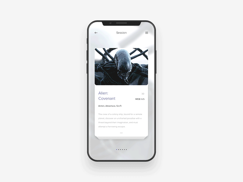
Image: Anton Skvortsov
#Introducing new elements
When we introduce a new element on the page, we try to focus users attention on the object and help them answer the question “Why do I see a new object?” Animation helps you to define object relationships and hierarchies when introducing new elements.
#Give the user a sense of spatial orientation
Animation helps users build better mental models of spatial information. And this is especially important for mobile users — a combination of short attention span together with a small screen size can easily lead to the situation when users get lost in the maze of screens.
We can use animation to guide the user. Animation helps to explain how information flows from one state to another are linked together. It keeps users from getting lost by giving the user information about what they’re going through right now.
Orientational animation lets you know where are you now in relation to where you came from. Image: Jae-seong, Jeong
In the following example, the floating action button (FAB) transforms into a header and makes it clear to the user how these two objects related to each other.
Animation can help you build a relationship between elements. Image: Anish Chandran
#Minimize cognitive load
Cognitive load is an amount of mental effort required to use a product. Cognitive load has a direct effect on how easily for users to interact with your app. Generally, the more effort required to use a product the less desirable it becomes.
As designers, our goal should be in creating an interface that is easy to use. Animation, when used well, reduces user effort required to complete the task.
In almost any app users have to fill out some forms. Many forms have text placeholders as labels for fields. When users tap on such field, the label disappears. As a result, it becomes hard for the user to figure out what this field represents. Floating label helps users to keep the context and makes it comfortable to interact with long forms.
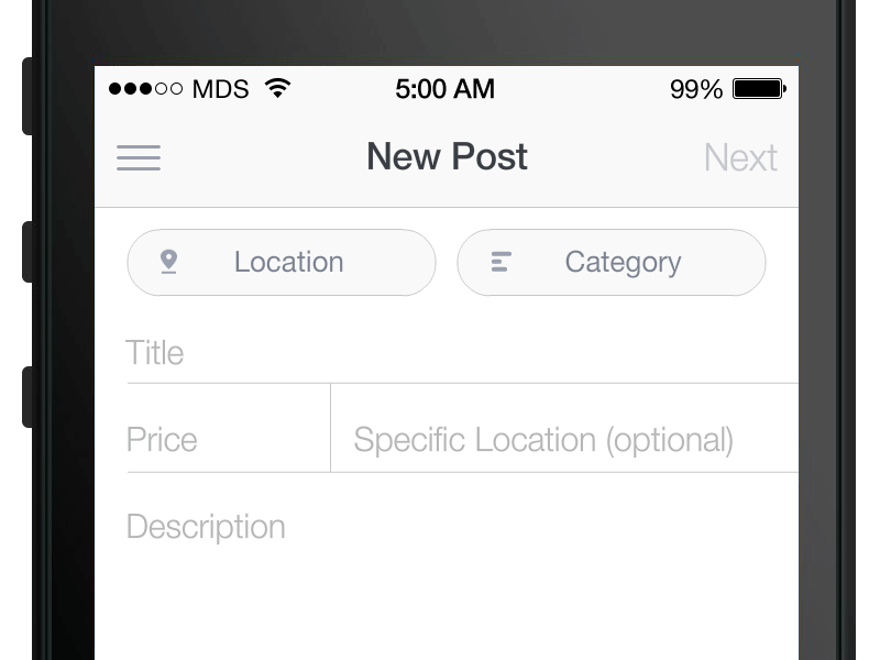
When it comes to user input, don’t rely on users memory. Make all critical information visible. Image: MDS
#Allow users to comprehend the functional change
Functional change happens when the element changes its function after the interaction. For example, when a user taps on the button, the button will mean a different thing. This animation helps users find the answer to the question “What this element does now?”
One common example of functional change which can be seen in many mobile interfaces is a toggle. Animation helps users understand what is the state of the element.
Button animates on tap so users can see the change. Image: Jurre Houtkamp
In some cases, the functional change of single element leads to the change of entire view. For example, a hamburger menu that changes to ‘X’ and activates a new view.
Make it clear to users that object utility was changed. Image: Tamas Kojo
#Conclusion
Animation is powerful when used in sophisticated ways. It solves a lot of functional problems within interfaces and makes them feel alive and genuinely responsive to the user. No matter what app you design it tells a story to your users. And animation can help you tell a story much more effectively.
Thank you!