Mobile Web: When Speed Matters

In 2016, mobile internet usage exceeded desktop for the first time worldwide. According to Google UK research:
Today, 65% of all UK adults use a smartphone as their primary device to go online.
People search for information, make purchases, subscribe to services using their mobile devices. The shift in user preferences has driven up user expectations. Today, a majority of users have little patience for bad performance — if they can’t get what they want immediately, they will simply switch to another option (which is literally one tap away).
In this article, I’ll provide a few tips on how to avoid common pitfalls in mobile apps — slow loading, sign-in walls and long checkout process.
Slow Page Load
As technology enables faster experiences, user’s willingness to wait has decreased.
2/3 of mobile web users say that the speed it takes to load a page has the most impact on their overall experience.
Google tested 900,000 mobile sites globally and found that the average time it takes to fully load a mobile page is 22 seconds. At the same time:
53% of users will leave a mobile site if it takes more than 3 secs to load
Solution
1.Try to find what cause problems
If slow loading is a common situation for your website, try to find what causes the problem and solve it. Typically, page load time affected by:
- Visual elements (images and animations). HD images and smooth animation can only create good UX when they don’t affect loading time. Consider reading the article
Image Optimization - Custom fonts. Like any other asset, it takes some time to download a custom font (and it takes more time if the font is located on 3rd party service).
- Business logic. The quality of code.
- Infrastructure. The hardware you use for your website.
2. Test your website
There are a few tools that allow you to test website performance. One of them is Google’s Test My Site which gives you an actionable report on how to speed up and improve your site.
WebPage Test is another helpful tool which allows you to run a free website speed test from multiple locations around the globe using real browsers (Internet Explorer and Chrome) at real consumer connection speeds.
3. Use skeleton screens
If you can improve the actual performance, at least try to create a perception of speed — how fast something feels is often more important than how fast it actually is.
A skeleton layout is a version of your page that displays while content is being loaded. Skeleton give the impression of speed — that something is happening more quickly than it really is.
Check this Codepen example of skeleton effect in pure CSS. Designers used an effect of pulsation to give users a feeling that website is alive and content loading.
Example by Owen-Campbell Moore
Sign-in wall
Sign-in wall is a mandatory registration before using an app. Sign-in wall is a common reason why first-time users abandon an app. The number of users who abandoning is especially significant for apps with low brand recognition or those in which the value proposition is unclear. Thus, it’s recommended to postpone registration — allow users to try the service and they’ll be more happy to complete this step.
Solution
1.Use email address or phone number as user id
If you ask users to create a unique username, most probably they’ll have following difficulties:
- Since usernames have to be unique, users might need to spend a few minute before they end up with a proper name because preferred usernames have already been taken by other users.
- Users might end up registering with a username that they hardly remembered after a while. According to Janrain+Blue Research, 92% of users will give up if they forget a user name.

Make user’s life easier by allowing to register using email or phone number as a login.
2. Make password authentication a frictionless experience
Users often forget their password, and they get annoyed when they have to go through a process of password reset.
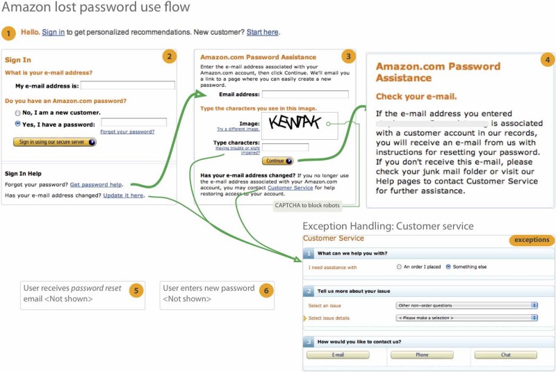
Amazon password lost flow. Image credit: Quora
Reduce the risk of abandonment by simplifying the authentication experience. Use third-party login (log in using Facebook/Twitter):
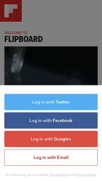
Flipboard allows users to log in using social network account.
Or fingerprint touch/Face ID login:
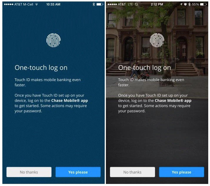
Chase bank app for iPhone provides one-touch log on option.
3.Provide alternative ways to sign-in
Use the information you have about your customers to provide alternative ways to sign-in. For example, if you have user’s cell phone number you can text one-time password on the phone.
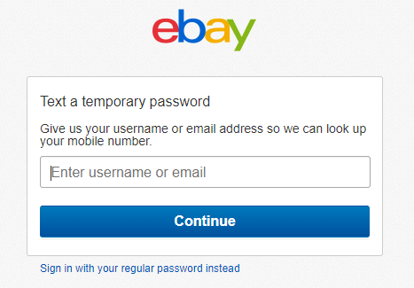
eBay will send you one-time password on your mobile phone
Long Checkouts
More and more mobile users not only search for products using their mobile devices but also complete the checkout process. This means that we need to design shopping experience for small screens to be as comfortable as possible. Easier said than done. Filling checkout form on a mobile device can be painful. So it’s not a surprise that long checkout forms are one of the leading causes of abandonment. According to Google Data:
50% of users abandon mobile transactions because of a poor experience
Solution
1.Don’t force users to create an account
According to the Baymard Institute, forcing users to create an account is one of the biggest reasons people abandon their purchase. Allow the purchase without registration. It’s essential not only provide option “checkout as guest” but also make it clearly visible (Baymard Institute also found that 88% of mobile checkouts have guest checkout options that can be easily overlooked by users).
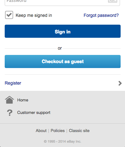
Ebay provides two options — ‘sign in’ and ‘checkout as guest’
2.Remember user details
Don’t ask users to enter any information they provided previously. Once you collected the data, reuse it for any new transaction. This might be shipping information and billing details. Just make sure that users can modify it if required.
3. Utilize geolocation data
Instead of asking users about shipping address you can use their current location as a default option for delivery. Just make sure that it’ll be easy for users to change it if required.
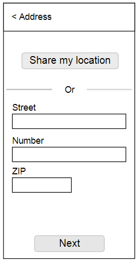
When users tap on ‘Share my location’ button the information in form will be filled with current address.
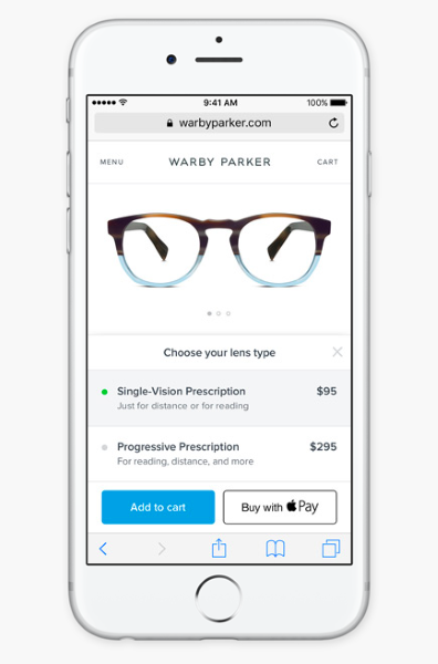
4. Make it possible to pay using Apple Pay or Google Pay
When it comes to payment, you should give as many options as you possible can so that users can choose their favorite methods. Apps that provide payment options, such as Apple Pay and Android Pay, relieve users from the pain point of filling out additional forms during checkout and can provide an increased sense of security.
5.Design “Quick buy” option
This option might be beneficial for regular customers. When users tap “quick buy” button, website should automatically redirect a user to the purchase summary (for the confirmation). All payment information and delivery preferences should be taken from previous orders.
6. Include the option to continue the purchase on another device
While the number of people who use mobile to complete a purchase is growing, there is quite a lot of users who use mobile phones just for browsing and prefer to complete a purchase on a desktop. Allow them to do it by providing options “save for later” or “send the cart to your email.”