Best Practices for Flat Design
Flat design can be seen as the more sophisticated cousin of minimalism — all design elements are centered on idea of simplicity. However, the simplicity of flat design is hard to achieve — everything should be designed with the same goal in mind to create a cohesive visual and functional design.
Let’s look at what you can do to make flat design works for your users.
Invisible Design
Remove unnecessary styling
It’s better to practice “invisible design” — make design choices that your users won’t notice. Because each time users spend noticing the design takes away from the immersion of the experience. Your goal is to help users quickly and easily understand certain actions and messages. Thus, your design should strip down visual elements to expose their essential functionality.
Color is a large part of flat design — it basically sets the whole feel of your site’s page or app’s view. Flat design color palettes are often much brighter and more colorful than those for other apps/sites.
Tips:
- Material Design and Flat UI Colors provide a good guide for choosing colors.
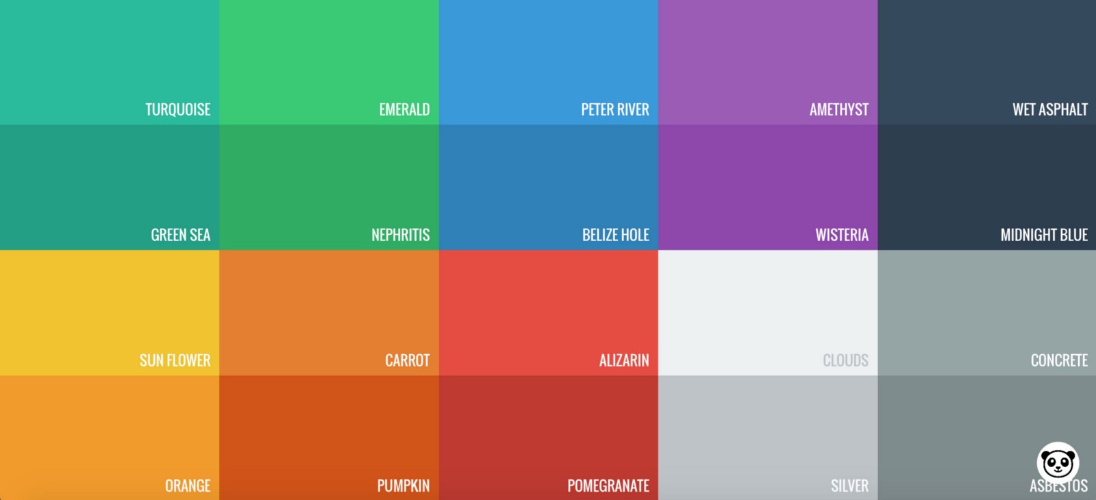
- It’s better to use colors which are slightly desaturated because they tend to add aesthetic beauty to your page without making your reader’s eyes bleed because of too much brightness.
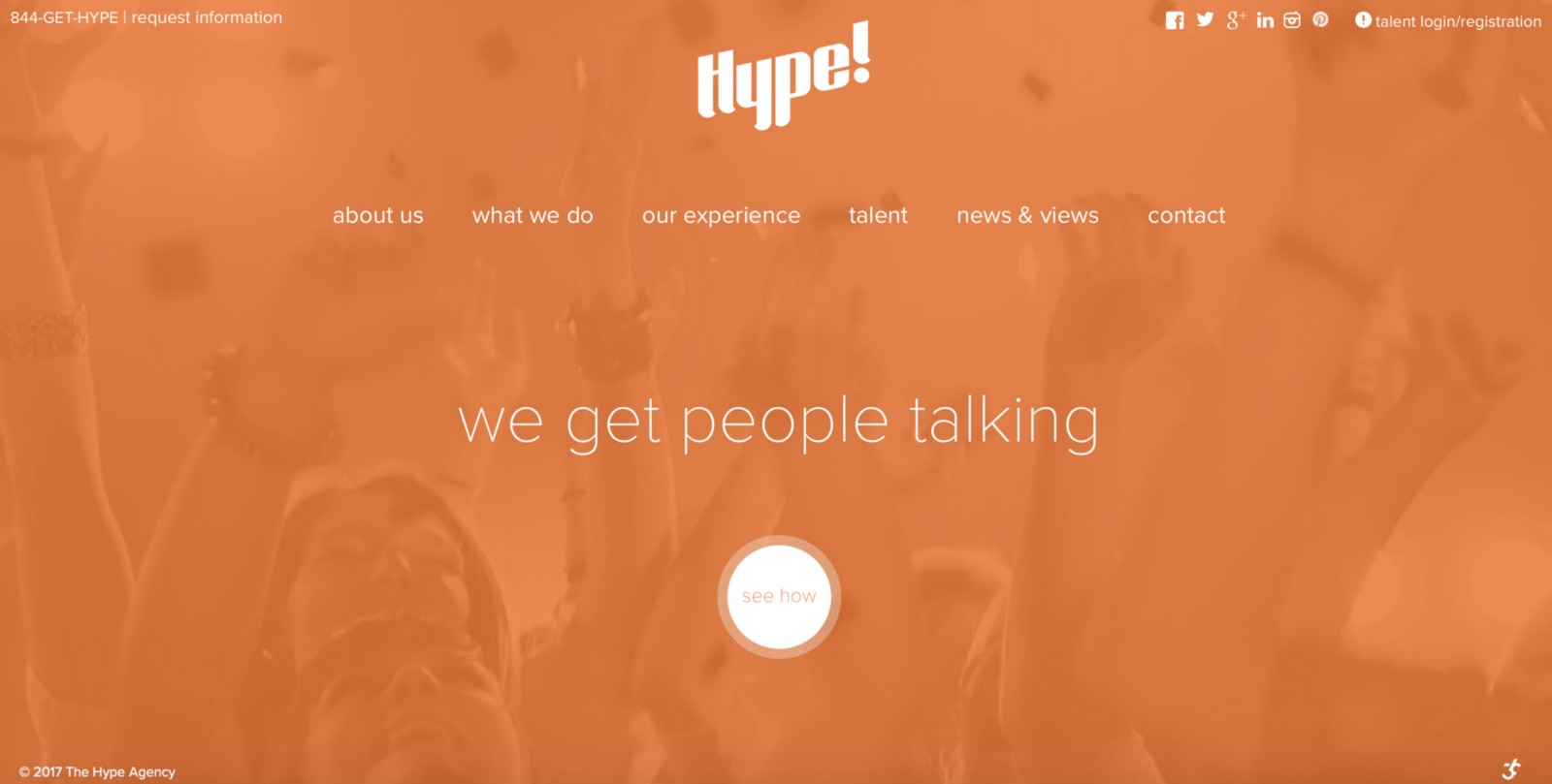
- Bright colors can be used as accents against a more subdued background. Notice how accent colors make the imagery seem to pop off of the page in example below.

- Making sure that colors in your UI are accessible for your users is a really important aspect of a well executed visual design. Test your color palette to make sure you have enough color contrast.
Focus on Typography
Design for the focused aesthetics
Type should tell users what is the most important on the page and how to use the design. It’s better to use simple typography, because it’s easier to read and better for loading, not to mention a necessity for minimalist styles.
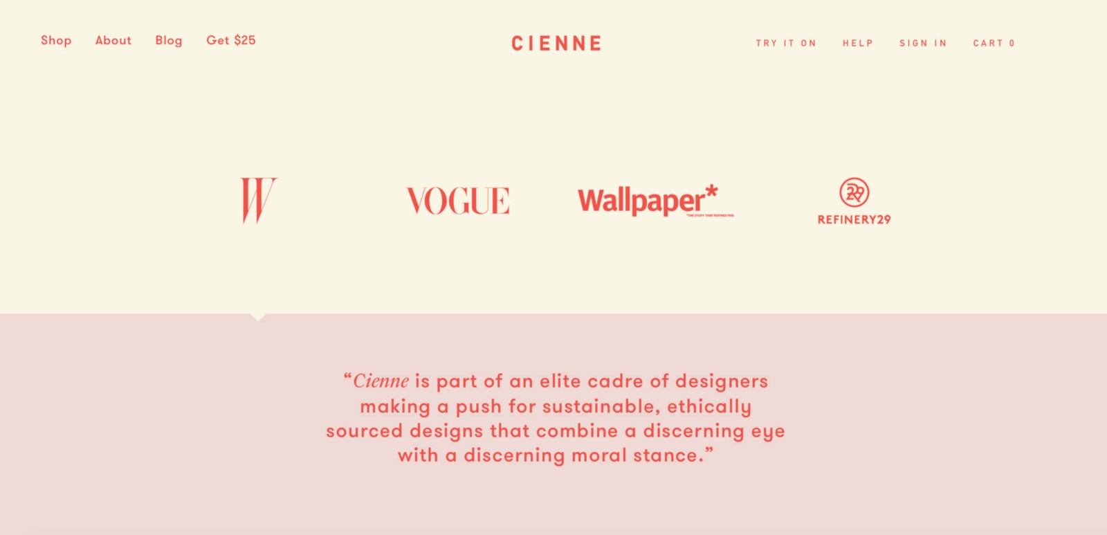
- Consider a simple sans serif type family with plenty of variations and weights for the primary typography on a site using flat design. This font family gives a clean, fresh and modern feeling.
- The tone of typefaces should match the overall design scheme. A highly embellished font might look odd against a simple design.
Motion
Motion makes flat design more user-centric
Flat’s visual simplicity works well together with motion. When users interact with your app or site, they might ask following questions:
- “What’s most important here?”
- “How do I know what to do next?”
- “How do I know I have completed my task?”
Questions like this might reveal opportunities to use motion to enhance the experience. Motion optimize perceived UX and answers the questions:
- It drives user’s attention and hints at what will happen if a user completes a click/gesture.
- It helps you orient users within the interface and provides guided focus between views.
- It provides a visual feedback.
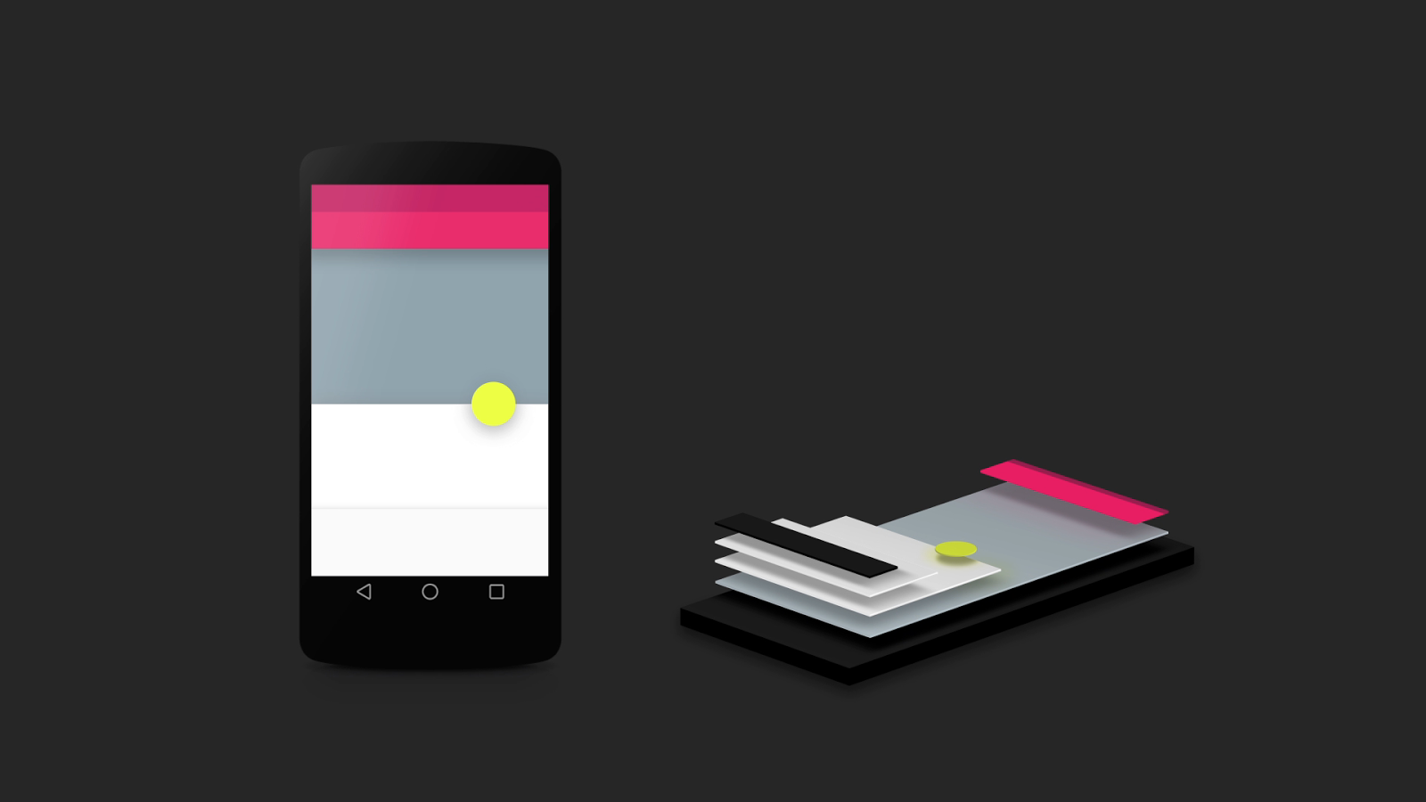
Motion-based design elements can be seen in a variety of forms, including transitions, animations and even on texture to mimic 3D depth.
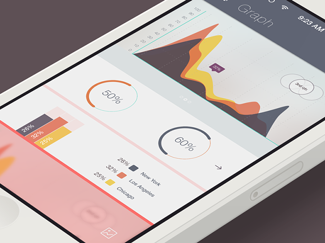
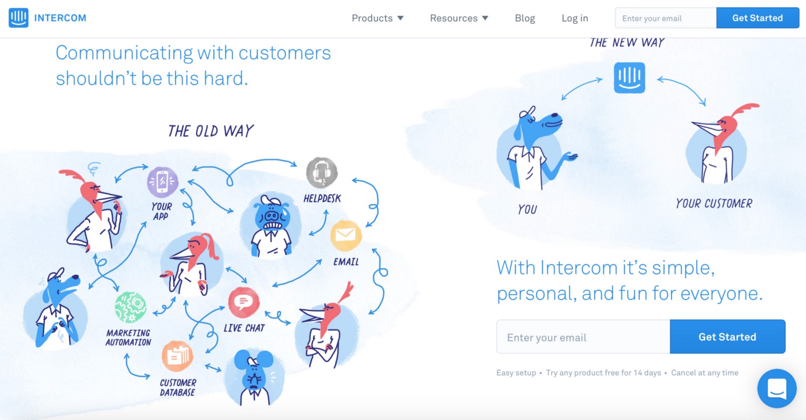
With the flat design style becoming more and more layered, it naturally incorporates more illustration.
Pictures speak louder than words and make the experience go faster
Properly-created illustrations clarify messaging by boiling down concepts into easily-understood visuals.
The biggest problems you will face when designing a flat UI are the interactive elements. Users need to know which areas of the page are plain static content, while other areas are clickable. Recently, designers have begun to realize this problem. As a result, a more mature and balanced interpretation of flat design has emerged — Flat 2.0 design:
Flat 2.0 design takes the best aspects of minimalism and skeuomorphism and makes them work together
Flat 2.0 design use subtle shadows and edge effects to imply this interactivity. Shadows and gradients give the necessary clues to tell users what can be clicked and what can’t be on an interface. As a result, user comprehension improves.
Thank you!