The Most Important Color In UI Design

As you probably already guessed this article is dedicated to blue color. Without a doubt, blue is one of the most important colors in UI design, and one of the most frequent. Just look at your smartphone app icons, and you’ll see that a lot of them are blue: Facebook, Twitter, Shazam, Safari, etc.
So why is blue the chosen color?
There are a lot of reasons to use blue, I’ll list a few of them:
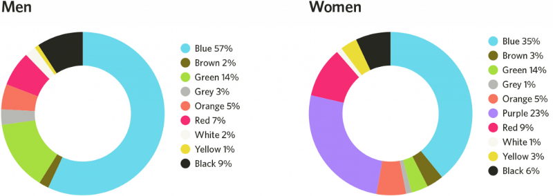
- People like this color. Surveys show majority of people see blue as their favorite color. Blue is considered to be the safest color globally.
-
Universal color for UI designers. From a UI designer standpoint, it’s an incredibly useful color. A lot of colors from designer’s toolbox such as red, orange, and green already have strong built-in associations —for error, caution/safety, success. This makes the blue color a good choice for designers.
-
Gives a sense of innovation. Often, companies use blue because it associated with tech and innovation.
-
Makes people feel safe. Blue is a very common color for websites and apps in the travel industry. It represents reliability, which is a good thing for travel companies.


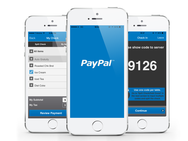
- Makes the product seem trustworthy. More often than not, it’s a case of trying to convince the user that this is the right product to use. The purpose of adding blue, in this case, is convincing the user of its credibility. Technology brands like Dell, IBM, Intel, AT&T and PayPal take advantage of blue’s trustworthy message; they create products that people rely on day after day.
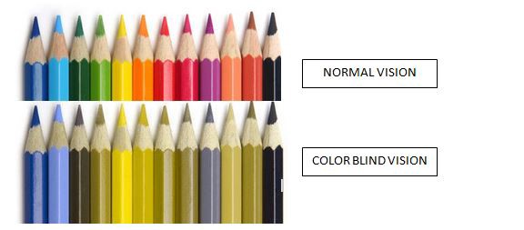
- Colorblindness. Most common types of colorblindness (Protanopia and Deuteranopia) can see the color blue. This can’t be said for colors like green or red.
What works on one site or app, doesn’t necessarily work on another. It’s a safe bet to select the color according to the preferences of your target audience:
Ultimately, the right color for your design is the one that your users think is right.
Thank you!