When To Use a Hamburger Menu

Oh, the hamburger menu. An icon of three stacked lines (two buns and the meat in the middle) used to represent a menu. Clicking/Tapping on the icon reveals available navigation options. A lot of posts have been written about the hamburger menu, mostly by designers, arguing against it. If you missed all, read Hidden Navigation Hurt UX Metrics by NNGroup. In a nutshell, it’s not about the icon itself but rather about hiding the navigation behind an icon.
However, in some cases, the hamburger menu might be a good choice.
Hamburger As a Secondary Navigation
Since the main downside of the hamburger menu is its low discoverability, it’s not recommended for the main navigation menu. However, when designing secondary navigation options, this pattern might be an appropriate solution. If the primary navigation options are available as on-screen CTA buttons or in some other form, the hamburger menu can be a good place for all the secondary navigation.
Consider Uber’s primary screen in example below:
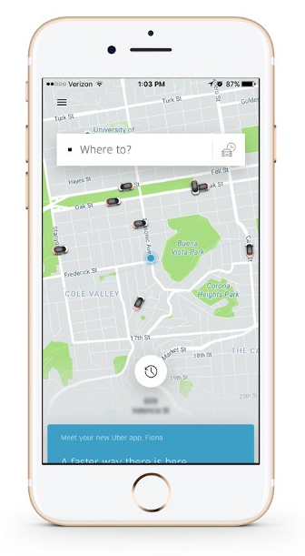
Since everything about the primary screen is designed to request a car, secondary options such as History and Settings can be hidden behind the hamburger menu (these features are unlikely to be used every time a person opens the app). The hamburger icon doesn’t distract users from the task, and still, gives them access to the secondary features.
In this particular case:
Less navigation elements means fewer distractions when users interact with the app. Minimising the navigation focuses the user’s attention on completing the task.
In general, if you choose whether or not to use a hamburger consider “80% rule.” Do the navigation options which you’re going to hide behind the hamburger icon fall below the 80% of regular usage? If your answer is yes, then putting them in a hamburger menu is OK.
Conclusion
While hidden navigation is very often harmful to the user, though any design decisions must always be considered within the context of the app’s goal. In other words, there are no ‘good’ or ‘bad’ patterns. Context is what matters the most.
Thank you!