The problem of clock font size in Apple iOS 16
Why sometimes small details matter a lot
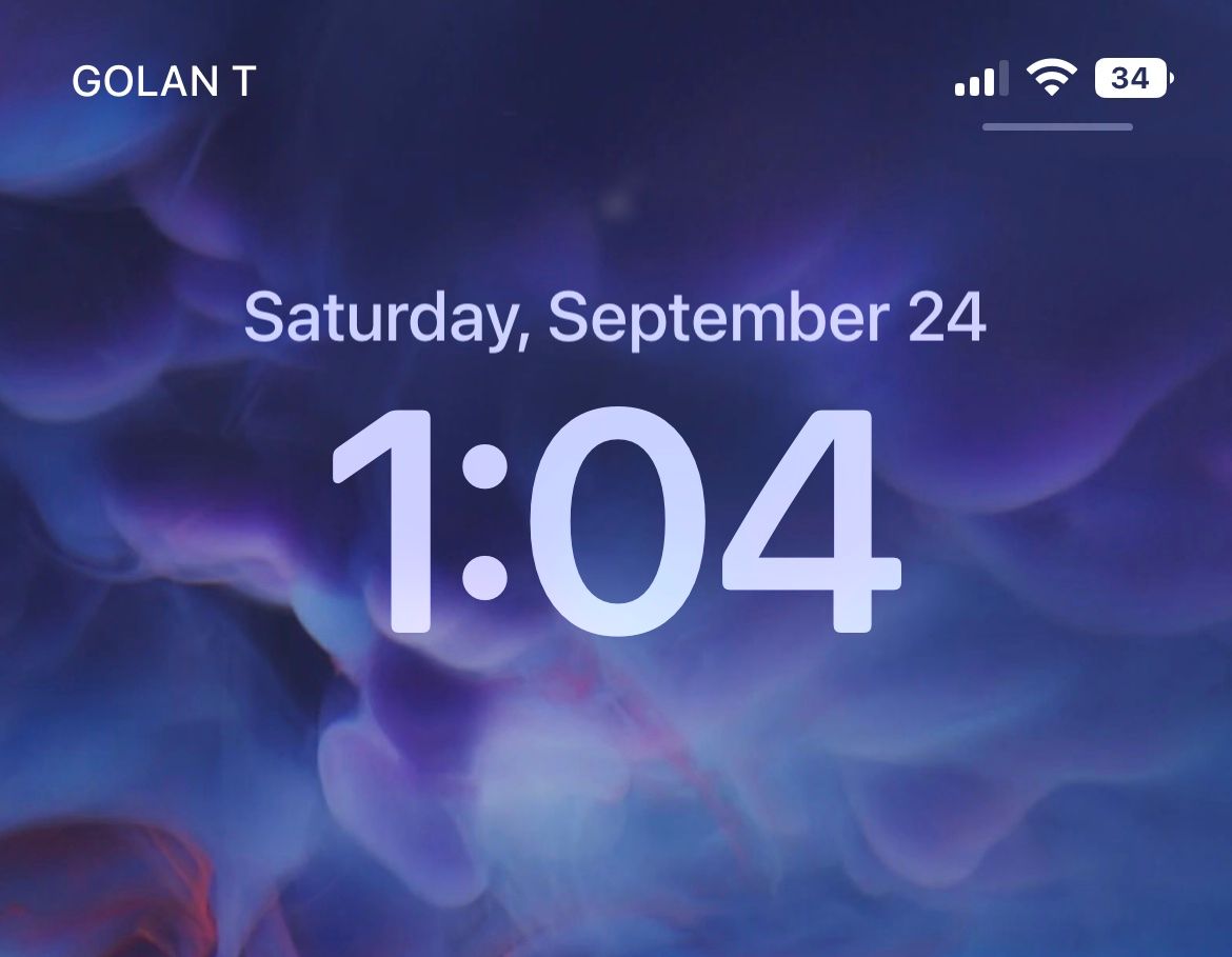
With all the UI changes that Apple introduced in iOS 16, including the Dynamic Island that got a lot of media attention, one subtle change hugely impacted almost everyone. Apple increased the font size of the clock display on the iPhone lock screen. Now it’s 82pt bold typeface.
iPhone users reacted differently to this change. Some people say that its the best update in iOS 16:
Does anyone else agree that the best update with iOS 16 is the increase in the Lock Screen clock’s font size?
— Adrian J. Moreno (@iknowkungfoo) September 20, 2022
Other people reacted more negatively:
Apple have changed the font of the Lock Screen clock and I am NOT HAPPY! pic.twitter.com/Tvr1fDob8e
— Ben Jammin (@viper_hammer) September 19, 2022
iOS 16, clock looks like it was made for someone who’s 95 in the shade @Apple
— Pjero Mardesic (@Pjeromardesic) September 22, 2022
How can it not drain the battery when it has 82pt Font size for the clock only? I like some features when connected to apple CarPlay though. pic.twitter.com/AnHhJvfZCv
— Mmbudzeni (@Nama_Chopani) September 20, 2022
Why did Apple decide to change the font size?
I think the primary reason behind this change was to make information more accessible to all groups of users, including people with poor eyesight. The new font size indeed makes it easier for users to know what time it is, even when they look at the screen from a distance.
Why are users so polarised about this change?
Every new design naturally faces some resistance at the beginning. But for this particular change, the problem is a bit deeper. The new font size doesn’t match the overall aesthetics of the iOS 16. The clock in the new design looks like an alien object to other UI elements of iOS 16; that’s why people are so bothered about this change.
Can users change the font size?
Surprisingly, no. Apple doesn’t offer an option to change the font size for the clock to make it smaller.
Thanks for reaching out! Changing the size of the digits for the clock is not an option on the Lock Screen. You can change the numbers to a font that is more pleasing as described here: https://t.co/qlrtcS3QsU DM us if you have more questions. https://t.co/GDrqU23wfr
— Apple Support (@AppleSupport) September 16, 2022
We know that people don’t change default settings, so most users won’t change the font size anyway, but it is strange why the company doesn’t allow this customization. Naturally, there is a clear demand for customization from the users.
Do we have an option to change the font size of the clock/time kwi lockscreen? Because wow its too big shame
— Zamokuhle (@Dlokovu_elihle7) September 16, 2022
Design is in the details
Small details make the product. Even when we don’t focus on elements like font, colors, and animations used in a product, they still impact how we think and feel about the product.
People also adapt to specific design decisions, and they notice radical changes. Let me give you an example from a physical world. Imagine entering a living room and seeing that the clock on the wall is twice larger now. You likely will think that something is out of place now. No wonder why users are so bothered about the iOS 16 clocks. That’s why it’s worth offering an option to revert/customize the changes to return to the previous design.