Progress Indicators: 4 Common Styles
‘Don’t make users wait’ is one of the essential rules in interaction design. Yet, despite all our efforts, sometimes it’s impossible to provide an instant response to the user’s request. But it’s vital to keep users informed about what’s happening, and progress indicators can help us with that.
You should use a progress indicator for any action that takes longer than one second.
In this article, I will review 4 popular styles of progress indicators and learn when to use each.
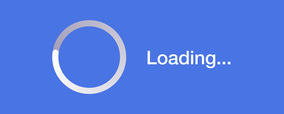
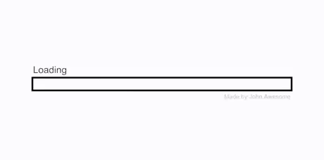
1. Loading spinner
A loading spinner is the most basic type of loading indicator. It simply informs users that they have to wait because the system is doing something, but it doesn’t provide specific details on how much time it will take.
An infinite loading spinner is perceived better than a static message “Loading” because it has a basic animation. Just the fact that something is moving on the screen gives users the idea that the system is working.

When to use:
Use it for a relatively short waiting time (2–10 seconds). 10 seconds is about the limit for keeping the user’s attentionfocused on the particular task.
How to create a loading spinner:
Here is a quick tutorial on how to create an animated loading spinner in Figma.
Tips:
- Provide additional contextual information to the user along with the spinner. Add a message that explains why the user is waiting. For example, you might show a message about what the system is doing now. It will reduce a user’s uncertainty.
- Try not to use a loading spinner when loading web pages, especially if waiting takes ten or more seconds. If the user sees a loading spinner without additional information for more than 10 seconds, they will likely abandon your website.
- Use creative loading indicators. When an app gives users something fascinating to look at while waiting, they will pay less attention to the wait itself.

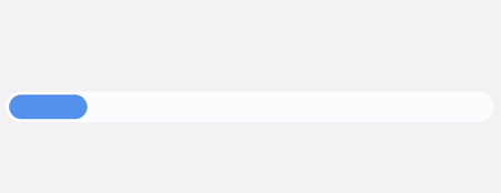
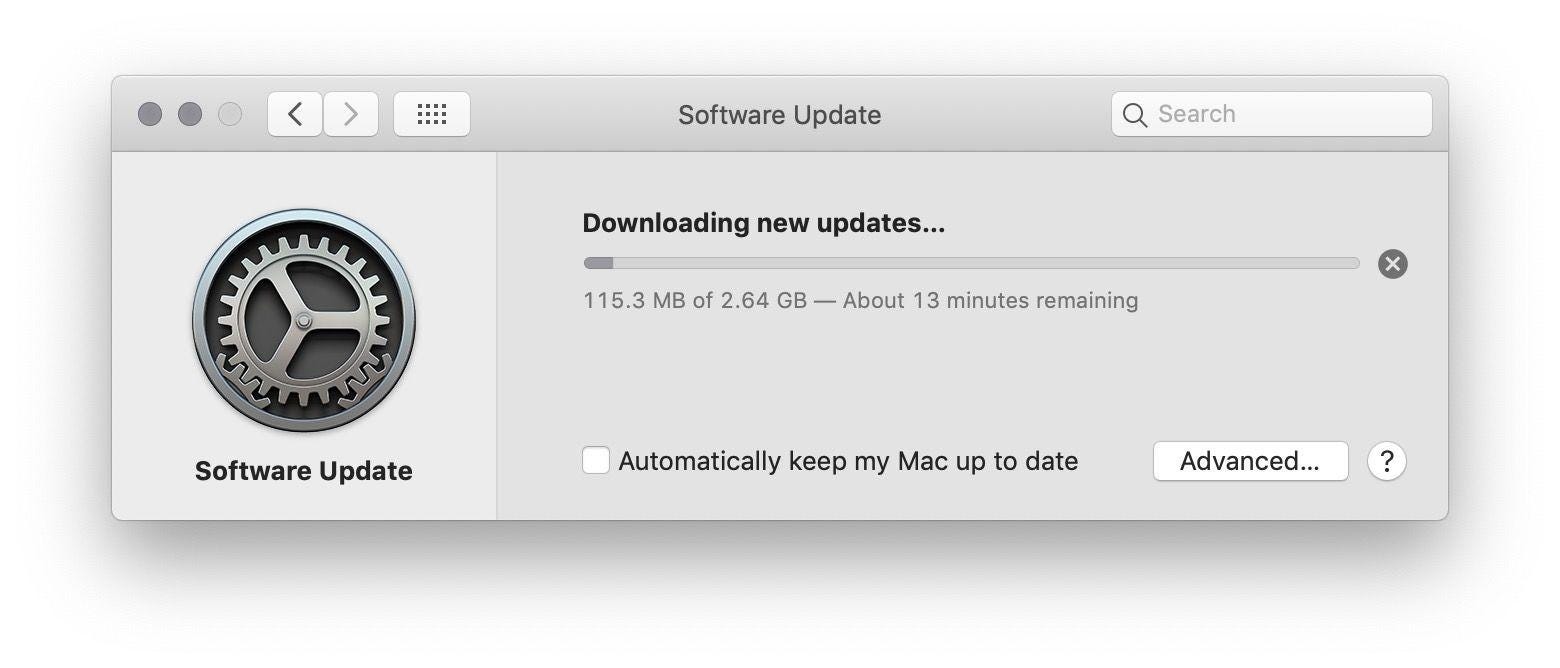
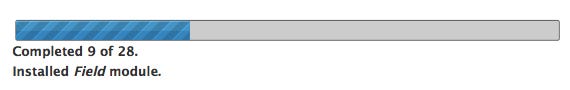
2. Linear progress bar
A linear progress bar is a determinate progress indicator that fills from 0% to 100% and never decreases in value.
When to use it:
Use a progress bar for longer processes that take 10 or more seconds.
How to create a linear progress bar:
Here is a quick tutorial on how to create a linear progress bar in Figma.
Tips:
- Provide general time estimates for time-consuming tasks. If an operation takes minutes (or hours), it is worth giving the user an estimate of how long it will take so that they can plan their time. Most of the time, the estimation shouldn’t be precise; having an approximate ETA is fine.
- Tell the user what has been done so far. For example, if you can break a task into a series of steps, you can tell the user how many steps have already been completed.
- Never stop the progress bar. Any unexpected stops will impact user satisfaction. The worst possible scenario is when the progress bar goes up to 99% and freezes. When users notice such behavior, they might think something is wrong with the app.
- Play with user perception. You can make the user perceive that the operation is faster than it really is by starting the progressive animation slower and moving faster as it approaches the end.

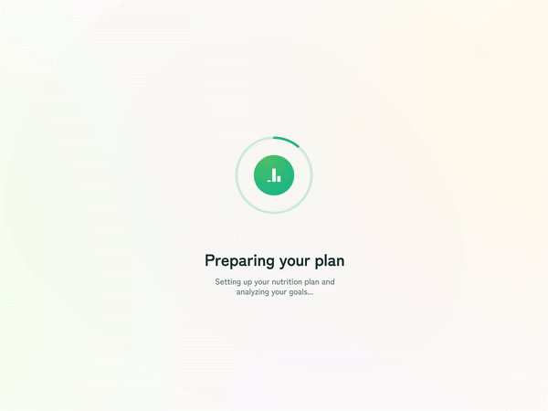
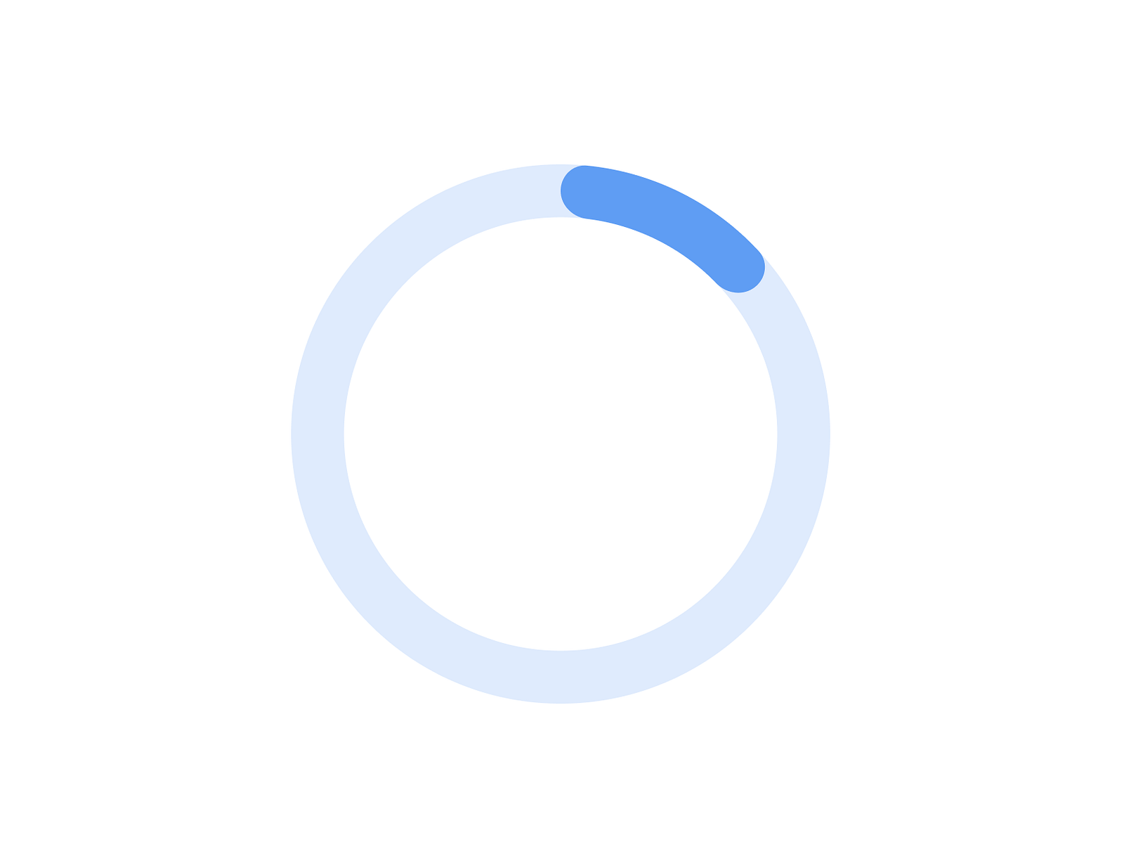
3. Progress ring
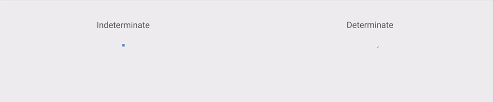
A progress ring is a type of progress indicator that can be indeterminate or determinate. Indeterminate indicators visualize an unspecified wait time (i.e., loading spinner), while determinate indicators display how long an operation will take (i.e., progress bar).
When to use:
Progress ring can be used for both short and long wait times. In the first case, the progress ring will be indeterminate, while in the second case, it will be determinate.
How to create a progress ring:
Here is a quick tutorial on how to create a progress ring in Figma.
Tips:
- Turn indeterminate into a determinate ring on the go. You can start with an indeterminate indicator if you need some time to calculate estimations and then turn it into a determinate one once you have the information on how long this operation takes.
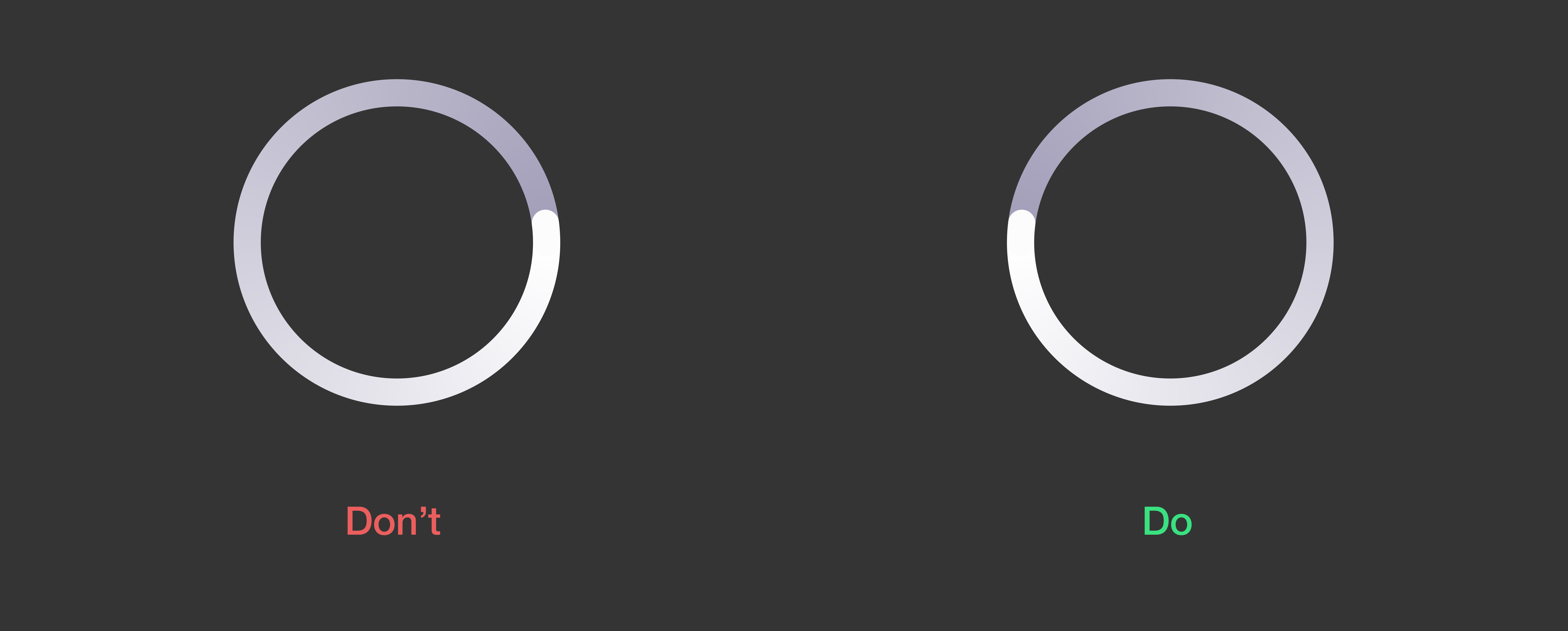
- Visual indicator should move in a clockwise direction. Clockwise direction look more natural for users rather than anticlockwise.
- Can be integrated into a button or any other actionable element. When you integrate progress ring to a button you make a direct connection between an action and wait time.

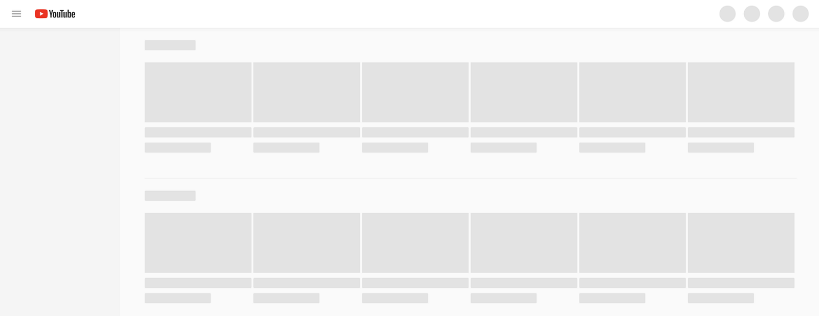
4. Skeleton screen
Skeleton screens is a version of a page that features only content containers into which information is gradually loaded. Unlike other types of progress indicators that focus user attention on the fact of waiting, skeleton screens create anticipation of what content they will have.
When to use:
The skeleton screen works best for short wait times. It’s recommended as a website solution because the web page should load in less than 3 seconds.
Tips:
- Don’t load all content at once. Once you show content placeholders, you don’t need to fill them with actual content all at once. You can fill them incrementally once you load more content.