Disabled Buttons in User Interface
When we design web forms, we always try to minimize the chance of users making mistakes. With that intention, we try to prevent users from taking actions that can cause errors. And disabling the submit button is one solution that, from the first glance, seems reasonable.
In this article, I will explain why you should be careful with disabled buttons.
Why disabled buttons can cause bad UX
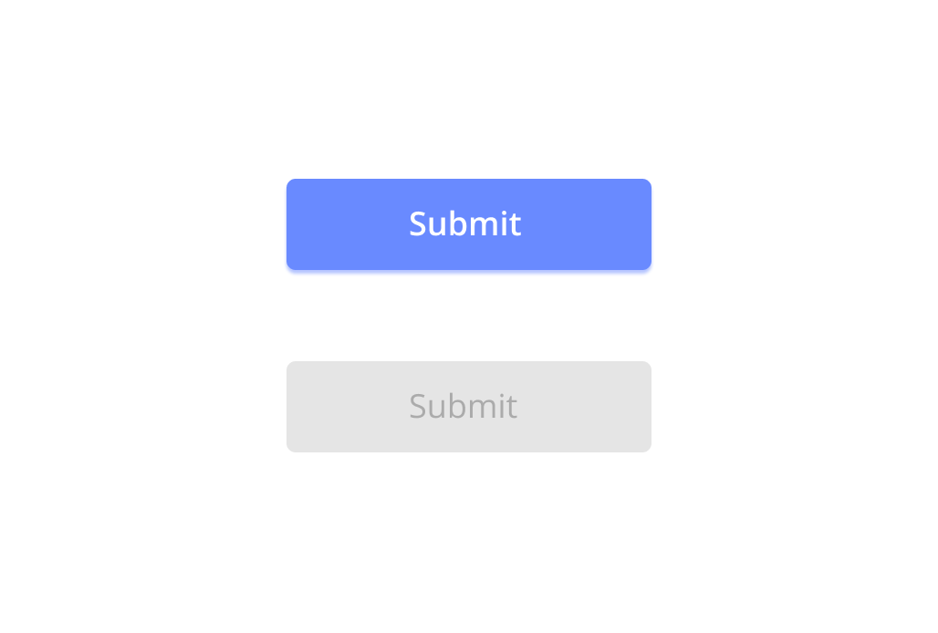
Disabled button is an interesting pattern. From one perspective, it works magical to user—when the user provides all required data in correct format, the system rewards the user by making a button active. But when something goes wrong, the disabled button becomes a major point of friction for the user because it prevents them from moving forward.

No feedback that is telling users what went wrong
“Why it’s not working?” is the question users ask when they cannot proceed. “Don’t make the user think” is the most important usability rule. When you disable the CTA button, you make the user think about how to activate them. Instead of clicking a button and seeing a specific error message, users will scan the form up and down in order to find what keeps the CTA disabled. It is especially true for long, complex forms — imagine a situation when you fill out a long-form on mobile, and only a fraction of the form is visible in a viewport.
What makes the situation worse is that even when the data is valid, wrong formatting can still keep the CTA button disabled. For example, the user might accidentally leave extra whitespace in some field in a form; the system cannot proceed with this formatting and doesn’t activate the CTA. The process of finding what causes the problem becomes challenging for the end-user. It is almost like the system is playing a puzzle game with a user:
Something is wrong, but I won’t tell you what exactly. You need to guess that.
No wonder that disabled buttons have a negative impact on user conversion. Users who don’t want to find what keeps the button disabled will simply abandon the process of filling out a form.
Bad accessibility
There are a couple of problems with disabled button design itself:
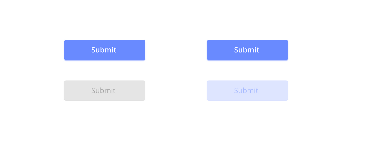
- Most designers indicate an inactive state by graying out the button. Grey buttons with gray labels can easily fail to meet color contrast recommendations for text.
- Sometimes disabled buttons are designed in a way that they cannot be read by a screen reader (buttons are not focusable, and hence users can’t reach them with a keyboard). No need to explain that users with disabilities will face problems with such behavior.
There are a few design solutions that will help you avoid accessibility issues. H Locke shares some hands-on tips on making the disabled button more accessible. One of the good tips mentioned in this article (which actually comes from this source) is not graying out the disabled button but using an opaque version of the primary CTA color. By doing that, you will make it easier for users to decode the button’s current state.
Vitaly Friedman offers some advice on how to make the disabled button more inclusive for users with disabilities. One great piece of advice is to use aria-disabled rather than disabled because it will still focus the button and announce for users that it exists.
Communicate better
Design is communication. No matter what product you design, you should always make it easier for people to understand how to use it.
Lets discuss two common cases for using disabled buttons in UI:
Disabled Submit buttons in web forms
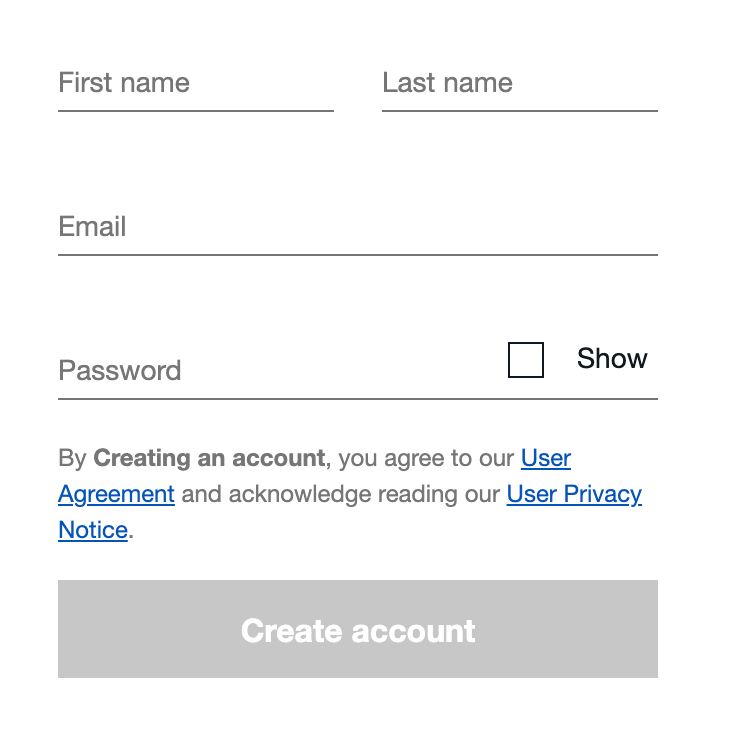
When it comes to disabled buttons, some designers blame the pattern itself and say that you should avoid using disabled buttons altogether. I think that not the pattern is wrong, but the way we use it. It is still possible to disable a submit button by default for login, shipping, billing, and many other forms when all fields are empty. Below is an example of a sign-up form that eBay uses. There is no point in enabling the CTA before the user provides any data.
However, when the user provides the information, it’s better to enable the Submit button.
Let users make mistakes and provide appropriate feedback so that they can easily recover from error states.
- Use inline validation. Inline validation can prevent users from seeing error messages in the first place. By validating user input on the fly you can reassure them that their input is correct. Of course, inline validation won’t guarantee that the user input is 100% correct, but it’s possible to minimize the chance of seeing error message after the user clicks Submit.
- Show well-designed error message on button click. A good error message helps users understand what causes the problem and guides them to find a solution.

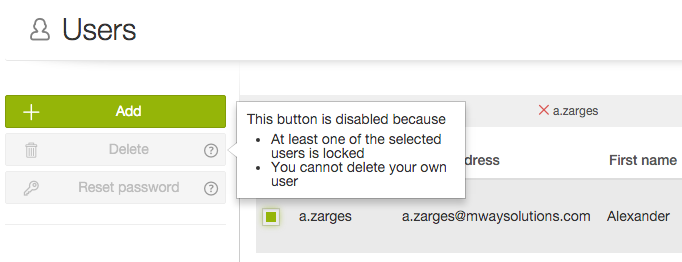
State-related buttons
Sometimes you need to use state-related buttons in your UI. For example, a button can become active when some condition is met. In this case, you should always explain why the button is disabled. For example, you can show a mouse on-hover tooltip that will explain that.