5 Simple Rules For Using Images More Effectively
Images are part of visual language product designers use to communicate with users. Images can tell a story, communicate a complex idea or accompany the text to provide more details.
The process of creating or selecting visual content for your app is time-consuming. But there are a few tricks and tools you can use to simplify this task:
1. Use context-relevant images
Each image in your design should serve a clear functional purpose.
Avoid purely decorative images
Purely decorative images rarely provide a positive experience for users - in many cases, users simply ignore them, but in some case, such images can overwhelm and distract them.
For example, many corporate websites are notorious for using abstract photos of buildings in design. The idea behind that is simple - give visitors a sense of a modern corporation. Unfortunately, such photos give zero valuable information to anyone who visits a website.

Don't use an image because it looks nice, always think about the message you're delivering
Test the meaning of your images
Imagery, like any other element of UI, should be tested for usability. It's vital to test and see that the message you try to convey using images is absolutely clear to your users.
Take user emotions into account
Your images should have an emotional impact on your users. They should reinforce the feelings you are trying to create.
Text may be read and forgotten, but a vivid image has a better chance to stay in the minds of users
Taking user emotions into account is especially important when users face problems. For example, if your users get an error message during form submission, showing a smiling face a person next to error message won't create a positive experience.
2. Have a focal point
When the point of focus is obscured, the image loose all it's value. Don't make users hunt for the meaning of the image.

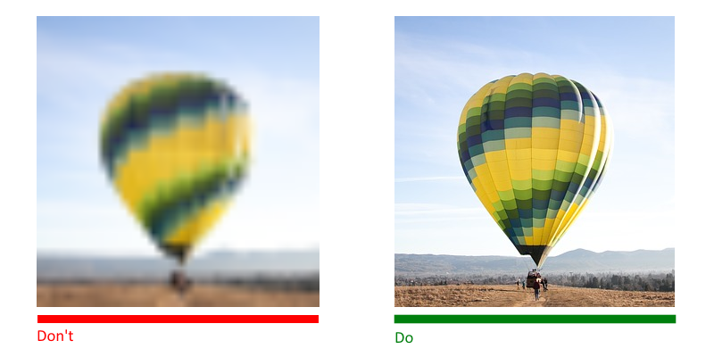
High resolution
Size all images for different displays and platforms properly. The images you use shouldn't appear blurry or pixelated.
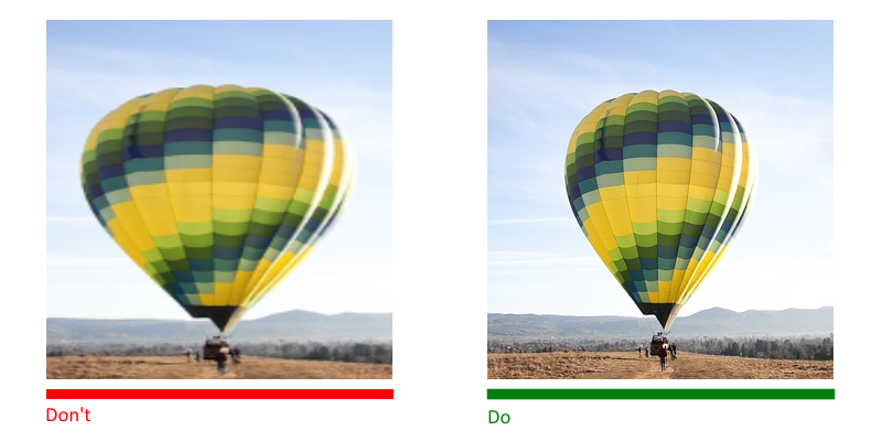
No distortion
Always display images at their intended aspect ratio to avoid distortion.
Test color contrast
If you use text overlay over the image, it's important to test color contrast rate to be sure that the text is readable.

The W3C recommends the following contrast ratios for image text:
- Small text should have a contrast ratio of at least 4.5:1 against its background.
- Large text (at 14 pt bold/18 pt regular and up) should have a contrast ratio of at least 3:1 against its background.
Here is a list of tools that can help you to check the contrast ratio
Provide captions for images
Don't forget about people with visual impairments who will use screen readers to interact with your content. Provide alternative text or a caption for each important image so that screen readers can give the users meaningful information.
5. Be careful with stock photos
Stock photos are an excellent tool in a designer's toolkit. They save a lot of time both during the prototyping phase and during final production.
But like any other tool, it's essential to use it carefully.
Always strive for images that represent genuine stories
Avoid generic stock photos. They are fake, and when people see such images they start to doubt the product. It often results in a lack of trust.

For example, if you want to tell a story about your team, it's always better to take photos of people who work with you instead of using generic photos of a random team. And don't worry that your photo won't look too polished - when visitors see such photos, they will understand that a real person took it and it helps to establish a human connection.