Features Audit Template

A simple tool that will help you identify the key features of your product
People choose to use a particular product because they believe it will help them achieve their goal(s). The more popular product becomes, the more tempting its for product creators to add extra features to the product.
But adding more features to the product doesn’t always lead to more value to end users.
Extra features often cause feature creep — a situation when a product becomes overloaded with too many unnecessary features. But how to identify the key features that provide the most value? A feature audit template can help you with that.
Feature audit template
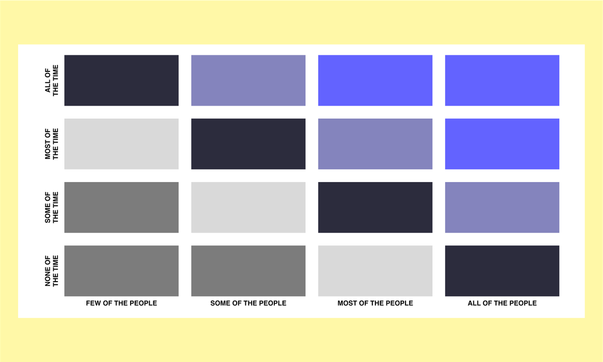
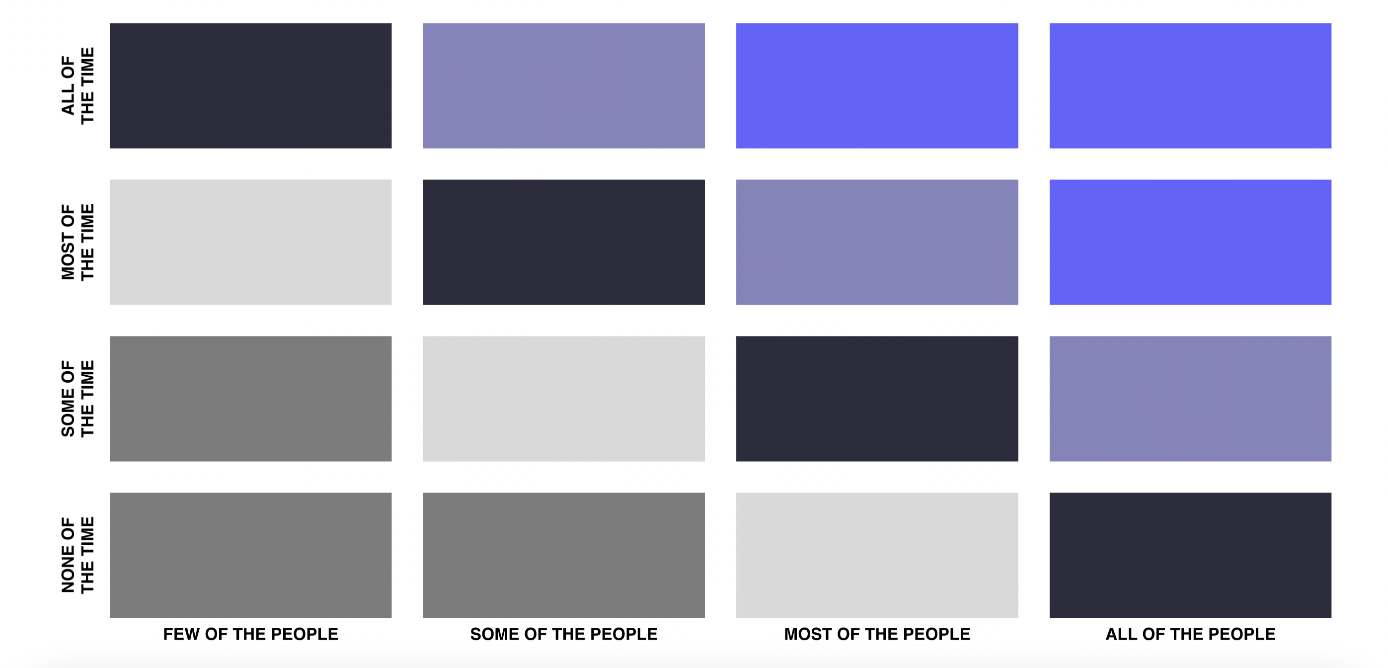
A feature audit template can help you prioritize features according to the frequency of use among your target audience. The template has two dimensions:
- On X-scale, you can see how many people use a feature (a few people, some people, most people, and all of the people).
- On the Y-scale, you can see the frequency of use (none of the time, some of the time, most of the time, and all of the time).
In the perfect situation, all features of your product should be located at the top right corner of the template (all of the people use them all of the time).

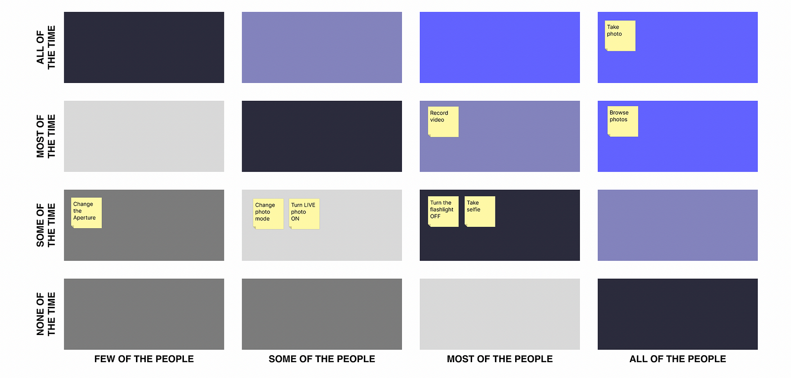
Here is an example of the template for the Apple iOS Camera app:

As you can see, all of the users use iOS cameras to take photos, and just a few people adjust the aperture.
When to conduct a feature audit
Roadmap planning is the ideal moment for conducting a feature audit. When you discuss what features you need to focus on in your design, it’s better to stop and think about how people actually use your product. Our hypothesis about features and the value they bring to users often might not match with actual user behavior. The right way to evaluate your design is to:
- Identify core features in your product. Identify features that you think are valuable to your users.
- Track the core feature usage over time to understand the frequency and adoption rate. Use qualitative and quantitive data to understand how real people actually use your product and what features they find valuable.
- Move features to the right quadrant in the feature audit template.
- Analyze the feature audit document you’ve created.
What to do with features that perform poorly?
What to do with the features that your customers are not using? Does it automatically mean that you should remove them? No always. The fact that users don’t use a particular feature doesn’t mean that it is useless.
Here are two popular scenarios that you should consider:
- The feature can perform poorly because of poor discoverability and findability in your user interface. Your users might not know that the feature exists in the first place or might not be able to find it. You can try to increase the adoption rate of the feature by making it more visible to users (i.e., adding visual cues in the interface).
- The feature itself might be poorly designed. Users tend to avoid using such features after the first negative try. The only way to solve this problem is to improve the design of your product.
Feature audit template for Figma
Here is a free feature audit template that I’ve created for Figma: